Effective Trading Strategy using Line Charts -Steemit Crypto Academy | S6W1 | Homework Post for @dilchamo

Am so happy to have the academy and all the students and my professors back in session on season 6 week 1 of the season of which my dear professor @dilchamo has put us through on her teaching on the topic of "Effective trading strategy using line charts".
Therefore I will answer the following questions provided to be answered with the necessary screenshot.
Welcome am @kingworldline

Therefore, the line chart bear by name can be defined as that line which gives insight based on crypto price changes observed in a period of covered interval which is signified by the movement of the line.
Hence the line chart is graphical representation of the assets based on its price, this line moves in accordance of the domination of the market based in the buying and selling, meanwhile the asset always has the opening and as well the closing price which has common connection line which shows where the opposition takes charge of the market.
The line chart actually shows the exact trend of the market without noise of other minor changes, meanwhile the chart line shows on the chart is as result of reflection of the internal happenings in the market.
The line chart has two basic side slopes between the horizontal axis and vertical which shows the time interval and price respectively, hence the line chart is judged based on the time and price it attains at a specific period of time.
Hence the line chart is used to trace information passed over time, it comes to exist as a result of different connections of different points of connection of the straight line, meanwhile it is also used to track down changes based on long and short periods.
USES OF THE LINE CHART
•The line chart is used in buying and selling in the crypto world of trading or any other world of that involve buying and selling, hence is this works in line with technical analysis behind trading which came as a result of visualising the debate between the the buyers and the sellers for past period of time.
•Hence this Can be useful in getting a close understanding of the market based on the price change, supply and as well the demand in the market.
•With the line chart a trader can extract vital information on the exact trend, the resistance and the support point in a market.
•Also with the line chart filter about all the noise which came as a result a minor change in the buying and selling order.
Based on the question above on how to identify the support and that of the resistance level with that of the line chart, hence this can be gotten with simple way.
IDENTIFYING THE SUPPORT SUPPORT POINT WITH LINE CHART
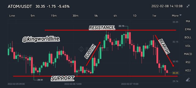
Therefore based on identifying the support levels with that of the line chart, this can be identified with help of the crypto chart which actually show the buying and selling order of a conjoin lines,
Hence the support points level can be spotted at a points are those lowest points whereby there is strong stop of the ongoing trend where the price of the asset reverse towards the opposite direction bullish phase of the market, hence this always identified at the deep points on a line chart.
Base on the chart above the straight horizontal line below the chart line, hence the this line came across the most deep (support point) where by the buyer take control of the market from the sellers, this is formed base on swing of the of the up and down known as the open and close of the market which now form trend that projected deep to get support levels as shown on the screenshot above.
Hence at the point of the support point are the perfect points to purchase an asset in order to sell in the future.
IDENTIFYING THE RESISTANCE POINT WITH LINE CHART
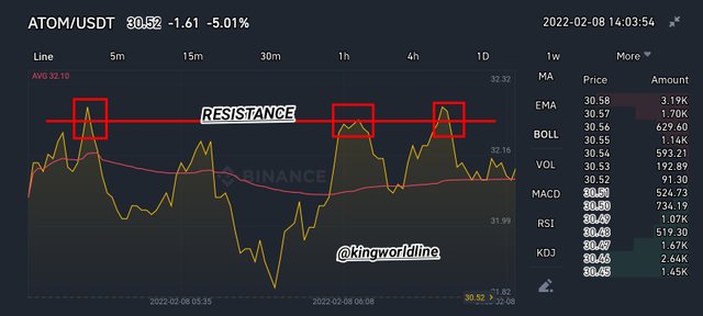
Based on resistance, this is the opposite side of the support points, hence the resistance level is those highest points where there is a strong stop of the ongoing trend toward the bearish side, hence they are claimed to be the peak points on a line chart.
As regards to the chart above Shows hass a straight horizontal line which runs at the tips of the peak point of the line chart which are known as the resistance point where by the market is taken charge by the opposition, this is a point the seller takes charge of the market over the buyers, hence this always happens at the peak points is formed by the little swinging of the open and close of the lines which tends to form a peak point known as resistance levels as shown in the above screenshot above.
Near or at those points of resistance are perfect points to sell off assets already bought.
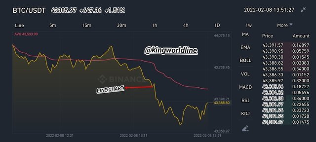
THE LINE CHART
The line chart can also known as (line graph or line plot) is graphical representation, which shows the historical price action of a particular pair of an asset and as well the information and data behind it over a period of time, hence this lines are connected at end point to another in a straight line,
The line chart is used to as an insight over the crypto price to that of the the time interval which is represented as a line graph which pass across information, meanwhile the line is connected at the closing point of the assets, meanwhile this does not contain all the little information passed across known as the noise, hence it shows the exact trend of the market
THE CANDLESTICK CHART
The candle chart is another means to express the fluctuation of the crypto price movement, hence this cover a lot both the little price action known as the noise, gaps and it as well shows the price action over a past period of time, meanwhile a candle stick shows the highest and as well lowest price and as well the open and close price
USING THE RELATIVE STRENGTH INDEX (RSI)
Firstly the Relative Strength Index known as the RSI is special indicator of it type used to measure the price momentum of an asset, stock and other security, meanwhile the basic ideology behind this indicator is based in the security over the up and down which are scaled at 70 and 30 respectively, with a total range of 0 to 100.
Therefore whenever the price action gets above 70 signifies overbought and while the 30 signifies oversold which show the point of exit and entry respectively.
Judging based on the point highlighted on the RSI side above shows the correspondences with that of the line chart which moves in accordance with the price action. Hence as shown on chart above show the point when the asset is overbought which is identified when the price exceeds the the mark out point of 70 above in the range 100 is a perfect point to sell off while the point where the price exceeds 30 below in the range of 100 then shows the oversold point which is the perfect point to enter the market.
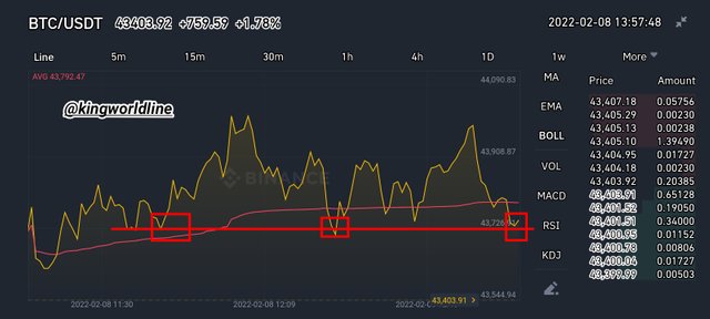
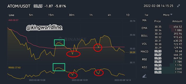
THE MOVING AVERAGE
The moving average works in accordance with the line chart which is based on the price movement of an asset. Hence the moving average as well shows the points of support and resistance, therefore the main basic guild on this is the higher the moving average obtained the stronger the support and the resistance price, as well with the time frame, meaning whenever the price get ranged wide shows the strong support and resistance and in reverse.
Based on the line chart above, this highlighted point shows the correspondences of the resistance and support point with the chart line which shows the points of buy and sell.
Hence is necessary to understand the trend of the market while trading with that of cryptocurrencies, hence before entry or exit we should make should we obtained the right position to carry our trade meanwhile trading against the trend can heat back on our trade badly, therefore is necessary to stick on the trend for perfect entry or exit.
Hence as regards to the question, i will be showing you the Bullish and Bearish Trading opportunities using the line chart.
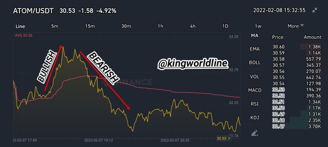
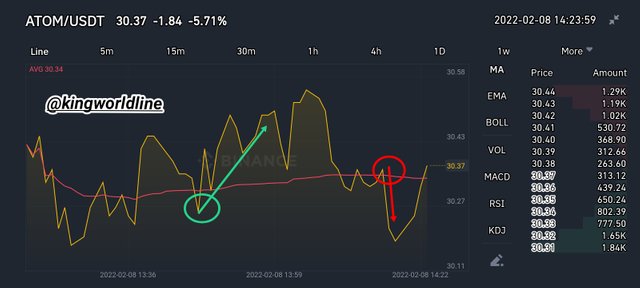
BULLISH TRADE OPPORTUNITY USING LINE CHART
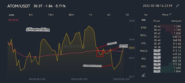
On this side the price is observed to be an up trend market, having an ATOM/USDT chart, at this point I identify a bullish opportunity alongside the moving average on that of my line chart. In the chart I observed that the price exceeded above the moving average which showed a change of trend for the bullish to that of the bearish, with that I can set up my entry and my stop loss below the moving average red line.
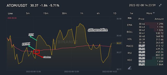
BEARISH TRADE POSITION USING MOVING AVERAGE
On this part the trend is identified as a downtrend, hence on the part whenever the price exceeds below the moving average red line shows a reversal from that of the bullish to the bearish, hence with this, the opportunity for trading bearish trend is identified.
Hence with the chart above with the currency pair of ATOM/USDT alongside with the moving average hence it is observed that the price exceeds the moving Average which shows a reversal, hence the sell position is open with a stop loss placed above the moving average.
ADVANTAGES OF LINE CHART
•The line chart is always clear chat which makes it understandable and as well eazy to explain and interpret
•The line chart as well helps us to easily identify the support and as well the resistance points or level in chart as regard to the market, hence this line chart filter all the short term noise and as well the wicks which are observed in candle sticks, which helps in making decision over entry and exist of the market.
•It gives the trader a pure mental picture of the market trends in the side of the bullish and the bearish trend.
DISADVANTAGES OF THE LINE CHART
•Hence with the line chart, it does not actually show all the necessary information for making critical decisions in trading.
•The line chart is not always good in making decisions in a short time frame, meanwhile it makes for a bigger frame for trading.
•Is not not incompatible with short term trading as we have in some kinds of trading.
In conclusion the line chart is technically inclined, based on its mode of operation as regards to the financial market, meanwhile it is used in the analysis base of the price action with the boundary of the price and the time interval in the chart.
Hence the line chart is compatible with all strategies as regards to determining the price action, although it does not actually show the minor individual differences in the buy and selling orders, hence it shows out what the market is up to in its trend showing the perfect points necessary for buying and selling.
And special thanks to my professor @dilchamo for this wonderful teaching on effective trading strategy using thh3 line chart.
REFERENCE; Note all screenshots used on this assignment are gotten from Binance exchange.
#cryptoacademy #dilchamo-s6week1 #club5050 #nigeria #steemexclusive #linecharts #cryptotrading