[REPOST]Crypto Academy/Season 3/Week 2- Homework post for by @reminiscence01 @kelechisamuel
I reposted this assignment because it was not curated within 7days of this post
INTRODUCTION:
We understand charts, signals, symbols, pictures of even lines properly arranged and used to imply the situation of the records of a particular thing or issue.
In the Crypto world ,they are seen as a record of information with different shapes used to show the movement of prices of assets over periods of time
I am @kelechisamuel and this is my homework post for @reminiscence01
QUESTION 1: Explain the Japanese Candlestick Chart? (Chart screenshot required)
The Japanese Candle Stick chart:
 source
The Japanese candlestick charts could be seen as an essential gadget used for technical analysis ,meant for the analysis of the price of assets .This development of Candlestick charts begun from a Japanese trader known as Munehisa Homma who discovered the effect of the feelings of traders on the price of price and it's supply too.
This genius, then developed, candlesticks that pictorially displayed the different market movements of the rice price and using colours to note the difference ,hereby giving traders a chance to act based on the defined information.
Through this epic discovery ,he dominated the markets and became renowned for the discovery of this method and in 1870s , candle sticks became a methodology for technical analysis even up till now in financial markets .
The candle stick was also built on four major parts being the high ,low ,close and open positions
The high of the candlestick could be seen as its most bullish price at the period of time the candlestick was drafted
The low on the other hand is the most bearish price at the moment of the candle stick draft
The close position could be seen as the fina price recorded in the candle stick.
And the open being the begin of the price movement as its recorded during that time .
There is also the bullish candle stick , representing increase in price of the asset over the period of time that is that the close position is higher than the open position while there is the bearish candle stick showing reduction in the price of the asset and that the close position is smaller than the open position.
The bullish candle stick is denoted by green colour while the bearish candle stick denoted by red colour
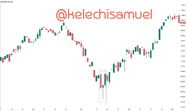
Like we see a candle stick chart below of a crypto asset with both bullish and bearish candle sticks , showing their different parts too
Describe any other two types of charts? (Screenshot required)
Aside the Candlestick charts ,there are other charts used in the representation of market data including ;
- Line charts ;
The line chart could be explained as one of the most basic kinds of charts .This chart is used to get the representation of price variations over a period of time using lines .
This one is majorly based on recording just the close position of the day and could have two scales ,linear and logarithmic .
The linear one has the scale , divided in equal parts while , the log chart has the crypto prices closed according to percent changes ,
Traders on the other hand love to look at the both charts for their technical analysis.
- Bar Charts ;
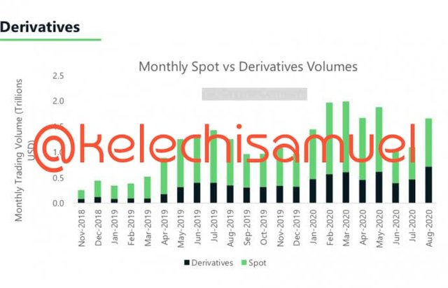 source
The second kind of charts used for trading are the bar charts . They are commonly used and understood price charts also each bar represents,the opening ,closing ,highest and lowest price for a particular period .
They are built on a particular structure where the vertical axis represents price and the horizontal part represents time .
The difference between the biggest and lowest functions could be seen as the range and just like the candlestick graphs when the closing value exceeds the opening value ,the bar gets green and when the opening exceeds the closing ,the bar gets red explaining it to be bullish and bearish respectively .The time frames are different ,ie it could be minutes ,days, weeks or even months
In your own words, explain why the Japanese Candlestick chart is mostly used by traders
The Japanese Candlesticks are used mostly by traders for several reasons including that :
It gives the most extensive way of technical analysis . Just like we know , the candle stick consists of several parts that gives extra details and information of the market like the closing positions , opening positions even the lows and highs making the study of the market behaviour easier compared to maybe line charts that may just give information that isn't well explained
Secondly, the knowledge they produce helps to Capitalise on any financial situation in the market based on the previous performances they had in the market ,in other words reducing loss
Describe a bullish candle and a bearish candle identifying its anatomy? (Screenshot is required)
Like I mentioned earlier, in the explanation of Candlesticks ,there are Bullish and Bearish candlesticks and we are going to be seeing their anatomies too ..
A bullish Candlestick ;
A bullish Candlestick represents ,a steady increase in the price of the crypto asset ,it entails that over the opening period, there has been value gained to the asset ie that the closing value is bigger than the opening value. Just like we can see below,The top of the candle entails the highest price it got to during the period
The first edge marked close as the final price of the asset as at the computation
The second edge as the open position ;being the price it was at before the market movement begun
the down line labelled low as the least price it got to through out the period .
Bullish Candlesticks too are represented by the green colour .The bearish candle stick ;
A bearish candlestick implies a steady decline in the value of a crypto asset over a period of time ie it explains that the closing value of the asset is less than the opening value .
In other words there has been a visible reduction in the price of the Crypto Currency .
The image below depicts the anatomy of a bullish and bearish candlestick as we see the;
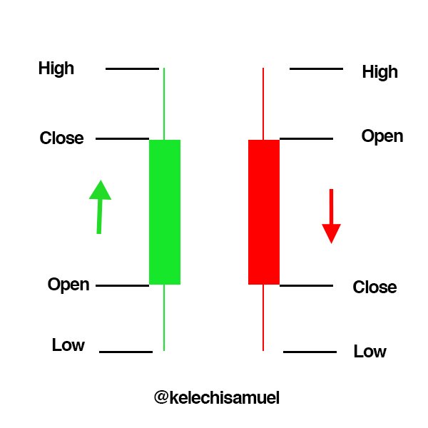
Top: The part labelled high to be the highest price level the Cryptocurrency has gotten to over that period
The first edge labelled open ; is the start of price movements in the market being the first position
The second edge labelled close:this is the final point showing the reduction in the value of the asset.
The last part which is labelled low is the lowest price the crypto currency ended in since it's bearish.
Finally ,the thin line inside could be seen as the skeleton showing the movement of prices along the candle stick
Thanks for reading
I reposted this assignment because it was not curated within 7days of this post
@reminiscence01