Crypto Academy / Season 4 / Week 1 - Homework Post for @sapwood

HODL WAVE & AGE OF A COIN
WHAT IS A HODL WAVE?
HODL wave is a visualization created by unchained capital that represents an occurrence in which a significant percentage of the total amount of a coin in existence is being held still in various addresses and not being transacted over a long period of time.
In a HODL wave, the coin seems to age in the various addresses as time goes on as the owners prefer to HODL them rather than to transact. Also, the price movement seems to flatten, rarely developing spikes.
For further comprehension, we'll consider the image below,
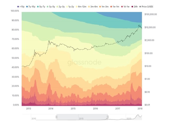
Source
Above is a visualization that comprises differently colored zones, with each color representing a time period. The vertical height of each zone represents a percentage of the UTXO coin (BTC/LTC) which is attached to that zone. These zones are the different ages of the UTXO coin.
The image contains a legend that tells the age each colored zone represents.
The zones at the upper part of the visualization represents the older coins (i.e coins that have stayed unpent in their addresses for longer periods of time). While the reverse holds true for the zones at the lower part of the visualization.
A HODL wave occurs when the zones at the top are progressively getting bigger and the ones at the bottom are progressively getting smaller.
This means that coins are staying put in their addresses for longer period, i.e from 1-3 months, the coins remains unspent for upto 6 months, then they continue for up 12 months, then 1 year, 2 years, and so on.
As this happens, the zones representing coins of the older age gets bigger as more coins are being held unspent for longer time period, i.e as coins of 1-3 months remains unspent for upto 4 months, the leave the 1-3 months zone and enter the 3-6 months zone. Assuming the coins entering the 1-6 months zone exceeds those moving out, the zone gets bigger.
This has an effect on the coins being held for a very short time, the size of their zone reduces.
HOW TO CALCULATE THE AGE OF A COIN IN A UTXO ACCOUNTING STRUCTURE
In HODL wave analysis, the age of a coin refers to how long a coin has stayed in a particular address without being sent or moved to another address. This definition is applicable in a UTXO accounting structure.
In a UTXO model, at any given time, the age of a coin in a particular address is given by
AGE OF COIN =
Amount of the coin
x
How long the coin has stayed unspent in that particular address
If the amount of coins considered is just 1, then the age is simply given by, how long the coin has stayed unspent in a particular address.
INTERPRETING A HODL WAVE IN BULL CYCLES
In a HODL wave, we see more and more coins being held for longer periods. The colored zones representing longer time periods become bigger while the ones for shorter time periods become smaller.
As more and more coins are being held unspent for longer periods, the amount of coins available in supply will reduce and with constant demand, there will be an increase in price. This will lead to a bull run.
APPLICATION OF ONCHAIN METRICS
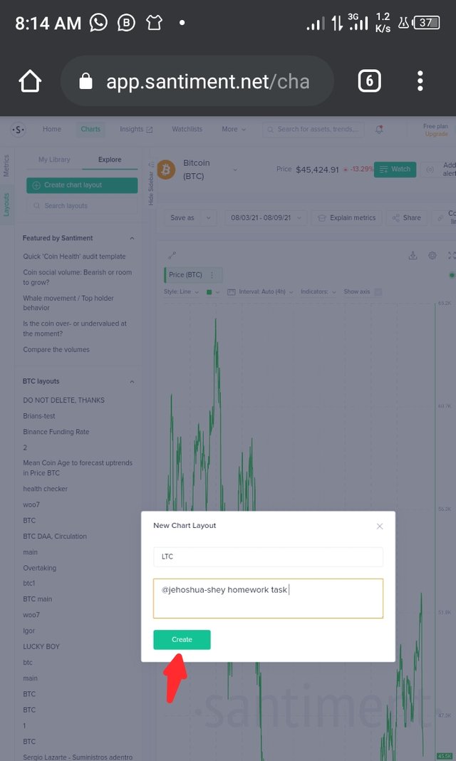
I'll use https://app.santiment.net to access onchain metrics for LTC and come up with an analysis model and correlate these metrics to the price of LTC during the period in view.
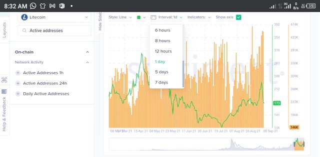
First, I create an account then I create chart layout before selecting and analysing the metrics
The following metrics were analysed
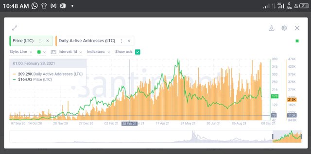
Daily Active Addresses
I search for active addresses and then select daily active addresses and clicked on the chart to load the metrics.
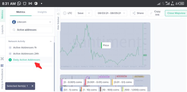
I also set the interval to 1day
Observation
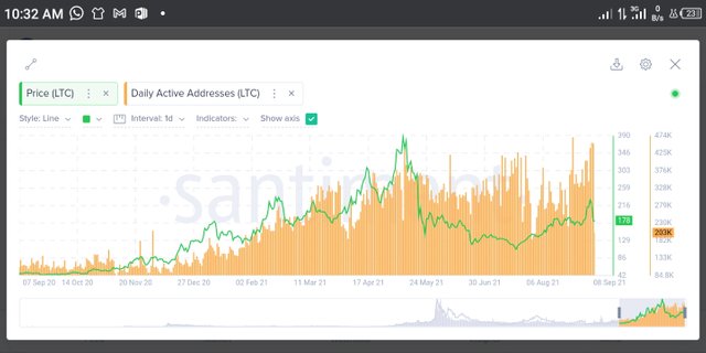
In the short term, about a period of about 3 months, from September 07 to December 01, 2020, we see a run from $48 to $85, about 77% increase. During this period, the no. of daily active addresses ranged from 85.75k - 209.65k daily active addresses.

At the start of the period in view, the price was $48 and daily active addresses were 109.08k. At the end of the period, the price was $85 and the daily active addresses were 209.65k.
Evidently, within the period in view there was an increase in the no. of daily active addresses. The price increases as the no. of daily active addresses increased.
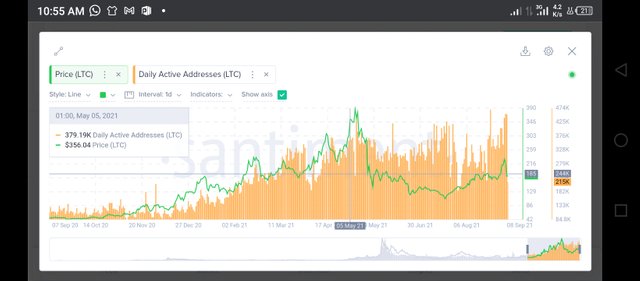
In the long term, about a period of 1 year, from September 07, 2020 to December 01, 2021, we see a run from $48 to $85, about 77% increase. in the first 3 months. During this period, the no. of daily active addresses ranged from 85.75k - 209.65k daily active addresses.
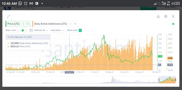
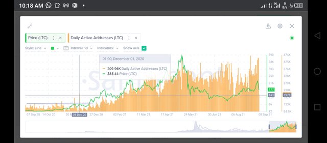
Next, we see another upward run from $85 to $226 and an increase in daily active addresses from 209.65k to 225.89k.
When price dropped from $226 to $164 within the next 3 months, there was also a reduction in daily active addresses from 225.89k to 209.29k.
As the price rallied to a period high of $386 from $164, there was an increase in daily active addresses as the tally rose to 379k just before the price hit the high point.
Analysis
From both the long and short term observations, it is evident that the activities on the network has a way of affecting the price. As the network activity increases, the price tends to increase sooner. It reverse is also true.
Transaction Volume
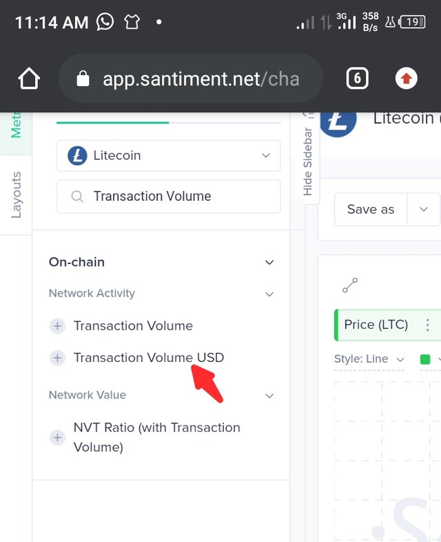
To open up the transaction volume metrics, I search transaction volume in metrics and select transaction volume USD. As usual, I click on the chart to load the metrics.
Observations
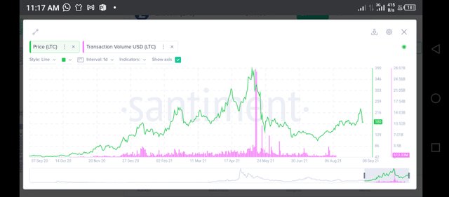
Due to a relatively long spike within the year, the rest of the volume bars are very small. However, the trend is clear for both short term (about 3 months) and long term (at least 1 year).
Over the span of the chart, whenever a bar rose above say, the previous 3,4, or 5 bars, there was a price increase ahead. An exception to this however was the two longest bars that didn't seem to result in higher prices.
Analysis
As transaction volume steadily increases, the price also increases. Sometimes however, the transaction volume might escalate so high, reflecting a surge in interest in the coin and even leading to a drop in price.
This is especially true when the escalation comes after a significant increase in price.
Slow and steady increase in transaction volume therefore hints at a corresponding increase increase in price while an astronomical increase could be an indicator of a sudden rush to the coin and when it happens in a bullish season, it could mean a drop in price is about to happen.
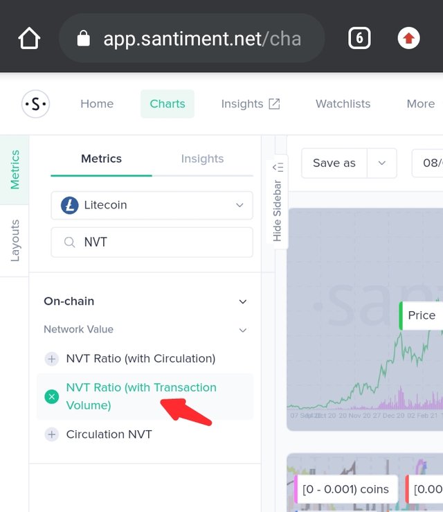
NVT
To open up the NVT ratio metrics, I search NVT in metrics and select NVT with transaction volume. As usual, I click on the chart to load the metrics.
Observations and Analysis
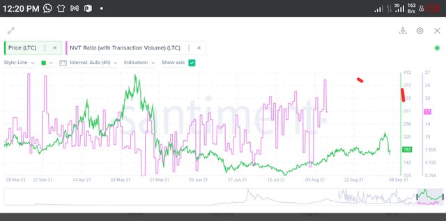
NVT is a lagging indicator and is suitable for long term applications. That being the case, I'll observe and analyse for long term (1 year).
Whenever the NVT ratio is high, it shows that the coin is overvalued and whenever it is low, it shows that the coin is undervalued.
Usually, at either high or low points, the NVT suggests a market correction in the opposite direction but nowadays, this indicator has become less reliable especially for short term analysis, due to the activities of private transactions which makes analysis difficult.
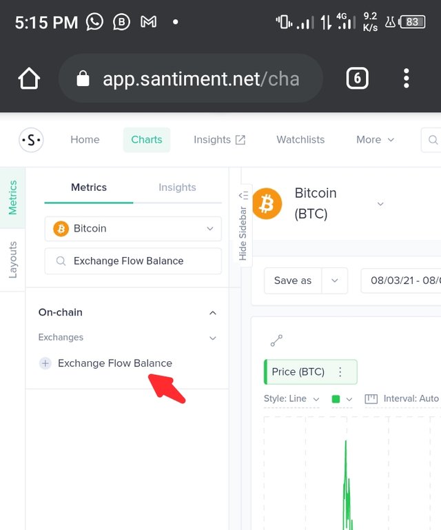
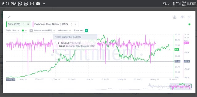
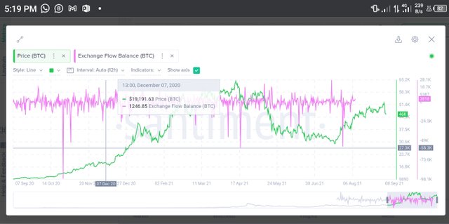
Exchange Flow Balance
Litecoin on santiment has no Exchange Flow Balance among it's onchain metrics. So, I have to use BTC for this analysis on Exchange Flow Balance.
To open up the Exchange Flow Balance metrics, I search Exchange Flow Balance in metrics and select Exchange Flow Balance. As usual, I click on the chart to load the metrics.
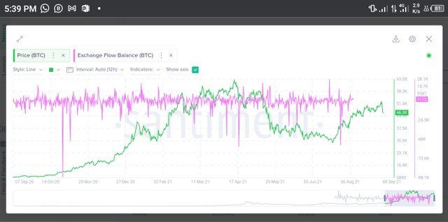
Observations
From the chart, we see an Exchange Flow Balance of -232.76 BTC (bullish) on September 07, 2020. By December 07, 2020, this figure was 1246.85 BTC (bearish). During this 3-month period, we see multiple downward spikes, indicating strong negative exchange flow balance and a bullish BTC rally from $10.369k to $19.191k.
Over the next 9 months, we see downward spikes form on multiple occasions as wells as some upward spikes. We also see a rally in the price of BTC from $19k to 64k, then a correction down to $29k before rallying upto $52k. In the entire year under consideration, we see BTC rally up from $10k to $64k then it continues within a range of $29k to $52k.
Analysis
Over the course of the year considered in this analysis (September 07, 2020 - September 07, 2021), we see more downward spikes indicating bullish price movement. During this period, the price follows the Exchange Flow Balance effect and is bullish overall.
Thus we see that the Exchange Flow Balance affects the price of the coin in the long run. Negative balance indicate bullish price movement while positive balance indicate bearish price movement.
Supply On Exchanges As A Percentage Of Total Supply
Litecoin on santiment has no 'Supply On Exchanges As A Percentage Of Total Supply' among it's onchain metrics. So, I have to use BTC for this analysis on Supply On Exchanges As A Percentage Of Total Supply.
To open up the Supply On Exchanges As A Percentage Of Total Supply metrics, I search for 'Supply On Exchanges As A % Of Total Supply' in metrics and select Exchange Flow Balance. As usual, I click on the chart to load the metrics.
Observations
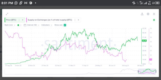
From September to December, 2020, the % of total BTC supply available on exchanges saw a steep reduction and the price of BTC rallied upwards. From December 2020 to March 2021, the % supply saw a net increase although with occassional drops from time to time. The price of BTC seemed to retract but continued upwards during this period.
Between March and September 2021, we see the % supply take a reluctant descent and the price of BTC rise to an ATH, then dropp before trading within a range not as high as it's ATH.
Analysis
The % supply of a coin on exchanges appears to have an effect on the price of the coin. When more of the coin are introduced to exchanges, it's only a matter of time before the price drops'. The reverse is also true for a lesser % of the coin being on exchanges.
APPLICATION OF THE ONCHAIN METRICS
The onchain metrics chosen in above have very useful applications,some in the long term and some in both long and short term.
NVT
NVT is a lagging indicator and as such is not suitable for short term. It can show areas of consolidation and/or correction but it's applicable for long term trading.
Exchange Flow Balance
Exchange Flow Balance can serve in the short especially when it is used in combination with technical analysis. It is however better applied to long term trading.
Transaction Volume
Transaction Volume seems to have the same effect in the short term as well as in the long term. Almost every time a bar is higher than the previous 3,4,5 bars, there's a rise in price shortly ahead. There is exception for astronomical increases in transaction volume as this has been shown to act against the price.
Transaction Volume can thus be used for short term and long term.
Daily Active Addresses
Daily Active Addresses is another metric is best suited for the long term. The trick with DAA is that, there is no fixed amount of DAA that can be said to be required to induce a bullish or bearish price movement.
The number of active addresses that preceded a bull run may not cause a significant increase in price on another occasion. It seems to be that the change in daily active addresses is what creates the effect rather than the daily active addresses.
It will take a while to establish any relationship between the change in daily active addresses and the price action, so the DAA will better be applied in the long term
Supply On Exchanges As A Percentage Of Total Supply
The % supply of a coin available on exchanges is better applied to long term. This is because the effect is not instantaneous. Supply can also be taken out shortly after it was introduced to the exchange, some external factors can induce the action of the owners of the coin.
It is required to give time for the effect of the % supply of a coin available on exchanges to be determined. If it continues to reduce or increase, there's a good chance price will soon take a significant stride in the direction opposite to that of the % supply. This will however better be studied over time.
Thus, % supply of a coin available on exchanges is best applied to medium or long term trading depending on the movement of the metrics.
LIMITATIONS
Generally, these metrics contain data that can be misleading. NVT metrics could consider private transactions which can distort results.
Percentage of the total supply of the coin on exchanges could also be misleading as not all coins on exchanges are in order. Some people leave their coins on exchange for ease of trade whenever they want to. These could inflate the percentage supply in exchanges but not lead to a a bearish price movement.
Daily active addresses seem to have an effect depending on the previous counts of daily active addresses. The limitation here is that the information on this metric is not enough to correlate to the price movement. A particular amount of daily active addresses can precede both bullish and bearish cycles.
Transaction Volume and exchange flow balance are both results of trading activities going on each day. We know that the market gets manipulated sometimes through trading, and these metrics have no way of picking out market manipulations. Why they may seem useful, they can't tell when the market is being manipulated.
CONCLUSION
Onchain metrics are very useful fundamental analysis tools that can guide the long term trader and help them maximize their profits. Some important metrics to consider are exchange flow balance, transaction volume, daily active addresses, NVT, and % supply of the coin available on exchanges.
These metrics are better applied to long term trading plans as they are not suitable to be used alone for short term trading. They can be accessed from trusted sources like santiment or coinmetrics.
Thanks for reading.
Cc:
@sapwood
Hello sir please can i have your discord or telegram ID, i want to discuss something with you.
You can leave a message here. Thanks.