Japanese Candlestick Patterns -Steemit Crypto Academy Season 4 Beginner's Course -Homework Post for Task 10
.png)
~INTRODUCTION~

Good day Steemians!
This is my entry for Task 10 of the Steemit Crypto Academy Season 4 Beginner's Course on Japanese Candlestick Patterns. I will be answering the question 1 of the homework task.
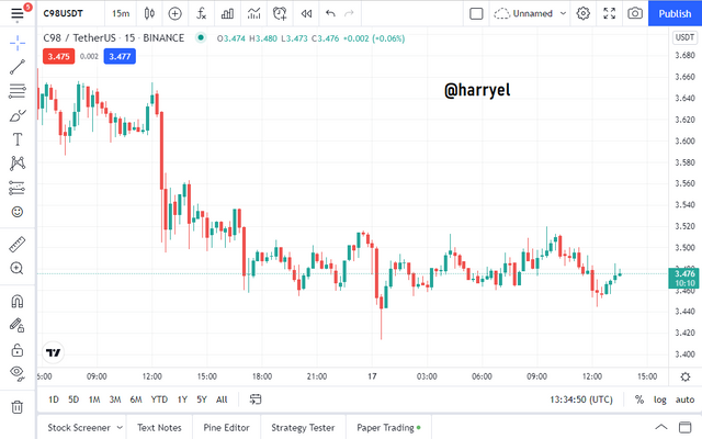
1a) Explain the Japanese candlestick chart? (Original screenshot required).
b) In your own words, explain why the Japanese Candlestick chart is the most used in the financial market.
c) Describe a bullish and a bearish candle. Also, explain its anatomy. (Original screenshot required)
1a) Explain the Japanese candlestick chart? (Original screenshot required).
From anime and emojis, to ramen and sushi, Japan has really blessed the entire world with a lot of its inventions, and in this task I will be talking about one of those inventions that has become, essentially, the backbone of financial markets and trading: The Japanese Candlestick Chart.
Japanese Candlesticks are the most widely used system of charting in financial markets today. They are thought to have been created by a Japanese rice trader, over 150 years ago, named Muneisha Honma (also known as Sokyu Honma).
Muneisha Honma studied the price movements of rice in his time and discovered that the price was heavily influenced by the emotions of the rice traders as well as demand and supply. Through his studies, he was able to create the candlestick charting method, which graphically displayed price movements, and made it easier for traders to identify patterns of price action.
The Japanese candlestick charting method gained popularity amongst rice traders and eventually was introduced to the west by the American technical analyst Steve Nison in his book "Japanese candlestick Charting Technique" in the '90s.
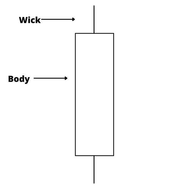
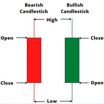
The Japanese candlestick charting technique is a method of graphically portraying price and time data on a chart. It consists of the use of "candlesticks/candles" which are bars with wicks drawn above and/or below them. These candles are drawn/created using price data within a specific timeframe, and show the price at the beginning of the time period (the Open), and at the end of the time period (the Close); these are represented by the bar. They also show the highest price within that time period (the High) and the lowest price within it (the Low); these are represented by the wicks.
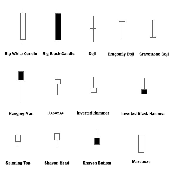
There are two major classes of candlesticks. The Bullish candlestick, representing an upward movement in price, which is created when the price at the end of the time period (the Close) is higher than the price at the beginning of the time period (the Open); it is usually coloured green or white. And the Bearish candlestick, representing a downward movement in price i.e. the price at the end of the time period (the Close) is lower than the price at the beginning of the time period (the Open); it is usually coloured red or black. From the two major classes, many different types of candlesticks can be identified based on the regularly occurring patterns
b) In your own words, explain why the Japanese Candlestick chart is the most used in the financial market.
The Japanese candlestick chart is currently the most used charting technique in most financial markets this is because traders have discovered a few advantages to using the Japanese candlestick chart. Here are a few of them:
- The Japanese candlestick charts denote, not just the close of price at a given time, like the line chart, but also the opening price within the time period, so that traders can have a broader view of price movement.
- Japanese candlestick charts also show the high and low of price within the given time period, also giving traders a broader, more detailed graphical representation of price movement.
- Japanese candlestick charts make it easier for traders to understand trends in price movement.
- Japanese candlestick charts are very compatible with most other indicators and are easy to build strategies around, due to their detailed information.
- Japanese candlestick charts are more visually appealing and user-friendly, making it easier for even newbies to understand price movement.
In essence, the Japanese candlestick chart is the most used because of its detailed representation of price movement, its easy interpretation and versatility of use.
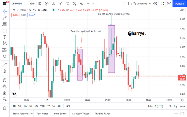
c) Describe a bullish and a bearish candle. Also, explain its anatomy. (Original screenshot required)
As I have mentioned earlier the Japanese candlestick charting techniques consist of the use of candles. Candles are calibrated using four price points.
- Open - The starting price i.e. the price at the beginning of the time period.
- High - The highest price reached within the given time period.
- Low - The lowest price reached within the given time period.
- Close - The ending price i.e. the price at the close/end of the time period.
These candles are majorly made up of two parts: the bar/body and the wick(s). The wicks can be at the top and/or the bottom, and represent the High (the top wick), and the Low (the bottom wick). Everything else in between the wicks, including the body of the candle, shows price movement within that time period.
As also said earlier candlesticks are of two major types depending on the positions of the Open and Close: the Bullish candlestick and the Bearish candlestick
The Bullish candlestick:
The Bullish candlestick is created when the Close price point is above the Open price point. This is indicative of upward price movement i.e. it shows that the price of the asset was higher at the end of the time period than it was at the beginning.
Bullish candlesticks are usually coloured green or white by default in charting platforms. The High is the top wick, and the Low is the bottom wick. Bullish candlesticks show an increase in demand of the asset i.e. an increase in buying pressure.
The Bearish candlestick:
The Bearish candlestick is created when the Close is below the Open. This shows that there has been some downward price movement i.e. it shows that the price of the asset was lower at the end of the time period than it was at the beginning of it.
Bearish candlesticks are usually coloured red or black by default in charting platforms. The High remains the top wick, and the Low remains the bottom wick. Bearish candlesticks show a decrease in demand of the asset, or an increase in supply.
~CONCLUSION~
The Japanese Candlestick chart is the most used type of chart for technical analysis in today's world, and it is no wonder, due to its detail, versatility and user-friendliness. Thanks for reading through!
-IamEl the ModestPoet
N/B: All pictures not cited, were designed by me using Canva, powerpoint, or gotten from the respective websites.