Candlestick Patterns - Steemit Crypto Academy Season 5 - Homework Post for Task 10

Beginners' course-Homework Task 10
Question to be answered
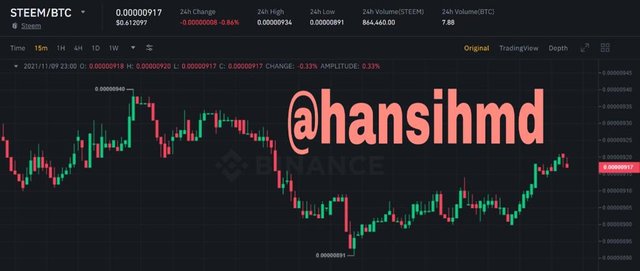
1a) Explain the Japanese candlestick chart? (Original screenshot required).
b) In your own words, explain why the Japanese Candlestick chart is the most used in the financial market.
c) Describe a bullish and a bearish candle. Also, explain its anatomy. (Original screenshot required)
1a) Explain the Japanese candlestick chart? (Original screenshot required).

There are more than 30 candlestick charts in the market which technically analyses the price movements of commodities along with the help of indicators. But among these, Japanese candlestick chart is crowned as the most popular candlestick chart out of all the others, which uses patterns and actions for the technical analysis in order to gain profits in regular basis.
This Japanese candlestick has represented its charts with a user-friendly graphical interface.
The history of this candlestick charts are gone to way back in 1700s where, a rice trader called Munehisa Homma from Japan wants to sort out the market behaviors for the respective price fluctuations of the commodities. By studying this relationship for a while he has come up with this important candlestick chart. In a nutshell this candlestick formation can be described as the interaction between a buyer party and the seller party for a respective commodity.
When we look at a one candle, it’s consisting of open price, highest price, lowest price and the close price.
With the use of candles the users can take the current market values and also with the given different time frames users can predict the future values of assets too.
b) In your own words, explain why the Japanese Candlestick chart is the most used in the financial market.
The following reasons will help you to understand why the Japanese candlestick charts are most used in financial market.
Easy to understand under user friendly conditions
This Japanese candlestick charts are crowned as a user friendly candlestick chart because of its easy in understand the trading world ups and downs by only going through the length and the colors of the candles.
Ease in decision making
By using Japanese candlestick charts, a trader can easily understand the current trends (Bullish and Bearish) ,price fluctuations and the future asset price predictions of respective commodities.In a nutshell, this will rise up the success trading accuracy in large numbers and give the traders an exact entering and exit point to minimize the losses and maximize the profits.
Graphical interfaces
Visual representation with colors of open price,close price,high price and low price is a major advantage in Japanese candlestick charts to determine the bearish and bullish patterns without any hesitation.
New comers’ can understand the theories easily
Colors will always close to our lives and here also new comers also find it very easy to deal with colors to understand the bullish and bearish movements of the market.When comparing with other technical analysis charts, Japanese candlestick charts are always easy to understand.In a nutshell,only knowing the basics in Crypto world will help you to use Japanese candlestick charts rather than going into the deep in Crypto world
c) Describe a bullish and a bearish candle. Also, explain its anatomy. (Original screenshot required)

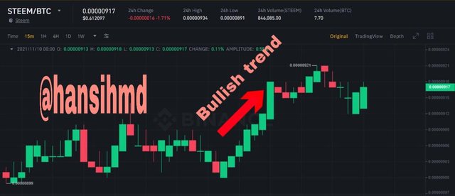
Bullish candlestick
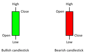
In Japanese candlestick charts , bullish trends are shown in green color. Here the closing price is higher than the open price of a respective commodity for given time period. With the identification of a bullish candle,the traders will enter the the market to sell off their assets to maximize their profits.
The anatomy of these types of candles will show the close and high prices on top of the candle while the open and low prices at the bottom of the candle.
So now let’s brief out this anatomy furthermore,
Open price-This is the start price of a candlestick pattern for a particular asset at a given time period(at zero seconds). Also in a bullish trend this shows that there is a bullish trend to be happened.
High price-For a given time frame, high price indicates the highest price which achieved by a bullish candlestick chart for a given time period.This price can be higher or equal to close price as well.
Close price-As I mentioned earlier, in a bullish trend, the close price is higher than the open price and the close price significance the last noted price in a candlestick chart for a given time period.
Low price-This is the lowest price shown in a bullish candlestick chart for a particular time period.

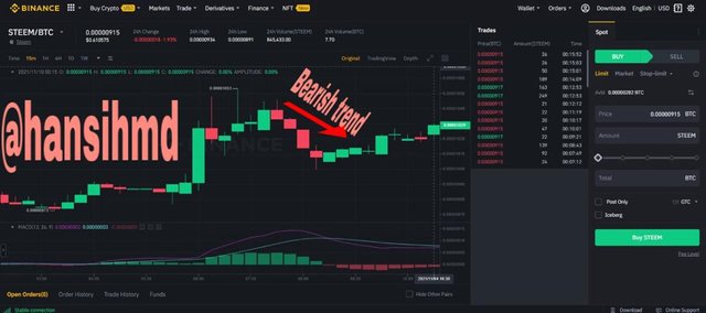
Bearish candlestick
In Japanese candlestick charts, bearish trends are shown in red color.In this type of trend, the closing price is lower than the open price of a respective asset for a given time period.With the identification of a bearish candle, the trader will immediately exist the market to minimize their lost.Also here the traders will buy assets and hold them as a future asset.
Furthermore the anatomy of these types of candles will show open , high prices at the top of the candle and the close, low prices at the bottom of the candle.
So now let’s quick a look at the Antony of this bearish candlestick chart.
Open price-in a bearish trend this price will emphasize that the trend will move in the bearish direction and also this is the start price of the bearish candlestick chart for a given time frame.
High price-This price will shows the achived highest price of an asset in a bearish chart for a given time period .somehow this value can be equal or higher than the open price of a particular chart for the given time period.
Close price-As mentioned before, close price of an asset for a given time period is lower than the open price of an asset.This close price is the last noted price in a respective candlestick chart for a give time period and this close price will be a new open price for a brand new candlestick chart for a different time period.
Low price-In a bearish chart the low price will indicate the lowest price hit in a chart for a given time period.Also this can be equal or lower than the close price of the particular asset for a given time period.

This is the end of my homework task and I really want to say thank you for professor @reminiscence01 for giving us a good knowledge regarding candlestick charts.
Professor @dilchamo can I resubmit this post after power up within today???
You can post one task only once. You can power up and try other tasks.
ok thank you!!!