Basics to trade cryptocurrencies correctly. | Part 2 - Crypto Academy / S6W3 - Homework post for nane15.


1. Explain your understanding of charts, candlesticks, and time frames. (Use your own words and put screenshots)
Charts: Chart refers to a kind of graphical display that shows the supply and demand level on a vertical line. It aids the better analysis of a market and also in the understanding of the market analysis. The chart could be interpreted to indentify who drives the market at a particular time i.e the buyers or sellers. Market charts are usually depicted in pairs. When for example we have StEEM/BTC, then the chart is only showing the amount of people who are trading Steem for BTC. Below is a sample of a market chart.
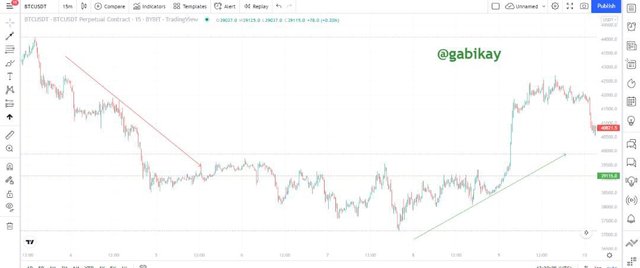
screenshot from tradingview
The chart above is a vivid example of a crypto chart. The green arrow shows the area(time) when the assets price was up as a result of much demand and less supply. Similarly, the red arrow shows the area where the assets price went down as a result of too much supply and demand that is less. Charts are of different kind like
• Line chart
• • Bar chart
• Heiken Ashi
• • Pie chart
• Japanese candlestick
Candlestick: This is the most popular kind of chart used in the market today. The candle stick has two colours of candle which is the red and the green candle. The red candle signifies a point in the market where there was more supply than demand. Technically, it shows where the sellers dominated the market. The green candle similar to the red signifies a time in the market where the buyers dominated the market.
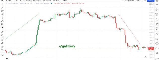
screenshot from tradingview
The candlestick has two parts which are the Candle Body and Wick. The candlestick also passes across 4 main information which are the;
• Open: The price where the candle started.
• Close: The price where he candle stopped moving and moved on to another candle.
• High: The point on the candle (usually the upper wick) where the market attained it's maximum price.
• Low: The point on the candle (usually the lower wick) where the market reached its lowest price.
However, the value of these four parameters are determined by the timeframe and so we are going to discuss about the timeframe next.
Timeframes: Timeframe can be said to be the splitting of market candlestick into different time intervals for better market analysis. It is advised that before entering a trade, you observe the important timeframes like 15-mins, 60-hours, 4-hours and maybe 1-day timeframe. This will help you to give an overall interpretation of the markets real trend.
If we trade with the 30-minuites timeframe, it mean that each candlestick on the chart represents 30-minuites up untill the present time.
Also, a time in a timefreame maybe represented with either a green or red candle stick. If for example we have a red candlestick representing a particular time on a timefreame, then it implies that at that time the market had less buyers and more sellers.
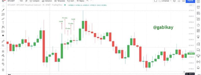
screenshot from tradingview
2. Explains how to identify support and resistance levels. (Give examples with at least 2 different graphs)
In trading, it is important to have a target price in mind. To help identify the target price to exit your position, it is best to identify the support and resistance points first. On a chart, there is a price point that is expected to attract the most of buyers or sellers and that is the support and resistance zone.
Resistance:
The name resistance suggests that it impedes price. Resistance is a price level where the asset could not get past a particular maximum price. At that zone, the asset has hit it's maximum price at several times without breaking past the price zone. A resistance would always be located above the current price of the asset. Atleast, 3 price actions need to make the resistance line. In ordinary words, a resistance prevents the price form increasing further.
Support:
Having got the knowledge of resistance, understanding support can be easy. Support zone shows a price that the market declined to until it could move down no more. In other words, support prevents the price from falling further The price is likely to bounce back when ever it hits a support zone. The support zone is always located below the current price of the market.
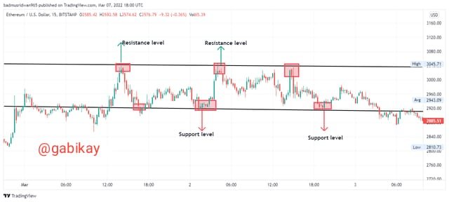
screenshot from tradingview
Steps to construct Support and Resistance
1 Load the Data Points: If we seek to identify a short term support and resistance, then we could load 3-6 months of data point. Also we could load 12-18 months data points for long term support and resistance.
2 Identify a minimum of 3 price actions zone: Identify at least 3 places where the price either could not go up speedily after an uptrend, or the price could not go down speedily after a downtrend or where a sharp reversal occurred.
3 Align the price action zones: observe the different price actions that has been identified and watch out how each point connects to another to form the resistance and support
4 Fit a horizontal line to join them: Use a horizontal line to join the already identified and visible S&R.
3. Identifies and flags Fibonacci retracements, round numbers, high volume, and accumulation and distribution zones. (Each one in a different graph.)
Fibonacci Retracement: This is used to get a clear view of what the market is doing or how the market is trending. Different Fibonacci inputs can be used depending on the level of the market. For an uptrend market, the Fibonacci Retracement could be expanded from the previous support level to the last resistance level while for a downtrend, the Retracement would be expanded from the previous resistance level to the last support level. The aim of utilizing Fibonacci Retracement is because in-between the Retracement, the price often bounces and hence can be used by long traders to determine the next price level.
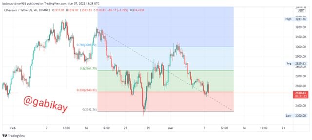
screenshot from tradingview
Round Numbers: The market movement can also be understood using round Numbers. When the price gets to a round figure like $110.00 or $25000.00 then we could at that point determine the next market move. This is because at such a point, different traders have set different orders awaiting the round number and so when the price reaches the round number, the market direction tendd to be exposed.
screenshot from tradingview
Accumulation and Distribution Zone: Mostly, this kind of zone is controlled by the strong hands. In this context, the strong hands refer to those who use very huge amount of assets to place buy or sell orders with intentions to manipulate the market and take profit. When the strong hands place a huge volume of sell order, we can leverage this by buying the token when the price is low ( Accumulation Zone) and then when they place a high volume of buy trade, we could sell when the price is high (Distribution Zone).
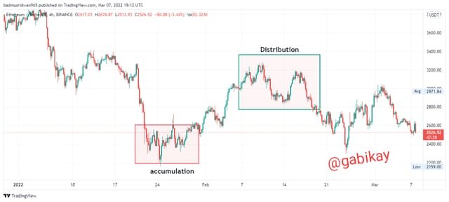
screenshot from tradingview
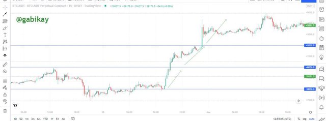
4. It explains how to correctly identify a bounce and a breakout. (Screenshots required.)
Breakouts: A breakout occurs in trading when the price of an asset overcomes the already established support or resistance line and continues to establish new support and resistance.
Bounce: A Bounce may occur when a breakout is temporarily being intercepted. Sometimes on the chart, after a supposed breakout, the chart still experience a little lag and then suddenly continues to the uptrend direction. That point where the price rests again upon the support before moving away to make a new resistance is called Bounce.
The bounce Is sometimes viewed as a retest of the breakout. When the bounce occurs, and then starts to move up to the uptrend like in the chart below, then it can be considered a buy signal.
screenshot from tradingview
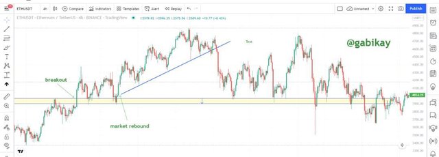
5. Explain that it is a false breakout. (Screenshots required.)
False Breakout: Sometimes, it is argued that breakout occurs when the price can actually close past the support or resistance zone but this is not always the case.
Let's take a case study of this pair to see what had happened when the support was defined to have been broken.
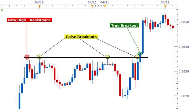
After all, we can now see that the breakout was a false one and hence could land a trader in a potential loss. The support was only breached temporarily. False Breakouts can be a very misleading series of candles and so it is wise to retest the breakout to ensure you do not fall victim of false Breakout.
.
6. Explain your understanding of trend trading following the laws of supply and demand. It also explains how to place entry and exit orders following the laws of supply and demand. (Use at least one of the methods explained.)(Screenshots required.)
Trend trading is a technique that can be employed in trading. For instance when the price moves in a new direction, we could leverage the trend to identify trade signals. I would use the Elliott wave theory to help analyse. Using the Elliott wave theory, a buy decision could be made when we can notice that the earlier line "a" is now less than the corrective line "c". simultaneously when the volume of line "a" becomes greater than the volume of line "c".
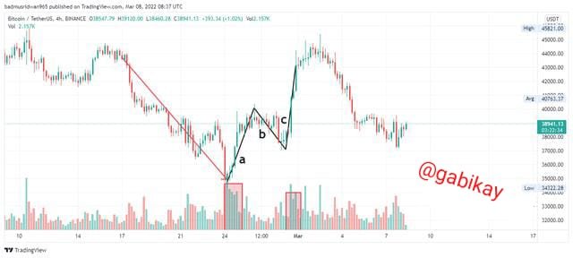
screenshot from tradingview
When the price must have broken the "c" on the plotted Elliott wave chart, we can then place a buy order at that position and then set the Stop-loss at the "c" line previous low.
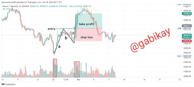
screenshot from tradingview
7. Open a real trade where you use at least one of the methods explained in the class. (Screenshots of the verified account are required.)
For this real trade, I will use my verified KUCOIN exchange account to trade on the LTC/USDT pair with leverage trading. I will aslo use multiple timeframe analysis accompanied with price volume and parabolic SAR.

Volume is an indicator on the price chart which shows the amount of trade carried out under a particular candle. A longer volume bar simply indicates that more trades were carried out at the candle it is found beneath. It can also be interpreted to tell when the market changed trend.
The multi-timeframe is a kind of technical analysis method that is used to monitor different timelines of a particular market and then be able to detect which particular trend the market is into.
Parabolic SAR is a technical indicator that is used to determine the direction which an asset moves. It is also known as Stop And Reverse System (SAR). Parabolic SAR mainly works in trending markets and can be used to determine the trend direction.
The parabolic sar is displayed as a series of dots when graphically represented. If it goes below the current price, then it can be seen as a bullish signal. Likewise, if it appears above the current price, then it can be interpreted as a bearish signal. These signals can then be used to set stop-loss and take profit levels.
Firstly, I will check the 15-minuites timeframe. Here, the price is gradually retracing with lesser market volume. The parabolic SAR is below the price which indicates a buy signal.
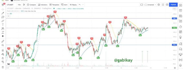
screenshot from tradingview
On the 1-hour timeframe, the price is moving up gradually and the parabolic SAR signals a buy trade.
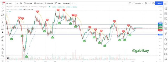
screenshot from tradingview
On the 4-hours timeframe, the chart is gradually going up with the parabolic sar indicating a buy signal.
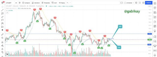
screenshot from tradingview
Next, I input a buy trade with 20× leverage.
| Entry | Stop-loss | Take Profit | Total PNL |
|---|---|---|---|
| 106.18 | 105.8 | 106.43 | +$1.53 |
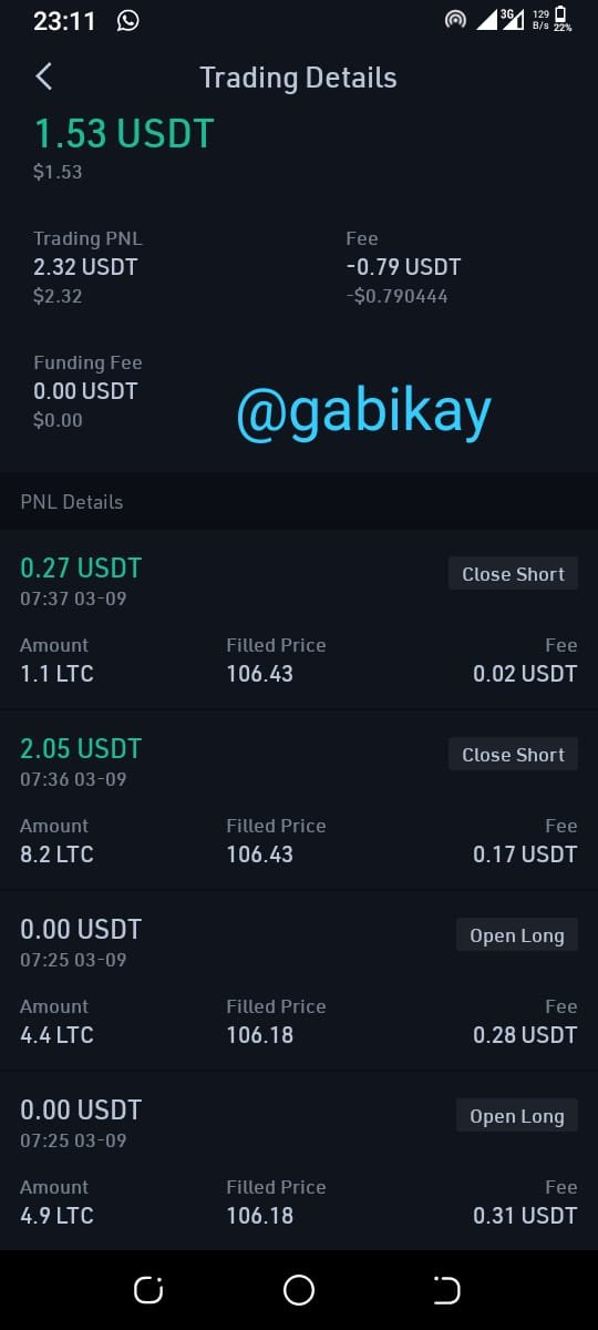
screenshot from Kucoin mobile app
Conclution.
Support and Resistance zones are very important concepts in trading and act as foundation for most trading strategies. This is why there is the need to comprehend this concept as a newbie in trading.
A support zone refers to that price area where the price found it difficult to break below. A resistance zone refers to that price area where the price found it difficult to break above.
Fibonacci Retracement aids the understanding of price Retracement in the market. As we know, the market is always moving in cycles and hence we can leverage the retracement tools along with support and resistance levels to understand where the market could have a bounce and a successful breakout as well.
Regards to professor @nane15.