Crypto Academy Season 3 / Week 2 - Homework Post for @reminiscence01 | Introduction to Charts
Introduction
It's my pleasure to visit the academy again to learn more about cryptocurrency from the professors that have presented lectures this week. And I am glad I attended the one presented by professor @reminiscence01 as the professor took us on a ride on the topic Introduction to Charts and with no doubt, it was a great lecture. I will use this piece to solve the questions given by the professor.
What are Charts in Cryptocurrency?
It is important to understand the basics of charts in cryptocurrency and that will lead me to say a few things before heading into the task proper. Charts in cryptocurrency can be termed as a set of tools that gives information about the behavior of a crypto asset over time. The patterns on the chart show the price behavior of the asset in question at a specific period as chosen by the one studying the chart.
In addition, charts are utilized by analysts/traders to make investment decisions as the pattern reveals the market behavior of the asset as explored at a particular time frame of choice. Briefly talking about support and resistance seen in either trends on the chart pattern, these are the levels that help the analyst to gain more insight into the market of the asset, to see how the asset has been trying to hold a position/trend over time. Let's head to the task properly.
1. Explain the Japanese Candlestick Chart?
Japanese candlestick chart which is otherwise called Candlestick chart is an invention of a Japanese known as Munehisa Homma in the 18th century and this person was known to be a Rice trader as at that time. A Japanese candlestick chart is also a technical tool that reveals the market behavior of an asset over time to show important details that enable analysts/traders to gain insight into the market before making a decision.
Just as the name implies, candlestick, it's in the shape of a rectangle with a line extending above or below the rectangle, the line which is known as wicks. The candlestick chart stores the market information of the asset as the price moves up/down and enable users to identify the trend, and as well see what has happened before and when some technical indicators are set up, the information from the candlestick helps users to forecast the next move of the asset under study.
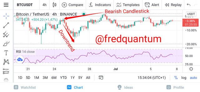
In addition, the Japanese candlestick charts is represented in a pattern that shows the market movement of the asset, revealing the opening price, high, low, and closing price of assets at a certain period. Let's see the screenshot below.
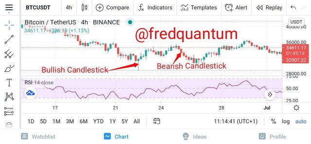
Japanese candlestick chart
The screenshot above shows the candlestick pattern of the BTC/USDT asset on a 4-hour time frame. In that chart, the green-coloured candlestick represents bullish candlestick while the red-coloured candlestick represents the bearish candlestick.
Components of the Japanese Candlestick
Let's take a look at the components of the Japanese candlestick chart in the list below.
Different patterns of the Japanese Candlestick
There are different patterns of the Japanese candlestick, let's see a few list below.
- Doji.
- Bullish Engulfing pattern.
- Bearish Engulfing pattern.
- Hammer.
Above are some of the pattern of the Japanese Candlestick and I'd like to talk briefly about Doji.
Doji: Doji is the pattern type of the Japanese candlestick that forms a plus (+) sign instead of the normal rectangles with extending wicks. And this pattern is seen when the opening and closing prices of an asset are identical.

2. Describe any other two types of charts?
I will explore two other types of charts which are the line and bar charts. Unlike the candlestick, the chart patterns are formed by lines and bars in these two types. Let's take a look at them below.
Line Chart
The line chart utilizes line just as the name implies unlike the candlestick to represent the variation in the price of assets over time. The line chart is very simple and as such lacks more information as compared to the candlestick chart, it basically gives the information about the daily closing price of a crypto asset at a preferred time frame, but other important information are missing which seems to be a setback of this type. Let's see the line chart below.
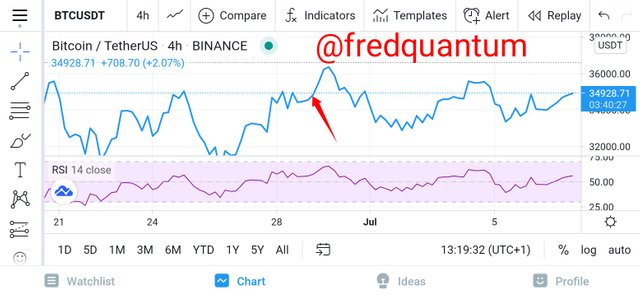
Line Chart
In terms of scale in line chart, we have the linear and logarithmic chart whereby the price change over time has its scale to be divided into equal pieces on a linear chart while the price change over time in a logarithmic chart is scaled based on percentage change over time.
Bar Chart
This is another important chart type in the crypto ecosystem whereby the pattern is represented with bars. This chart type has more detailed information as compared to the counterpart line chart mentioned earlier, the bar pattern shows the opening price, high, low and closing price of an asset over time at a desired time frame. Let's see the screenshot below to explore the bar chart pattern.
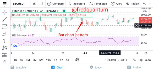
Bar chart pattern
From the screenshot above, we can see the chart pattern at 4 hours time frame represented with bars, which clearly shows the trend of the asset BTC/USDT and it takes into account the opening price, high, low, and closing price at a particular bar of the chart pattern.
3. In your own words, explain why the Japanese Candlestick chart is mostly used by traders
There are lot of reasons to which traders/analysts uses the Japanese Candlestick chart to analyze an asset of choice before deciding on whether to enter or exit a market. I will give a few list of why traders mostly prefer this chart type.
Above are a few reasons why most traders in the crypto ecosystem prefer the use of the Japanese candlestick for their analysis.
4. Describe a bullish candle and a bearish candle identifying its anatomy?
Bullish Candlestick
Knowing that the term bullish simply means when the market of an asset is going uptrend/upward, in other words, when the price of an asset appreciates. Relating it to the bullish candlestick, it means the candlestick that shows up when the price of an asset is moving up and it contains the price of the asset at that period, and the high and low attained due to price volatility. Let's check on the screenshot below.
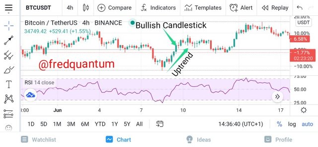
Bullish candlestick
The above chart pattern revealed a point where the market price of Bitcoin goes uptrend and it is characterized by an appreciable numbers of consecutive green candlestick. Note that, my preference is set to green for identification of bullish candlestick which can be different in a case of another analyst.
Bullish Candlestick anatomy
In this part, I will look at the bullish candlestick and explore different components. Let's see the image below.
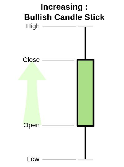
Image source
The real body: From the image above, the body entails the Open and Close, where Open represents the price at which an asset opens, in a bullish candlestick while the Close represents the price at which the asset closes in the same bullish candlestick. Both Open and Close falls within the real body of the candlestick.
High and Low: These two are identified by the wicks that extends above/below the real body, as such, High is the highest price attained by an asset in a bullish candlestick while Low is the lowest price attained by an asset in a bullish candlestick.
Upper shadow: This is the distance between the closing price of the asset and the high attained in a bullish candlestick at a certain period.
Lower shadow: This is the distance between the opening price an asset and the low attained in a bullish candlestick at a period.
Bearish Candlestick
Bearish candlestick on a chart pattern indicates the downward price movement of an asset at a particular period. Similarly, the bearish candlestick contains the opening and closing prices, and the high and low attained during the movement. The opening price in this case appears above the closing price on the candlestick unlike the case of a bullish candlestick. Let's see the screenshot of the chart pattern below.
Bearish Candlestick pattern
As seen from the screenshot above, the asset's market is bearish as we can see the downward movement. The bearish candlestick above is customized to be red in colour, that's my preference which can differ from one user to the other.
Bearish Candlestick Anatomy
The image below would be used to analyse different parts of the bearish candlestick that includes the opening and closing prices, high and low.
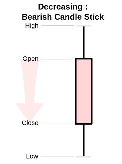
Image source
Open and Close (Real body): This is the part of the bearish candlestick that gives the information about the opening and closing prices respectively. Open is the opening price of the asset in a bearish candlestick as the price movement goes downward while Close is the closing price of the asset in the bearish candlestick before another one surface. Note that, Open appears above Close in a bearish candlestick.
High and Low: High represents the highest price attained by the asset as revealed by the bearish candlestick at a particular time while Low represents the lowest price attained by the asset on the candlestick in the bearish direction.
Upper shadow: Upper shadow represents the distance between the opening price and the high attained by an asset on the bearish candlestick.
Lower shadow: Lower shadow represents the distance between the closing price and the low attained by an asset on the bearish candlestick.
Conclusion
In conclusion, the Japanese candlestick chart has been adopted by so many analysts/traders to help them gain insight into the market of an asset as it is easy to identify; the state of a market, the trend of the asset, various price behaviours and so on.
In addition, the Japanese candlestick give users the option to choose colour preference for the duo of bullish and bearish candlesticks which enhances the comfortability of studying the chart. And the bullish candlestick surface as an indication of investors purchase of the asset at a period while the bearish candlestick appears as an indication of investors sale of the assets at a particular time. Thanks to professor @reminiscence01 for this great piece. Thank you, all.
Cc: @reminiscence01
Written by
@fredquantum
Hello @fredquantum , I’m glad you participated in the 2nd week of the Beginner’s class at the Steemit Crypto Academy. Your grades in this task are as follows:
Recommendation / Feedback:
This is a good detailed explanation on Japanese candlestick chart and its anatomy. Thank you for submitting your homework task.
Thanks for the kind review professor @reminiscence01. It's my pleasure to learn more about the Japanese candlestick. Thank you.