CANDLESTICK PATTERNS - STEEMIT CRYPTO ACADEMY SEASON 5 - HOMEWORK POST FOR TASK 10
Hello crypto enthusiasts, I am back again with this Season 5 Homework task 10 post for professor @reminiscence01, which is my last introductory task. This is my last task and it is all about Candlestick Patterns, I will take my time and answer the questions below.

Image created on canva

1a) Explain the Japanese candlestick chart? (Original screenshot required).
b) In your own words, explain why the Japanese Candlestick chart is the most used in the financial market.
c) Describe a bullish and a bearish candle. Also, explain its anatomy. (Original screenshot required)
The Japanese candlestick chart is a graphical display of multiple candlesticks that shows the price movements and interactions between traders in the market.
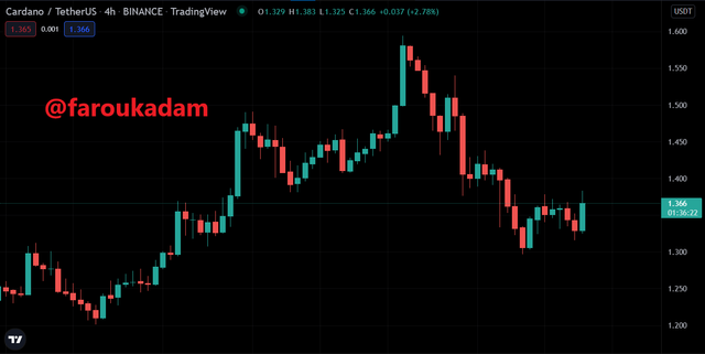
Example of a candlestick chart - ADA/USDT chart || Screenshot from tradingview.com
The image above is a display of Japanese candlesticks charts. From my knowledge, this chart indicates price fluctuations on different cryptocurrency exchanges like; kucoin and trading pairs on tradingview.com like the screenshot above.
The Japanese candlestick is a display of operations or interactions between the buyers (bulls) and the sellers (bears) for any particular asset's price. I think they are called candlesticks because they are shaped like candles. The Japanese candlestick charts were set in the 1700s by a rice trader in Japan. It is among the most widely accepted and used charts in the financial markets. Crypto traders use these candlestick charts to get ideas about future price movements or directions. Candlesticks are usually made up of four parts, and they are open price, highest price, lowest price, and close(final) price.
Prices charts on an exchange can be viewed in different time frames like 5M, 15M, 30M, 1H, 4H, 1D, etc to see the interaction between the buyers and sellers to make a better trading decision.
Personally, I think the Japanese Candlestick is the most used In the financial market because it shows more detailed price action information and it is easy to use and understand compared to others. It is very accurate in capturing price movements within a particular period in the market. Crypto traders use the candlestick charts with other technical tools like the Relative Strength Index (RSI) and Moving Average (MA) among others to make standard analyses and decisions in the market as seen in the screenshot below.
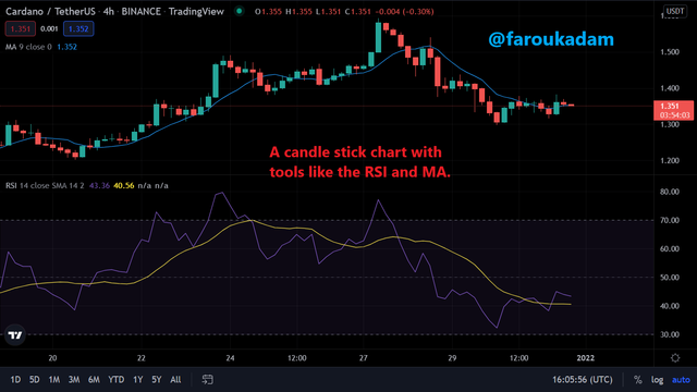
candlestick chart with the RSI and MA - ADA/USDT chart || Screenshot from tradingview.com
Candlestick charts show the price direction or movement of an asset. This includes asset price openings and closures. In addition, it shows an increase or decrease in the price of an asset within a particular time frame so that crypto traders can get ideas about future price directions or movements.
Japanese candlestick chart consists of two color candles, the red and green candles. Here the red color shows a negative price and the green color shows a positive price movement. Most traders use red and green colors, sometimes blue or white instead of green and black instead of red are used also. This separation of colors makes it helpful and easier to read and analyze the market.
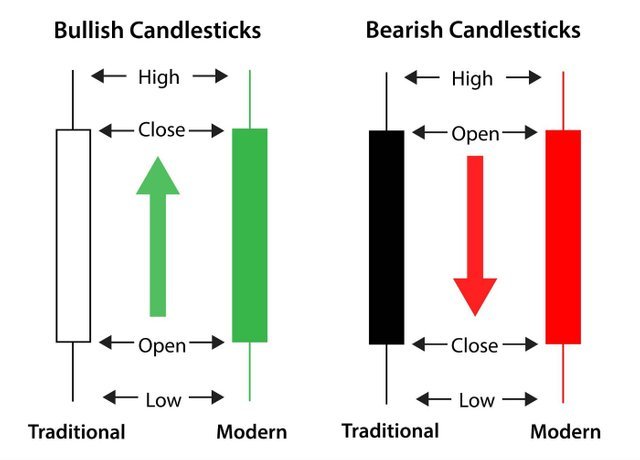
Image description of Bullish and Bearish candles || Source
Bullish Candle
The bullish candle is colored green or white, and it indicates an increase in the price of an asset in the market. The anatomy of Bullish candles represents an increase in the price of a trade asset over some time. This increase is also commensurable to the successional increase in the graph. If a market trend is in a bearish trend, the formation of a bullish candle shows that the buyers are gaining momentum and the movement of the market is about to reverse.
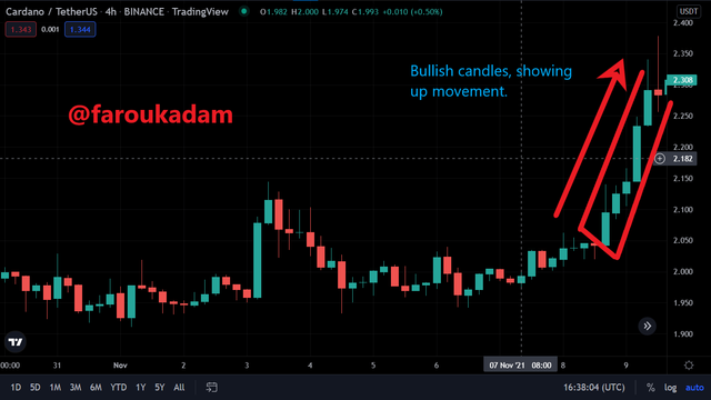
Example of Bullish candles - ADA/USDT chart || Screenshot from tradingview.com
The screenshot above shows the bullish candles and how they caused a reversal in the trend and direction of the asset's price.
Bearish Candle
The anatomy of a bearish candle is the opposite of the structure of a bullish candle. Bearish Candlestick is painted red or sometimes black, and it indicates a decrease in the price of an asset in the market.
The top of a bearish candle shows the open/high price of an asset and the bottom shows the close / low price of an asset. If a market trend is in a bullish trend, the formation of a bearish candle shows that the sellers are gaining momentum and the movement of the market is about to reverse to a downtrend or movement.
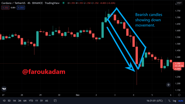
Example of Bearish candles - ADA/USDT chart || Screenshot from tradingview.com
The screenshot above shows the bearish candles and how they caused a reversal in the trend and direction of the asset's price.
A very big thank you to professor @reminiscence01 for this impactful lecture on Candlestick Patterns. Now I know more about Candlestick Patterns, their functions, structures, and how they form as well as how to use them with technical analysis.
