Steemit Crypto Academy Season 3 Week 2 - Homework post for @reminiscence01 | Introduction to Charts
Hello (Hola) to you all amazing steemians. I hope you all will be fine. Today, I am here to complete my homework task for Professor @reminiscence01 on the topic of "Introduction to Charts" after attending his amazing lecture on the said topic. I hope my homework will be up to the standard of the professor's hopes. Now Let me start my Homework.
 Edited in Canva.com by myself
Question-1:
Explain the Japanese Candlestick Chart? (Chart screenshot required)
Answer:
The original Source of this Screenshot is Binance.com.
Candlestick chart is the oldest way of reading the market in the price of different assets candlestick charts are mostly famous because they are very easy to read and you get all the information that you need in one place when we compare one chart with another chart, we see that it contains all the information when the price was up and when the price was low and it also tells you about that time when the price was low but it went up candlestick charts are most famous among the traders because of it's easy to understand the structure.
There are two types of candles in the candlestick chart, one is red and one is green mostly these are the different colors for these candles every trader and every user can change the color depending on their choice. The red candle represents the downfall of the price and the green represents the up words movement of the price.
Candlestick charts also tell you about the all-time low and the all-time high price of the asset. You can also see the charts for 15 minutes and you can also see the chart for one hour and then one day also when we do technical analysis candlestick charts helps us a lot because it gives you so much information about the market and if I say that you don't need any other charts to analyze the market and you can just do it with the candlestick charts, it will not be wrong.
Candlestick charts help us to identify if the market is bullish or if the market is bearish, when we see many green candles in a chart and It's continuously Green it means that the market is going upward and at the same time if we see so many red candles going downwards it means that the market is bearish.
Question-2:
Describe any other two types of charts? (Screenshot required)
Answer:
Line charts
These charts are considered to be the basic charts because they are very easy to read and there is not much information about the market inside these charts, you will get only the closing price off the market from this chart. This chart takes all the closing points and then connect all the dots together and form a chart so by looking at this chart you will see where the market was closed and you can do really good analytics from this chart for your technical analysis because this chart is very clean and clear like resistance and support can be really easily identified throw using this chart.
For example:
The original Source of this Screenshot is Binance.com.
Bar charts
These charts are also really good charts and these charts are considered to be one of the best, recently the dominance of candlestick charts has been a little more otherwise Bar charts are widely used among the traders for many years. These charts give you the closing point, the opening point, the high and low. It is quite similar to the candlestick chart the only difference between a candlestick chart and a bar chart is the shape and that's it, both of these charts give you the same information in different ways so a bar chart is also one of the best charts for the market analytics.
For example:
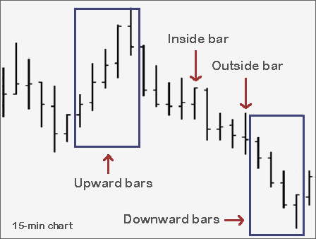
Question-3:
In your own words, explain why the Japanese Candlestick chart is mostly used by traders.
Answer:
Japanese candlestick charts are mostly used by traders because as we all know that in trading you need as much data as possible and when it comes to charts, candlestick charts are the most reliable and the most perfect way to understand the market because the Japanese candlestick chart gives you more and more data from the market when it comes to charts. The charts only tell you about a specific thing but the Japanese candlestick charts tell you, where the market started and where it ended and how much it was low and how much it was up to you get a clear idea about what will happen next and that is the one reason why most traders prefer candlestick charts over the others.
Candlestick charts can be divided into a very good time frame like you can read candlestick charts for 1 hour and for one day also and that makes it very easy for you to understand where the market is going.
The Japanese candlestick charts are very easily understandable anyone can understand them very easily because there is no complex mechanism to understand them. It's all visible and it gives you the whole information about the market in a very easy way.
You can identify the market if it’s bearish or bullish just by looking at the market and seeing where the candles are going, there are more candles in green it means that the market is going upwards and the market is in a really good phase of time. Most of the traders prefer this because reading the Japanese candlestick chart is a very fast and furious thing to understand the market and you need everything to be fast in trading and a candlestick chart does that for you.
Candlestick charts are very easy and it tells you about if there are more buyers in the market or more sellers in the market and it also tells you if there is more demand or supply so looking at that you can decide and you can predict the price and also where the market is going at that time, that's why mostly all the traders prefer this charts over the others.
Question-4:
Describe a bullish candle and a bearish candle identifying its anatomy? (Screenshot is required)
Answer:
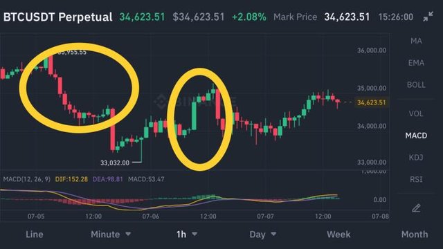
Bearish market
To identify the bearish market it's very easy you just have to look at the candlestick charts and you will know what is the market status currently. To identify the bearish market we must see a few things, the first thing is that we need to see if there are more red candles in the graph in arrow there are many red candles going down as I said red candle means that there are more sellers in the market and the buyers are not that many, people are selling the asset and that's why the demand is pretty much low and that's why there are more red candles in the graph which indicates that currently, the market is in the bearish trend.
For example, Refer to the Screenshot of BTC Bearish Charts.
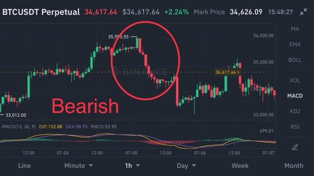
The original Source of this Screenshot is Binance.com.
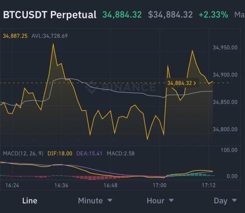
Bullish trend
To identify the bullish trend we also have to read some of the charts I will refer to read the Japanese candlestick charts because that will give you a really great idea about which trend the market is currently going. To identify the bullish trend we have to see if there are more green candles in the graph and the green candles are making and the graph is going up it means that there are many buyers in the market currently and that people are buying which shows that there is a very good demand for that asset and the market is currently in the bullish trend.
For example, Kindly refer to the given screenshot of the BTC Bullish chart.
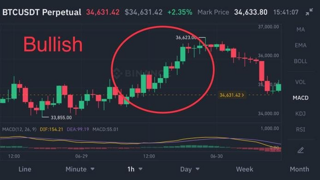
The original Source of this Screenshot is Binance.com.
This was my Homework post for Professor @reminiscence01. I hope I have got up to the required level of the task. I would be happy if there is any corrections or suggestions pointed out.
Thank you all for reading!
Regards: