Steemit Crypto Academy Season 3 Week 2 - Beginner's Course | Introduction to Charts
Steemit Crypto Academy Season 3 Week 2 - Beginner's Course | Introduction to Charts

Hello to all friends of steemit, today I present my task and I hope it is to your liking, I hope to learn more every day and fill myself with new knowledge, blessings for all and successes.
Explain the Japanese Candlestick Chart? (Chart screenshot required)
It is a way of graphing, which is used in stock market technical analysis, the most common graph that is seen is the line graph, but here we see the Japanese candlestick graph that is expressed as a rectangle that is composed of the body and the wick, the candles what they do is provide us with more detailed information, of which a line graph can provide us, when we see that there is little body and a lot of wick it means that there was a lot of votibility, when the body is stable it means that there was a lot of volume, when there is little body and a lot of wick, the body is not in the center but on one side Or so another, usually that means that the volume of the trend that was already bringing down a lot and a change in trend is approaching.

#We know Japanese candles ?
First of all, we must know that they have four levels that are really important to know, the first and that we see in the previous graph is the opening level, all candles start at one point and end at another, this graph can be called a candle Japanese bullish why? Because we can see that it begins at one level and ends at another, which would be the closing, if an example the candle represents a week, we already know that the opening begins on Monday and the closing ends on Friday, so to speak.
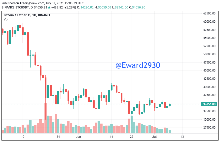
This is the Japanese candlestick bitcoin chart.
Describe two other types of charts. (Screenshot required)
Bar graphic
We can see that a bar graph is a visual representation of numerical data, it provides us with a better understanding since it is easier to see the data in a table than to see it graphically so that I can better understand the results, it is formed by rectangular bars. Lengths are proportional to the values represented while the value is greater, the bar will be higher or higher, and if it is lower it will be lower, what can we use it for? It helps us to compare values, they can be two or more values, its mission is to compare values without the need for me to read the table which value is larger and which value is smaller, its elements are the first bone abscissa axis horizontal axis represented by X which is where the variables are placed, second element is the bone coordinate axis vertical axis, represented by the letter Y as you can see this information is quite simple since this is something that we do not see in high school class.

Line graph
What is a line chart?
We can see that a line graph is a visual representation of data, every graph visually represents us the information that we want to show, it can help us to better understand the information, they are composed of a series of data represented by points joined by lines Line graphs are generally used to see the behavior of a variable over time, of course, we can see if it increases or decreases over the days, months or years.
For serving us?
It helps us to quickly check the change in trend of the data over time, if they are increasing or if they are decreasing.

In your own words, explain why traders primarily use the Japanese candlestick chart.
It is the type of chart that provides more information and security, you can observe the opening and closing price of time by figure.
¿Describe a bullish candle and a bearish candle identifying their anatomy? (Screenshot required)
It is a candle pattern where a candle wraps another candle, in order to cause a turn, formed by two highly reliable candles, in the case of the bullish we have in this example a small red previous candle, then we have a green candle where the candle covers the red candle, in case of the bearish candle the opposite happens, we have a small green bullish candle that is enveloped by a bearish red candle covers the entire body of the previous candle, it is one of the typical patterns that we says a change.

In conclusion we can highlight that the Japanese candlestick charts are very important, in order to know how to interpret the prices in the financial market, mastering this analysis of the candles will put you ahead, I invite you to investigate, and soak up more of this important topic that can help you in the course of this adventure, in order to increase income, we must train every day and like any professional and execute strategies, thank you for reading my assignment and I hope you like it, I hope every day to learn more and be able to develop more my ability to understand these issues.
CC
@reminiscence01.
Hello @eward2930, I’m glad you participated in the 2nd week of the Beginner’s class at the Steemit Crypto Academy. Your grades in this task are as follows:
Recommendation / Feedback:
I'm not satisfied with your work. Please spend quality time to perform the homework task and always proof read your work before submission.
Thank you for submitting your homework task.