Steemit Crypto Academy Season 4 Beginner's Course - Task 10: Candlestick Patterns
Hello fellow steemians, it's my pleasure to write this last task for the beginner's course. I am so happy to be allowed to learn about candlestick patterns. This is task 10 of the homework for beginner's fixed courses, I will be writing the assignment task given by professor @reminiscence01.


Question
Explain the Japanese candlestick chart? (Original screenshot required). In your own words, explain why the Japanese Candlestick chart is the most used in the financial market. Describe a bullish and a bearish candle. Also, explain its anatomy. (Original screenshot required)
Explain the Japanese candlestick chart? (Original screenshot required).
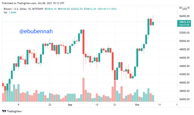
Market participants have been using this type of statistical analytical technique to monitor and evaluate the overall price trend of assets. Munehisa Homma, a Rice merchant from Japan, invented the idea of candlestick graphing. He discovered that the grain markets were controlled by merchants' feelings throughout everyday trade, even while recognizing the impact of buyers and sellers on rice prices.
He created candlesticks that graphically represented the pattern of price swings by utilizing various colors to make the variations. Analysts can use candlesticks to discover price movement trends and identify judgment calls on the price's directness.
Homma controlled the markets as a notable rice dealer of financial products, then he became famous for inventing the candle graphing style. Local technical traders used his technique in the trading system when the Japanese stock exchange first opened in the 1870s.
Steve Nison, an American analyst, popularized the approach in the West with his book titled "Japanese Candlestick Charting Technique." Traders currently utilize Japanese Candlestick charting to study the financial system as a prominent quantitative measure.
Anatomy of Japanese Candlesticks
Every candlestick has a center part, known to it as the body, that displays the length between both the opening and closing of the securities currently exchanged. The difference in price between both the top of the body as well as the high for the trading range is called the upper wick. The lower wick represents the difference in price between both the body's low and the trade period's lowest.
Whether such a candlestick is bullish or bearish, is determined by the ending value of the security being transacted. If the candlestick concludes at a better price than what it opened, the skeletal frame is usually white. The book value has been at the peak of the true body in this case, whereas the starting price is at the base.
The body is normally black if the asset being exchanged concluded at a lower price than what is entered for the time frame. The starting price is at the top side, while the closing price would be at the bottom. Current candlesticks now come in a variety of colors, including red, green, and blue, to substitute the traditional white and black of the body. While using computerized trading systems, traders choose from a variety of colors.
In your own words, explain why the Japanese Candlestick chart is the most used in the financial market.
The Japanese Candlestick Chart is the most used in the financial market because;
They can be used to retrieve relevant information on the movement of the price of securities traded.
It is seen as a graphic representation of its current state.
They can be used by the trader as he or she pleases.
They can be used as a whole or alongside other analytical trading tools such as moving averages.
They can be used as signals, indicating whether a trader should enter or exit.
The trader uses its analysis of the chart to make better and simplified decisions.
It can be easily translated by the trader.
Describe a bullish and bearish candle. Also, explain its anatomy. (Original screenshot required)
Bullish Candle
A bullish candle pattern informs traders that the market is about to enter an uptrend after a previous decrease in prices. This reversal pattern is a signal that bulls are taking over the market and could even push the prices up further – marking the time to open a long position.
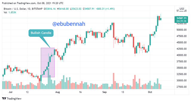
Anatomy of the Bullish Candle
Each daily bullish candlestick represents one day's worth of price data and includes the open, close, high, and low prices of the session. Whether the beginning or closing price is higher, it is indicated by the coloration of the candlestick body. The bullish candle consists of;
Open: This is usually the opening price that is the start of the price of the securities traded. It indicates that now the price is rising. It's the time and price at which the exchange starts trading for each day.
Close: This is usually the closing price that is the end of the price of the securities traded. It usually represents the last value received for the duration and signals the end of the candlestick for a particular time.
High: This is usually the maximum price attained by a security in the course of trading. It is visible beyond or even at the same level as the ending point.
Low: This is usually the minimum price attained by a security in the course of trading. The cheapest price is either lower or even at the same level as the offering price.
Bearish Candle
A bearish candlestick pattern is one that indicates low prices are on the way. Indicators of bearish candlestick patterns are; an up (white or green) candlestick followed by a massive down (black or red) candlestick, which engulfs the smaller up candlestick. The pattern is significant because it indicates that sellers have surpassed purchasers and are driving the price lower than buyers were able to do.
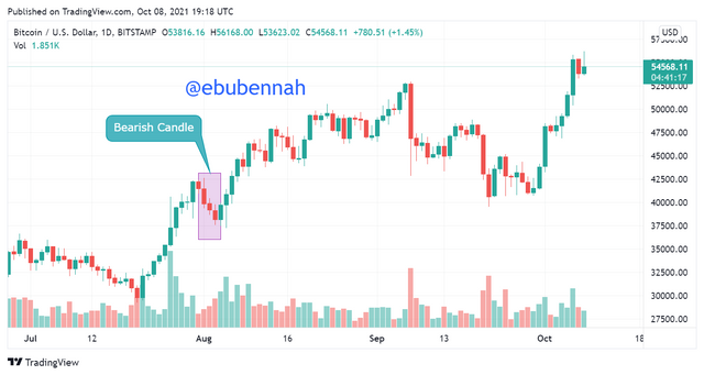
Conditions that indicate a bearish Candle Pattern:
- The candlestick forms just after a bullish candlestick.
- Absorbing must happen.
Anatomy of the Bearish Candle
Each daily bearish candlestick represents one day's worth of price data and includes the open, close, high, and low prices of the session. Whether the beginning or closing price is higher, it is indicated by the coloration of the candlestick body. The bearish candle consists of;
Open: This is usually the opening price that is the start of the price of the securities traded. It indicates that now the price is rising. It's the time and price at which the exchange starts trading for each day in .
Close: This is usually the closing price that is the end of the price of the securities traded. It usually represents the last value received for the duration and signals the end of the candlestick for a particular time.
High: This is usually the maximum price attained by a security in the course of trading. It is visible beyond or even at the same level as the ending point.
Low: This is usually the minimum price attained by a security in the course of trading. The cheapest price is either lower or even at the same level as the offering price.
Conclusion
The Japanese candlestick chart is unarguably the easiest chart to analyze and most traders are comfortable using it and bearish and bullish candles are easy to spot on the chart.
Thank you for reading, and thank you professor @reminiscence01 for the lecture.