Steemit Crypto Academy Season 3 Week 2 - Beginner's Course- Homework| Introduction to Charts By @dilchamo

Homework Tasks
• Explain the Japanese Candlestick Chart? (Chart screenshot required)
• Describe any other two types of charts? (Screenshot required)
• In your own words, explain why the Japanese Candlestick chart is mostly used by traders.
• Describe a bullish candle and a bearish candle identifying its anatomy? (Screenshot is required)

INTRODUCTION
A chart represents the price variations over time. There are two axes in a chart “X” and the “Y” axis. Y-axis represents the price and X-axis represents the Time frame. In trading, there are different types of charts used. Among them,
• Line chart
• Bar Chart
• Heikin-Ashi
• Candlesticks chart can be seen.
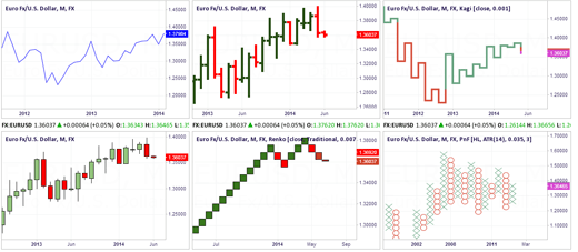
Explain the Japanese Candlestick Chart? (Chart screenshot required)
A Japanese candlestick chart was first originated in Japan. It is famous among many countries where trading is prominent. The Japanese candlesticks chart is used to analyze the price variation of certain products or services. The demand, supply, and distribution of products and services are clearly demonstrated in a candlestick chart.
The Japanese candlesticks chart shows the opening, closing, high and low points of prices in a given time period. It is very for traders and investors to understand the price variation of a certain cryptocurrency using candlestick patterns.
To understand the price fluctuation of a certain tradable using a Japanese candlestick chart the users should have a clear understanding of its components and what each component expresses about the market.
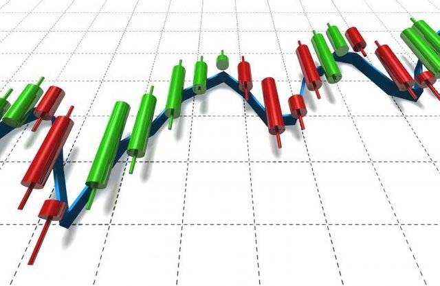
Candlestick Anatomy
There are candle structures in two colors.
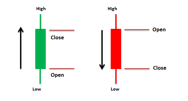
Image is created by me using MS Word
• Red- Red candlesticks indicate the upward movement of price.
• Green- Green candlesticks indicate the downward movement of price.
Also, There can be of,
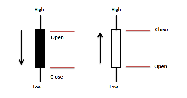
Image is created by me using MS Word
• Black- Black candlesticks indicate the downward movement of price.
• White- White color candlesticks indicate the upward movement of price.
Every candle has six main parts.
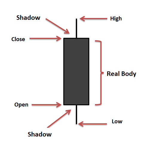
Image is created by me using MS Word
01.Real Body
The real body of the Japanese candle demonstrates the distance between open and close over a certain time period.
02.Open
The open defines the opening price and it is the beginning of the candle within a certain time period.
03.Close
Close is the closing price and it completes the candle within a certain time period.
04.High
High demonstrates the highest price and the highest level in the candle within a certain time period.
05.Low
Low demonstrates the lowest price and the lowest level in the candle within a certain time period.
06.Shadow
Shadow indicates the struggle between buyers and sellers which indicates that the price is not settled.
Describe any other two types of charts? (Screenshot required)
There are many designs of charts that are used by traders to understand the price of assets with time.
01.Line Charts
Line charts include only a single piece of information just like the ending price during a certain time period. There may be traders who consider only the closing price of a certain asset. This line chart design is a prominent design among daily basis trading. A line chart reduces the noise and line charts are simple and easy to understand.
A line chart clearly represents the resistance levels and trends of a certain asset. Rather than using complex charts, traders prefer simple charts to get a complete idea of the marketplace of an asset. Line charts are ideal for beginners as it is simple to understand.
02.Bar Charts
Bar charts demonstrate how the price of an asset moved up and down with time by using multiple bars. Each bar indicates the open, high, low, and close of prices in a certain time period. The vertical line represents the high and low prices and the Horizontal line represents the open and closing prices. A one-minute bar chart shows a new bar in each minute which helps traders to depict the market value of cryptocurrencies. Long vertical bars show big price differences and short vertical bars show small price differences.
In your own words, explain why the Japanese Candlestick chart is mostly used by traders.
In my point of view, In the Japanese candlestick charts, the candles provide detailed information about price movements in comparison to other bar charts or line charts. In each candlestick, the height of the candlestick shows the distance of price between low and high prices.
Candlesticks represent the details in a more visualization so that traders get a more graphically clear picture of the market value of assets.
The shadow area of the candlestick is important for traders as it depicts the action of the price of an asset.
Traders have the ability to use graphical candlestick structures to make decisions on candle patterns.
In terms of price variation, traders can compare the present price actions with the past and give predictions for future market values by having a detailed observation of the candle patterns.
Describe a bullish candle and a bearish candle identifying its anatomy? (Screenshot is required)
There are two trends in the Japanese candlestick charts depending on the price movements. They are,
01.Bullish Trend
02.Bearish Trend
01.Bullish Trend
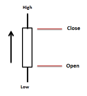
Image is created by me using MS Word
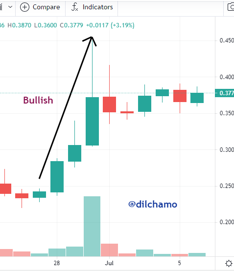
• The upward moving candles which are in Green or White colors are called Bullish Candle Sticks. In the steem cryptocurrency in this chart represents the increase of price over the time period. The low shows the lowest price and the high shows the highest price of that certain asset. If there is a continuous increase in the price of assets then it is referred to as a Bullish Trend.
02.Bearish Trend
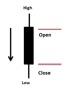
Image is created by me using MS Word
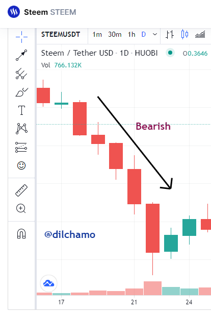
• The downward moving candles which are in Red or Black colors are called Bearish Candle Sticks. In the steem cryptocurrency in this chart shows the decrease of price over time. Bearish candlestick demonstrates the uptrend or a pullback. The bearish pattern displays after an upward price move. The candle shows a decrease in the price. The low shows the lowest price and the high shows the highest price of the asset in a period of time. If there is a continuous decrease in the price it is referred to as a Bearish Trend.
CONCLUSION
As users who are working with cryptocurrencies, It is an essential consideration to study the charts. As traders users must have a clear understanding of the price fluctuation of digital assets by carefully observing and investigating the assets with charts. From this lesson as a cryptocurrency user, I got complete knowledge on how to study and rely on charts to understand the price movement of assets that I work with. I would like to pay my gratitude to Professor @reminiscence01 for acknowledging us with such a valuable lesson.

All the best with your homework tasks
Thank you so much