Crypto Academy Season 3 Week 2 - Homework Post for @reminiscence01 || Beginner's Course: Introduction to Charts || by @daiky69
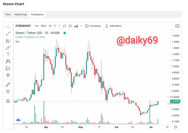
- Explain the Japanese Candlestick Chart? (Chart screenshot required)
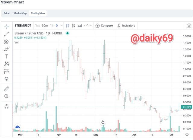
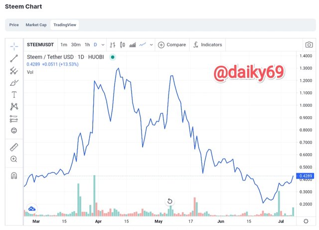
- Describe any other two types of charts? (Screenshot required)
- In your own words, explain why the Japanese Candlestick chart is mostly used by traders.
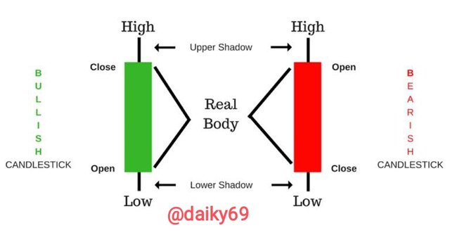
- Describe a bullish candle and a bearish candle identifying its anatomy? (Screenshot is required)
What is Chart?
Let's discuss a little about charts, broadly understanding charts are graphical representations taken from data, with charts users can see the results of the data in order to better understand and predict current or future data. There are various kinds of charts that we can use to collect data and predict the market, however the most widely used today are the following:
- Candles chart
- Bar chart
- Line chart
- Heikin Ashi chart
- Baselina chart
- Area chart
- And much more
Candlestick charts are financial charts that are used to predict the market, also look at the interactions between sellers and buyers as well as market trends. This chart will show the price movement in different colors. Traders use candlesticks to see market movements and make trading decisions, candlesticks can help traders predict the short-term price direction.
The candlestick will also show the opening, closing, high and low prices for the day, specifically for the opening and closing prices will be displayed based on market price movements. When the market is in a bullish stage, the closing price will be displayed higher than the opening, and vice versa if the market is bearish, the opening price will be higher than the closing price.
Candlesticks are designed like candles but have an upper and lower wick, the wicks tell us about the highest and lowest prices or usually called upper shadows and lower shadows. Green or white real bodies indicate that the market is bullish, while red or black real bodies indicate that the market is bearish.
We are also possible to see the highest and lowest prices in the time that we can set ourselves using the Candlestick chart. Please note that candlestick charts are used for market movements based on past charts. Trading is strongly influenced by trading psychology and market psychology, and also some biases that greatly affect a person in trading but with candlestick charts we can read them and know the psychology of the market that is going on.
Actually there are a lot of charts that we can use to analyze the market, including:
1. Bar Chart
Bar charts are also able to provide complete information for us, bar charts are also known as OHLC charts can display opening prices, highs, lows, and closing prices.
Look at this screenshot, and look at the top bar that is the highest price in a certain time, while the bottom bar is the lowest price, the open price of the streak is on the left side, while the closing price of the streak is on the right.
If the closing price of an asset at a certain time interval is lower than the opening price, then the bar will be red which we call bearish. And vice versa, if the closing price is higher than the opening price, then the bar will be green which we call bullish.
2. Line chart
Line charts are simpler than bar charts, line charts have a single line then drawn from left to right to connect the closing prices, or other price points of each predetermined time interval. Line charts are often used by investors to observe long-term trends, but the information provided by line charts is considered too simple by investors for daily analysis. Line chart also not showing informatika about high, low, and open price, and this of course will make investors confused.
There are several reasons (my version) why traders use Japanese Candlestick charts more, including:
The body of the candlestick chart can show the relationship between the opening and closing prices, thus the candlestick chart will give traders a warning about market psychology. This market psychology is very dangerous for traders because it can change trends in the short or long term.
Candlestick charts can quickly identify changing market participants and also provide signals faster than other technical analysis tools.
The color difference in indicating the bullish and bearish trend and also the presence of shadows have made it easier for traders to analyze the market and trends.
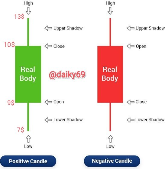
Bullish candle:- is a candle that shows the price movement of an asset to be more expensive/higher, a bullish candle uses a green color to indicate the price of an asset is rising. There is also a real body which is an indication of the volume of buying power, the longer the green real body, it indicates the level of buying volume is taking over the market, while the short real body is an indication that the buying volume is not too strong (equivalent between buying and selling), then the upper shadows indicate session high and lower shadows indicate session low.
Look at the green candle, this is a bullish candle. There are four anatomical parts:
- High price
- Closing price
- Open price, the opening price is lower than the closing price on the bullish candle.
- Low price
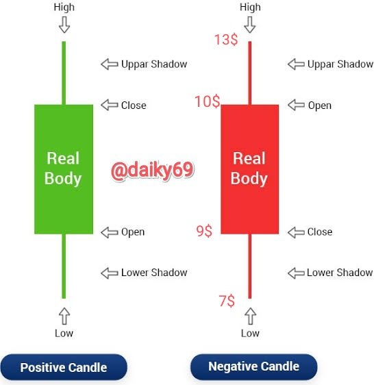
Bearish candle:- the opposite of a bullish candle, using red to indicate the price of an asset is falling. Long real bodies indicate people are taking over the market in selling their assets, shorter real bodies are an indication of selling within reasonable limits, shadows are the same as bullish candles, upper shadows indicate the highest price during a bearish trend and lower shadows indicate the lowest price during a bearish trend.
Look at the red candle, this is a bearish candle. There are four anatomical parts:
- High price
- Open price, the opening price is usually above the closing price because the price has gone down at the same time
- Closing price
- Low price
CONCLUSION
With Japanese Candlestick Charts we can predict market prices more accurately, Japanese candlestick charts provide almost all the information we need to analyze the market and trends that are happening in the market.
There are many charts that we can use in conducting technical analysis, but candlestick charts are still better than other charts.
With this crypto class we can add to our insight about cryptocurrencies and also analysis, we should thank professor @reminiscence01 for addressing this theme in his class.
Finally, I as the author ask all of you to correct if there is an understanding or my writing is wrong.
Regards






Hello @daiky69 , I’m glad you participated in the 2nd week of the Beginner’s class at the Steemit Crypto Academy. Your grades in this task are as follows:
Recommendation / Feedback:
Thank you for participating in this homework task.