Effective Trading Strategy using Line Charts -Steemit Crypto Academy | S6W1 | Homework Post for @dilchamo
Hey guys, welcome to this very first week of season 6 which came after a long break. I welcome you all to my blog as you read through my piece of participation. I will be attempting Prof @dilchamo homework Lessons on Effective trading strategy using Line Chart.
Define Line charts in your own words and Identify the uses of Line charts.
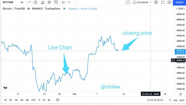
We may be familiar with other trading tools used in the chart analysis like the candles, hollow candles, Heikin Ashi, etc, the Line Chart is no exception as it was created by Charles Dow with its concept of having to read price trends through its the closing price. It is a less complex trading tool that doesn't necessarily have to distort the real value of price trends before coming to terms.
This trading tool provides a smoother signal when in use as it does not react to insignificant market effects; there is a relative removal of noises in the market and false signals which gives it some degree of level of acceptability and adoption. In so doing, it requires little or no experience level to use across the board.
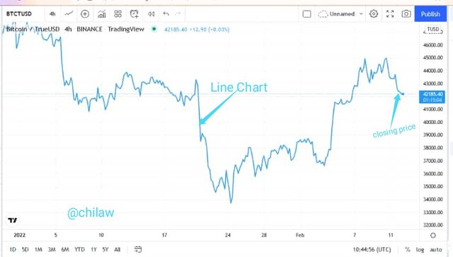
This trading tool can also avail signals like the resistance and support levels in a price movement which helps traders to know the available price zones vis-a-vis were to anticipate possible trend reversal or continuation. Price trend can easily be figured out using the line Chart as this only make use of the closing price parameter.
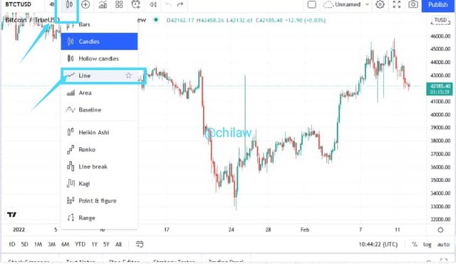
This is a typical view of how this can be added to chart analysis. To be illustrated using the tradingview.
How to Identify Support and Resistance levels using Line Charts (Demonstrate with screenshots)
Resistance and Support levels are basically strong price zones where there are concentrations of either stronger buying activities to repel market pressure to the opposite direction or stronger selling pressure to repel trend to the opposite direction. Therefore resistance and support levels are characterized by strong trade activities geared towards a prospective trend reversal.
These levels can be called resistance and support zones when it has successively repelled price action at least a minimum of two times. This is indicated by a horizontal line drawn from one point to another point which serves as a ceiling for price action.
In a Support Level, which means there should be a visible presence of downward movement of price trend creating Lows and highs before hitting on the support level. As at the time of this downtrend, selling activities seems to outweigh the buying activities wherein in the market. But as soon as it gets to the strong support level, the opposite is the scenario. Buying pressure is observed to be more sufficient than the sellers therein.
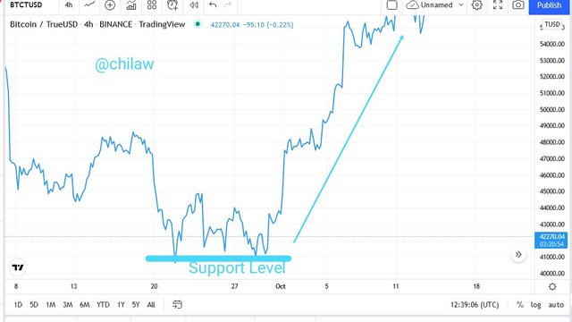
A stronger support level is characterized by at least two same levels where price movements are repelled to the opposite direction. In this case, we should anticipate a bullish trend reversal.
In a Resistance Level, which means there should be a visible presence of an upward movement of price trend creating highs and lows before hitting on the resistance level. As at the time of this uptrend, buying activities seem to outweigh the selling activities wherein in the market, h nice the observed uptrend. But as soon as it gets to the resistance level, the opposite is the scenario. Buying pressure is observed to be less sufficient than the sellers therein and hence the bearish trend reversal.
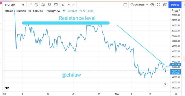
A stronger resistance level is characterized by at least two same levels where price movements are repelled to the opposite direction. In this case, we should anticipate a bearish trend reversal.
Differentiate between line charts and Candlesti ck charts.( Demonstrate with screenshots)
I made mention of this different trading tool in any chart analysis in my understanding of the Line Chart. They are all trend-based indicators that help in the overall trading strategy of a trader. But there are some important differences I will let us take note of and with screenshots in this regard.
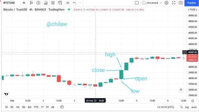
The Line Chart just as the name implies is observed as a diagonal, Zigzag, horizontal or vertical line that stretches without any market gap to a Close Price of an underlying asset which is represented on the chart analysis. It has only the Closing price in determining the trend direction of an underlying asset whereas the Candlestick charts comprises the Opening Price, High/Low prices as well as Closing price.
Line Chart does not allow for more data Availability in the market due to the only presence of the closing price parameter whereas with the opening, high, low and closing prices of an asset, all the required data needed to execute orders are available handy for the trader.
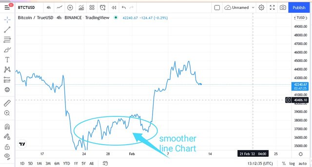
Moreso, the Line Chart seems to be smoother in signals which invariably means that there low cases of false signals due to the outright removal of noises in the market. It makes sure that insignificant and unneeded market effects are not taken into consideration. But for the candlestick chart analysis, there is a full representation of all market effects which makes traders vulnerable to fakeouts or false signals if not combined with other confirmatory indicators.
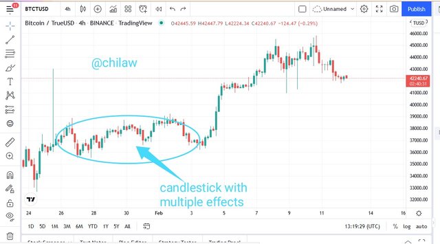
This is why we observed candlesticks with unprecedented gaps (market gaps) while using it due to the effect of institutional man activities in the market. But not observed while using the line Chart instead there would either be a bull or bear trend witnessed.
Explain the other Suitable indicators that can be used with Line charts. (Demonstrate with screenshots)
I will be using the Relative Strength Index (RSI) Indicator with the Line Charts. We already know the structure of this line Chart which is a trend-based indicator. The RSI indicator is a momentum-based indicator that helps to show the strength of trends in trade, especially in the overbought and oversold regions.
The overbought region is levels where the asset price is overpriced with the RSI indicator line observed above the band 70 readings. It is oversold when the asset price is undervalued and the RSI indicator line is observed below the band 30 indicator.
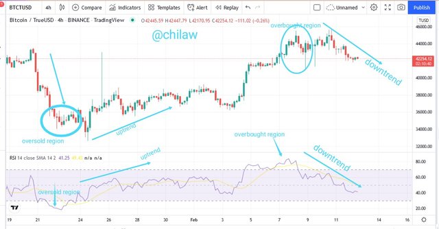
In the overbought region, we are to anticipate a possible bearish trend reversal as Selling pressure > Buying pressure. For the Oversold region, we will anticipate a possible bullish trend reversal as Buying pressure > Selling pressure.
Prove your Understanding of Bullish and Bearish Trading opportunities using Line charts. (Demonstrate with screenshots)
My understanding of the bullish and bearish trading opportunity in a Line Chart analysis may be illustrated using some of the trading tools like the RSI and the Descending and Ascending triangles. In the RSI, I have already mentioned that when the trend is observed at an overbought level, there is a higher opportunity for a bearish trend reversal. This simply shows a Sell signal to maximize Profit when the price is at its peak. But when the trend is at the Oversold level, it means that we should anticipate a bullish trend reversal which is a Buy signal.
Therefore, when we see trend lines in those peak and low zones, we should be prepared to execute our orders as the need be.
To also understand the bearish and bullish trading opportunity using the Line Chart, the ascending and descending Triangle trading tool would be of great help.
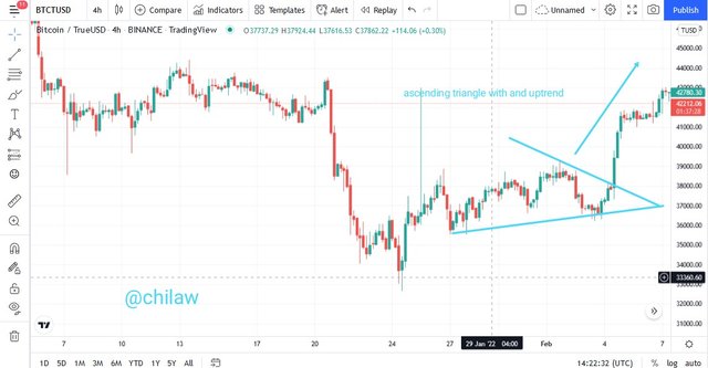
In an Ascending triangle strategy as seen above, we should be able to connect different peak and low points of the line Chart in such a manner that there is a point in which these two horizontal lines are connected. At this connecting point, we should be observing a Bullish price movement.
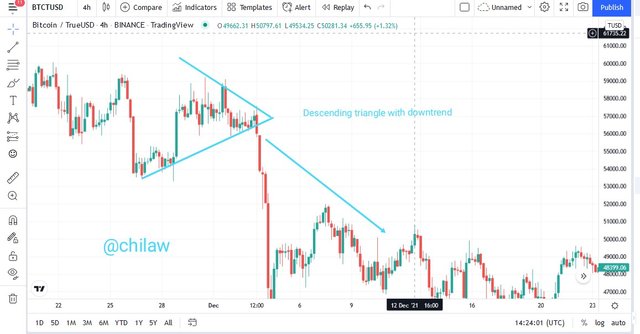
This is also applicable for the descending Triangle as seen above. In a descending triangle strategy, we should be able to connect different peak and low points of the line Chart in such a manner that there is a point in which these two horizontal lines are connected. At this connecting point, we should be observing a Bearish price movement
#Investigate the Advantages and Disadvantages of Line charts according to your Knowledge.
Advantages of a Line Chart
- Can be used by anyone without necessarily having the prerequisite experience of trading.
- It is trend based trading tool that does not require any complex process in deriving the direction of price movement
- It is smoother in its signals which invariably removes noises from the market
- Only has the closing price indices which gives an instant overview of a trend direction
- Works perfectly in long periods
Disadvantages of a Line Chart
- Does not have the opening, high, and close price indices which limit the availability of data needed for more trading strategy
- Due to its smoother structure, signals like the gaps are not captured which represents activities of large order executors
Conclusion
The Line Chart is a trading tool available for all cadre of individuals participating in the Cryptocurrency market without any level of experience. It is a trend-based trading tool with only Closing price indices which provides price movement in a view as well as smoother signals with the ability to remove false Signals. It can be combined with other trading tools/Indicators for efficiency and better performance.
Thank you Professor @dilchamo. This is my submission...
I have used the tradingview site for all images/screenshots uploaded here. Thank you for reading through.
Written by: @chilaw