Crypto Academy / Season 3 / Week 2 - Homework Post for professor @reminiscence01
Hello steemians, welcome once again to my blog article. In regards to the lecture given by prof @reminiscence01, it was really a nice class studying the Japanese candlestick patterns. I learned so much about candlestick and its behavior, and in this piece of article, I will be demonstrating my understanding of this topic.
Preamble

The Japanese candlestick has been active for over some years now, and it was some Japanese traders that were looking at charts that could help them analyze the trending market back then in the 1650s. History has it that Rice trading was dominating the market then and as such, the Japanese began looking for methods of studying the Rice market as it has become the most important commodity.
Then, there was a man named 'Munehisa Homma' also known as Sokyu Homma who was a rice trader. He knew the basic concept of Demand and supply. He also knew that emotion also plays a role in the market settings, and wanted to follow the emotions of every market player which was what led to the inventing of candlestick patterns.
Since its inception, the candlestick has gained population, and today it is seen as the best analysis chart for financial markets. Candlestick patterns are very important because It gives you information about the open, high low, and the closing price of every market trend
Explain the Japanese Candlestick Chart.
As I have briefly said in the above preamble. Candlestick charts are literally used by financial traders to study the price movement of an asset. It can be used in the:
- Cryptocurrency Market
- Foreign Exchange Market - (Forex)
- Commodity Market
- Derivatives Market
These are markets where a trader can make use of the candlestick trading charts. Now, let's take, for instance, you happen to find yourself in any of these markets where you don't know the language they speak, you can never make profits out of your trades, this is because you have not understood the language that is been spoken in that very market, with candlestick charts you can read and interpret the market at any given time frame.
If you can study these patterns, you will understand what the market is saying, and as such enabling you to make some $$$ from the market. It will help you to know how the market behaves, thereby knowing the right time to enter and exit the market.
The Candlestick Anatomy
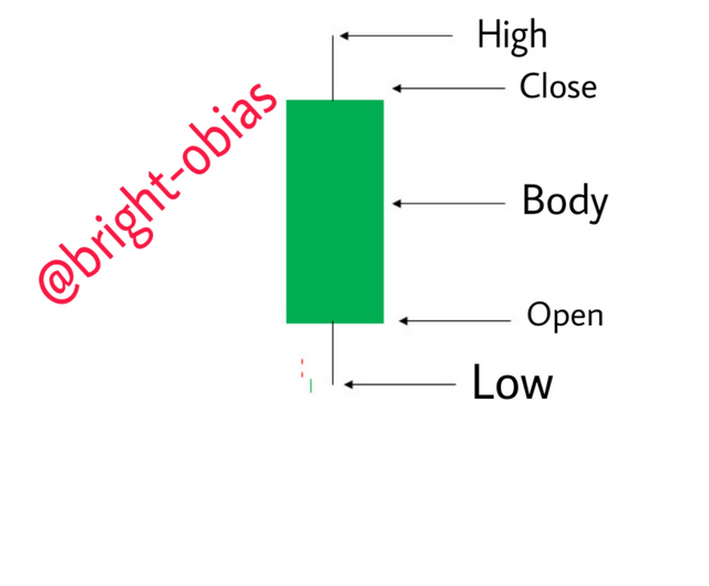
Just as humans have bodies, so the candlestick has a body, and different sizes. It is very important for a trader to check the bodies of every candlestick in other to understand the psychology behind it. Below is an image illustrating the body of a candlestick.
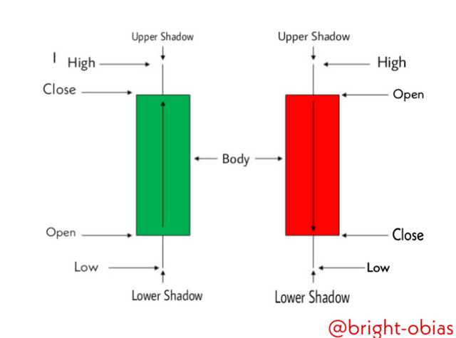
The above image depicts the body of a candlestick. They are positioned in the market as open, high, low, and closed based on the market time frame. On the image, you can see how I illustrated the different sections of the body. On the image, you can see two different candlesticks - The bullish candlestick(Green) & the Bearish Candlestick(Red). Note: most traders do change the color of their candlestick, in some cases, it can be Red & white color, but for this task, I have indicated it with Green and Red as it is the most used among traders. Let's take a look at the body components.
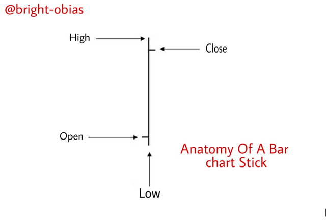
The candlestick body is made up of High, Close, Open, Low, Shadows, and Real body. You can refer to the above image for a clear view. Although I explained briefly about these components, for a clear understanding, I will specify what they represent in the candlestick chart of a given market.
- High: This represents the highest price of a particular crypto asset within a given time-frame
- Close: The closing section of a candlestick is talking about the point at which the price of a crypto coin is closed.
- Open: This section entails the price at which the market begins to trade.
- Low: the low section represents the lowest price of a particular crypto asset within a chosen time frame.
In the Candlestick chart, we can say a candlestick is bearish when the market is falling, this can be seen when the close is below the open, on the other hand, the market can be rising when the close of the bullish candlestick is above the open. Always note that the most important thing is the open price and close price. Let's consider the below facts, as it is on the image.
- In the candlestick, the lines that are above and below the body are the shadows that tell you that most trading action was around the open and close.
- The filled part of the body as it is in the image is the real body.
- The top of the upper shadow is high, and the bottom part of the lower shadow is low which signify high & low session
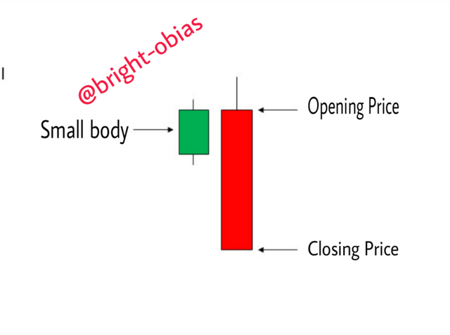
You can refer to the image again, for better understanding. Now Let's talk about their sizes. Candlestick has different sizes that also explain the movement of the market. See the image below:
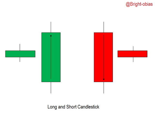
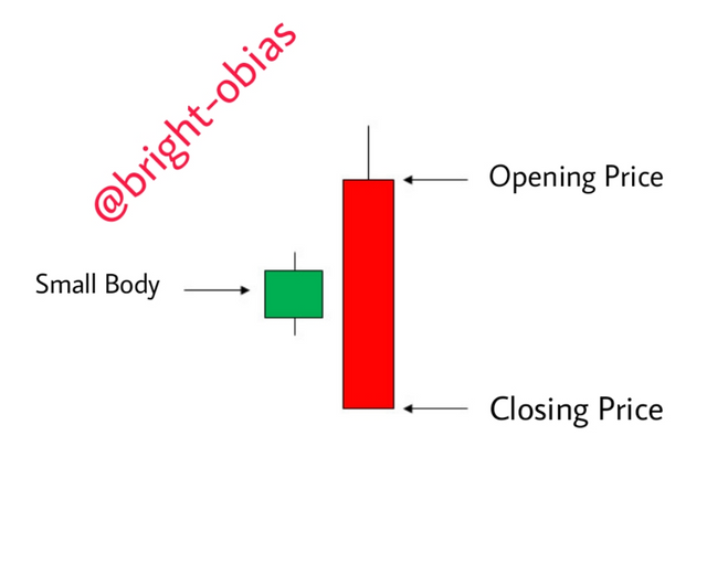
As a crypto trader that is making use of the candlestick charts, you will encounter the above candlestick, it is called the long and short candlestick. The long body signifies Long/strong buying or selling pressure. Whenever a candlestick that its close section is above the open with a long body, it simply means that the buyers are stronger in the market.
The same is applicable to the bearish candlestick. whenever the bearish open is above the close with a long body, it simply means that sellers are in charge of the market. on the other hand, the short bodies signify short sell and buy in the market. Below is another notable size of a candlestick.
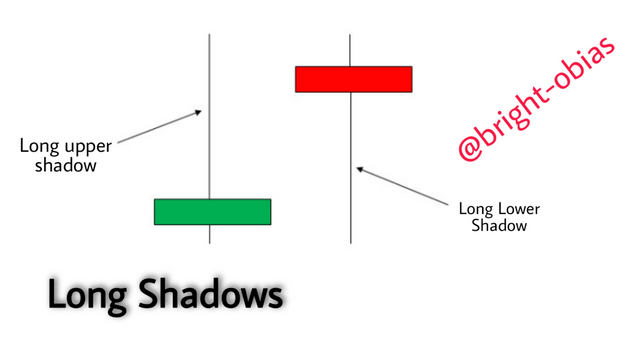
The above image shows a candlestick with long shadows, They are very common on the candlestick charts. If you see them in the market, it is telling you that the trading action within that time frame was normal over the open and close, let's say in the side of the bullish candlestick(long upper shadow), it means that the trading session was high, and for the bearish, it was low.
Japanese candlestick can also come with short shadows, which is telling you that the trading action occurred near the open and close. In some cases, a Japanese candlestick can come in both long upper shadow and short upper shadow, it means buyers pulled weight and bid price higher. But because of some reasons sellers turned up and flog the price back to its open level.
Now, let's see some candlestick patterns. Candlestick patterns are common on the Japanese candlestick charts. Below are just a few of them.
- Bearish Engulfing bar: In the Japanese candlestick chart, there is a candlestick pattern called the engulfing bar. This pattern acts as its name 'Engulfs'. In the chart, it usually engulfs the previous candle. It can also engulf more than one candle. In the case of the bearish engulfing bar, it is the most important in the market chart as it tells a trader that sellers are in charge of the market.
When you see this kind of pattern in an uptrend or at the end of an uptrend, it signifies that buyers have been engulfed by the sellers which means the market will go downward. see the image below for a better understanding.
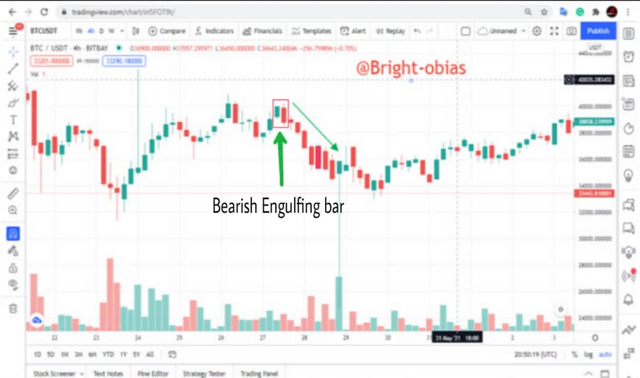
On the image above you will notice the trend reversal. The price action occurred on the uptrend telling you that there might be a trend reversal as buyers have not taken over the market fully.
- Bullish Engulfing: As we have seen the bearish engulfing bar. The bullish engulfing bar tells us that the market is not under the sellers that buyers will soon take over the market. See the image of a bullish engulfing bar.
As I have said earlier, it tells you that the market not the charge of the sellers, whenever it forms on an uptrend, it states a continuation signal., when you see it on a downtrend it is telling you that the reversal will be stronger in that case surrendering for buyers to take charge. see the chart below.
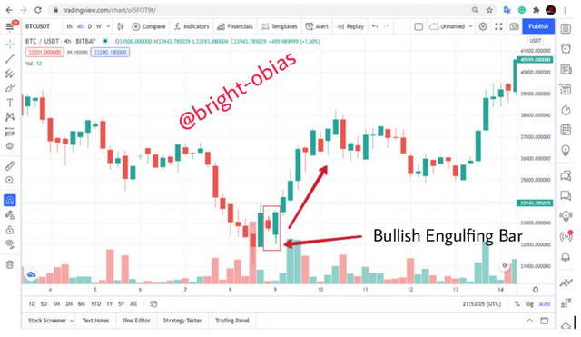
The image above depicts how the market changed after the forming of the bullish engulfing bar. On the image you will see the smaller candle which was covered by the bigger candle, it tells you that there will be a reversal. Below are other candlestick patterns that I will not be explaining.
- The Morning Star
- Doji Candlestick pattern
- Dragon Fly Dogi Pattern
- The Hammer Candlestick Pattern, and lots more.
Describe any other two types of charts
There are different kinds of Trading charts which are; Bar Chart, Hollow Candle chart, Candlestick charts, Heikin Ashi Charts, Line Charts, Area Charts, Renko charts, and lots more. But for this task, I will be explaining two kinds of charts
Bar Charts:
A bar chart is a kind of chart that technical analysts can also use to study the movement of price. It has multiple price bars assigned to it that help the technical trader to place trades effectively.
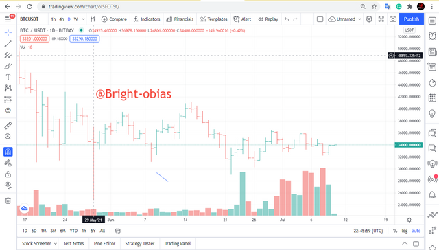
This kind of chart is similar to that of candlestick the difference is the lines, although they alter the same information but in deferent ways. Based on the image, bar chart consist of vertical and Horizontal lines showing the Open, High, Low and Closing Price of the asset. Just like the candlestick that has a time frame, bar charts also have trading time frames where traders decide which time to monitor, they can either go with the 1-minute time frame chart which shows a new price every minute.
Investors can also make use of these charts but no under the 1 minute time frame. The bar has a weekly chart that an investor can use to analyze in other to invest long-term investment. Most investors/traders choose this chart because of its ability to show open, high, close, and low prices in a given time frame.
On the above image, you see some long vertical bars, it tells you that the market was in high volatility, as such increased during that session. conversely, when it has small bars, it is simply saying that there was little pressure.
Line Charts
Line charts are kinds of charts that display the historical price of assets over time, and it the most popular chart, it shows the price on both yearly, weekly, and daily, and even minutes. It displays the closing price at a particular time frame. See the screenshot below.
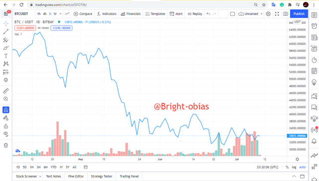
Line charts, the time frame you decide to trade with depends on the trading strategy. As a trader, you will want to focus on the minutes or hours trading, and the lines chart is suitable for such trading as it displays both minutes, hours, weekly, monthly, and yearly time-frame. Investors can also use these charts to analyze the trend, for investors that want to go long-term, the monthly or yearly time frame chart will be suitable.
Always note that line charts can come in different scales which are: linear and logarithmic, these two scales have different tasks to carry out on the line charts. The linear chart divides the price into equal pieces, while the logarithmic, the prices are been scaled according to tho the % changes.
What it means is that, if two price changes are the same on a definite value but still equal in %, they would be represented in the log scale as the same vertical shift. On the linear chart, you can understand the movement of price while the logarithmic makes it easier to read charts and understand the trend.
Explain why the Japanese Candlestick chart is mostly used by traders.
There's no doubt what the candlestick does in the financial market. Candlestick is very important because of the following few reasons.
They help a trader to interpret what the market is saying, remember I said earlier that if an individuals find him/herself in a market where buyers and sellers speak an unknown language, do you know that you as a trader will be lost? Yes! this is because you are not understanding what they are saying. But with a candlestick chart, you can trade effectively in the market as it helps to interpret the language of the market.
It is also important because it can be used alone, although it advised you attach with other technical analysis tools like moving averages, and momentum oscillators.
The emotions involved in the financial market are always, the fear of losing money, greed, and hope. With candlestick, you can analyze these factors thereby showing you how the market players(buyers & sellers) interact with each other.
Describe a bullish candle and a bearish candle identifying its anatomy
Although I have briefly explained the candlestick anatomy, for this very question, I will be explaining the bullish candlestick, and I will also indicate a bullish & bearish candle.
Bullish Candle
Bullish candles represent the buying signals. It tells a trader that the market is about to enter a buying session after some decrease in the trend. It consists of both the opening price, closing price, high and low of the day's trade. let's see the bullish body below.
The above image is the is showing the anatomy of a bullish candle. a bUllish candle is always on every candlestick chart, the ability to read them determines your winning percentage. whenever you see it in the charts, it tells you about buyers, and the more buyers the higher the price of that crypto asset, let's see the BTC/USDT chart below.
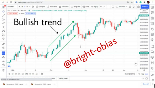
In the above image, you can see that the constant increase of the bullish candle has increased the price of BTC/USDT to a certain amount in that given time frame.
Bearish Candle
The bearish candlestick is very common on candlestick trading charts, spotting them in the market charts doesn't require any critical thinking, they appear often in the market because of changes of sentiments from traders. Let's take a look at its anatomy.
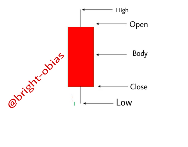
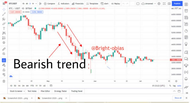
The above image describes the body of a bearish candle. Like the bullish candle, It consists of both the opening price, closing price, high and low of the day's trade, and whenever it appears in the market, it tells you of selling pressure. The more bearish the market goes the lower the price of that crypto asset in the market... Let's see the image below. it shows a downtrend which tells depicts that sellers are in charge of the market during that session.
Conclusion
In conclusion, I want to especially thank the prof @reminiscenc01 for bringing up this topic, it was really a wonderful time exploring the candlestick, and to the best of my knowledge, I want to say that the candlestick chart is the best trading chart for both beginners and advanced trader, although, other trading charts like the bar chart that we saw about is truly a great chart for traders that would want to technically.
Also having the understanding that despite the information that a candlestick chart will display, it is advised we use other trading indicators in combination with the candlestick chart that will enable you to trade effectively. Thank you for reading through to the end.
Hello @bright-obias, I’m glad you participated in the 2nd week of the Beginner’s class at the Steemit Crypto Academy. Your grades in this task are as follows:
Observations:
This is correct. The size of the candlestick body and the closing price determines the momentum in the price of an asset.
Recommendation / Feedback:
Thank you for your in-depth explanations and research on Japanese candlestick chart. Thank you for participating in this homework task.
Thank you prof for your wonderful observations and ratings, I really enjoyed the lecture.