Steemit Crypto Academy | Season 3 | Week 2 - Homework Post For Professor @reminiscence01
This is yet another week of the Steemit Crypto Academy and I am very delighted to be part of the academy as I present my homework post in response to professor @reminiscence01 lecture about introduction to charts. Let's dive in:
Explain the Japanese Candlestick Chart. (Chart Screenshots required)
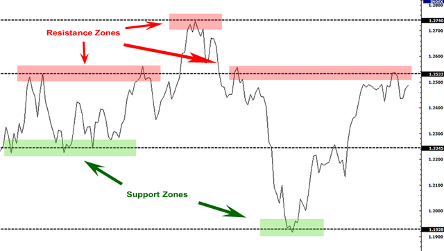
A trading chart in simple terms refers to a graphical representation of price movements and activities of a specific asset for a given period of time. These charts give investors precious information on how the price change over time and a clear record of the asset’s performance. These charts include the line charts, candlestick charts, volume charts, bar charts, mountain charts, volume charts, among others.
.jpg)
Munehisa Homma is credited with developing Japanese candlesticks in 17th century, Japan. He is said to have studied and analyzed the price patterns, weather conditions, and trade the psychology of the proceeding ten years before starting to trade. This has long taught traders that studying the past can broaden their knowledge about the future price. The use of candlestick charts a principle developed by one of the world’s first market gurus Homma was first introduced to the West in 1985 and since then the candlestick charting and analysis method became one of the most popular trading strategies in financial markets.
Candlestick is basically a rectangle with the opening price and the closing price at either end. The rectangle is called the candlestick body comprising of the high and low price connected to it as vertical lines called the shadows. If the close is greater than open, it means that the price has risen over the period and the candlestick has a green body. If the close is lower than the open, it means that the price has fallen over the period and the candlestick is represented in red. This color change makes the candlestick more appealing and easier to be interpreted by the trader.
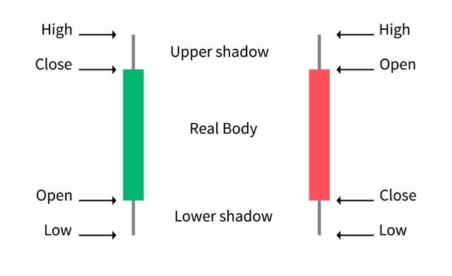
The Japanese candlestick method of viewing charts is one of the most popular methods of looking at charts. One candlestick shows the open, high, close, and low points of a price at a given time frame. The shadow shows the distance between the high and low and it also measures the distance between open and close. When the close is higher than the open price, then the body of the candlestick is green which reflects a positive sentiment in the markets and when the close is lower than the open price then the body of the candlestick is red which reflects a negative sentiment in the market.
Describe any other two types of charts. (Screenshot required)
There are various types of charts that traders use to analyze the financial markets. In this sense, I will talk about the following;
Line Chart:
This refers to price charts that connect the closing prices of a given market over a span of time. Many traders who trade the stock market prefer to use the line chart to see the price movements because they consider the closing price to be the most important price of all.
Despite everyone using the Japanese candlestick chart to analyze the financial markets, the simplest kind of chart contains only a single kind of line which helps to filter out the market noise.
Basically, the line chart consists of only the closing price for each period which offers traders a clean easy to understand the view of the market. It is one of the simplest and easiest charts to be understood by a beginner the fact that they give a bigger picture of the market. On the other hand, the line chart lacks a lot of information that bar charts and candlestick charts show, for instance, the open, the high, and the low price and for this reason, they tend to be misleading.
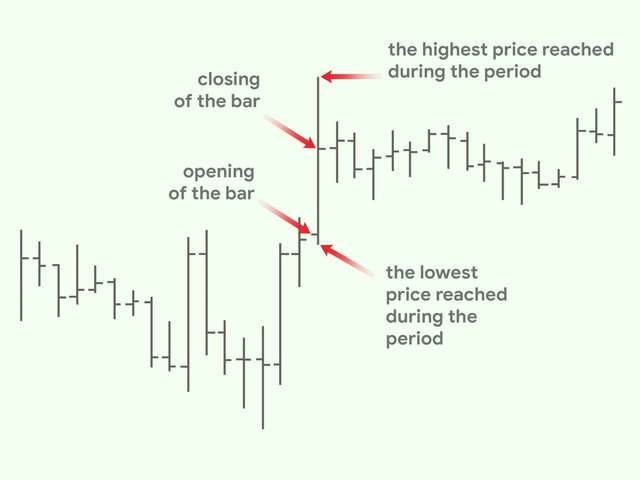
Bar Chart:
This is a technique used to study the markets comprised of a vertical line that represents the price range of a specific time frame. The time frame depends on the charts with the most popular namely; hourly, daily, weekly and monthly. The highest point on the bar acts as the high price of the financial asset and the lowest point acts as the low price. The interval between these two points is the price range. A tick to the left represents the opening price and a tick to the right represents the closing price hence the vertical line in conjunction with the left and right ticks is called the bar.
In your own words, explain why the Japanese Candlestick chart is mostly used by traders.
The Japanese candlestick chart is one of the most used charts by traders to analyze the future price of an asset because of the following reasons;
Describe a bullish candle and a bearish candle identifying its anatomy.
Each fully formed candle represents the price action of a specific time period, for instance, if a trader is looking at a 30 minutes chart then each fully formed candle represents 30 minutes of the price action.
Bullish Candle:
A bullish candle simply shows that the price has increased over the time period. It represents the candle that had stayed in a downtrend reverses and moves into an uptrend at a point known as a bullish reversal.
In a downtrend at a good support point, the price opens and moves too close below itself respecting its previous trend but at one important point, there will be a retracement for the fall making the price rise back up. It rises in such a momentum that price closes over its open which means that at this important point bulls start this as the best discount price to enter the trade. Buyers become so aggressive because the price rose and closed at a price that is greater than the open.
Bearish Candle:
A bearish candle simply shows that the price has decreased over the time period. A bearish candle is the exact opposite of a bullish candle which implies that the price over time of an asset is going lower and lower.
In conclusion
The Japanese Candlestick Chart is currently the most used chart in the financial market since it provides a detailed view of the financial market and very easy to understand by newbies. Therefore I would like to thank professor @reminiscence01 for such a wonderful lecture which has greatly improved my understanding of trading charts in the financial market.
You have been curated by @yohan2on, a country representative (Uganda). We are curating using the steemcurator04 curator account to support steemians in Africa.
Keep creating good content on Steemit.
Always follow @ steemitblog for updates on steemit
.