Crypto Academy / Season 3 / Week 2 - Homework Post for Prof. @reminiscence01
Hello everyone. This is my homework task submission for S3/W2/Beginner's: Introduction to Charts by Prof. @reminiscence01.

Designed on Canva
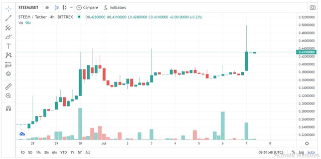
1. Explain the Japanese Candlestick Chart? (Chart screenshot required)
Japanese Candlestick Chart is one of the most popular tool used by traders for technical analysis, i.e. to monitor the price movement of securities, derivatives or currencies.
Candle stick chart source
Today, this methodology is widely used by traders for analysing financial markets. A Candlestick represents the interaction between buyers and sellers graphically. The colour codes in a candlestick indicate price patterns and guides a trader in long/short term price predictions.
It was Munehisa Homma, a rice trader from Japan who is credited with the invention of candlestick charting. Homma observed that the rice market was influenced by the emotions of traders alongside the demand-supply cycle. Using this tool he was able to dominate the rice markets.
With time, this popularity of the candlestick chart grew manifold. This technique was popularized in the western world as ‘Japanese Candlestick Chart’ by Steve Nison, who learnt it from Homma.
2. Describe any other two types of charts? (Screenshot required)
A chart is a graphical tool used primarily by traders to analyse price fluctuations of commodities over time. Among the different types of charts that are in use today, here’s a brief overview of the two of them.
- Line chart:
This is one of the most basic form of chart where price values are plotted against time interval. The resultant chart is obtained by joining the points in a straight line.
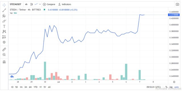
Line chart source
Line charts are ideal tools for amateur traders because they are simple to understand and analyse. They only represent the closing price. While for experienced traders, this might be a little outdated since it doesn’t represent the opening, high and low prices.
- Area chart:
An Area chart is similar to a line chart. Here also, the basic price denoting tool is a straight line joining the points of Price v Time changes. The major addition here is that the AREA between the value line and the zero line is coloured. This way the chart draws visual attention of the user as it puts emphasis on the total area to show magnitude of price fluctuation.
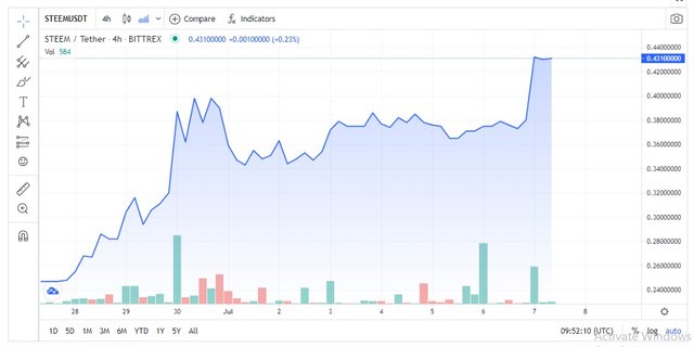
Area chart source
Again, this is not an ideal choice of chart for experienced traders because it has no scope to take into account the sharp fluctuation of values in between the straight line. Thus it can be misleading at times.
3. In your own words, explain why the Japanese Candlestick chart is mostly used by traders.
Easy to understand: Traders can determine the current state of the market, either it is falling (bearish) or rising (bullish), simply by observing the colour and length of the candlesticks.
Detailed insight: The candlestick chart also helps traders to analyse whether an uptrend is actually a bullish momentum or just a bearish spike.
Decision making: Based on the candlestick patterns at a particular moment, traders can decide whether to go long or short, enter or exit the market.
Successful History: With a successful history of over 200-years since its inception, the Japanese candlestick chart has several features compared to other charts which gives traders an upper hand in market negotiation.
4. Describe a bullish candle and a bearish candle identifying its anatomy? (Screenshot is required)
Let us have a brief overview of candlestick anatomy before we analyse a bullish candle and a bearish candle.
Candlestick anatomy
A candlestick chart is a graphical tool used to represent price fluctuations. Each candlestick represents price variation at a particular time intervals (may be minutes, hours, days).
There are four parts in a candlestick representing different price features. They are: Open, High, Low and Close.
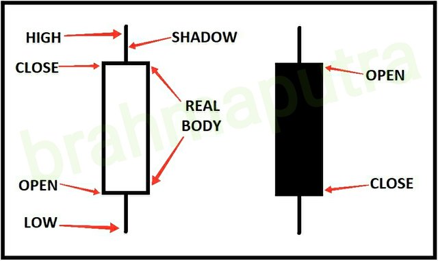
- Open: This part represents the opening price within the selected time frame. The price starts to build upon this opening price in the candlestick.
- High: This part represents the highest price valuation within the specified time frame.
- Low: This part represents the lowest price valuation during the selected time frame.
- Close: This part represents the closing price within the selected time frame. This is the last price before the candle’s longevity ends.
Two other essential parts of a candlestick are: shadow body and real body. While shadow body represents the unsettled price movements, areas that price moved though but couldn’t close, the real body represenst the extent of price fluctuation within the selected time frame. In other words, it is the entire stretch between Opening Price and Closing Price.
Candlestick Analysis:
From common understanding, we know that the price of a commodity fluctuates either UP or DOWN. The candlestick chart may be evaluated based on such price movements.
A Bullish candlestick represents an increase in price values. Such a continuity is termed as Bullish trend.
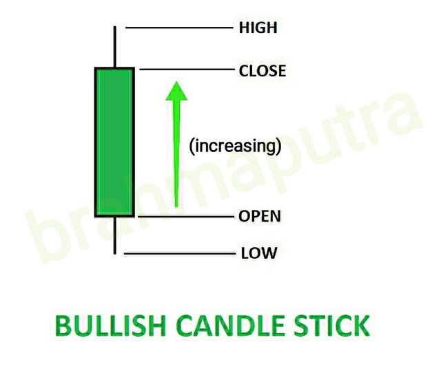
- Here closing price settles and closes above the opening price.
- Consequently, price moves upwards within a specified period.
A Bearish candlestick on the other hand, indicates drop in prices. Such a continuous downtrend is called Bearish trend.
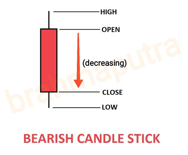
- In this case, closing price settles and closes below opening price.
- This means the price of a commodity fell in a specified time interval.
Conclusion:
The knowledge of charts is very much necessary to set foot in the world of crypto trading. As a newbie myself, I had no idea what is a chart, what are its types. The Japanese Candle stick chart is indeed an essential tool for traders. This lesson has been a great value addition to my crypto learnings till now. I would like to thank Prof. @reminiscence01 for his elaborate and easy-to-understand class notes.
Unless otherwise stated all infographics are my Original creations
All the best for your homework tasks
Thanks a lot.
#affable
Hello @brahmaputra. I’m glad you participated in the 2nd week of the Beginner’s class at the Steemit Crypto Academy. Your grades in this task are as follows:
Observations:
That's true. The colour if the candle is just to differentiate between the bullish candle and the bearish candle. But more emphasis should be layed on the candlestick dynamics.
Recommendation / Feedback:
You have done a great work. Thank you for participating in this homework task.
Thanks for the evaluation and the suggestive remarks Prof.