Steemit Crypto Academy Season 3 Week 2 - Beginner's Course | Introduction to Charts

Dear Steemians,
I am glad to be part of this week's lesson. Thanks to Professor @reminiscence01 for giving us this excellent lecture on Introduction to Charts. After going through the notes and researching this week's topic, I have decided to review what I have learned in my homework task.
Explain the Japanese Candlestick Chart? (Chart screenshot required)
Japanese candlestick Chart
The Japanese candlestick chart is a technical analysis price chart demonstrating the opening, closing, high and low price points of a particular asset at a specific time. With this information, a trader can also analyze the market to know the best time to enter and exit the market. This tool was invented some centuries ago by a Japanese Rice merchant; it was widely used by Western traders which one of them is a broker called Steve Nison in the 1990s.

The tool has different shapes depending on the price action of the asset. As the price, movement of the asset keeps on changing daily; different shapes are formed; these give rise to the wicks or shadows; these are lines located above or below the body.
The common anatomy of the Japanese candlestick has two bars,
- The green bar, the green bar representing the upward movement of the value of an asset in the market. On top of the green bar is a "Close," and the bottom indicates an "Open."
- The red bar shows the downward movement of the value of an asset in the market. The button of the red bar indicates close, and the top indicates the open.
Both the Red and Green bars of the candlestick can be seen having the wick, also known as "the shadow," on top of the candle. This wick gives traders to interact with the market since it gives vital information on the price of an asset at a particular time. For instance, when the wick is high, it indicates high volatility in the market which a low wick also indicates low volatility in the market.
Candlestick patterns
The pattern of a candlestick is the number of the sticks that make up the pattern; based on this; there are 3 main types of candlestick pattern,
- Single candlestick pattern
- Double candlestick pattern
- Tripple candlestick pattern
The most commonly used patterns are,
Doji pattern. This Japanese candle has the closing or opening value is equal to or very close to that of the last candle. This makes it have a developed body.
Hammer pattern. This candle has its lower wick, which has a length double the length of the candle's body. It appears when the market is trend is bearish.
Marubozu PatternThis candle is very strong, which it hardly had a which. Use to determine an upward or downward trend.
Engulfing Pattern This candle type has 2 candles that can be bullish or bearish.
Describe any other two types of charts? (Screenshot required)
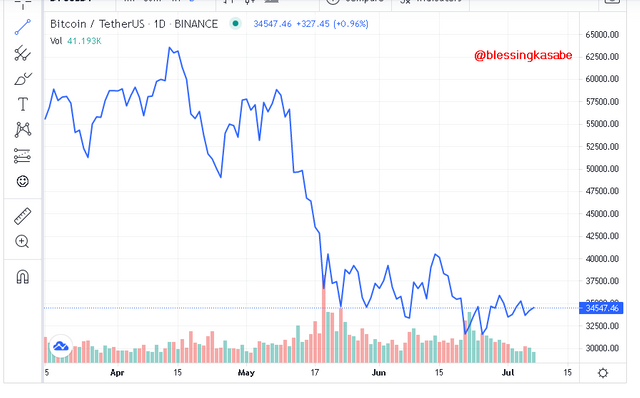
- Line charts
The line chart is one of the charts used to analyze the price of an asset; traders use this chart to analyze the long and short-term trends of the price movement of an asset in the market. This chart is basic, and it's easy for people to read, but it lacks certain features.
- Bar chart
This chart has many bars that indicate the candle's nature; these can be Open, High, Low, and Close. This provides traders with a lot of data on an asset at a particular time. The bar in the bar chart is plotted on a graph so that the vertical axis indicates the asset's price, and the horizontal also indicates the time frame.
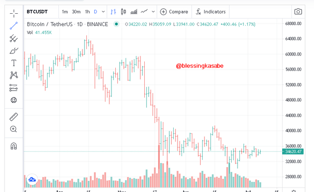
The bar chart has a lot of extra features as compared to the line chart. This makes it a little bit complicated. This comes with extra tools to help analyze the trend of an asset.
In your own words, explain why traders mostly use the Japanese Candlestick chart.
As the question clearly stated, the Japanese Candlestick stick is the most popular and widely used for technical analysis. This gives more information on an asset because it focuses mostly on the Open and Close of the chart rather than the Highs and Lows.
One of the factors for its widely used is its easy interface for reading and interpretation the trends of an asset; this helps traders predict the trend of the market.
Certain bullish and bearish swing systems are shown in the Japanese candlestick charts, which are not present in other charts such as Line, bar charts, etc.
Describe a bullish candle and a bearish candle identifying its anatomy? (Screenshot is required)
- Bullish trend Candlestick
A candle is said to be a bullish candle when the Market price closes higher than its initial opening point; this means that the market value or price keeps on moving or the price is in the upward trend. Traders use this candle type to analyze and know when an uptrend is likely to occur in the market. When traders keep on buying the asset, the price will increase; this will cause the bullish candle to be shown when the "close" is at a higher level than the "open," at this state, the candle becomes mostly green.
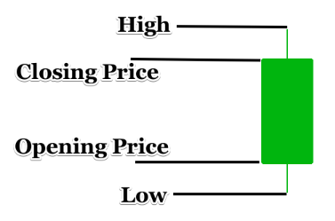
• Anatomy of Bullish Japanese candles.
[source(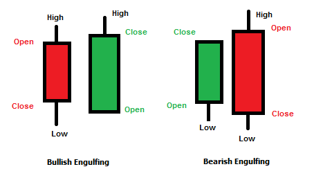 )
)
Open. This is found at the bottom of the bullish candlestick. This represents the first price of an asset for a particular time frame.
Close. It is also seen at the top of the candlestick. This represents the last price of an asset in the market over a given timeframe.
High. It is also seen at the top of the candlestick. This represents the highest price of an asset over a specific time frame.
Low. It is also seen at the bottom of the candlestick. This feature shows the lowest price of an asset over a specific time frame.
Bearish trend Candlestick
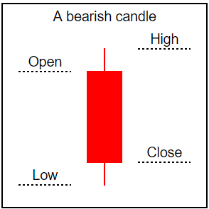
As I have explained the bullish candlestick, the Bearish candlestick is the opposite of the Bullish. In Bearish candles, the market value of an asset tends to be in the downward trend, which arises when a lot of traders seels off that particular asset. The candle begins to close lower than its opening points.
source
Anatomy of Bearish candlestick.
Open this is seen at the top of a bullish candlestick, and it represents the first price of an asset at a given timeframe.
Close it is seen at the bottom of a bullish candlestick, and it also represents the last price of an asset at a given timeframe.
High this is seen at the top of a bullish candlestick, and it represents the highest price of an asset at a given time frame.
Low it is seen at the bottom of a bullish candlestick, and it also represents the price of an asset at a given time frame.

Conclusion
Thank you, professor @reminiscence01, for broadening our scope of knowledge about cryptocurrency. I have really learned a lot from this week's lecture hope to learn more from you.
The Japanese Candlestick is well known and widely used tool for the technical analysis of an asset due to its unique features.
Its simple features make it easy to use with little guidance, making it traders' favorite when it comes to technical analysis since traders can use it to minimize losses and maximize profits.
Thank you for taking your time to read my post
Hello @blessingkasabe, I’m glad you participated in the 2nd week of the Beginner’s class at the Steemit Crypto Academy. Your grades in this task are as follows:
Recommendation / Feedback:
Thank you for participating in this homework task.