Effective Trading Strategy using Line Charts -Steemit Crypto Academy | S6W1 | Homework Post for @dilchamo

Introduction
Before I define Line Charts, let's look at what charts in general are?. Charts refers to the graphical representation for the visualization of data whereby the data is represented by symbols. These symbols include lines, slices, bars, etc. Lines are represented in a line chart, slices in a pie chart, and bars in a bar chart. Now after we have gotten the definition for Charts, let's look at what line charts are.
Line Chart as the name suggests refers to a single line representation of a chart showing a representation in a 2D data format of the price of assets. Line charts represent an asset's historical price in a series manner with a continuous line formation. The line chart is usable for all kinds of time frames and it is the basic chart that is mostly used in terms of finance. The Line chart is also used in detecting the closing price of assets over time. They mostly use the day-to-day timeframe.
Line charts provide a clear visualization to traders about where the price of a security has moved to within a given period of time. Line charts also help in reducing the noise present in less critical times during a day trading, these noises include high, open, and low prices of an asset. Line charts can be used with other charts so as to clearly see or analyze crypto assets technically without many false indications.
There are three different types of line charts and they include; simple chart, multiple line chart, and a compound line chart. The simple line chart indicates a relationship between two different variables, i.e. the closing price of a security and the day of the week. The multiple line chart refers to the line chart that indicates the relationship between a line chart and two or more lines. It shows or displays two or more variables that alter within a particular time period. Lastly, the compound line chart is being utilized when there is a possible subdivision of information into different types by displaying the total data sets of data plus the make-up or composition of the different types of data.
The following includes some of the uses of line charts and they are;
Line charts are sued in representing data for a continuous period of time.
Line charts are used in depicting the trends of an asset over a period of time.
Line charts are used in representing the historical data or price of an asset by using a single continuous line.
Line charts are used in depicting the closing price of an asset.
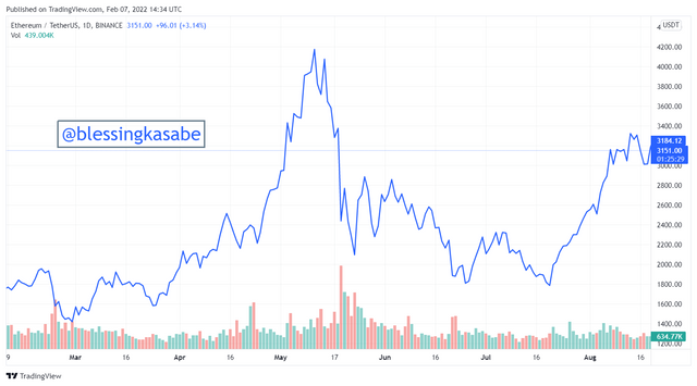
Line charts are used in depicting key support and resistance levels of assets.
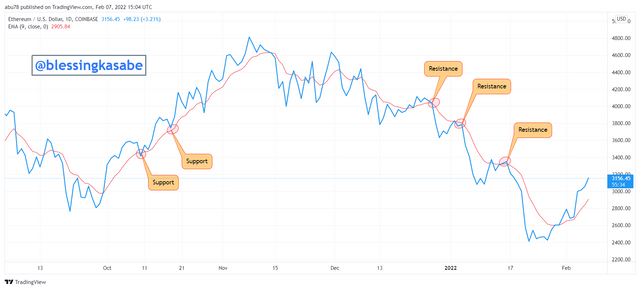
Before I demonstrate how to identify resistance and support levels using the line chart, I would like to briefly explain these two terms (support and resistance). Support is the price level of an asset whereby its price remains without falling below that level for a period of time. Support level of an asset is created during the times when buyers are entering the market when they see the price of the asset dipping to a lower price than before. The support level can be indicated on a chart by drawing a line to join two obvious swing lows of the price of the asset. Simply, support can be defined as the level or the point at which an asset's price struggles to fall below that point over a specific period of time. The chart below indicates an example of a support level on a line chart.
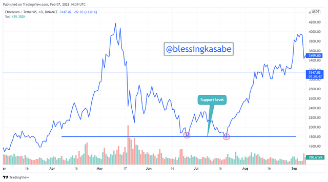
On the other hand, Resistance, refers to the price level of an asset whereby its price remains without rising above that level for a period of time. The resistance level of an asset is created during the times when sellers are leaving the market when they see the price of the asset surge to a higher price than previous highs. The resistance can be indicated on a chart by drawing a line to join two obvious swing highs of the price of the asset. Simply put, resistance can be defined as the level or point at which an asset's price struggles to rise above that point over a given period of time.
The chart below indicates an example of a resistance level on a line chart.
Now, coming to identifying support and resistance level using the line chart, this is simply done by joining the previous swing lows and swings highs with a horizontal line respectively. This means that to identify support levels on a line chart, a horizontal line is drawn from the previous lows to the current lows or by joining two swing lows together by a horizontal line. Similarly, to identify resistance level on a line chart, a horizontal line is drawn from the previous highs to the current highs or by joining two swing highs together by a horizontal line. These can be seen from the above charts shown.
Line Charts
Line chart as I already mentioned above in this article, refers to a 2D representation of the price of an asset in a single continuous line over a given period of time. Line charts are easy and simpler to read and understand. Line charts only depict the changes that have occurred in the closing price of an asset over a given time. Line charts do not provide more information on the price of an asset. The line chart provides a vivid visualization of where the security price of an asset has traveled over a specific period of time. Line charts help in reducing noise in times of the less critical trading day.
Line charts are good in use for long-term traders that are more concentrated on the direction in the price of the asset.
Candlesticks Charts
Candlesticks charts, on the other hand, refer to the type of chart that is to show the high, low, and closing prices of a security in technical analysis over a given time period. This type of chart was originated the rice merchants and traders of the Japanese to follow the market price of assets as well as the daily momentum. As a result of how it was originated, it is given the name "Japanese Candlesticks". The Japanese candlesticks depict other valuable information about the price of an asset which includes the highest price for the day, opening or closing price of the asset, and lowest price of the day.
Whilst the line chart provides only the closing price of a security at a given period of time, the candlesticks provides five different valuable information about the price of an asset, i.e. closing price, opening price, low price, high price, the direction at which the price of the assets is moving. Candlesticks are used for identifying chart patterns by traders. Candlesticks are used in determining the pressure on buyers and sellers in the market. Candlesticks are difficult to read as compared to line charts.
As we all know, there is no trading strategy that does not require an indicator to produce accurate signals. With line chart trading strategy not being left out, it also requires an indicator to produce a quite accurate and convincing signal and also prevent or avoid false signals. I would be using the Moving Average (MA) with the line chart in this question to determine trends or patterns on crypto charts.
The Moving Average indicator is a type of indicator that follows trends/patterns and is represented by a single line on the chart. The Moving Average is represented by a single line just like that of the line chart making it a good and suitable indicator to use with the line chart in determining trends of assets.
The Moving Average indicator serves as the dynamic support and resistance on the crypto chart. Trend reversal of the price of an asset is determined when the price of the asset crosses above or below the Moving Average indicator. When the price of an asset trades closer to the Moving Average indicator then it indicates a weaker trend and when it trades farther away from the Moving Average then this indicates a stronger trend of the asset's current price movement. Using the Moving Average indicator on a line chart would help to produce close accurate and good trading signals on crypto charts. Now, let's look at cases of identifying support and resistance level by combining the MA on the line chart.
Identifying Support, Resistance, trends, and trend reversal using Moving Average on the line chart
From the start of answering this question, we got to realize that the Moving Average does serve as a dynamic support and resistance level on the crypto chart. The price of an asset moves back to the Moving Average during times of strong trending in the market to find support and resistance before the original trend further continues and when this occurs, it grants the opportunity for traders to enter a trade with respect to the direction of the original trend. A good example is shown below in the chart.
From the ETHUSD chart shown above, we can see that the support was formed during an uptrend when the price of the asset moved back down to the Moving Average indicator to get support and then continue with the uptrend. Similarly, the resistance was also created during a downtrend whereby the price movement of the asset moved up towards the Moving Average to get resistance and then continue its downtrend as shown above.
Now let's look at how to identify trends and trend reversal as well using the Moving Average on a line chart.
In identifying trends, when the price of the asset is trading below the Moving Average indicator then it indicates a downtrend. Similarly, when the price of the asset is trading above the Moving Average indicator then it indicates an uptrend. When there is a breakage of the Moving Average line either above or below it then this indicates a trend reversal and that is when traders take entry trade position. A good example of is shown below in the following charts.
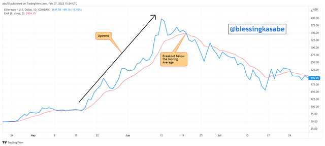
We can clearly see from the above ETHUSD chart that there was a strong uptrend when the line chart is seen to be farther up away from the Moving Average indicator which indicates an uptrend. We also experienced a breakout in the price of the asset when the price of the asset crossed below the Moving Average indicator showing a possible trend reversal in the downward direction.
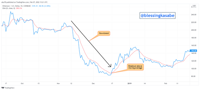
Similarly, we can clearly see from this ETHUSD chart also that there was a strong downtrend when the line chart is seen to be closer to the Moving Average indicator which indicates a downtrend. We also experienced a breakout in the price of the asset when the price of the asset crossed above the Moving Average indicator showing a possible trend reversal in the upward direction.
The understanding of bullish and bearish trends in the market is one of the vital criteria for a trader to know. understanding them helps a trader to know when to enter and exit trade positions. Knowing the direction of the trend of an asset before entering or taking a position would help one to avoid losses and obtain profits.
I have already explained to the layman understanding how to identify bearish and bullish trends as a matter of that I would go straight to how to obtain bearish and bullish trading opportunities with the line chart. First of all, let's look at the bullish trading opportunities.
The Bullish Trading Opportunity using a line chart
As I already explained earlier, during an uptrend the price of the asset moves above the Moving Average and when there is a breakage of price above the Moving Average then this signals a trend reversal from a bearish to bullish in the market, and as result traders take advantage of this period and enter into trade. A good example of a bullish trade opportunity is indicated in the chart shown below.
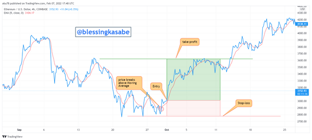
From the ETHUSD chart shown above, the line chart broke the Moving Average line upwards which signaled a buying opportunity or indicated that buyers are now the influencer of the price of the asset. Immediately after the breakout, I placed the buy entry, and take profit was placed or set at the previous highs whilst stop-loss was also placed or set at just below the previous low.
The Bearish Trading Opportunity using a line chart
As I already explained earlier, during a downtrend the price of the asset moves below the Moving Average and when there is a breakage of the price below the Moving Average then this signals a trend reversal from bullish to bearish in the market, and as result traders take advantage of this period and enter into exit trade. A good example of a bearish trade opportunity is indicated in the chart shown below.
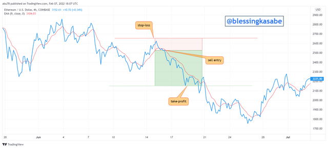
From the ETHUSD chart shown above, the line chart broke the Moving Average line downwards which signaled a selling opportunity or indicated that sellers are now the influencer of the price of the asset. Immediately after the breakout, I placed the sell entry, and take profit was placed or set at the previous low whilst stop-loss was also placed or set at just above the previous high. The risk to reward ratio was 1: 3.
In this section, I would elaborate on some of the advantages and disadvantages of line charts, but first of all, we would look at the advantages of a line chart.
Advantages of Line Chart
The line chart as we said earlier is very good and suitable for novice traders
The line chart is easy to read and interpret on crypto charts
It is very good and suitable for long-term traders in analyzing the trend in the market.
The line chart is good in reducing noise from the market thereby smoothing trading signals on crypto charts.
Furthermore, the line chart aids traders to spot and identify support and resistance levels easily on crypto charts.
It is also usable or compatible with any timeframe on crypto charts.
The line chart when used with other indicators helps to provide accurate and perfect results of signals.
The line chart also provides or displays hidden information from other chart styles. It also provides unique breakouts that can be obviously spotted easily.
Disadvantages of Line Chart
Line charts require previous data levels in order to display information about an asset in the market.
The line charts don't display all important activities and reactions to fluctuations in the price of an asset such as gaps.
The line chart depicting only the closing price of an asset is not enough signal to determine and predict the movement of an asset's price in the crypto market.
Because the line chart is appropriately used for higher timeframes, it produces a noise when used with lower timeframes and as result makes it difficult to be read by traders to make decisions on when to enter and exit trades.
The line chart doesn't reveal important information such as high price, low price, and opening price, of a crypto asset but rather only displays the closing price of the asset.
- The line chart doesn't display the current close position of an asset when used alone.
Conclusion
In conclusion, I would like to briefly summarize what we have done so far in this article. To set the ball rolling, we looked at the concept of line charts and some of their uses as well in the crypto world. Furthermore, we looked at how to identify support and resistance points using the line chart by demonstrating that on crypto charts.
Again, we looked at some of the differences between line charts and candlesticks charts by showing examples on crypto charts as well. In addition, we discuss how to use other suitable indicators with the line chart. In doing so, we used the Moving Average indicator to do that. We showed how to identify support, resistance, trends, trend reversal on crypto charts by using the Moving Average indicator with the line chart.
Moreover, we discussed the understanding of the formation of bullish and bearish trends as well as their trading opportunities using line charts on crypto assets. Finally, we looked at the advantages and disadvantages of using line charts on crypto assets.
I would like to say a very big thank you to professor @dilchamo for this wonderful lecture. I have really understood the concept of "Effective Trading Strategy using Line Charts".
Thank You.