“Perfect Entry” Strategy using Stochastic Oscillator + 200 Simple Moving Average - Crypto Academy / S5W3 - Homework post for @ lenonmc21


State in your own words what you understand about the Perfect Entry Strategy (Place at least 2 examples on crypto assets)?
The "Perfect Entry" strategy is a style of strategy that gives trader the best time to enter the market. It is composed of three different element. They are:
Candlestick on a Trading chart200 Moving Averages IndicatorThe Stochastic Indicator
These three elements combined together give traders the best entry points as well as the best exit points.
The Candlestick is used to show the current movement of the market through its structure or the formations that it showcases when working with the strategy. The candlestick through the market structure or formations shows when the market is in an uptrend or in a downtrend.
The 200 Moving Averages Indicator gives a broader overview of the movement of the market. The indicator takes the average of the last 200 candlesticks that are formed on the timeframe being used. The indicator also shows when the market is in a downtrend and when the market is in an uptrend. This is shown when the candlesticks cross over the 200 MA to the upside or to the downside. More importantly, the 200 MA is used in conjunction with the candlestick market structure or formation to give a clearer view of the market's current trend and also, when the candlestick touches the 200 MA and then continues in its direction. This touch is very critical in this strategy as shows how the candlestick behaves when it touches the 200 MA indicator. The 200 MA also in this sense acts as dynamic support or resistance trendline.
Finally, the Stochastic Indicator acts as the signal for the entry and exit of the market. When the indicator reaches certain levels it signals when a trader should place a position and it also gives the trader an idea of when to exit the position.
The "Perfect Entry" strategy is somewhat of a Trend Continuation strategy because we have to confirm that the trend would continue in the current direction when we are operating with the strategy.
Together the three elements must be used harmoniously to achieve greater success. So, therefore, for a trader to successfully execute this strategy they have to follow the following conditions very strictly:
Find out the prevailing market trend.
Make sure that the candlesticks are at the confluence with the 200 moving averages indicator.
See to it that the Stochastic Oscillator is at the extreme (Oversold and Overbought) conditions.
The market entry follows after the first two conditions have been met or else, the strategy is to be redone.
Below are two charts with illustrations for the 3 elements found in the "Perfect Entry" strategy. The first chart is for a bullish market and the other chart is for a bearish market.

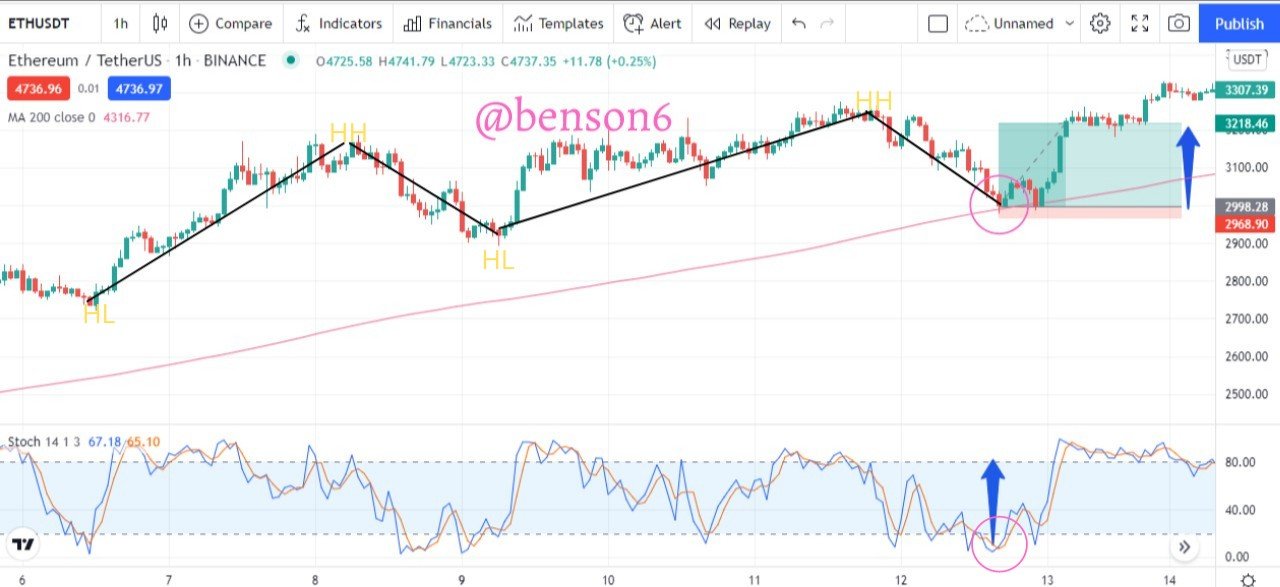
In this chart, we can see how the market is moving. The price was on a steady rise as depicted by the structure that the candlestick formed. The candlestick formed a series of higher highs (HH) and higher lows (HL).
We can also see the 200 moving averages indicator. It is the purple line below the candlesticks. We can see how together with the candlestick pattern we can be sure that the market is in an uptrend. Also, we can see when the candlestick touched the 200 moving average lines and bounced back up as shown by the black arrow.
Finally, we can see the Stochastic indicator which is at the bottom of the chart. We can see how it moves up and down between the band (extreme points) in the indicator. We can also see the signal that it gives at the point where the candlestick touched the 200 moving averages line. The signal is indicated by the purple circle shape.

In this chart, we can see how the market is moving. The price was on a steady decline as depicted by the structure that the candlestick formed. The candlestick formed a series of lower lows (LL) and lower highs (LH).
We can also see the 200 moving averages indicator. It is the purple line below the candlesticks. We can see how together with the candlestick pattern we can be sure that the market is in a downtrend. Also, we can see when the candlestick touched the 200 moving averages line and bounced back down as shown by the black arrow.
Finally, we can see the Stochastic indicator which is at the bottom of the chart. We can see how it moves up and down between the band (extreme points) in the indicator. We can also see the signal that it gives at the point where the candlestick touched the 200 moving averages line. The signal is indicated by the purple circle shape.
Explain in your own words what candlestick pattern we should expect to execute a market entry using the Perfect Entry Strategy.
The candlestick pattern we should expect is a series of movements that indicate if the market is currently in a bullish direction or in a bearish direction. Also when spotting the candlestick pattern, we should look at the candlestick that is just above or below the 200 MA indicator.
In the bullish direction, the candlestick should move in a series of higher highs and higher lows as stated above. The higher highs are usually followed by higher lows. The higher highs are an indication that the price is in a bullish trend and that the bulls are dominant during this time, and is shown in the momentum of the price moving upward after every retracement or pullback. It is these retracements that cause the higher lows.
At the same time, during the bullish movement, as the price experiences a pullback of price, a candlestick would touch or be above the 200 MA. This candlestick is a small bearish candlestick with wicks above and below it. This signifies that momentum for the downtrend isn't strong enough to push the price downwards and form a new trend. Also is shows that the market is set to continue moving in its current direction (uptrend).

The chart above shows the bullish candlestick pattern and the touch of the candlestick on the 200 moving averages line. As mentioned earlier, the price moved in an uptrend as shown by the series of higher highs and higher lows denoted by HH and HL respectively.
At the same time, we can see how the price touched the 200 moving averages line as it was moving upwards. This touch is shown by the purple circle shape. Inside the purple circle shape, we can see a small bearish candle with wicks above and below it. This shows that the initial enthusiasm of the bears wasn't strong enough to push the price down further and break past the 200 moving averages line. Afterward, the price continued in its upward movement.
Also, in the bearish direction, the candlestick should move in a series of lower lows and lower highs as stated above. The lower lows are usually followed by lower highs. The lower lows are an indication that the price is in a bearish trend and that the bears are dominant during this time, and is shown in the momentum of the price moving downward after every retracement or pullback. It is these retracements that cause the lower highs.
At the same time, during the bearish movement, as the price experiences a pullback of price, a candlestick would touch or be above the 200 MA. This candlestick is a small bullish candlestick with wicks above and below it. This signifies that momentum for the uptrend isn't strong enough to push the price upwards and form a new trend. Also is shows that the market is set to continue moving in its current direction (downtrend).
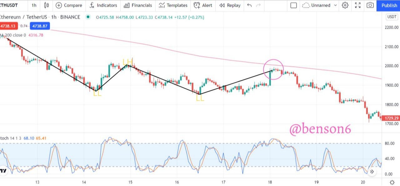
The chart above shows the bearish candlestick pattern and the touch of the candlestick on the 200 moving averages line. As mentioned earlier, the price moved in a downtrend as shown by the series of lower lows and lower highs denoted by LL and LH respectively.
At the same time, we can see how the price through the candlestick touched the 200 moving averages line as it was moving downwards. This touch is shown by the purple circle shape. Inside the purple circle shape, we can see a small bullish candle with wicks above and below it. This shows that the initial enthusiasm of the bulls wasn't strong enough to push the price up further and break past the 200 moving averages line. Afterward, the price continued in its downward movement.
Explain the trading entry and exit criteria for buy and sell positions in any cryptocurrency of your choice (Share your own screenshots)
To make a trading entry and exit for the buy and sell position, certain criteria have to be met. It is by following these criteria that we can get success in our trading operations using the "Perfect Entry" strategy. These criteria are:
We should make sure that the conditions necessary for trade execution are met.
In an event where one of the conditions is not met, then the operation should be let go and a new operation should begin.
While observing the market structure of the price, it should move in a noticeable or healthy manner so that the trade operation can be carried out optimally. This means that if the current market structure is in a range then it should not be put into consideration.
When placing our stop-loss it should be above or below the small bearish or bullish candlestick that forms close to the 200 moving averages line. And the take profit is measured with the distance between the band where the signal is given and the other band on the Stochastic oscillator indicator.
We can see the criteria being followed in the bullish chart above. The conditions necessary for the trade execution were met. The market structure which was bullish moved in a noticeable and healthy way as shown by the higher highs (HH) and higher lows (HL). A small bearish candlestick formed on the top of the 200 moving averages line as shown in the purple circle shape above. Then the Stochastic indicator gave the signal where the indicator lines were below the 20 band extreme (oversold condition), which is captured by the purple circle shape below.
The distance between the point where the Stochastic indicator crossed over the 20 band extreme and the 80 band mark is noted, this is shown by the blue arrow. The distance is then used as the take profit mark which is shown by the green shaded area on the chart. The stop-loss is below the small bearish candlestick and the 200 moving averages line.

We can see the criteria being followed in the bearish chart above. The conditions necessary for the trade execution were met. The market structure which was bearish moved in a noticeable and healthy way as shown by the lower lows (LL) and lower highs (LH). A small bullish candlestick formed at the bottom of the 200 moving averages line as shown in the purple circle shape above. Then the Stochastic indicator gave the signal where the indicator lines were above the 80 band extreme (overbought condition), which is captured by the purple circle shape below.
The distance between the point where the Stochastic indicator crossed over the 80 band extreme and the 20 band mark is noted, this is shown by the blue arrow. The distance is then used as the take profit mark which is shown by the green shaded area on the chart. The stop-loss is above the small bullish candlestick and the 200 moving averages line.
Trade 2 demo account trades using the “Perfect Entry” strategy for both a “Bullish” and “Bearish” scenarios. Please use a shorter period of time to execute your entries. Important you must run your entries in a demo account to be properly evaluated.

This is a bullish trade of SKLUSDT on the 5 minutes timeframe. It follows all the criteria and conditions of the "Perfect Entry" strategy. The market was in an uptrend as shown by the higher highs (HH) and higher lows (HL) of the candlestick formation. Also, the candlestick was on top of the 200 moving averages line.
As the market kept on moving it got to a point where a small bearish candlestick formed on the top of the 200 moving averages line as shown in the purple circle shape above. At the same time, the Stochastic indicator gave the entry signal as it was below the 20 point level as shown in the purple circle below.
So I placed a Buy Entry. Then I took the distance between the point below the 20 point level on the indicator and measured the take profit level and put my stop loss below the small bearish candlestick. This is shown as the green shaded area and the red shaded area respectively.

This is the trade history for the trade entry of SKLUSDT. It shows different details of the trade such as side, quantity, average fill price, etc.
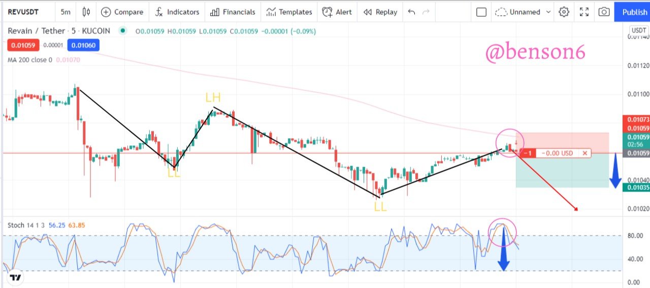
This is a bearish trade of REVUSDT on the 5 minutes timeframe. It follows all the criteria and conditions of the "Perfect Entry" strategy. The market was in a downtrend as shown by the lower lows (LL) and lower highs (LH) of the candlestick formation. Also, the candlestick was below the 200 moving averages line.
As the market kept on moving it got to a point where a small bullish candlestick formed below the 200 moving averages line as shown in the purple circle shape above. At the same time, the Stochastic indicator gave the entry signal as it was above the 80 point level as shown in the purple circle below.
So I placed a Sell Entry. Then I took the distance between the point below the 80 point level on the indicator and measured the take profit level and put my stop loss below the small bullish candlestick. This is shown as the green shaded area and the red shaded area respectively.

This is the trade history for the trade entry of REVUSDT. It shows different details of the trade such as side, quantity, average fill price, etc.
Conclusion
The "Perfect Entry" strategy is a very solid strategy to employ as a trader. It comprises the candlestick patterns, 200 moving averages, and Stochastic indicators. As the name implies, it gives traders the perfect time or situation to enter the markets. The market entry can either be to the upside or to the downside. However, to use the strategy effectively, certain conditions must be met without which, it is just a waste of time and effort.
It is a strategy that follows the trend continuation principle as it gives a signal on when to enter the market through the continuation of the trend. It is also a strategy that involves the use of 3 indicators to give traders a "perfect" view of the markets and entry points. Most times traders are used to using one indicator and then adding another one to get a clearer view of the market.