Crypto Academy Season 3 Week 2 Homework Post for @reminiscence01 Submitted by @awakpasnas
This time, I want to make a homework post that will answer professor @reminiscence01 from Steemit Crypto Academy, as the homework is to answer some questions given by our professor..
[A] Explain the Japanese Candlestick Chart? (Chart screenshot required)
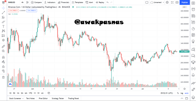
I'm pretty sure many of you have seen a graph like the one in the picture above. The graph is a graph that shows the price movement of a cryptocurrency which is a digital currency that has a Blockchain network system.
This chart is often used by investors and traders in predicting the price of cryptocurrencies, they will see the history of price movements on the chart so that they are able to make a prediction of the future price of the cryptocurrency. There are many types of these graphs such as Line, BaseLine, Area, etc. But among all that there is a type of chart that is most often used, namely the Candlestick Chart.
Candlestick is a tool used to see a price movement of a cryptocurrency. This type of chart was first discovered in Japan which was inspired by one of the famous traders from Japan, Munehisa Homma. He has a talent in reading rice price movements, he is very smart in managing his business so that he becomes a rich merchant in Japan because of his expertise.
Candlestick has several parts in its shape, namely Body and Shadow, each of which has its own meaning. Then if we look at the example chart above, we can see that there is a green candle and a red candle. The green candlestick is a candlestick which indicates that the price of the cryptocurrency is increasing, while the red candlestick indicates that the price of the cryptocurrency is decreasing.
[B] Describe any other two types of charts? (Screenshot required)
As I explained earlier that the chart has several types, besides candlesticks there are 2 other types that you can take as your tool in predicting cryptocurrency prices.
1. Renko Chart
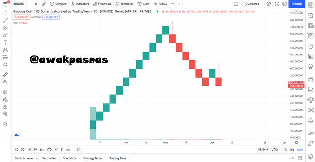
From the name alone, we can already guess that this type of chart is a chart that comes from Japan as well as candlesticks. How to use this type of graph by understanding the meaning of the boxes in the graph.
Each box will indicate a price movement within 10 points, after the 10 points are met, a new box will be re-created. This will occur in both conditions, both when the cryptocurrency price is up and when the price is down.
2. Baseline Chart
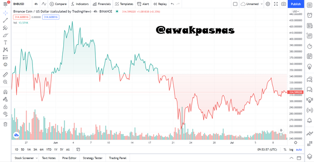
The next one is the baseline chart, this chart is a simple chart and very easy to understand. However, unlike other graphs, the amount of information that will be provided by this graph is very small. This graph only shows how the state of our investment in a cryptocurrency is, whether we have made a profit or have we lost.
You can see in the example graphic above that a green area is shown and a green area is shown and then there is a line that separates the two areas. If the last state of the chart shows green, it means we are making a profit, otherwise if the state of the chart is showing red, it means we are experiencing a loss. Then for the barrier line is the price position when we buy the cryptocurrency.
[C] In your own words, explain why the Japanese Candlestick chart is mostly used by traders
In each of our trades, investors and traders would want a chart that displays as much information as possible, this is so that it can lead us to our goal of getting profit. This information will be very difficult to apply to one type of graph, so that over time more and more types of graphs are created that aim to compress all of this information. And in my opinion Candlestick is the most appropriate chart to choose because it has the most information among other charts.
On the candlestick there is a body part that shows that the information is the most and very important, the length of the body of the candlestick will show the ongoing trend and show the momentum at that time, if the body of the candlestick is long then there is a one-sided trend between buying and selling.
Then there is the shadow, this section shows how fast the price movement is in each of its momentum, if the length of the wick made is long enough then it indicates that the price movement of the cryptocurrency at that time was very fast.
In addition to these two sections, candlesticks also have information that shows when the initial price position was in a period and at what price the cryptocurrency came out in that period. This is very helpful for traders and investors in predicting cryptocurrency prices.
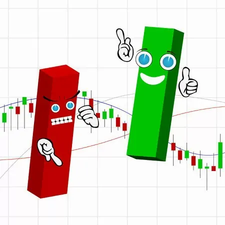
[D] Describe a bullish candle and a bearish candle identifying its anatomy? (Screenshot is required)
There are two types of candlesticks based on their color, including:
1. Bullish Candle
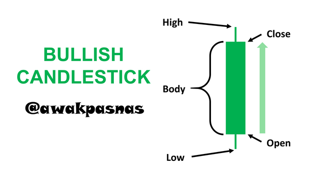
Bullish candle is a candlestick that shows that the trend of a dominant cryptocurrency is Buy. The characteristic of this candlestick is that it is green. The meaning of the information in the image above is as follows:
- Open: At this time is the opening price of a cryptocurrency, in the bullish phase the opening price will be at the bottom and will move up.
- Close: At this time is the closing price of a cryptocurrency, in the bullish phase the closing price will be at the top.
- High: This is the highest price a cryptocurrency has ever reached in a period.
- Low: This is the lowest price a cryptocurrency has ever reached in a period.
2. Bearish Candle
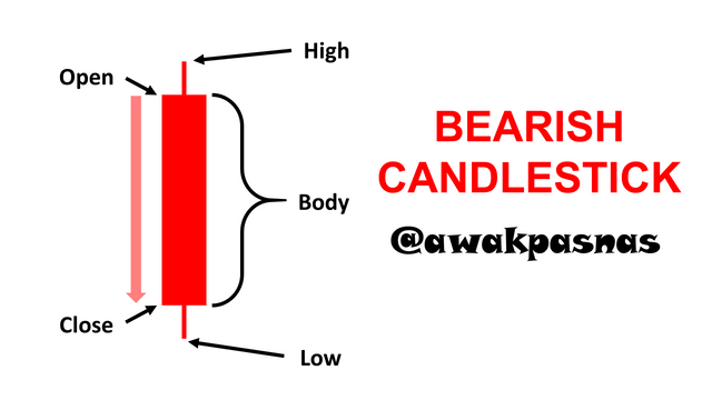
Bearish candle is a candlestick that shows that the trend of a dominant cryptocurrency is selling. The characteristic of this candlestick is red. The meaning of the information in the image above is as follows:
- Open: At this time is the opening price of a cryptocurrency, in the bearish phase the opening price will be at the top and will move down.
- Close: At this time is the closing price of a cryptocurrency, in the bearish phase the closing price will be at the bottom.
- High: This is the highest price a cryptocurrency has ever reached in a period.
- Low: This is the lowest price a cryptocurrency has ever reached in a period.
[E] Conclusion
Candlestick charts are a very good chart type and are suitable for use by anyone, be it investors or traders. With all the information he can provide in the form of bars, this information will be very useful for traders and investors in trading and investing in cryptocurrencies.
Thank you for reading my blog, hope it will be useful for readers.
I would also like to thanks professor @reminiscence01 for creating such an excellent study like this.
See you in the next post!!
Hello @awakpasnas, I’m glad you participated in the 2nd week of the Beginner’s class at the Steemit Crypto Academy. Your grades in this task are as follows:
Recommendation / Feedback:
Thank you for participating in this homework task.
Hi @reminiscence01, My post has not been curated and now it has been 6 days, please help to provide curation.