Crypto Academy / Season 3 / Week 2 / Beginners : Introduction to Charts. Homework for @reminiscence01
Great lecture on charts with specific reference to the Japanese Candle Stick and here is my submission prof. @reminiscence01
Explain the Japanese Candle Stick Chart?
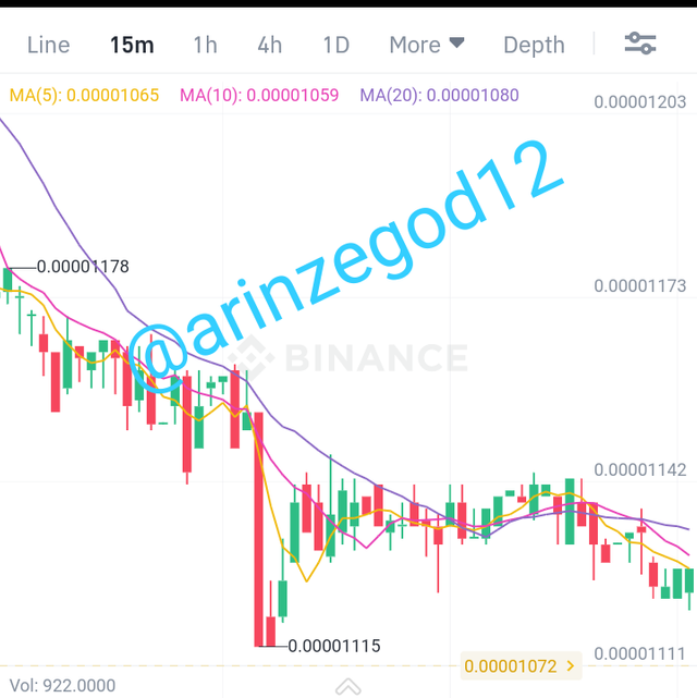
It is a price chart that shows the opening, closing, high and low price points. It indicates or illustrates the interaction between the buyers and sellers in the market, showing various points during the interaction.
They are the most popular way to quickly analyse price action used by most technical traders. They provide a graphical representation of the supply and demand behind each time periods price action. The Japanese Candle Stick comprises of four parts
They each represent a specific point in price movement:
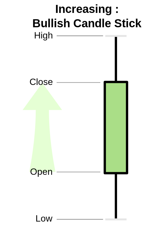
Open:
It represents the start of price movement.
High:
It represents the highest price that is recorded at or within a particular time.
low:
This part of the candle stick indicates the lowest price recorded within a specified time.
Close:
It represents the last price recorded in a candle.
Describe any other two types of Charts?
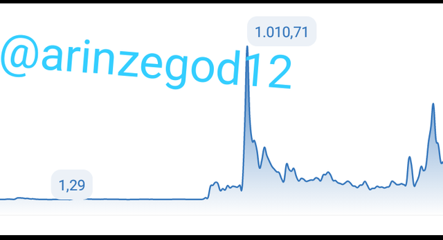
line Charts
Is the most basic type used in finance. It is a graphical representation of an assets historical price action. It only indicates a security's closing prices overtime. It's simple in nature and shows information as series of data points connected by straight line segments.
Bar Chart
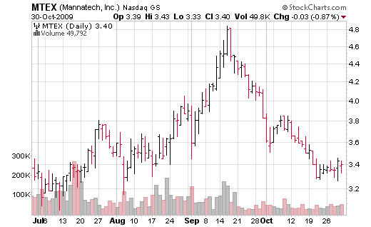
It indicates the open, high, low and close prices of an asset or security over a specified period of time. The vertical lines on a price bar specifies the high and low prices while the left and right horizontal line on each of the price bar indicates the open and closing prices .
Source
Explain why the Japanese Candlestick chart is mostly used by traders?
The Japanese Candlestick provides a more detailed and accurate information about the market or price movement. It is easier to understand as these price movement can easily be detected or spotted. It also helps technical analyst to determine when to enter and exist trades by showing the impact of investors sentiment on the market price. Traders can use it to analyze any and all periods of trading be it daily or hourly.
Describe a Bullish Candle and a Bearish Candle identifying it's anatomy?
A Bullish Candlestick
shows an increase in the price of a commodity. It informs traders that the market is about to enter an uptrend probably after decrease in price.In a Bullish Candle the opening price is below the closing price, it represents an increase in price. The low Indicates the lowest price recorded while the high shows the highest price recorded.
Source
Thus a continuous occurrence of a Bullish Candle stick is called a Bullish Trend. It takes the shape of a charging bull.
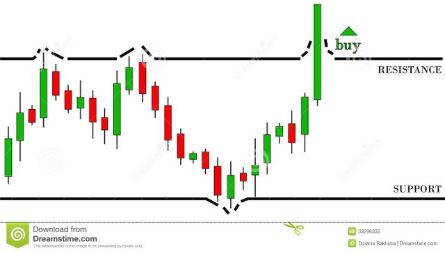
Source
A Bearish Candlestick
It signals lower prices. It's usually red or black. It informs traders that the market is about to enter a down ward trend after increase in price. In a Bearish Candlestick the close price is under the open price, this shows a decrease in the price of a commodity.
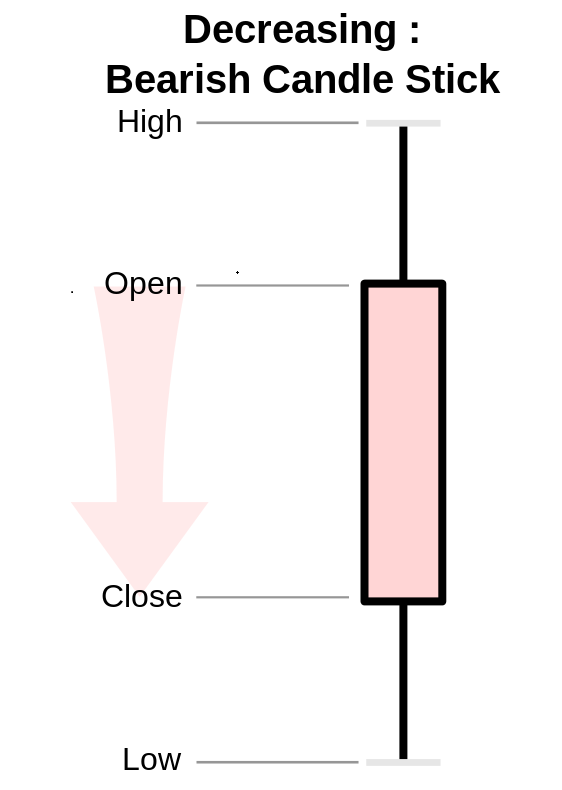
Source
Thus a continuous occurrence of a Bearish Candlestick is called a Bearish trend. It normally looks like a bear bringing down its raised claw.
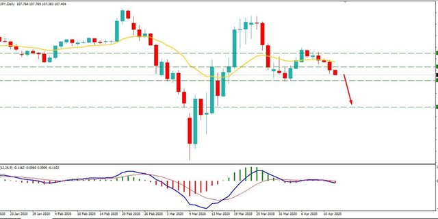
Conclusion
Charts are a clear representation of the prices of commodities and how they're affected by the forces of demand and supply. This ought to be studied or analyzed to enable traders place their trades.
Focusing on the Japanese Candlestick it has proved to be the most efficient and widely used chart for trading. They provide a graphical representation of the supply and demand behind each time periods price and action. There are other kind of charts. The Line Chart and the Bar Chart. Thus charts serve as a guide that help traders to determine when to enter and exit the market.
@reminiscence01 this my assignment has not yet been marked is there any problem
Hello @arinzegod12, I’m glad you participated in the 2nd week of the Beginner’s class at the Steemit Crypto Academy. Your grades in this task are as follows:
Recommendation / Feedback:
Your explanations are too brief. Please soend more time in your work to produce a quality content. Thank you for submitting your homework task.