Crypto Academy / Season 3 / Week 2 - Homework Post for @reminiscence01; introduction to charts by @alexanderpeace.
Having gone through the lectures, this is my submission post for the home work. I want to first congratulate the professor @reminiscence01 for his appointment as one of our professors. Good to have you sir.
So I'll go ahead and answer the homework questions.
Explain the Japanese Candlestick Chart? (Chart screenshot required)
Before I proceed to explain the Japanese Candlestick Chart, I'll start by defining a chart. Our professor has done justice to that already hence in my own understanding, I'd say a Chart is a form used to communicate a clear message about the subject of interest through the use of lines, objects, graphs, images etc that are well arranged.
The Japanese Candlestick Chart
The Japanese Candlestick Chart is the most frequently used chart in finance trading.
The Japanese Candlestick Chart represents the price of assets through candlesticks arranged to show or depict the price movement of an asset or commodity over a period of time. This is to say that it is used to study or analyze the fluctuation in the prices of an asset or commodity. The Japanese Candlestick was developed by Munehisa Homma, a rice trader in January in 1700s. He has the understanding of supply and demand which led him to study price rotation and how the market reacts to it. With this, he was able to develop the foundation candlestick.
Describe any other two types of charts? (Screenshot required)
We saw that there are other types of charts such as bar chart, volume charts, tick charts, line charts, renko chart.
Am going to describe the Renko chart and volume chart.
Renko chart
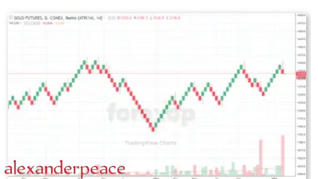
Renko chart is developed using price movement unlike other charts that are developed using both price and time difference. Renko chart was also developed by the Japanese.
Renko chart looks like a series of block, so it was said to have been named after the Japanese word for bricks which is "renga".
Renko chart makes a price history easy to read and makes room for markets that easily changes e.g oil to be better understood.
The points in Renko charts are blocks or bricks. Whenever the price of a commodity uncreases or decreases by a certain amount, a brick or block is plotted.
Renko charts are made up of regular up and down diagonal lines as opposed to regular price time charts.
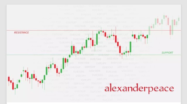
Volume chart
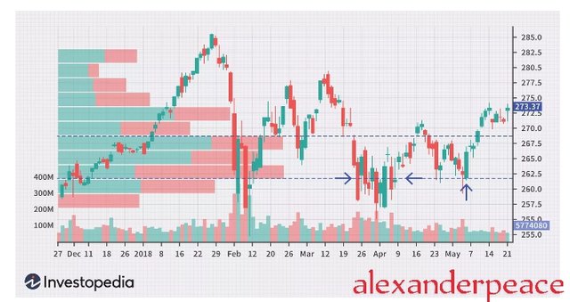
Volume chart is also called price by volume chart. They are used at distinctive or definite price levels to illustrate high buying and selling interest. They show price levels over a period of time.
The price by volume is plotted horizontally in a security Chart and reveals the volumes of shares traded at a definite price level which shows support and resistance of the market.
The price by volume chart shows total volumes at existing price level over a period of time.
To get the most probability of success, price by volume charts are used with other technical analysis such as technical indicators and chart patterns.
In your own words, explain why the Japanese Candlestick chart is mostly used by traders.
In my own understanding I'd say the Japanese Candlestick Chart is mostly used by traders because it helps them to be understand the present State of the market at a glance. By simply looking at the color and length of a candlestick, the trader will be able to know if the market is becoming bullish or bearish. Hence it shows the trend of the market easily. This bullish or bearish trends may not be dictated easily on other charts.
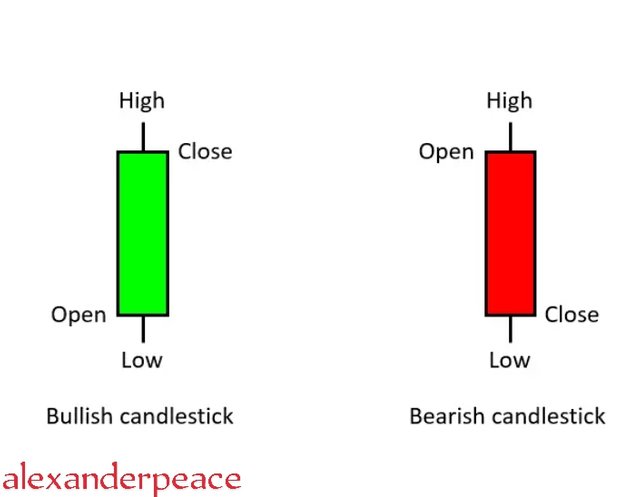
Describe a bullish candle and a bearish candle identifying its anatomy? (Screenshot is required)
We have two types of candles, the bullish candle and bearish candle.
Before I describe the bullish and bearish candles, let's briefly look at the anatomy of a candlestick.
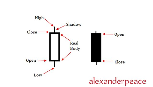
The Japanese Candlestick has four points and these points represents price movement . The four points are seen in the screenshot above.
These four points are the open, close, low and high.
The open shows the beginning of price movement while the close is the last price recorded in a candle. The high is the highest price recorded over a definite time while the low is the lowest Price recorded over a definite period.
The other parts which is the shadow and real body shows the unsettled movement of price between the buyer and seller and the distance covered by the price within a time frame respectively. The price of a commodity can either move up or down, hence the candlestick is classified based on this movement as either bullish or bearish. The bullish candles are the upside move candles while the bearish candles are the downside move candles.
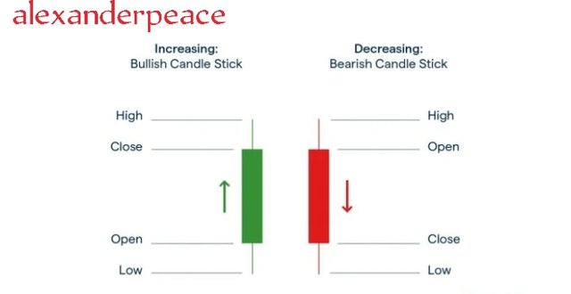
The bullish candle and it's anatomy
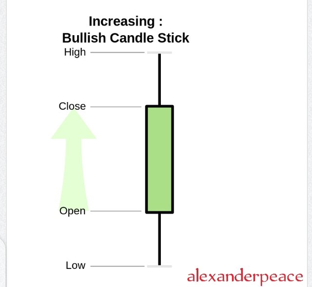
A Bullish candle is a visual portrait that shows the increase in the price of an asset or a commodity. In a bullish candle, the closing price is above the opening price showing that there was an upward movement of price over a definite period of time. Bullish candlesticks are either green or white candles. The opening price is at the bottom (low) of the candle while the closing price is at the high of the candle. When there is a continuous formation of a Bullish candle in finance trade, it shows a continuous increase in the price of an asset and this trend is called bullish trend.
The bearish candle and it's anatomy.
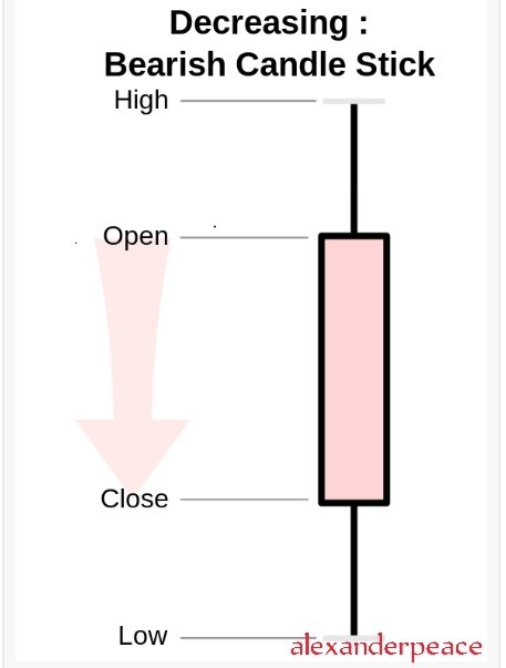
A bearish candle is a visual portrait that shows a decrease in the price of a commodity or an asset. In bearish candlesticks, the closing price is at the low of the candlestick while the opening is at the high of the candle stick. When there is a continuous formation of the bearish candle in a finance trade, it's known as a bearish trends. It depicts or represents a continuous decrease in the price of a commodity.
Conclusion
I want to thank the professor once more for this eye opening lecture. I now understand that charts are parts and parcel of trading and they show the connection between buyers and sellers. There are various types of charts but the Japanese Candlestick Chart is the most widely used. A balanced knowledge about charts will help one trade effectively as they give important and relevant information about the market.
Hello @alexanderpeace, I’m glad you participated in the 2nd week of the Beginner’s class at the Steemit Crypto Academy. Your grades in this task are as follows:
Recommendation / Feedback:
Thank you for submitting your homework task.
Thank you so much sir. You made it easier to comprehend with your style of teaching.