Japanese Candlestick Patterns -Steemit Crypto Academy Season 5 -Homework Post for Task 10

(a) Explain the Japanese candlestick chart? (Original screenshot required).
(b) In your own words, explain why the Japanese Candlestick chart is the most used in the financial market.
(c) Describe a bullish and bearish candle. Also, explain its anatomy. (Original screenshot required).

Explain the Japanese candlestick chart?
Candlestick Model of the Japanese , which was created by a rice merchant named Homma Munehisa, is the most commonly used and recognised by every trader in the world. No pattern, whether it's a candlestick, a bar chart, or a basic line chart, can predict market action, as we all know.
The primary motive for Homma Munehisa to create candlestick patterns was to better understand the attitude of buyers and sellers at any particular time. You can't predict the market's future, believe me; otherwise, you'd be a millionaire by now and not be reading this nonsense. The candlestick, bar, and line charts all represent market conditions in different ways, but the candlestick pattern is more informative than the other two.
Candlestick Pattern
Line Pattern
Bar Pattern
A learned man can predict (may be correct or incorrect) market sentiment for the short term using the above line pattern, but a learned man can predict (may be correct or incorrect) market mood using the candlestick pattern. Due to its simplicity of judging market emotion, the Japanese candlestick pattern is the most often used by cryptocurrency, commodities, and stock traders all over the world.
Candlestick patterns might reveal the buyers' and sellers' attitudes. The Candlestick is divided into four portions that show how the price of an item moves. The following are the four parts:
- HIGH
- LOW
- OPEN
- CLOSE
Green and red are the two colours used to display candlestick patterns. When the market is controlled by buyers, the green candlestick suggests bullish moves. The Red candlestick, often known as a bearish candlestick, is controlled by the sellers. It all boils down to a game of supply and demand.
To put it another way, if there is a lot of supply of an asset, demand will be low, and the price will decrease (bearish - Red candle), whereas if there is a lot of demand, the price will rise (bullish - Green candle) (Bullish - Green candle).
In your own words, explain why the Japanese Candlestick chart is the most used in the financial market?.
The Patterns of Candlestick appear to be more practical, accessible, and understandable than bar and line charts. Candlestick patterns have been researched extensively, and some of the recurring patterns could help any trader identify the market's likely next move. Traders continue to chart in order to extract whatever available information from candlestick patterns in order to make large bets. As a result, the bulk of financial markets, including cryptocurrencies, stock markets, gold markets, and commodity markets, employ it. When utilised in technical analysis, the candlestick pattern gives a clear picture of price volatility.
- When you see candlestick patterns for any asset, you may quickly recognise market movements. When it comes to predicting market action, candlestick colours are a crucial tool for traders. The construction of many types of well-known patterns, such as Engulfing, Doji, Hammer, the morning and evening star, and the manufacture of various types of well-known patterns, may easily locate bullish and bearish patterns.
Assist with the comprehension of both buyers and sellers' emotions.- At work, there is a supply and demand game that has evolved into a candlestick pattern. The formation of a green candlestick for any asset shows that buyers are more optimistic than sellers about the product. Buyers are less optimistic about the asset when the red candlestick occurs, and sellers are selling their asset, resulting in bearish patterns.
- Candlestick patterns are more difficult to understand than bar and line charts. Reading several blogs or even watching a good lecture may teach a novice several types of candlestick patterns, but understanding bar and line charts is considerably more difficult.
- These are a available in a wide range of colours and styles. The body size of the candlestick pattern also indicates the value of various assets. Candlestick patterns provide traders with an indicator of how much individuals are buying and selling. In conclusion, the Candlestick pattern provides a multitude of information (bearish, bullish, market sentiment, and volume) only by looking at it, but the bar and line chart cannot compare in terms of understanding market movements.
Describe a bullish and bearish candle. Also, explain its anatomy. (Original screenshot required).
Bullish Candlestick
There are essentially two types of candlestick patterns in question 1: bullish and bearish. As we all know, bullish candlesticks arise when there is a limited supply and a high demand for any asset (buyers are optimistic about the asset). The asset price surges due to a lack of supply and great demand, resulting in powerful bullish patterns.
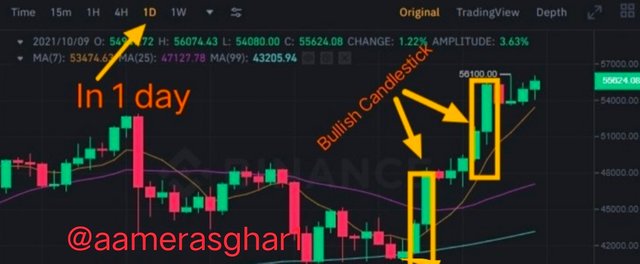
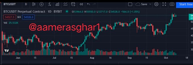
In the diagram below, I've emphasised how the bullish candle appears. A one-day chart is shown here, with each candle indicating one day.
Bitcoin's hourly candlestick chart was quite bullish, with values reaching 45k to 50k USDT. Buyers who see bullish candlesticks are optimistic that BTC will reach its all-time high.
A Bullish Candlestick's Anatomy
Each candle, as previously indicated, is made up of four parts, each of which represents a different price at any given time. There are two more sections to this storey. The body and shadow are also quite important when it comes to candlestick patterns.
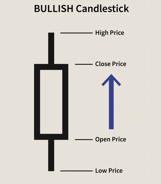
OPEN PRICE:
This is the point at which the price movement of an asset begins. The body of the candlestick will be formed by price movement. A bearish candlestick's opening is always higher than a bullish candlestick's. It's also referred to as the asset's starting price.
CLOSE PRICE :
This is the final price of the candle, and it signifies the end of the particular candlestick pattern. A closing price is another name for it.
HIGH PRICE:
This is the highest point/price of any candle over a given time period. If the high of a bullish candle is higher than the close, more people are buying the asset, signalling buying pressure that propels the market higher.
LOW PRICE:
The point when lowest price reached by a product over a certain time period. If the low is lower than the open price, it suggests that the price started out high but declined owing to selling pressure. Later, though, the market was driven upward by purchasing demand.
The other two pieces that come from the interaction of these four points are the body and shadow.
BODY:
The body refers to the area between the close and open price in candlestick patterns. The volume of certain items traded is proportional to the size of the body.
SHADOW:
It's the space between the candlestick's low and high prices, or the high and opening prices. It's also known as the wick of a candle at times. The greater the wick or shadow, the more volatile the market.
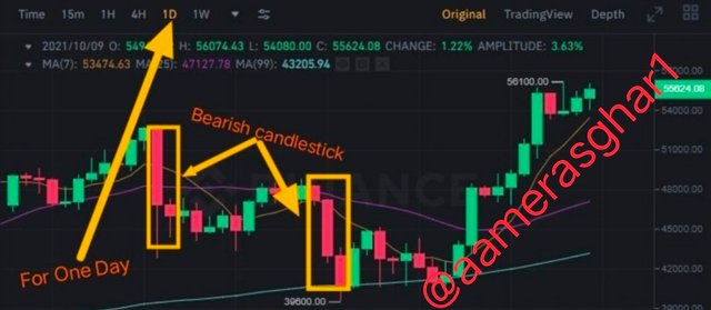
Bearish Candlestick
A Bearish candlestick develops when there is more supply than demand for a certain asset, as mentioned in question 1. (buyers are not optimistic about the asset). The market is under selling pressure as a result of the large supply and little demand, resulting in strong bearish candlestick patterns.
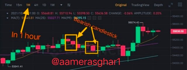
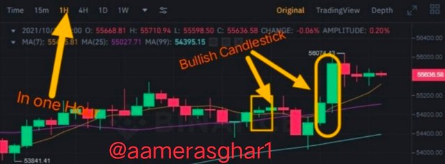
In the chart below, I've demonstrated how the bearish candle works. A one-hour chart is shown here, with each candle indicating one hour. Bitcoin was bearish at the time shown in the graphic below, as indicated by the yellow boxes.
A Bearish Candlestick's Anatomy
Each bearish candle has four components, each of which represents a different price at a different time.
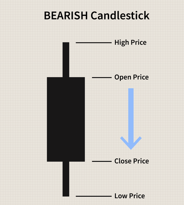
OPEN PRICE:
It is the asset's initial or starting price, from which price volatility begins. The body of the candlestick will be formed by price movement. In general, a negative candlestick opens higher than a positive candlestick. It's also referred to as the asset's starting price.
CLOSE PRICE:
The last price of the candle, and it denotes the end of a given candlestick pattern. It's also referred to as the asset's closing price over a specific time period.
HIGH PRICE:
The highest point that any candle has reached in a certain period of time. People are buying the asset more when the peak is above the open in a bearish candlestick, and then selling pressure is created, turning the entire candle bearish.
LOW PRICE:
The asset's lowest price over a period of time. If the low is lower than the closing price, it indicates that the price started high but ultimately declined owing to selling pressure.

Have a nice day
Mention
Prof . @dilchamo
Regard