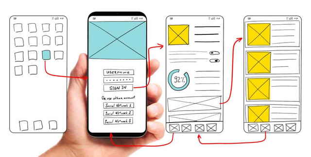
What is UX/UI and what should be considered?
User experience and usability are now commonly used terms in conjunction with interface design. In other words, what exactly is UX/UI? How are they different? Let us work together to solve these questions.
The UX acronym is user experience, while the UI acronym is user interface. Let's look at the UI (user interfaces) for further clarification. The term "user interface design" is commonly referred to as "UI". The design of the remote keys, such as their location, size, and colour, are chosen by the designer. Website examples of this are buttons, grit structure, and background. Colours, title colours, gaps, dimensions, and colours, as well as visual designs, are all used.

Use a simple and useful interface to help your users navigate the site and to help them spend more time on the site because we as users need to decide whether to stay or browse within seconds.
This is where UX becomes important. To put it another way, usable design is becoming more important. A website or app's user experience (UX) is focused on the user's overall feelings rather than appearance. Thus, user experience aims to ensure that whatever you want to do is done quickly and easily.
UX designers should be familiar with information architecture, interaction design, user testing, usability, and content strategy concepts. Beyond these, they should be aware of concepts such as human psychology, anthropology, and individual and social sociology, which are important for user and preference analysis. If you are selling a product, you should cover all issues, such as how you selected the product, whether it's easy to locate and add to the cart, how long it takes to pay, and what type of delivery information you provide to the customer.
As it relates to user experience (UX) and user interface (UI). By optimising the user experience and using abstract concepts such as comfort and adoption, the end user is being urged to form a habit. To rephrase, creating a website or application that will remain in the market is extraordinarily difficult. The critical part is that your target audience will enjoy it.
The most important consideration is the ease of use and learning for the end user. Memorability takes precedence, in order to provide these two conveniences. To an extent, standards do exist, but each person is different. When describing these standards, the main elements are colour-coding, different fonts, and a site-wide layout. How did these standards originate?

It is designed for extensive user testing. It must go through multiple stages of testing before it is made available to the end user.
After these initial stages, using heuristic analysis tests and online eye tracking tests is beneficial. To illustrate the benefit of the eye tracking test, it is observed what information or text is presented to the end user in direct proportion to how much his eyes move, and the goal is to give the end user the best experience in a short amount of time while saving time.
To summarise, applications and websites must keep the UX/UI details current at all times, in formats that target end users and save time. Investing time and money in these two details makes it more likely that you will be successful.