Ash From Pokemon Fanart
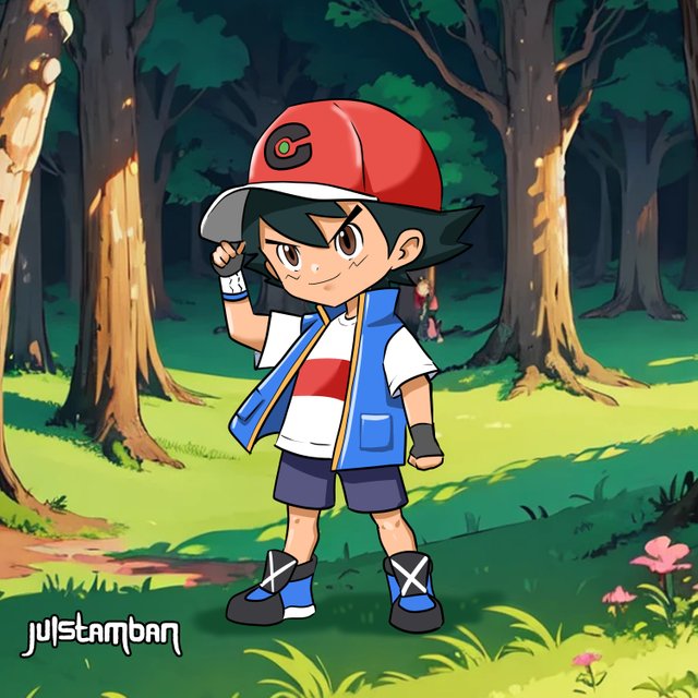
It's great to do Ash from Pokémon fan art in Clip Studio Paint, as one gets to try different techniques and illustrate one of the most loved characters in their own unique way. Detailed below is my drawing process from the rough draft to the final image.
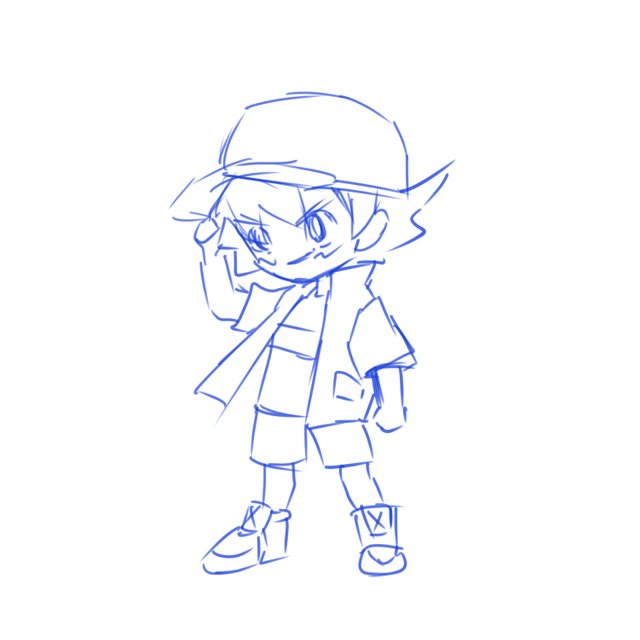
Every drawing initiates with a rough draft or simple sketch. In this piece, I laid down basic shapes and lines to capture Ash's pose and his overall proportions. Keeping the lines pretty loose and light, the idea is to get in the gesture and stance of the character. I wanted to nail Ash's iconic cap and spiky hair from the very start, so extra attention was given to their placement and size. My approach at this point was to establish a base that I could further flesh out in the subsequent steps.
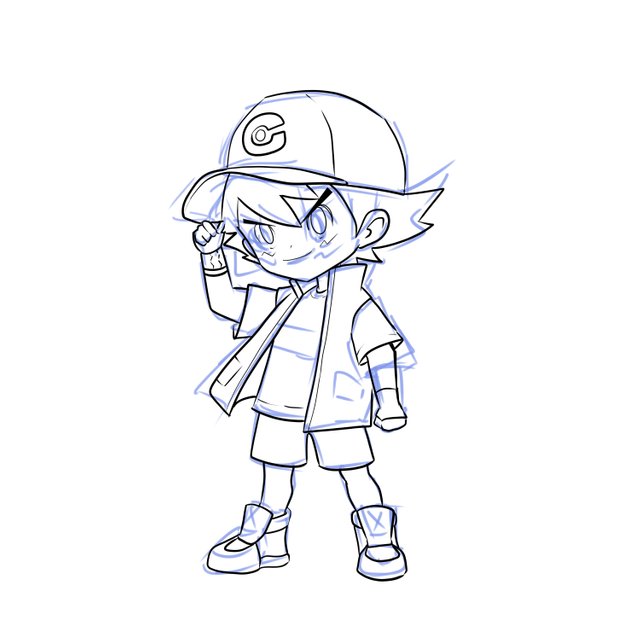
With the rough sketch done and fairly complete, I went in to refine the line art. This is entailing to re-trace over the original sketch, cleaning up the lines, and adding finer details such as the features, folds, and accessories. At this stage, I put in much effort trying to capture Ash's resolute expression and his classic outfit. Everything should stay true to the character while adding a bit of me in it. Using the vector layer feature provided by Clip Studio Paint makes sure the lines would look smooth and easy to edit if there are any future changes.
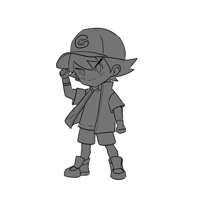
Now that the line art is done, the next thing to do is coloring. I started filling in the basic colors for Ash's clothes, his skin, and hair. This stage lays down the flat colors that will later be used as the base for further shading and detailing. I just used a different layer for each element like the cap, jacket, and shorts, simply to keep it organized. This way, I could easily change colors or play around with shades if needed.
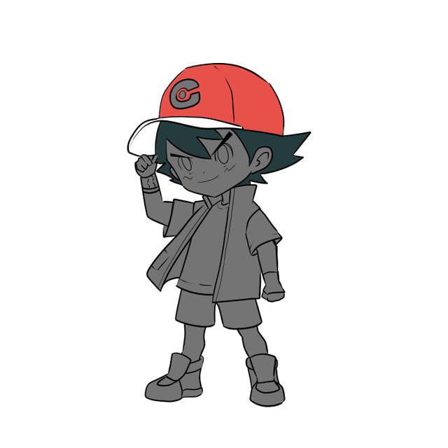
After laying down the basic colors, I started adding shade and highlights to achieve better depth and dimension on the character. I used the soft and hard brushes together to create smooth gradients for shadows and sharp edges for highlights. I imagined a light source coming in from the upper left, and this basically served as a guide on where to place shadows on Ash's clothes and his face. Highlights on the hair and cap were important in giving it that very vibrant and energetic look to the character portrait of Ash.
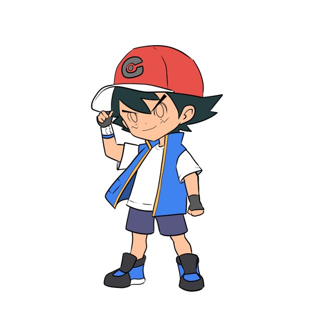
Finally, the finishing touches were added. Some of the refining done at this stage includes the shaping of any remaining details, adjusting the color balance, and other subtle effects to complete the image. I wanted to set Ash against a forest background, which brings one in memory all his journeys across the Pokémon world. In choosing the colors for the background, I had to be very sure that they would support Ash's color scheme without overpowering him, thus keeping him as the central element in the image.

Ash from Pokémon was a task that made me remember the good old times when I used to look at this character; therefore, it was an exercise in nostalgia. From the rough draft until the last touches, every single step was the opportunity for me to refine my skills and try out many things. I hope this process breakdown gives other artists inspiration to jump into their projects with enthusiasm and creativity. Whether you are a seasoned artist or a newcomer to drawing, remember that every drawing in itself is a journey, so enjoy the steps taken toward it!
Thank you, friend!


I'm @steem.history, who is steem witness.
Thank you for witnessvoting for me.
please click it!
(Go to https://steemit.com/~witnesses and type fbslo at the bottom of the page)
The weight is reduced because of the lack of Voting Power. If you vote for me as a witness, you can get my little vote.
Click Here