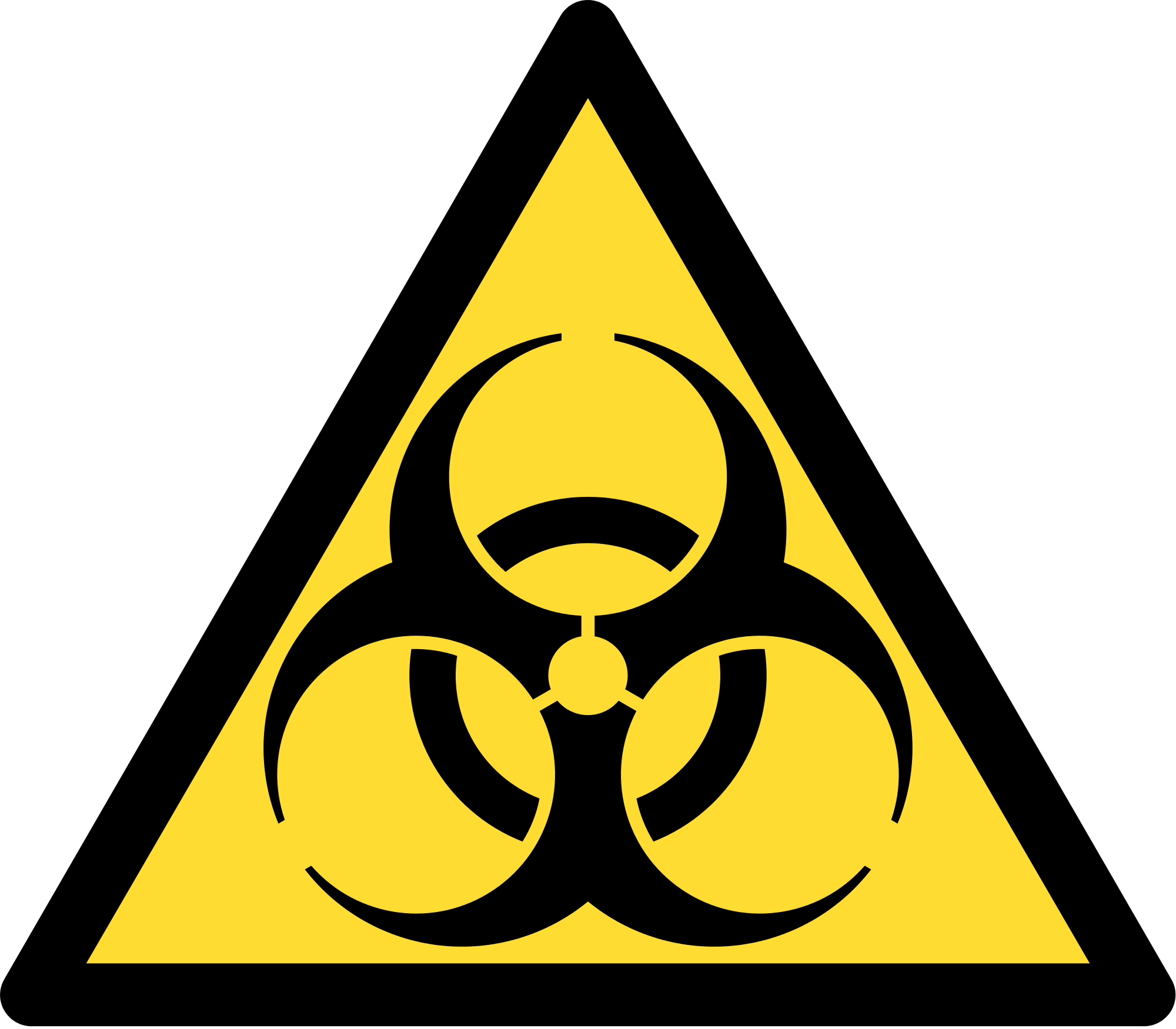
The origin of the "Biohazard" symbol

Biological risk or biohazard consists of the presence of an organism, or substance derived from an organism, which poses a threat to human health. This may include sanitary waste, samples of a microorganism, virus or toxin from a biological source that may be pathogenic. It may also include substances harmful to animals.
Charles Baldwin, a retired environmental health engineer, explains his role in the development of the biohazard symbol.
"In 1966 I was working with the chemical company Dow developing containment systems for the cancer institute at the National Institute of Health, and it was fairly obvious to us that there were several types of" danger "signs in the various laboratories we visited, But there was no standard as to symbolization in itself, so to speak. We saw the need for this kind of symbol, and proceeded to develop some logos with the help of Dow's marketing department (the package). The only parameters I established were that the logo should be something unique and striking enough to be remembered. We wanted something memorable but meaningless, so we could teach people, the use we wanted to give.
We began testing the test symbols across the country, with the help of the marketing department, who had survey groups to test various Dow products. There were half a dozen of our original symbols in the initial survey of 24 symbols. All the others were recognizable icons like the star of Texaco, the symbol of Shell, the red cross and even the swastika. The subjects who lent themselves to the test were asked to look at the symbols and then try to guess what each one meant. The symbol of biological risk was the one that had the least number of successes in the interpretation of its meaning. Then we came back a week later, and we did the exercise with the same people and the same symbols, plus 36 new common icons, and asked which of the symbols they remembered best. They chose the symbol of biological risk.
The color was orange on, one of the colors used in the explorations to the Arctic for being more visible under most climatic conditions; Had three sides because if it was to be used in a box, and the box was to be moved or transported, the symbol could be recognized in various positions. We also needed something that could be stenciled easily.
The next big step was to present it to the scientific community. I did it by writing a note in the journal Science. The next thing was getting permission from the people who could use it. It was soon adopted by disease control centers, health and safety professionals, national health authorities and institutes.
Whenever I go to the doctor's office or the dentist's office or in any hospital, I look forward to seeing the symbol. Of course, I am proud of the fact that I was able to come out with something, or to direct the program that evolved into this symbol that is nowadays so widely recognized and useful. However I came across a somewhat peculiar situation a couple of years ago, when someone was giving a seminar about biological hazards. As a gift to the participants, the seminarian had designed a beautiful tie with small biohazard symbols everywhere. This upset me, and I sent him an unpleasant letter telling him that the symbol was not designed as a haute couture item. "
Reference:
ErroresHistoricos
