Mixing inks
In line with my previous photo, it's once again a case of looking for the perfect color! Working on a handmade paper business cards order and trying to achieve a not-too-pink and not-too-red color, a bit like wine. So we mix red, blue and black inks drop by drop - a single drop can change the mix a lot!
I'm sorry my phone cannot capture the different hues, but all those brush strokes and dozens more are each a little bit different :)
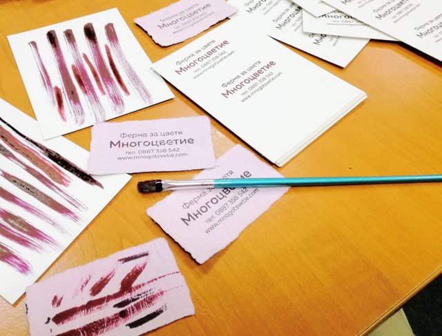
After we achieved the desired color, we stamped the handmade paper blank sheets that were dried and pressed the previous week. It's a local order, hence the Cyrillic text - a local flower growing farm!
OK now let me paste some text hubby sent me, should add a beautifl logo and a link to our new shop in the @homesteaderscoop!
It is so nice to see some of your process for your design work! You clients are lucky to have your appreciation for good aesthetics and finding the perfect color :)
Thank you, @sagescrub ! We try to create a beautiful product for every order. It is good to have clients that appreciate that and allow us the time required to do so.
Posted using Partiko Android
Congratulations @bghandmade! You have completed the following achievement on the Steem blockchain and have been rewarded with new badge(s) :
Click here to view your Board
If you no longer want to receive notifications, reply to this comment with the word
STOPTo support your work, I also upvoted your post!