Gridcoin 1 Millionth Block Commemorative Coin Designs
The Full proposal has been released and a poll has been made. Vote! Proposal found here.

Only 8900 Blocks to Go!
Design
At the end of this post are the three designs the Branding community has developed for the 1 Millionth Block Commemorative Coin. As there has been a recent surge of Gridcoin community members, we thought it would be a good idea to open up discussion regarding the design before we initiate the official Proposal and Design Poll. These designs are formatted to work with the manufacturing process: CnC milling into brass. More on manufacturing will be explained in the proposal, but this means that many aspects of these designs cannot be changed without changing the whole design. It is too late for that, however!
@joshoeah has volunteered to make reasonable minor changes if there is general agreement around such a change. "Reasonable minor changes" are those suggestions with generally positive comments and a relatively high number of upvotes. Think text changes or simple tweaks.
I want to stress that there was already a lengthy open discussion regarding design that took place a few weeks ago. This post is intended to get a conversation going regarding design before we present the full proposal which will include plans for manufacturing and distribution. Because the main design conversation already took place, @joshoeah, @dutch, and @jringo will make the final call regarding any proposed changes to these designs -- it is crunch time folks; we need to make sure we have time to vote, produce, and distribute.


What do ya'll think?!
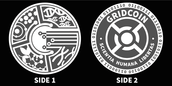
NOTE: The binary around the outside of the coin says "Gridcoin".
Past threads regarding the millionth block commemorative coin can be found below. Keep in mind the designs used in these posts are older versions than what is posted above.
Designs in this post have been developed by consensus among the Branding community and designed by @joshoeah.
Just rearing my head to say hi, and invite any questions regarding manufacturing or modelling.
My support is for the top-most design.
Those all look pretty damn good, but why no date?
We had a design with a date on it way back when -- we couldn't figure out how to make it all work. The CnC limits us to text about the size you see in the design. I am in favor of fitting the date on there if we can. Or even something like "One Million Blocks" or whatever. We could replace the binary with the date instead, for example. Any other thoughts on how to fit this in?
We also discussed adding the RAC of Team Gridcoin, and tons of other information, but it turned into something far too messy for a coin.
I figured you guys had already discussed this, and I totally see how it would be difficult to fit in. Having the date in binary I think would be a good plan, with Gridcoin having 8 letters, you could have it fit twice around the coin (just the year) or once (year, month, date). I think that would be a lot more important than having the word Gridcoin twice on a side, especially for a one-of-a-kind commemorative coin.
Sorry if I seem like I'm not minding my own business! I'm adding my 2 cents because I think the work done here is impressive. Even if the context of their creation wast lost, these coins would be pretty objects on their own.
The input is more welcome than you know! We want to include as many people in the development and design process as we can. More people = more conversation. More conversation = more ideas. We're still trying to find the best ways to reach as many people as we can. I know the Dev team is working on the same issue regarding dev news. There is talk about updating the client's ability to display Gridcoin related news and updates. This is something I would support down the road.
I also like the idea of having at least some marker in the binary instead of "Gridcoin" -- you're right, this is a special moment in time and that's what we're trying to mark with the coin!
As we have been discussing putting together a little certificate to pair with the coin, an alternative could be to have the date there instead of on the coin.
I like the design on top the most (best from both worlds in my opinion).
If it works CNC-wise I think it would be great to replace the binary and add something along the lines of "1 million blocks" :)
That could certainly be done - all text is very easily replaced :) the only limitation here is keeping the smallest details within the limits of the machine it's to be created on.
absolutely the top one. and I would specifically not choose anything that says "BOINC" for the following reasons. First, because even though gridcoin supports boinc, we are not one in the same. Seems that could offend both the folks at Berkeley, as well as long-time BOINC'ers who have their own teams they are loyal to. Second, although BOINC is the primary project we support, I would like to imagine a future where BOINC is one of many such projects that get eventually wrapped up under Gridcoin. I would want us to be the science research coin, that rewards for all sorts of projects (e.g. folding@home, etc.) . That's obviously in the far future, but I would want us to support all science, not just a particular project. (although, things could go another way, if BOINC decided to do the integrations with other projects, and then we wouldn't have to.)
TL;DR . option 1 :)
I agree! We talked a little about this potential conflict as we were putting together the designs. We rationalized using the BOINC logo as we are attempting to take a snapshot of Gridcoin at this moment in time -- the 1 millionth block! And we are going to be focusing on BOINC for the foreseeable future. They are a part of us in this moment. We are a part of them. ... ;)?
Right now, there is some contention between Gridcoin and BOINC community members, teams, projects, etc. As I understand it, this stems largely from the Gridcoin team requirement -- it forces people to choose between meeting a need (paying their electric bill) and working with who they want to work with. That is an unfair choice to ask someone in any situation, particularly because there is usually a solution. In this case, that solution is Gridcoin Team Neutral.
On the other hand, there are many BOINCers who are heavily committed to the success of Gridcoin as a project, so while the contention is often seen, the unity might actually be stronger than we think. At the same time, the potential conflict is a real risk with a BOINC design. I feel the development process and intent behind the designs mitigates this risk. At the same time, we did not openly reach out to the BOINC community for their input. At the same time, BOINCers from before Gridcoin even existed helped in the development of the coin! There's a lot to consider, but in the end we have to decide if the product is worth the risk .
That, and which one we think looks better =).
Are there any copyright issues with using the BOINC logo?
Our understanding is that the BOINC logo is part of the public domain. They request that it is paired with the boinc website when used in a website, but nothing is required.
We have been discussing putting together a little certificate to pair with the coin. If we do, we will be putting some information about BOINC in there, including the website URL.
https://boinc.berkeley.edu/logo.php
I'd go for the topmost. I wonder why this one has different dots before and after "scientia humana libertas" and a dot at the top between the bits. All in all very nice designs!
@joshoeah might be able to explain the dot difference. the top most design is the most recent so i'm guessing the other dots are just left from old designs.
Oooh that is strange.. Perhaps some old artwork slipped through the cracks. Rest assured the dots before and after would work as in the top design, regardless of the final design picked. That dot separating the bits should appear on the final design too. Thanks so much for pointing that out!
It was a bit like the child game: find the difference
;-)
I'd go for the first one since it honors both the past and the future of what we are trying to accomplish. Although the other two designs are pretty neat, the first one is the one I think will be the coolest one to have in the long term. I can't wait to order one for myself.
I like 1 and 3, but if we decide 3 I'd want "Gridcoin" to say "BOINC" on side 2.
No mention of Gridcoin at all?
The binary says "Gridcoin" and the whole Side 1 is the Gridcoin complex logo.
That's quite geeky. I think a coin should at least have the name or the symbol. One that is recognizable for someone that doesn't know binary and doesn't have an ASCII table at hand I mean ;-)
Thanks for pointing out what the binary is. Didn't even think about what it might be.
good point about the geek out. xD
Hey, I resemble that remark :P
The geek shall inherit the Earth!
I agree I like 1 and 3 as well.
I also agree with jringo that the Gridcoin should be replaced with BOINC as the binary says Gridcoin.
The binary may be 'geeky' but we're allowed that eccentricity.
IRC:
https://kiwiirc.com/client/irc.freenode.net:6697/#gridcoin-help
Slack:
https://teamgridcoin.slack.com
I like the middle design.
Does the binary mean anything on the outside?
"Gridcoin" I will add this to the post