SLC21/WK6: Summary on Lessons so far [Hands-on Practical]
Hi friends, after reading around I am interested in participating in an amazing challenge this week. The challenge is titled: Summary on Lessons so Far by Mr. @lhorgic following the contest link: Summary on Lessons so Far
Edit by canva
Previously I also invited other friends such as Mr. @irawandedy, Mr @muzack1 , sir @sisol and my friend @cymolan.
| Please study the lessons from lesson one to five, and then make a comprehensive summary of each lesson. Also, demonstrate well how well you understand each lesson. Please note that if you explain in as much detail as possible, you will be ahead of the others. |
|---|
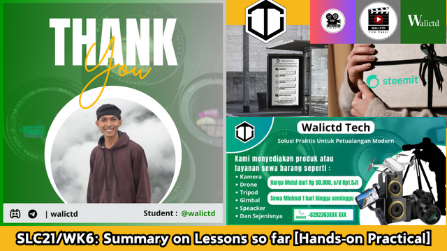
Therefore, this time I will conclude from lesson one to lesson 5. Where in lesson one we are given material to create a gradient. As we know that gradient is a combination of one color with another, either on an element or on a letter. Here's an example of a gradient by creating a thank you project.
| Lesson 1: Introduction to Gradients and Applications |
|---|
This lesson gave me an insight into the concept of gradient, one of the important elements in the world of graphic design. Where we know that Gradient is known as a gradual transition of color from one color to another, it turns out to have many variations and types that are interesting to learn. Not only discussing standard gradients as usually delivered by Mr. Lhorgic, the material can also introduce me to the types of gradients that are rarely known, all of which can improve design.
It is also more interesting that this first lesson provides material that I can learn and directly apply in real work. Through this first gradient experience, I realized that gradients are not just a matter of processing color combinations, but can create depth, feelings, and messages in design.
Since I haven't practiced the gradient lesson before, this time I will directly practice it.
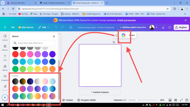
First, I will create a new worksheet in canva (here I am using canva web).
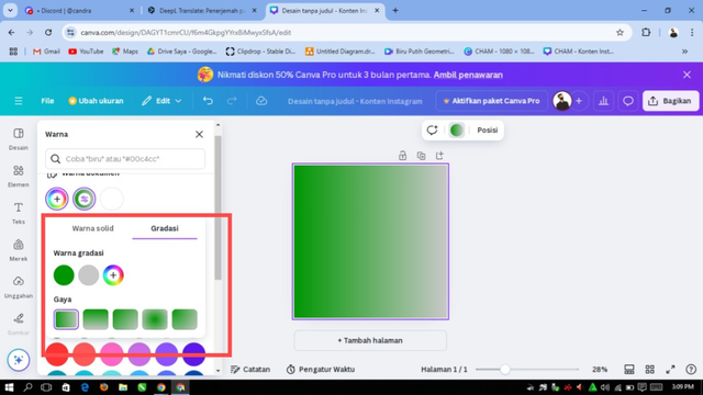
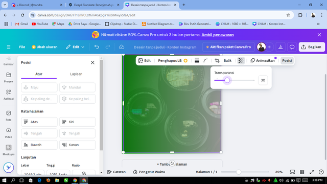
Then just choose the gradient color according to our choice. Here I want to choose dark green combined with gray.
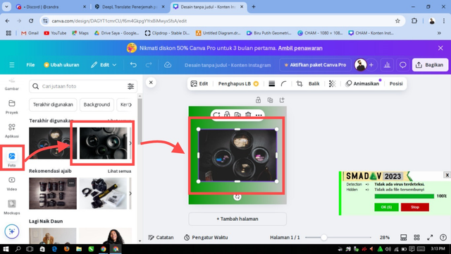
Next, I will add an image for the background, because I like photography, so this time I will add another image with a type of photography.
Then I will adjust the size of the image and give it a transparency effect.
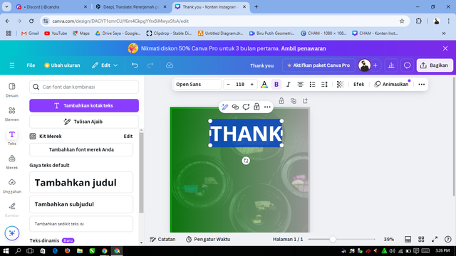
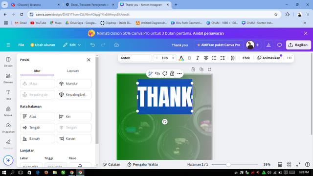
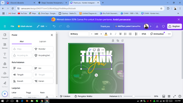
Next I will add a word of thanks to Mr. @lhorgic for the lesson he gave:
 |  |
|---|
I will adjust the color with white, the font is Anton with size 196. Next we add the word “You” with the font “Brittany” size 160 with orange color.
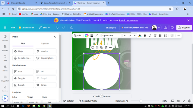
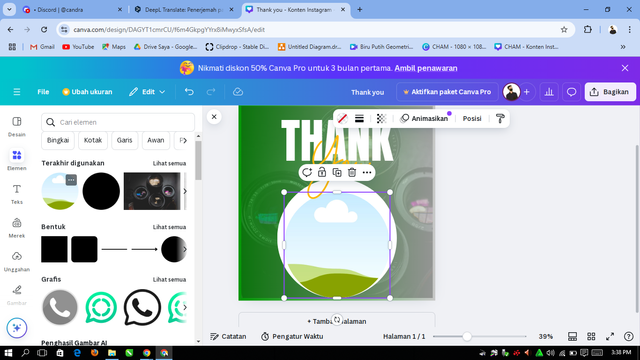
Kemudian saya menambah elemen bulat untuk latar belakang foto, lalu menambahkan elemen foto yang bentuk bulat yang mana disana saya akan menambah foto saya sendiri.
 |  |
|---|
Then I added my own photo and also added other details such as a discord or telegram address:
| Lesson 2: Introduction to Logo Design |
|---|
In lesson 2, of course, I was introduced to how to design a logo, where the material discusses the combination of art and technology to create a symbolic image that can characterize a product, brand and so on. With some useful material provided by teacher Lhorgic so that I can learn some of the core elements that must be present in logo design in order to produce an attractive logo. Elements like simplicity, relevance, and memorability are all utilized to create a logo that has a long-term impact. Not only that, we can learn about different types of logo designs, ranging from logograms to even abstract logos.
I think this lesson is also very useful when it comes to the practical approach. Here we can learn not only theory, but we can apply it directly so as to produce a logo for our product. Like the following example of a logo that I designed through canva, this logo is useful for youtube or facebook logos and so on.
 | .png) |
|---|
| Lesson 3: Logo Design - Part 2 |
|---|
This third lesson certainly provides a fairly in-depth understanding of the different types of logos, plus how to distinguish the main characters between each of them. I teach in more detail about how each logo type, such as Wordmark (text-based) and Monogram (combination of letters), has a unique role in reflecting a brand's identity.
Not only that, in this Logo Design - Part 2 lesson, I also teach the importance of choosing a logo type that suits your needs, as well as where to use it. For the results of this 3rd lesson, I was able to produce two types of logos, namely Wordmarks that highlight brand identity through typography, and Monograms that combine initials into a simple yet meaningful design. Through this experience, I learned that each logo carries its own message that contributes to the success of the brand in the eyes of the audience.
| Lesson 4: Mockups in Design and Apps |
|---|
I am grateful to be able to take part in this 4th lesson because in this lesson, I learned so many lessons from knowing what a mockup is and how to use it so that it can make the design look more attractive and professional. Mockup itself means a visual depiction of a design that shows how the end result will look, for example a finished product or application that is ready to use.
From the material learned here, it makes me understand that mockups are able to help test design ideas before they are actually implemented in the field. Maybe not only that, but mockups also make designs easier to understand by many people out there, because they can directly see how the design works in the field or in the real world.
After learning, I can also practice the mockup to promote Steemit. Now the results of the design can make it easier for me to show the concept in a more interesting way. Taking this third lesson can give me new skills that can be utilized to improve my designs and convey ideas more clearly to the public.
| Lesson 5: Hands-on Practice |
|---|
In this 5th lesson, teacher lhorgic teaches us by providing clear steps to create an attractive and effective brochure design for a brand or business. The explanations are very clear and detailed, so anyone who follows the guide can easily learn or even replicate the approach to produce quality designs.
The homework assignments really helped me understand the concepts more deeply. I was able to directly apply the knowledge taught to a real project, which was to design a brochure for my soon-to-be-launched restaurant business. The brochure was designed to attract customers' attention while conveying important information about my business in a professional manner.
This experience taught me the importance of combining creativity with strategy in creating a design that is not only visually appealing but also effective in conveying the message. The brochure I created is the result of this lesson and you can see below as a real-life example of what I've learned.
This is the conclusion of the lessons that I can share while learning design from Mr. Lhorgic. Hopefully, this lesson will make me grow more and be able to really apply it in my daily life. Thank you very much for this lesson.
@walictd



https://x.com/walictd/status/1864314071618867586
Hello @walictd thank you for participating in this week's lesson. We have assessed your entry and we present the result of our assessment below.
Feedback:
Welcome back to class dear student.
Let me start by commending you for a job weldone, the effort put in this work is quite commendable.
You have done a nice summary of the lesson and this you did practically which is quite commendable.I want to also salute your courage for staying through the lesson and for taking every form of correction in love and patience. I hope you would maximize all of these lesson and you them to your profiting. Thanks for staying through.
Regards
@lhorgic❤️
Thank you so much for your assessment, my friend. Glad to see good advice from you. Success is always yes