SLC | S21W 5 | Hands-On Practical Using any design App/Software of your choice.
Greetings, friends! Here we are again, diving into Week 5. It feels great to share another post with all of you! Last week, we tackled the art of mockups. And guess what? I nailed it! Yes, you heard that right—I did it very, very well.
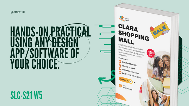
This week, we’re switching gears and moving on to something new. The challenge? Designing a flyer! Yes, it's time to get creative with colors, text, and layouts. A well-designed flyer can make a big difference, so let's bring our A-game.
But hold on—don’t worry if you’re not a design pro. We’re going to take this step by step, just like we did last time. I promise, it's going to be fun. If I can handle mockups, you can definitely handle a flyer!
We’ll explore some cool design ideas and get a bit playful with our choices. Maybe a splash of bright colors or a bold font—something that really catches the eye. It’s all about grabbing attention and making an impact, right?
So, buckle up, friends! Get those creative juices flowing because we’re going to make our flyers stand out from the crowd. Trust me, we’re going to have a great time designing this one. Stay tuned!
Let's get started and make Week 5 the best one yet!
Design a promotional flyer/banner/poster for your brand using any design app/software of your choice. Kindly be sure to be very detailed, showing every relevant detail as this could be your leverage. |
|---|
Step 1: Creating my flyer In creating my flyer, I decided to use Canva. It is user-friendly and offers a range of creative options, perfect for this project.
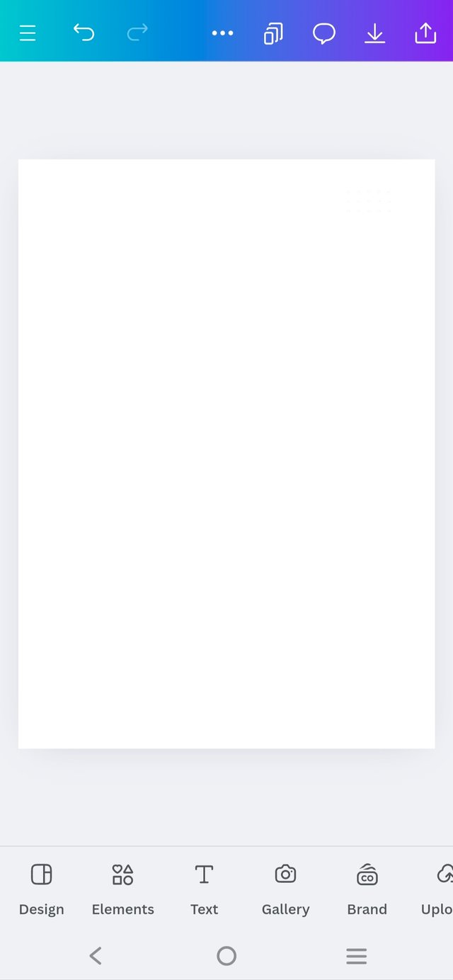
So, the first step I did was to open Canva and choose a blank canvas - specifically a flyer-size format. I used standard flyer dimensions so that it fits well for both digital and print use.
And now, here is a clean, empty space that's ready to be filled with all the exciting elements for my promotional design!
 |  |  |
|---|
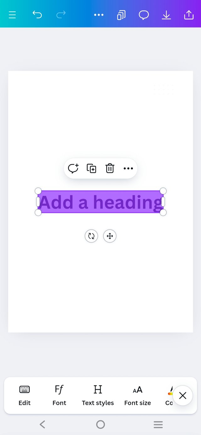
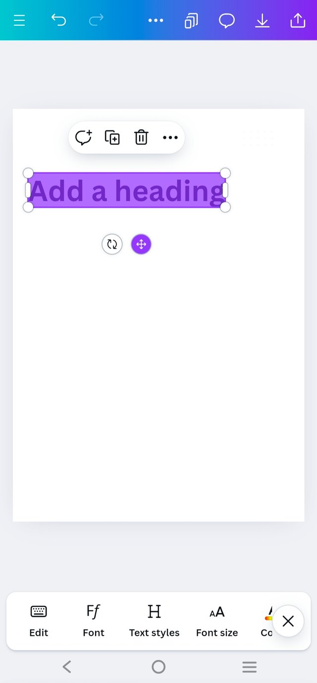
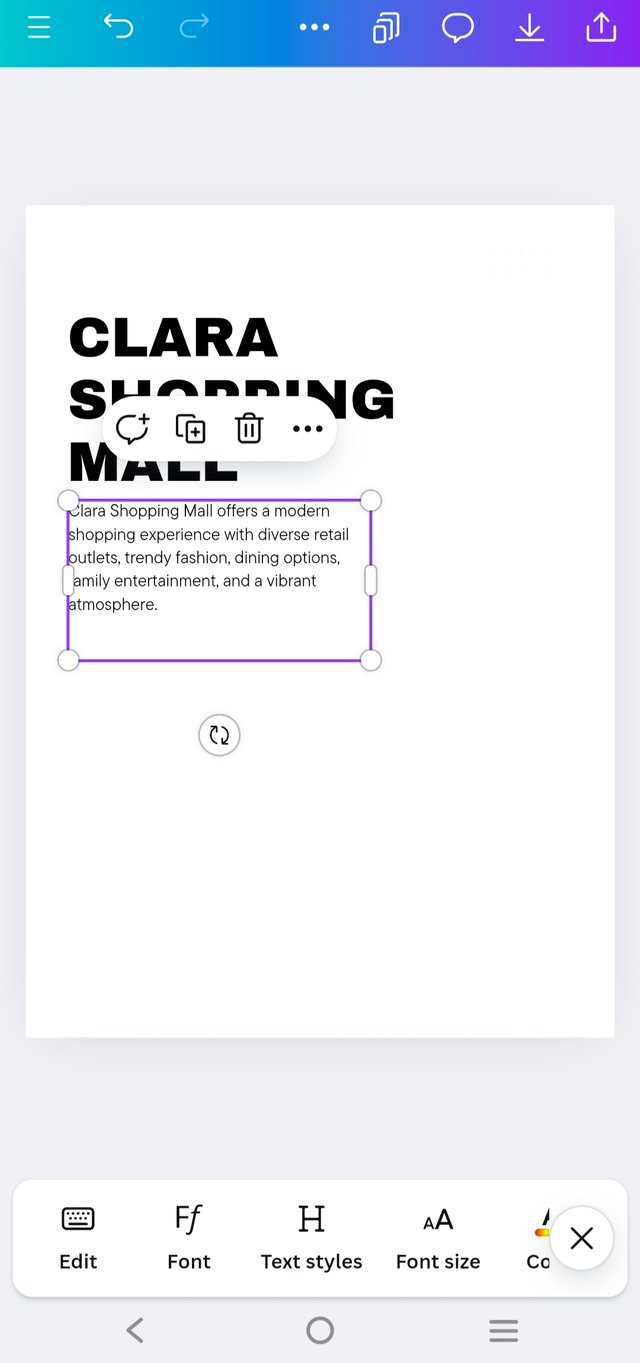
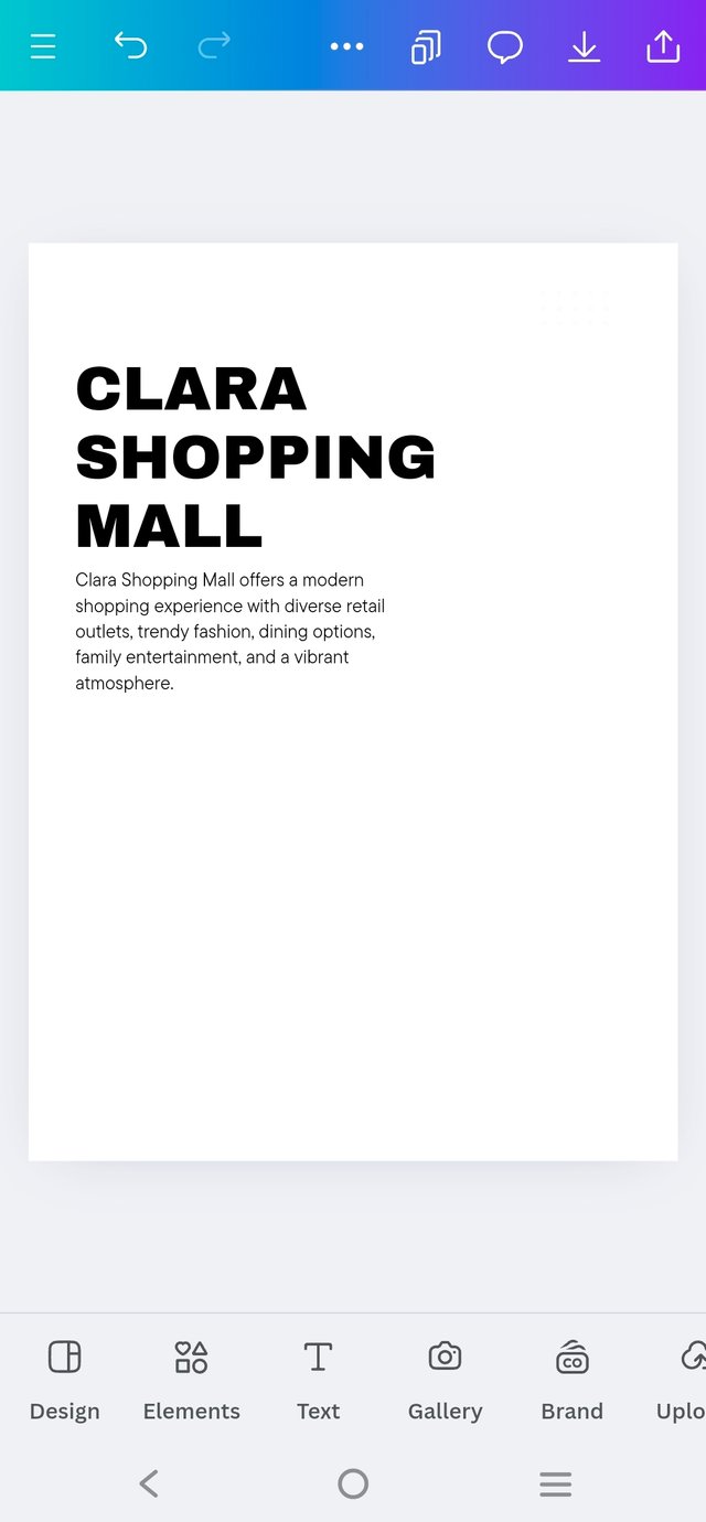
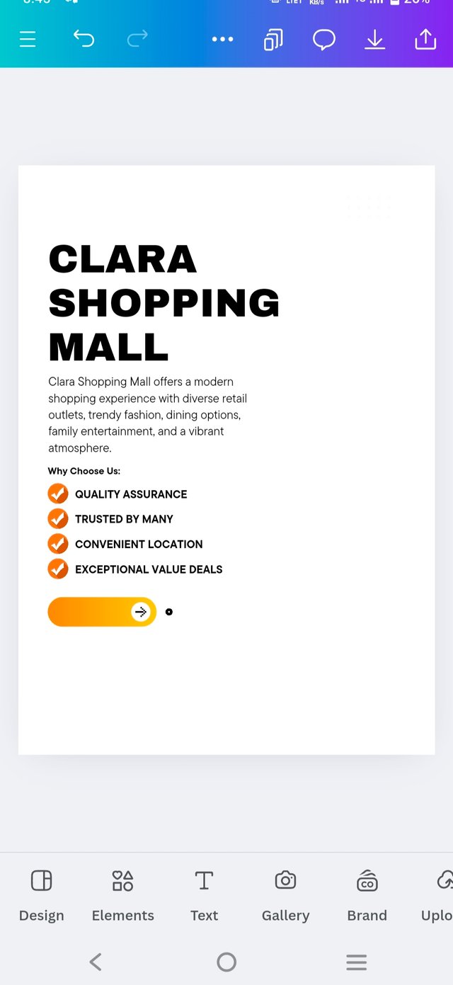
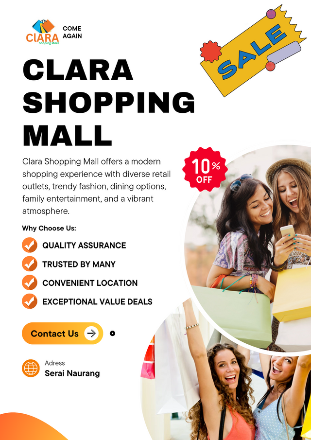
Step 2 : Start by adding the main header text, which should be bold and attention-grabbing. Use a large, clear font for visibility. For example, type "CLARA SHOPPING MALL" in uppercase and set it in a bold font style.
Below the main header, include a smaller subtitle or tagline that provides context. This could be description or another catchy phrase related to the promotion.
 |  |
|---|
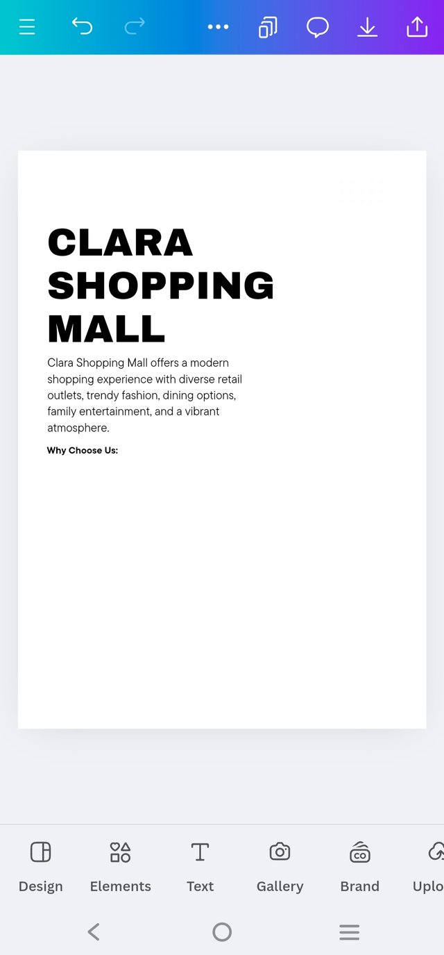
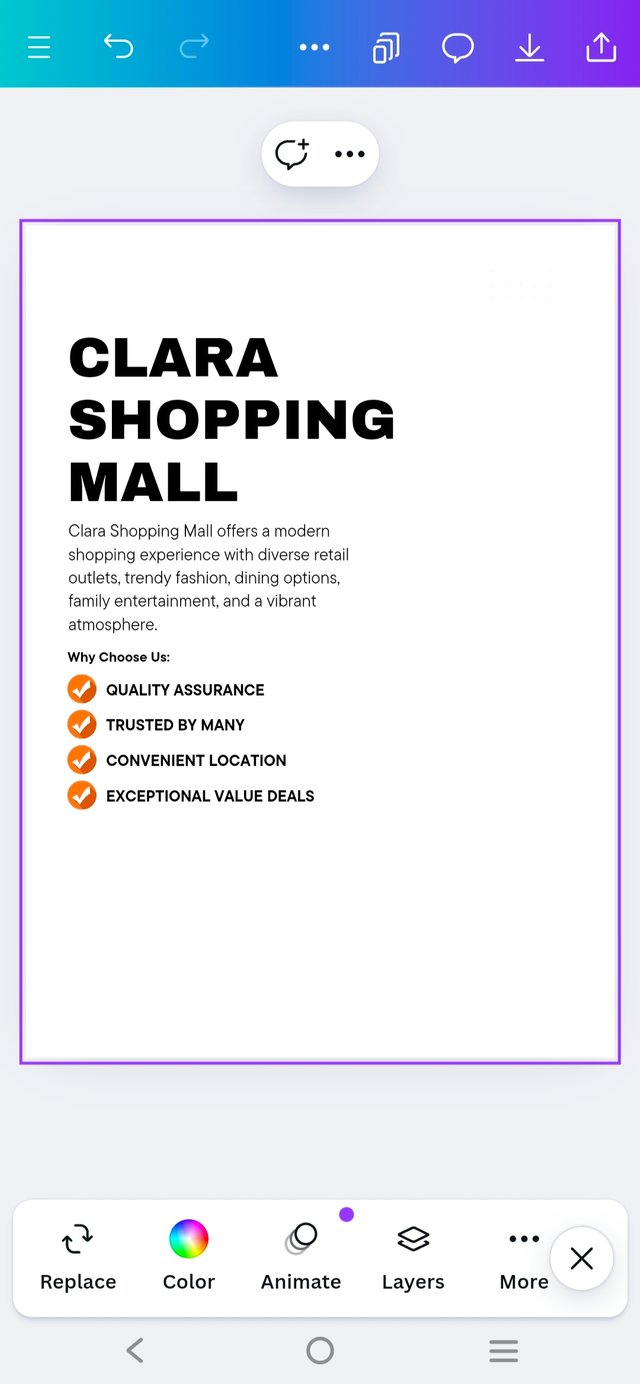
Step 2 : Next, just below the header, I added a bold subheading with the text "Why Choose Us" to highlight the key benefits.
Following that, I incorporated five bullet points, but instead of standard dots, I used unique graphic icons to make each point visually distinct and engaging.
This added a creative touch, making the content stand out more effectively.
 |  |
|---|
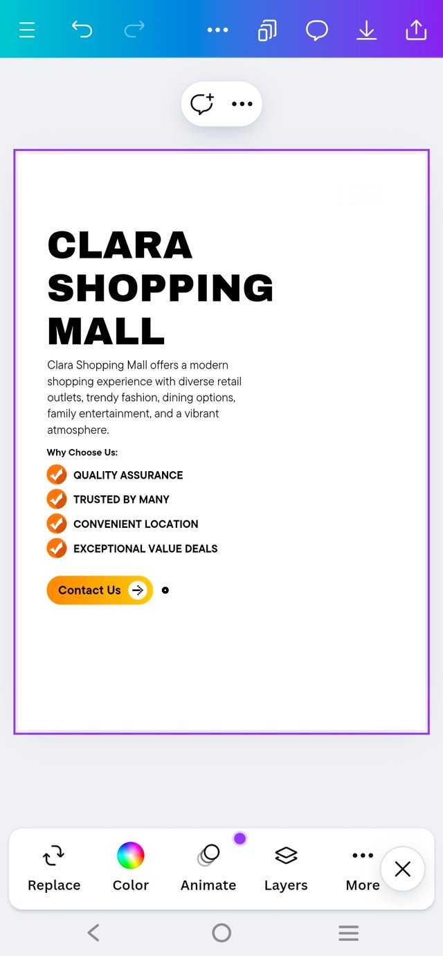
Step : 3 Now, let's move on to a crucial step I focused on—the contact information. I wanted to make sure this section immediately grabbed attention, so I carefully searched for eye-catching elements to emphasize the "Contact Us" area.
Using a bold font for clarity, I combined striking graphic elements to make it stand out, ensuring it was impossible to miss.
This section was all about drawing the viewer's eye directly to how they could get in touch, as it's the most important part of the flyer.
 |  |  |
|---|
And So on ....,
 |  |
|---|
Step : 4 The next essential element in the flyer was adding the logo, which I had already designed back in Week 3. Alongside the logo, I included two key tag words at the top, using a subheader format to make them stand out.
When it came to placing the logo on the flyer, I kept in mind a piece of feedback I received from @lghoric last week, mentioning that the logo was positioned too high in term of size.
This time, I paid extra attention to the logo’s placement and size, making sure it was balanced and visually appealing without overwhelming the design.
 |  |  |
|---|
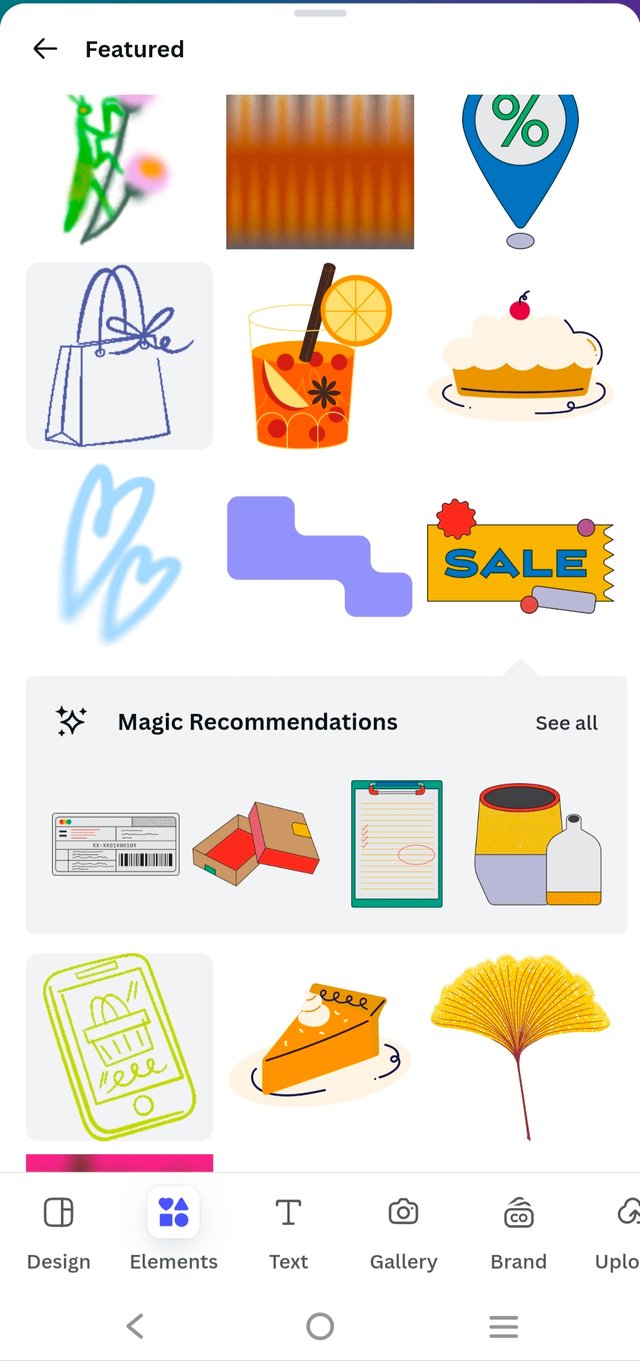
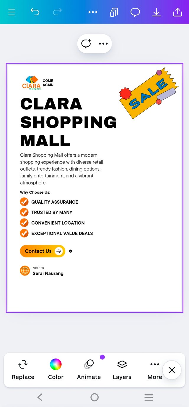
Step : 5 Next, I added an element to the left side of the flyer. While browsing Canva's "Graphics Section" and searching for shopping-related visuals, I stumbled upon hundreds of options.
I chose a Sale graphic to fill the empty space in the top right corner, which added a promotional flair to the design.
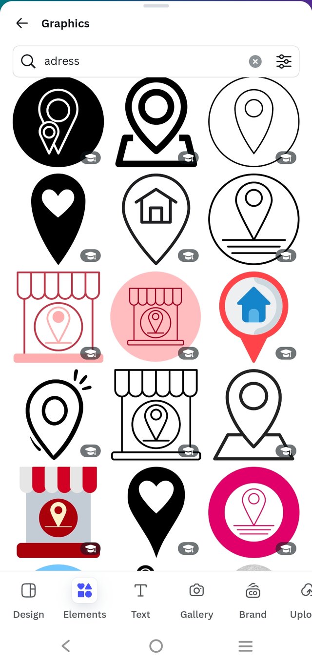
At the same time, I had the idea to include a location icon next to the "Contact Us" section, making it easier to spot the contact information while enhancing the flyer’s overall look.
 |  |  |
|---|
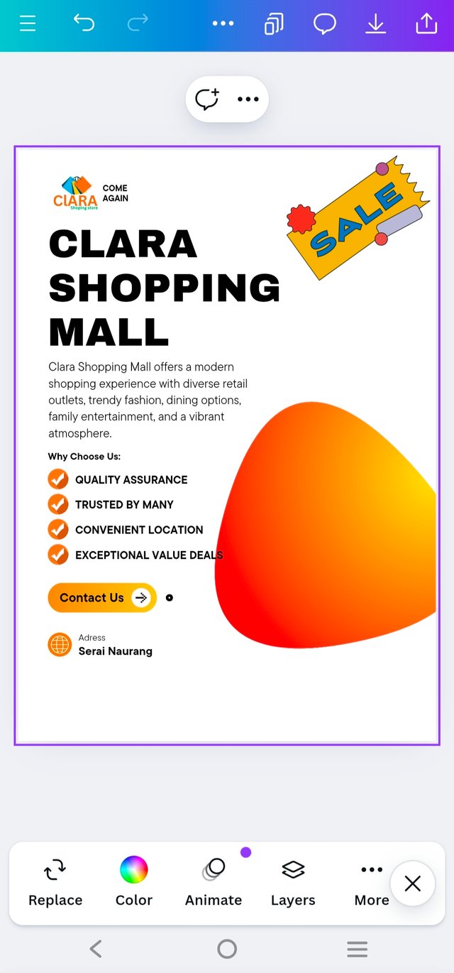
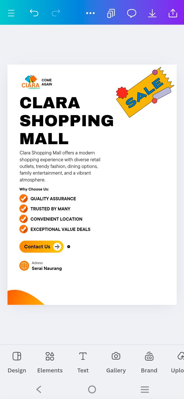
I also searched for some balloon elements to add a fun touch to the flyer. I found a large graphic that worked perfectly, resizing it to about 1/4 of its original size to fit the design.
This was definitely the coolest addition—before the balloon element, the flyer felt a bit chaotic, but after adjusting it, everything came together beautifully, giving it a polished and lively look!
 |  |
|---|
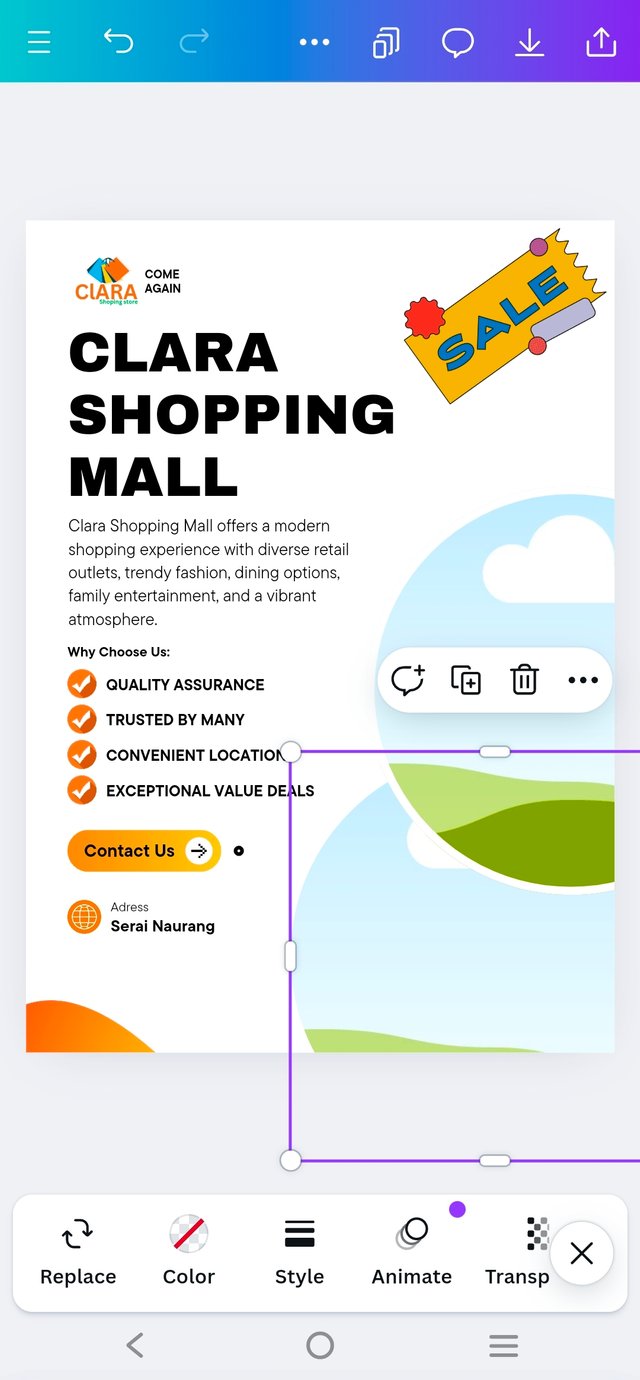
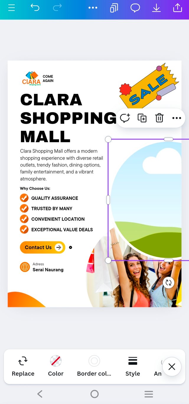
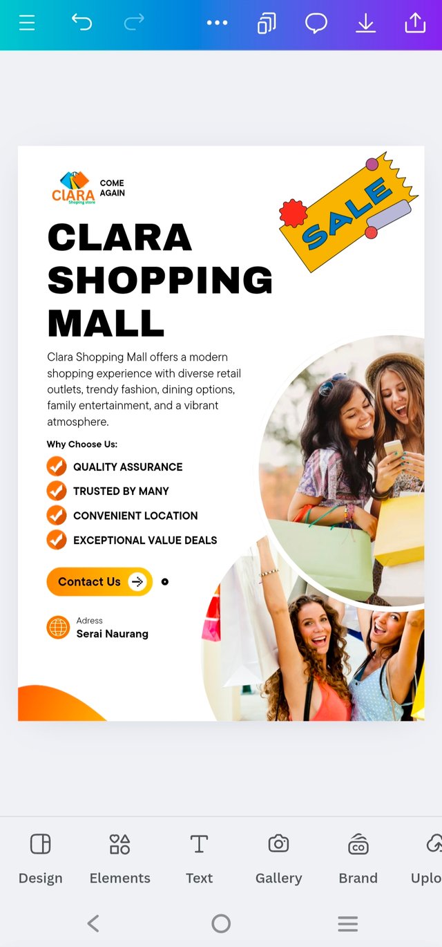
Adding pictures was the final and crucial step, but I had a funny moment of indecision. At first, I thought, "Why not go all out and add two, maybe even three images?"—imagining a flyer bursting with excitement! But, after a little reality check (and realizing my flyer might start looking like a crowded party bus), I settled on using just two pictures.
They fit perfectly without making the design feel cramped, giving the flyer a lively yet balanced vibe. It was like finding the perfect puzzle pieces to complete the look!
 |  |
|---|
And So on.....,
 |  |  |
|---|
 |
|---|
Once again use a suitable mockup to promote your design. |
|---|
To create a mockup for promoting my design, I turned to Canva, which is a fantastic tool for this purpose. Here’s how I went about it:
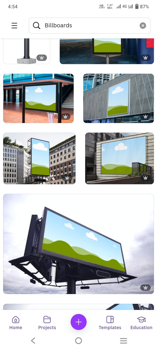
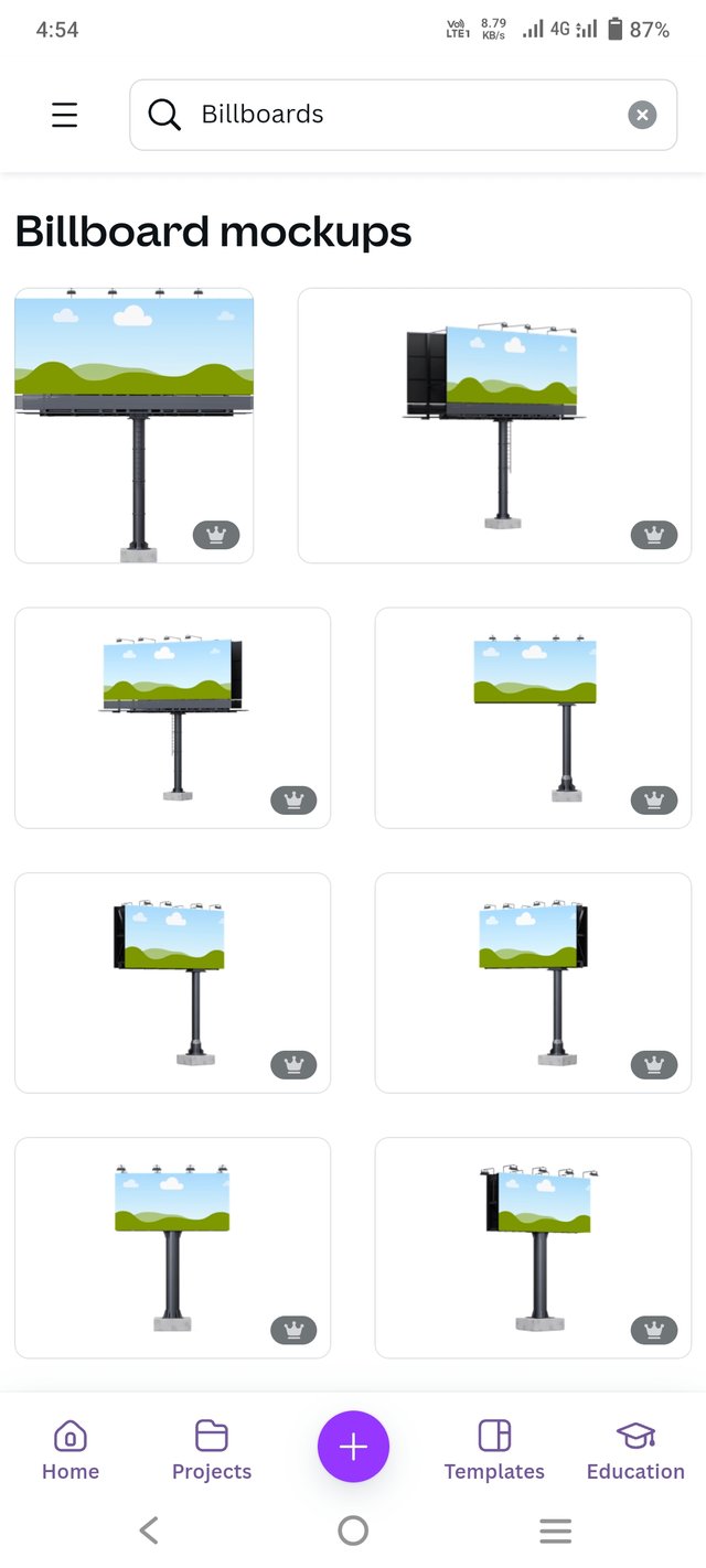
- Browsing I began by browsing Canva's large collection of mock-up templates. There are countless possibilities to choose from—ranging from realistic flyer displays to digital screens. I chose a template that will really highlight my flyer design, ensuring that it will look professional and eye-catching.
 |  |
|---|
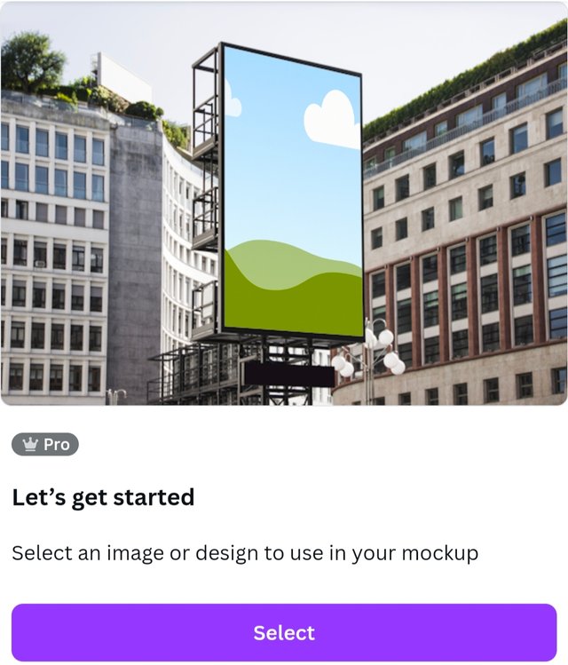
- Uploading My Design: After I chose the mockup template, I uploaded my final flyer design to Canva. It's as easy as clicking and dragging your design into the mockup. I made some adjustments in its placement so that my flyer would fit exactly inside the template, and all my important details would be captured.
 |
|---|
- Customization of Mockup Canva also permits extra customization. So I experimenting with background color, shadows, and lighting effect on this mockup to focus attention to the flyer. Additionally, I checked to see if the text and images appear clear in the mockup format.
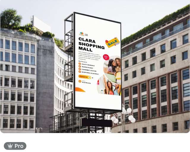 |
|---|
- Preview of Final Mockup: Before saving, I previewed how my flyer will look under real-world conditions—say, wall-mounted or on a wooden frame. This gave me the final chance to check the mockup and adjust it, if necessary.
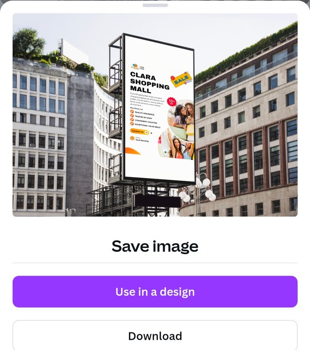 |
|---|
- Downloading and Saving: Once I was satisfied with the mockup, I downloaded the final version in high resolution. That way, I had a finalized and eye-catching mockup ready to share my flyer design across various platforms.
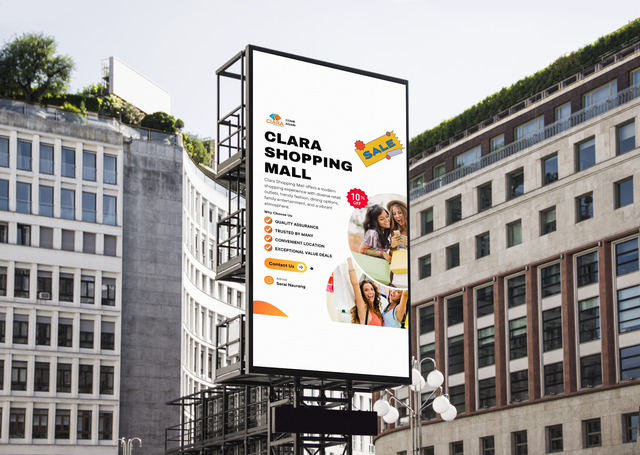 Final Outcome Final Outcome |
|---|
kind Regards
@artist1111
Adieu, folks!
May the winds of fortune
carry you to greatness!
May the winds of fortune
carry you to greatness!

Hello @artist1111 thank you for participating in this week's lesson. We have assessed your entry and we present the result of our assessment below.
Feedback:
Welcome back to class dear student.
Let me start by commending you for a job weldone, the effort put in this work is quite commendable.
I can see you used your already made logo which is quite cool, of course there is no need to create another just as stated in the task.
You're flier is nice, I can see a very nice improvement, your design is well structured and I can also see that you maximized most of the principles of design. One of my observation is that the sales image you added from element doesn't seem to blend well with it. The concept is nice but that particular one looks a bit odd on it. I also noticed you didn't dedicate a session to talk about the principles of design you engaged which was requested in the lesson...Finally,the design looks good on the outdoor billboard.
Regards
@lhorgic❤️
¡Saludos amigo!🤗
Veo que tienes experiencia elaborando folletos... Te felicito por ello, ya que diseñar este tipo de imágenes no es tan sencillo como creemos debido a la cantidad de elementos y textos que se usan.
Te deseo mucho éxito en la dinámica... Un fuerte abrazo💚
The color combination of logo and poster is really charming. This is an interesting example for branding. Best of luck for the contest my friend.