SEC20/WK5: Graphic Design Hands - On practical 2
Assalamu'alaikum everyone.
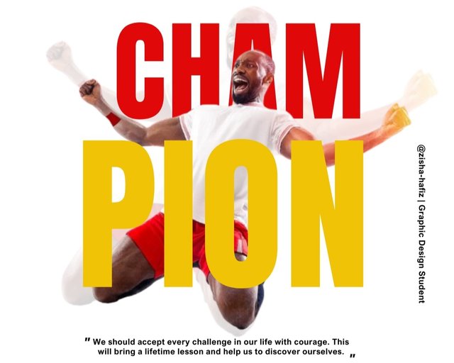
By attending in this contest day by day I learned many features of Canva with which I was not familiar. This really improves my knowledge about this app and also design. From the core of my heart, I would like to thank sir @lhorgic for arranging such an amazing challenging contest. In the last participation, I made lots of errors which sir has analyzed very thoroughly and I learned a lot from there.
 |
|---|
Made By Canva Today I'll do my best to represent today's task by following sir's guidelines. I believe if I make any mistake sir will help me to find out and advise me how to solve those. So without wasting any moments, I would like to share my task.

Step- 1
 |
|---|
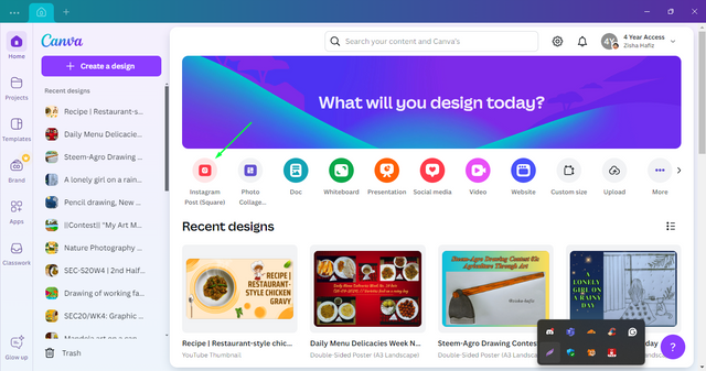
First of all, I open the "Canva" app from the computer. After opening one, the customer selects the design used for the Instagram post from the various designs available there. This design dimension I keep as 1080px in length and 1080px in width.
 |
|---|
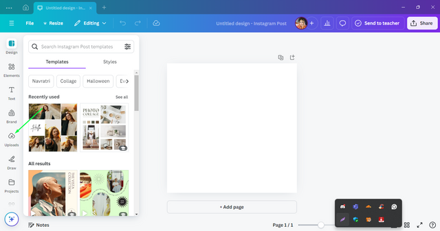
From the left side interface select the upload option.
Step- 2
 |
|---|
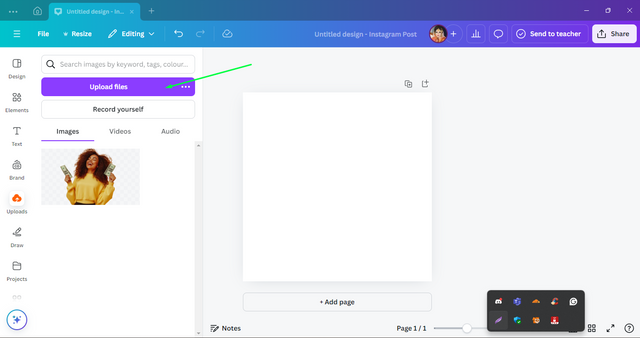
From the appeared interface I select the "Upload Files" option.
 |
|---|
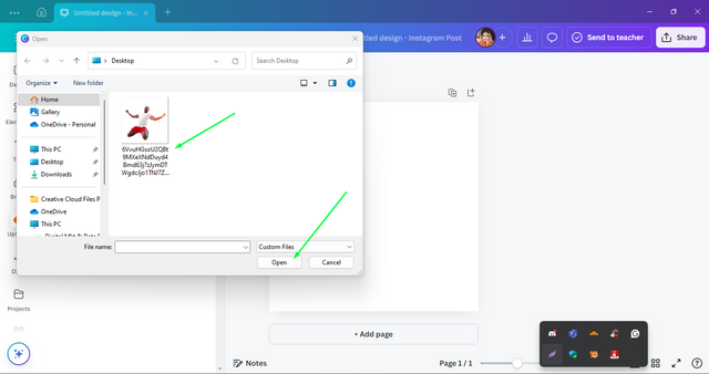
After selecting the upload option another interface comes from there select the desktop option where I have saved the image given by our teacher. Now click the desired image "Open" option.
Step- 3
 |
|---|
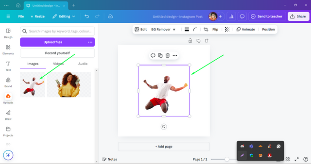
As soon as I click the option, it brings up the previous Canva app and sees that image. Hereafter clicking on the image I got it appreaded on the page.
 |
|---|
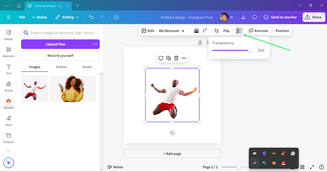
After clicking on the image, some options will appear above. Select the "Transparency" option from it.
Step- 4
 |
|---|
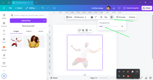
Reduce the transparency of the image from 100 to 18.
 |
|---|
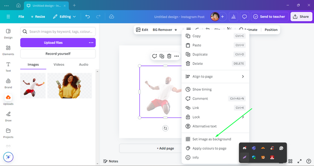
To place the image in the background of the design, place the mouse point on the image and click on its right button. After clicking, select the "Set image as background" option from the interface that appears.
Step- 5
 |
|---|
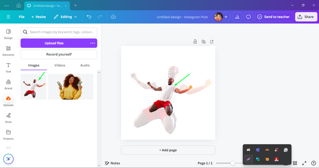
After setting up the image as the background, selecting this image on the left will bring you back to the design page. Then try to drag the image and place it between the background image that our teacher shows in his demo design.
 |
|---|
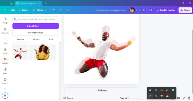
While placing this image on the background image, I have carefully taken care that the distance between the hands of the background image is correct, and I have also taken care that the lower legs of the man in the image are placed in the demo position as shown by our sir.
Step- 6
 |
|---|
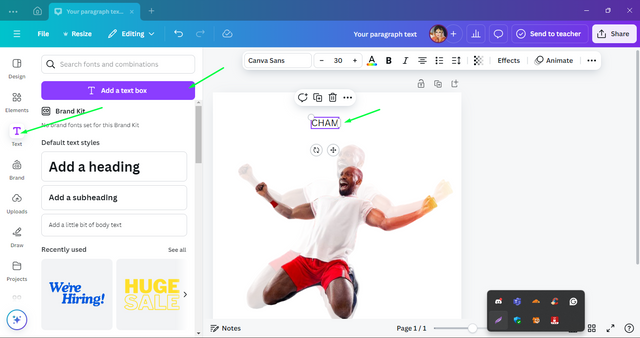
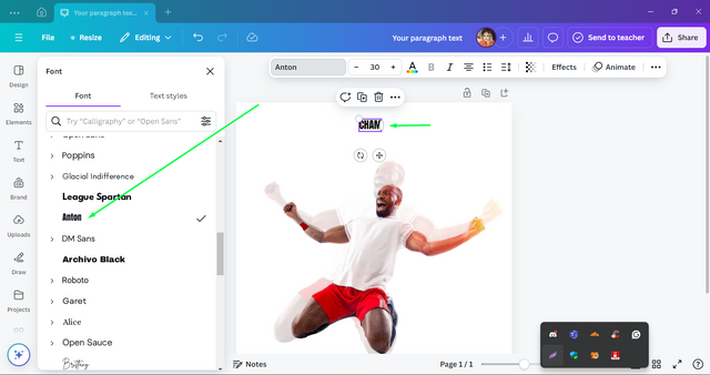
In this case, select the "Text" option from the options on the left side. After that selecting it one interface has appeared from there I select the "Add a text box" option from the next interface. In this box, I wrote the word "CHAMP".
 |
|---|
By clicking on the font option above, a demo of some different fonts is shown on the left. From there I choose the "ANTON" font. I think this font style is most similar to the demo design provided by our sir.
Step- 7
 |
|---|
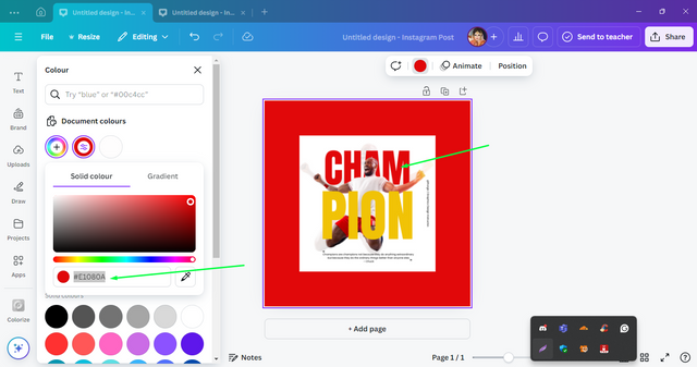
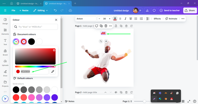
Now it's time to select the color of the text “CHAM”. For coloring the font I need the specific colour code for it. Through color theory and application classes organized by our sir, I learned how to find the exact color code of from a design using hex codes.
 |
|---|
I use the same method to extract the champ text color which is #E1080A as the text color of my design.
Step- 8
 |
|---|
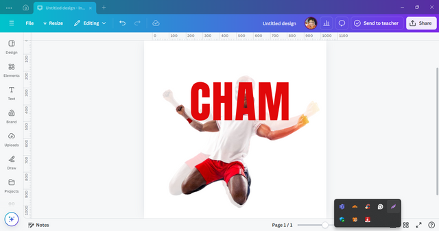
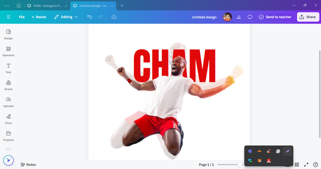
Then I increase the size of the text "CHAM" to the size shown by Sir as in the demo.
 |
|---|
To place the text behind the image, click the right mouse button on the text and an interface will appear. From this interface, I chose the "Layer" option and among this option, I chose the "Send backward" option for moving the text behind the image.
Step- 9
 |
|---|
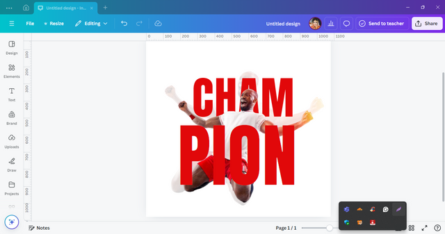
Similarly write the text “PION” and the size of the text is not a little bigger than the text “CHAM” as in the demo.
 |
|---|
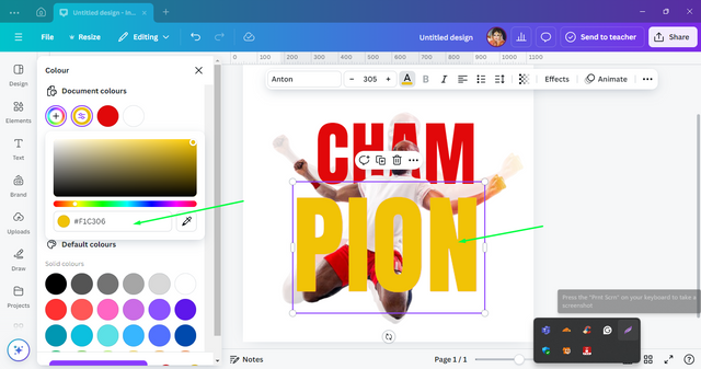
Just like before, identify the hexa color code of the font "PION" and colored my design text.
Step- 10
 |
|---|
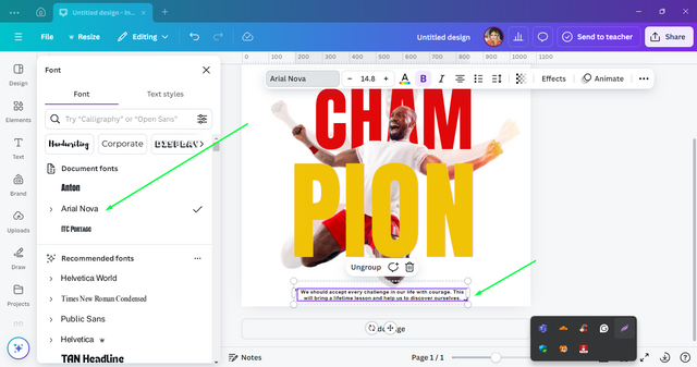
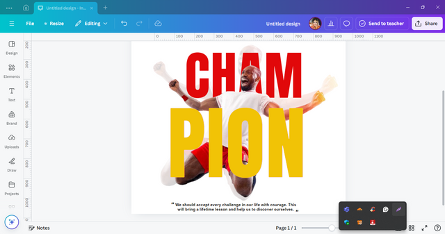
Now click on "Add a text box" and a box appears in it I wrote my own quote about the challenge. For the quote that I made by myself, I chose the "Arial Nova" it was supposed a similar font as what I see in the demo design. I try to give the size of the fonts as like the font size of the speech given in the demo.
 |
|---|
I placed the quote very carefully at the end edges of the design.
Step- 11
 |
|---|
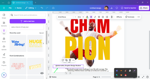
The written was not as per my desired place so I decided to move it to the accurate place as I found in the demo.
 |
|---|
So this time, I rotate the text box to the right side and set it to the right edge of the design.
| Briefly talk about the principle you engaged in your design |
|---|

Before ending my today's task I would like to invite some of my Steemian friends - @mehwish-almas, @sadaf02, and @bimanakhan to participate in this amazing contest and for getting vast experience in graphic design.
Warm Regards

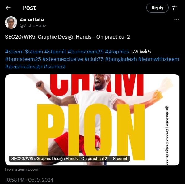
X Promotion :- SEC20/WK5: Graphic Design Hands - On practical 2
Upvoted. Thank You for sending some of your rewards to @null. It will make Steem stronger.
Thank you so much for curating my post.
Like every step guideline given in your post! It will be very helpful for those who want to learn to design.
Nice job done. Good luck for this contest.
Thank you so much for your appreciation. It really means a lot for me.