"SEC20/WK4: Graphic Design Hands - On practical 1"
 canva design canva design |
|---|
Graphic design is just sweet when you can find your way around. I am so proud of myself and what I can do now, all thanks to the teacher @lhorgic for being a wonderful teacher to his students.
From week one, the lessons has been cool and interesting and this week four is just perfect to show what we've learned so far. You can check out my design steps below.
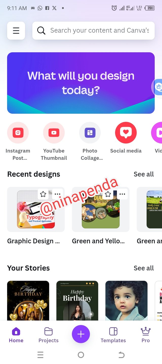
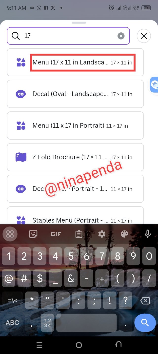
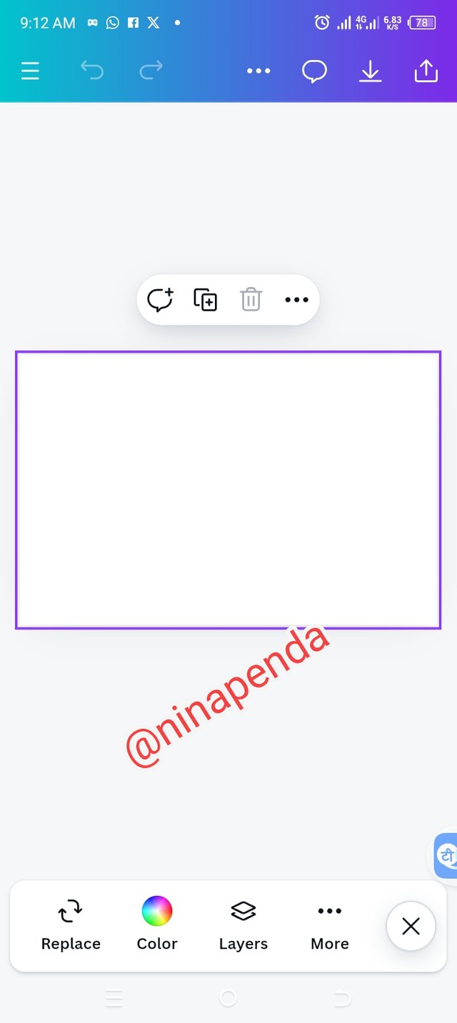
• Step 1: Opening my canva app, I clicked on the + sign to add the size of my workspace as highlighted in my image above. Then I highlighted my workspace and it is ready for use.
 |  |  |
|---|
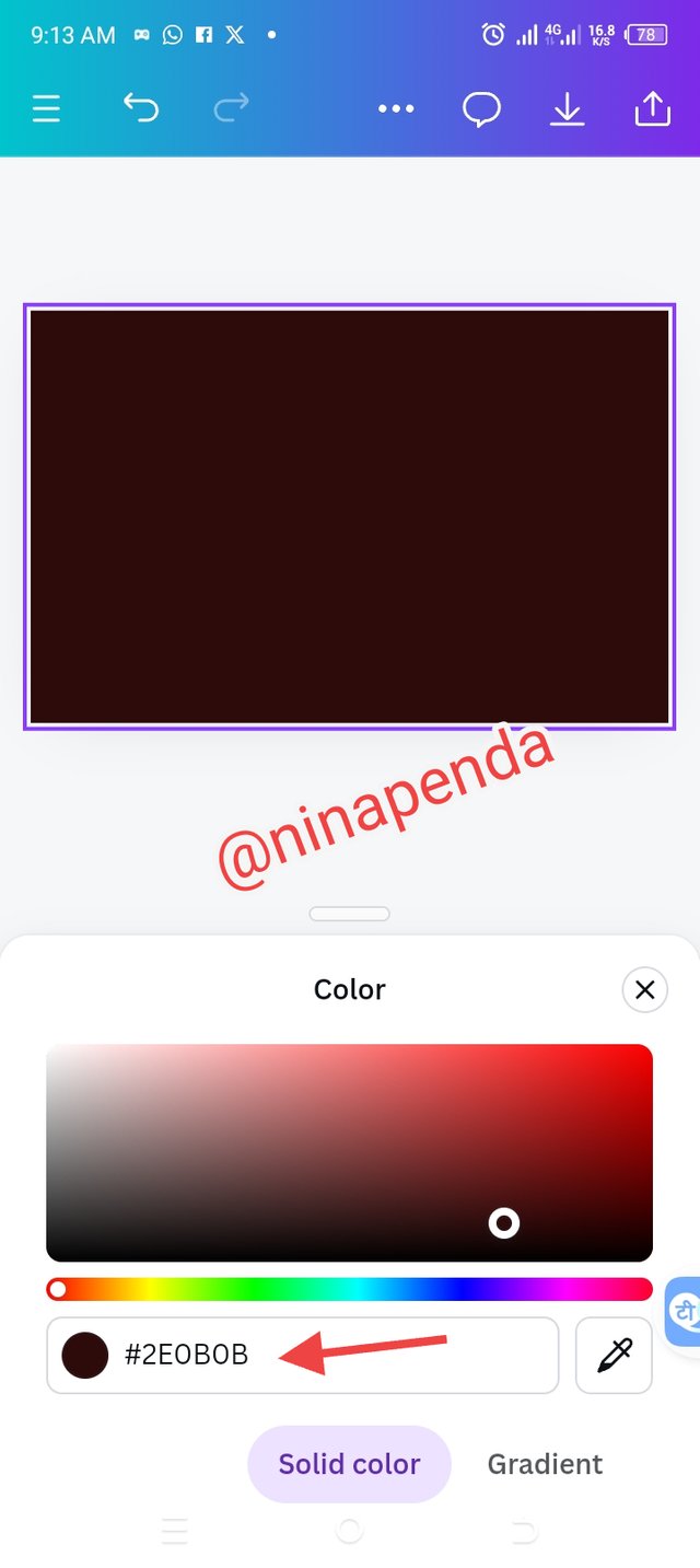
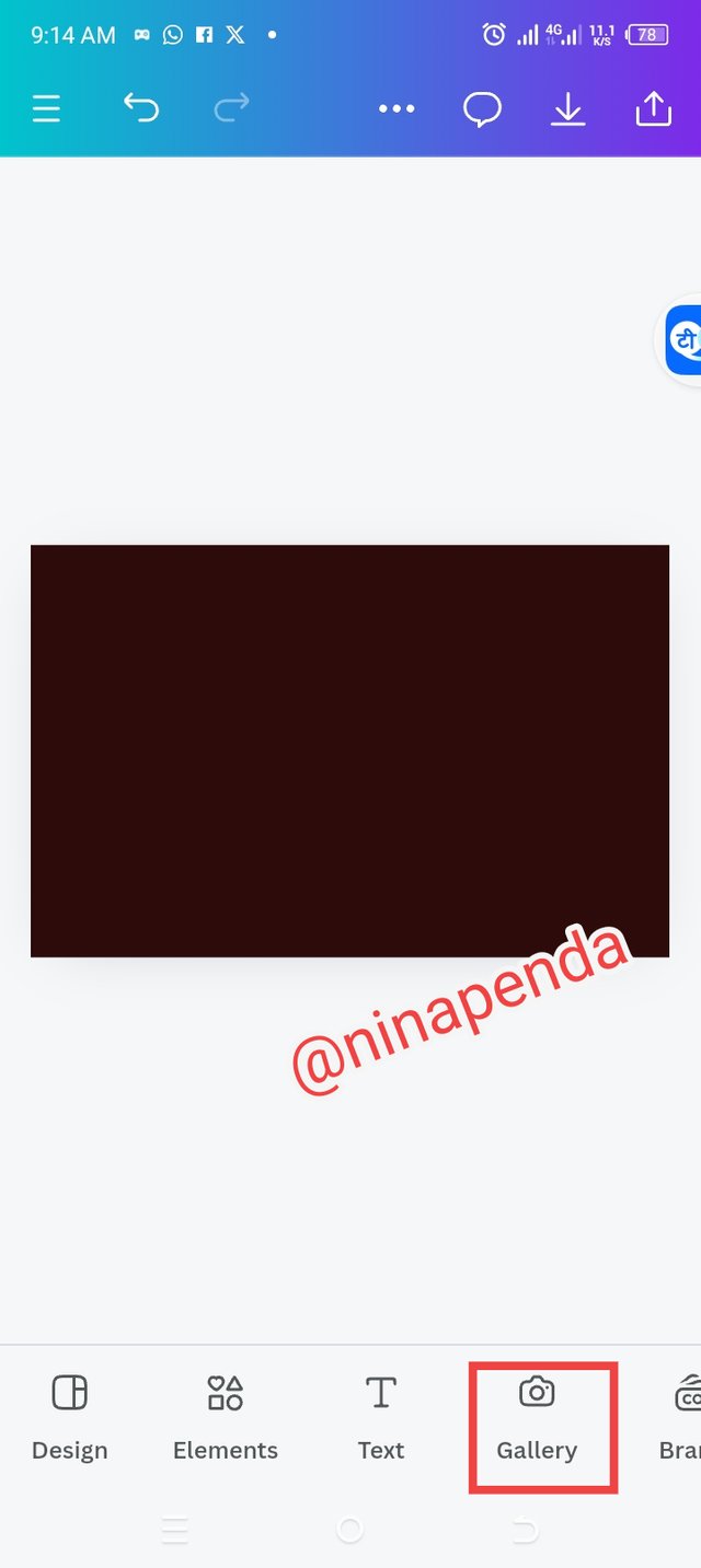
• Step 2: It's color time. I chose a good color background that would look good for my work. After that, I clicked on the gallery to select my background image.
 |  |
|---|
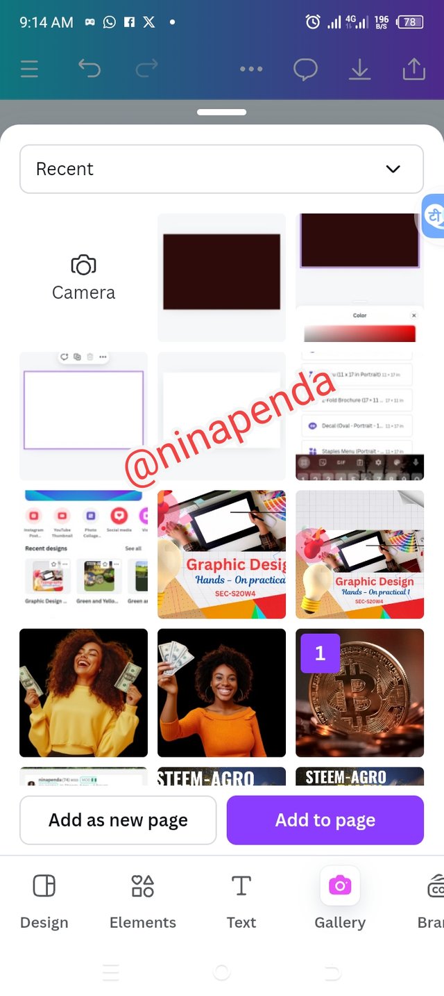
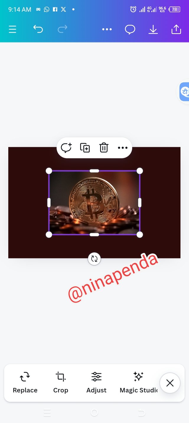
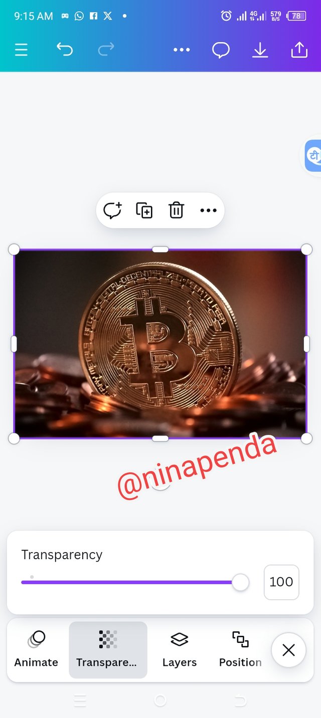
• Step 3: Launching into my gallery, I selected my background image and added to my workspace. I enlarged the image by dragging to fit into my workspace. I finally hit the transparency option and set it at 20 to make my image lighter.
 |  |  |
|---|
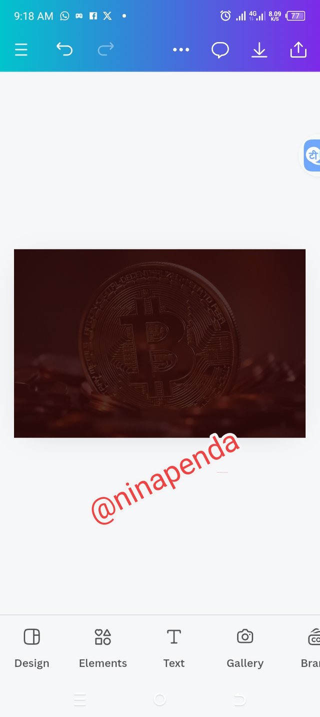
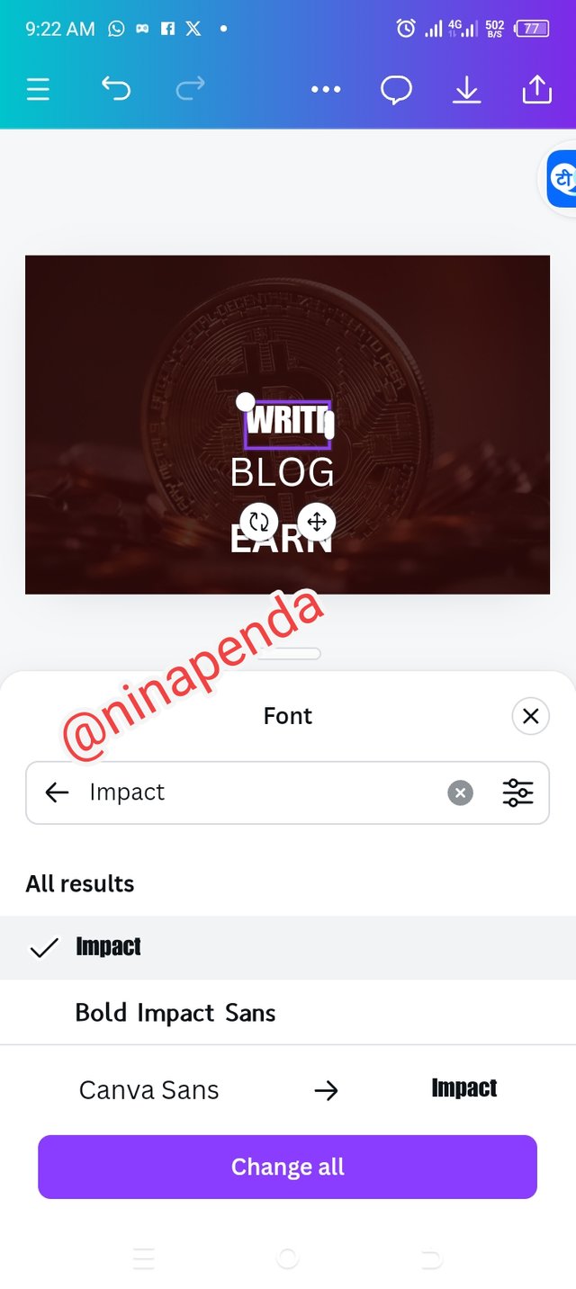
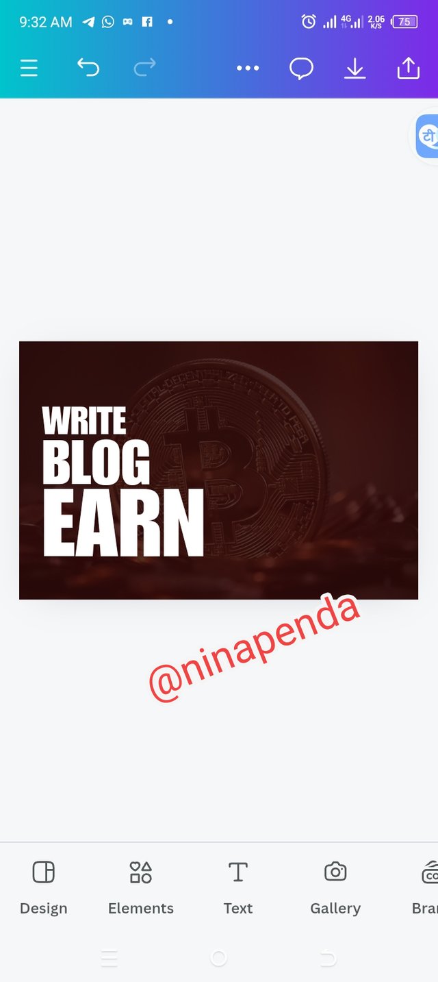
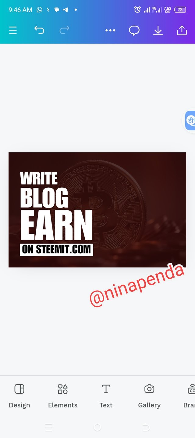
• Step 4: Looking at my image below, you can see that it's no longer projecting but lighter to work with. Then I clicked on the text icon to type in my text. I made a choice of typeface (impact) just like the teacher did and I positioned it to where I like. With the principle of hierarchy I was able to resize my text appropriately.
 |  |  |
|---|
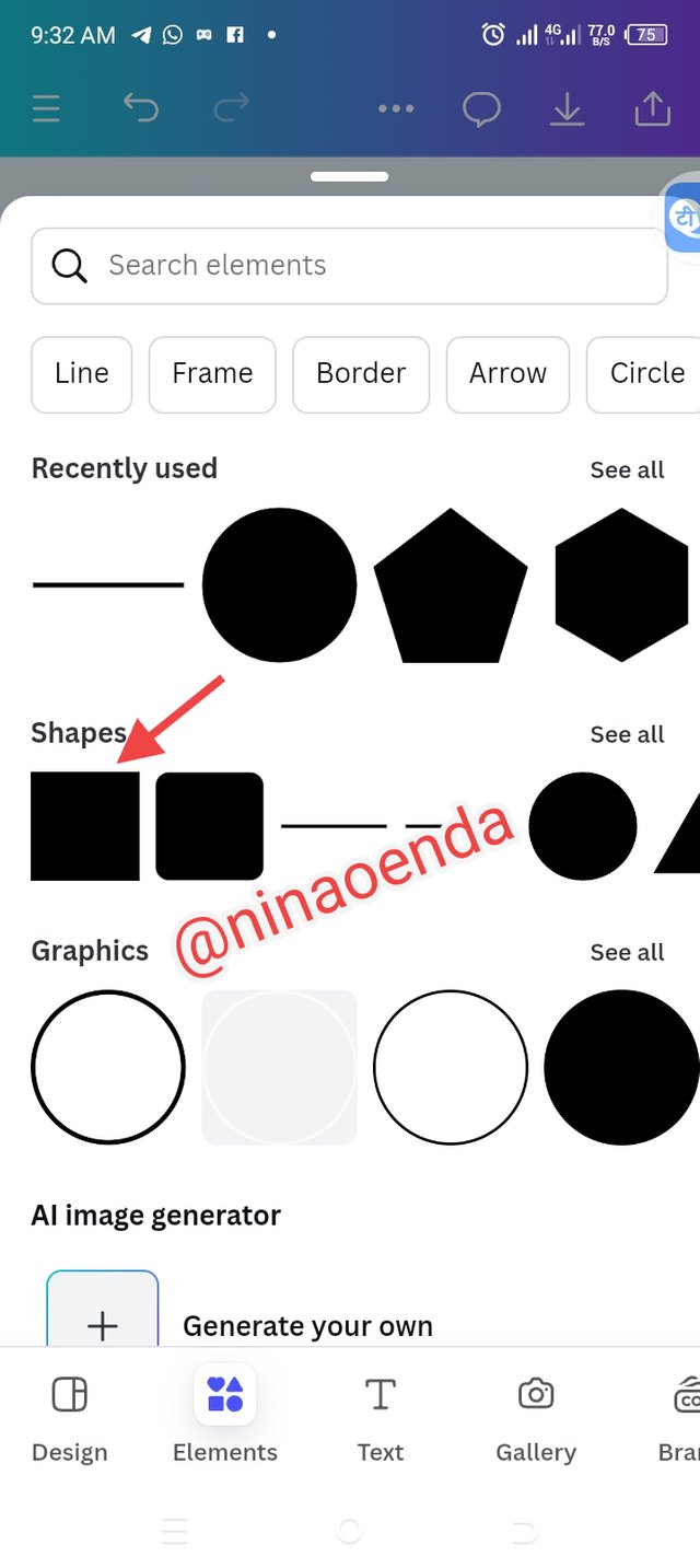
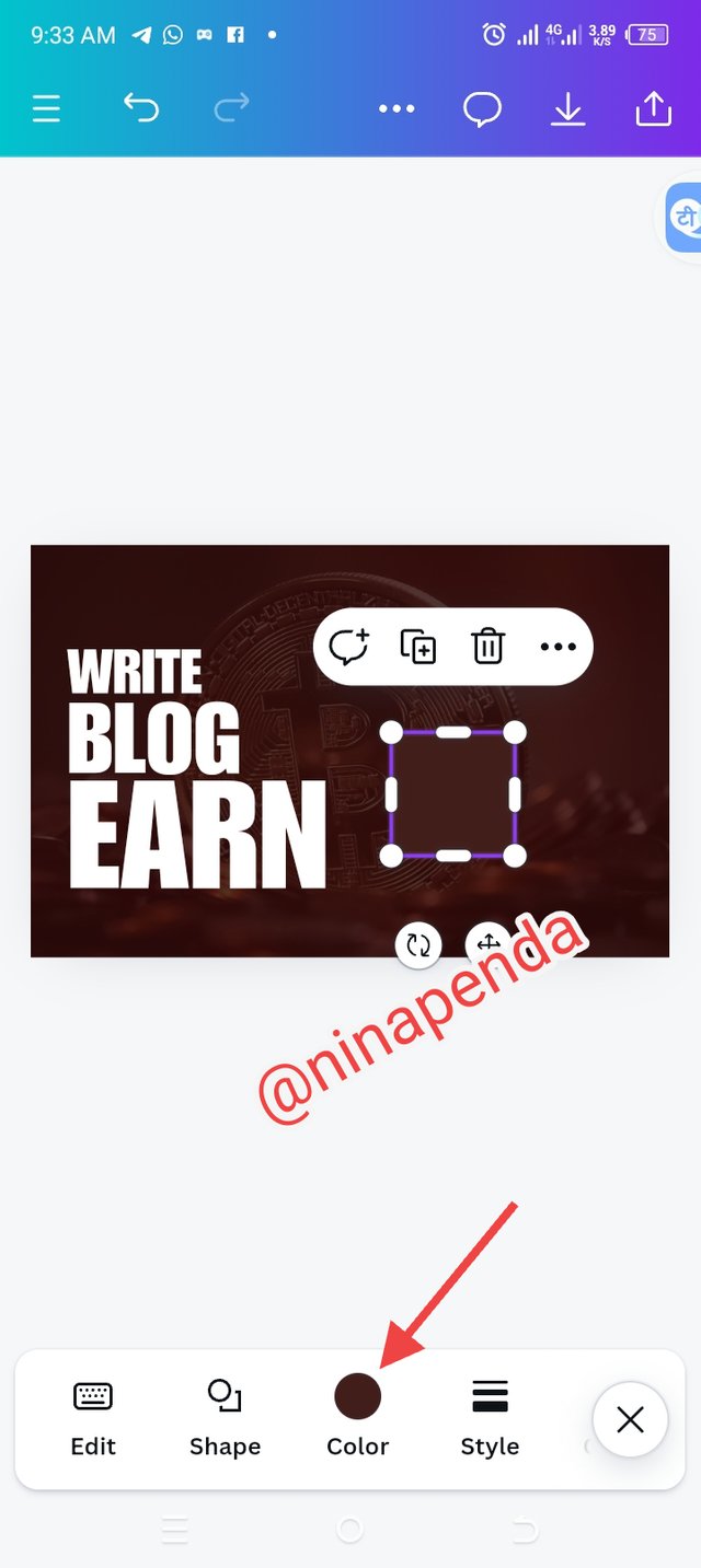
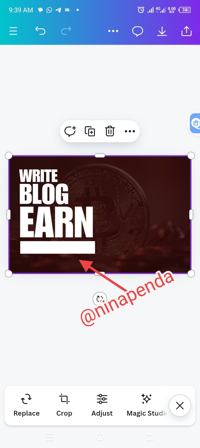
• Step 5: The next step I did was to select the right element that I will be working with, I chose a square shape, changed the color and then resized it to fit in where I want it to be which is below my text
 |  |  |
|---|
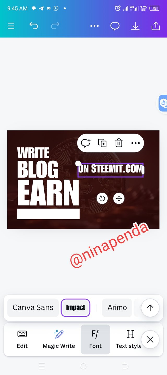
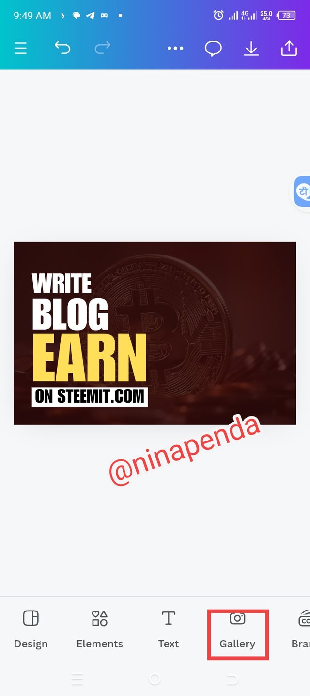
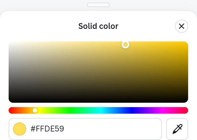
• Step 6: I introduced another text which is"on steemit.com", that would fit in the resized shape under my text. I placed the text where it should be and then used the principle of emphasis on "Earn" by changing it's color. The hex code is #ffde59. I clicked on the gallery icon to import an image I need for my work.
 |  |  |  |
|---|
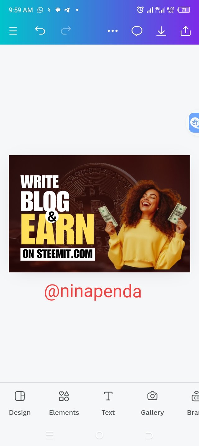
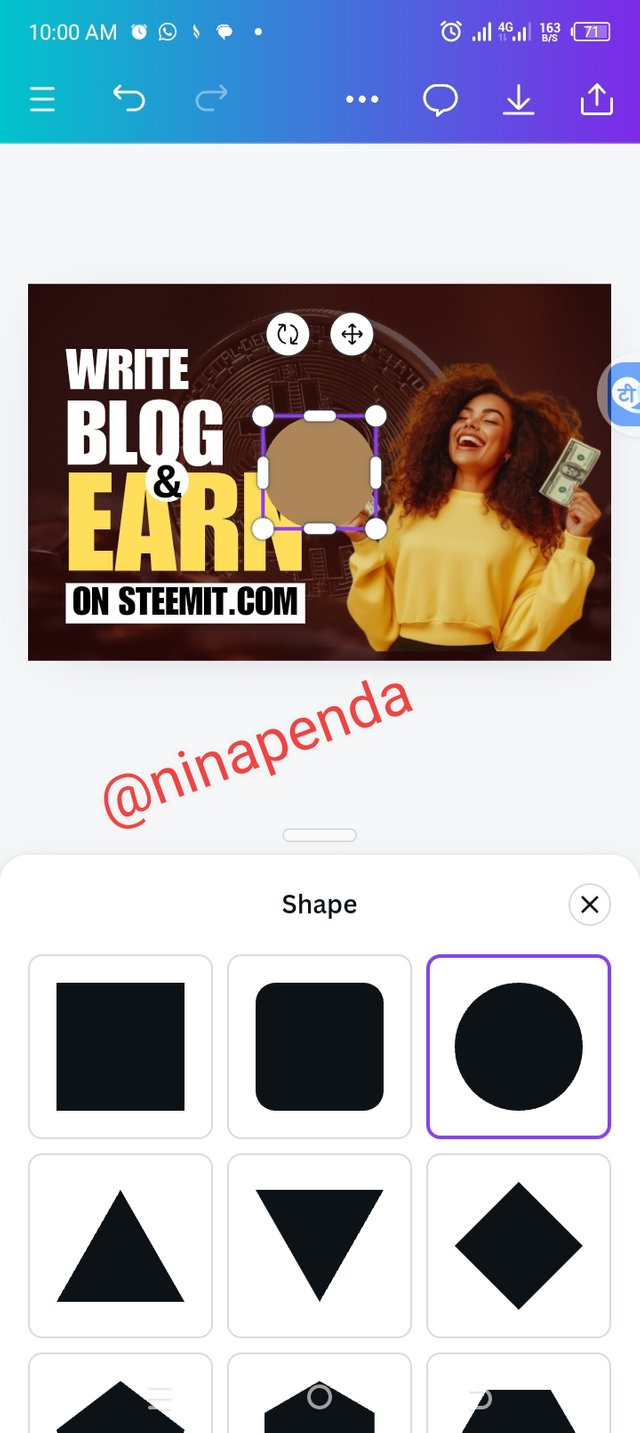
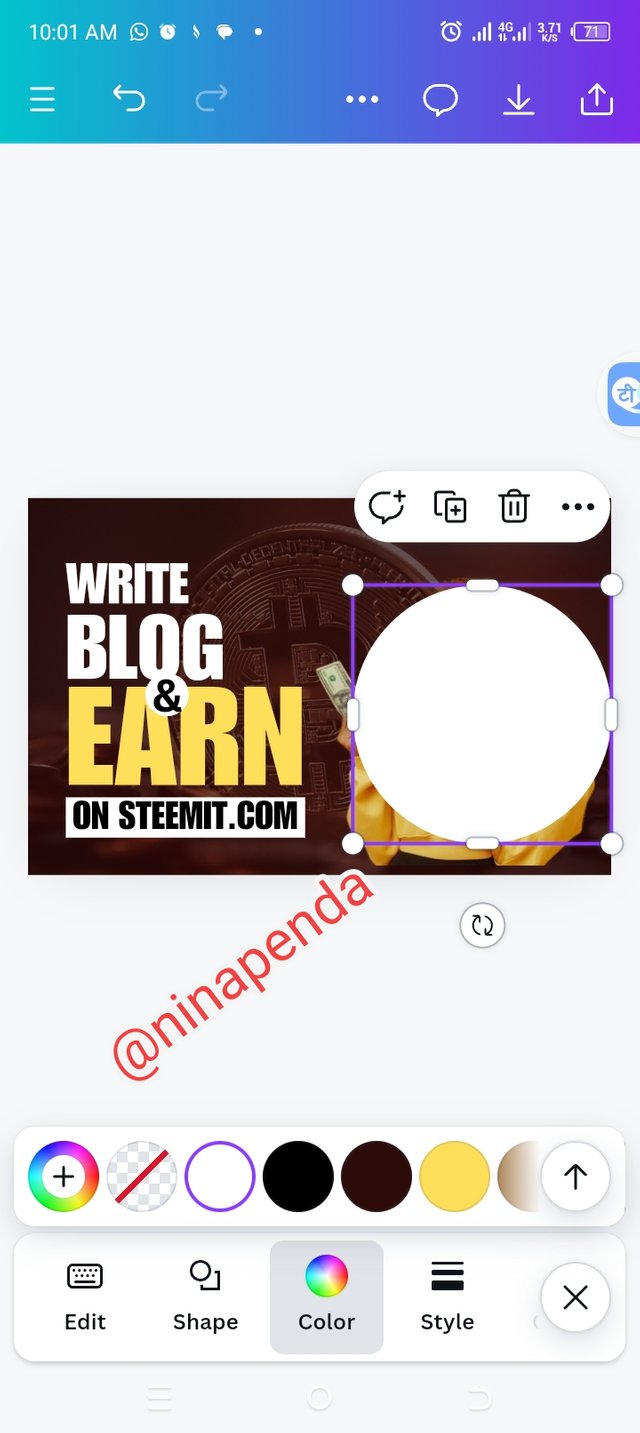
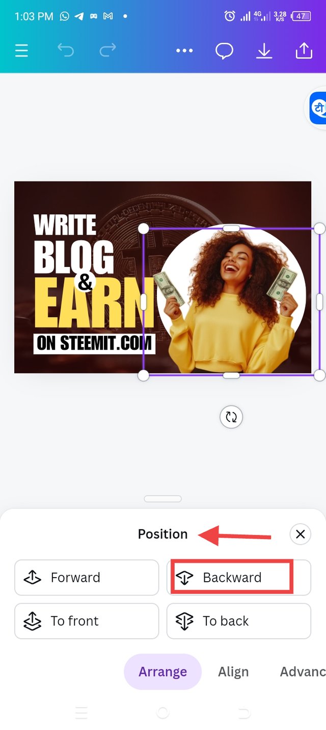
• Step 7: After importing my image, I resized it to fit in its position.I used the same process of getting a shape and adding a text to have the (&) logo planted in it's position. I went ahead to select a shape for my design. I chose the circle shape and then resized it, changed the color and positioned it using the position icon to send it behind the image.
 |  |  |  |
|---|
Final Design |
|---|

Let me invite @ruthjoe @nancy0 @goodybest to show how well they can design.
Upvoted. Thank You for sending some of your rewards to @null. It will make Steem stronger.
Hello @ninapenda thank you for participating in this week's lesson. We have assessed your entry and we present the result of our assessment below.
Feedback:
Let me start by commending you for the effort put into this practical work. Weldone. Your result is cool, It's obvious you followed me right from top to bottom and I appreciate. I would just point out few things you need to adjust on subsequently.
Your image and the circle effect should be moved up a little bit to match up with the whole text element. Another thing you need to take note of in your design is the space to your right and left, it must match, it's an aspect of balance as well and your element must not be too close to the edge on the right and left, there must be allowance so that it doesn't get cut off in the process of printing the design.
In all, you did beautifully well and I must commend your effort. I hope you keep up with the energy level dear student.
Regards
@lhorgic❤️
Thank you so much Teacher and as for the corrections, I have taken note of them. My energy is always full at all time, until the end of the class.
Thank you!