SEC20/WK3: Typography and Practical Application.
Hello dear friends how are you all? I hope everyone is well by the grace of God. I am also very well by the grace of Allah. Today I am here with a contest entry post. The third week of the Steem Engagement Challenge Season Twenty is underway. The contests organized this week are excellent. The teaching contest organized by @lhorgic is excellent. I am ready to participate here with pleasure. Let's get started, I hope you stay with me.
Made by canva
| Discuss your understanding of Typography. |
|---|
Typography is a technique of making text visually attractive and readable. Presenting your writings more attractively to the reader through typography. Typography is used to make texts more visually appealing to the reader.
At one time handwritten texts were used, but gradually different typography was invented to attract the reader's attention. Smart typefaces are certainly more attractive to the reader than handwritten typefaces. And that's why we use typography according to our heart's desire.By using typography we can make our content more attractive. Typography plays one of the important roles in writing markings, line shapes and presenting characters in a beautiful way.
Typography Any creative writer can use typography as per his/her needs. First we use the typography of our choice, then we imagine how the typography will look to people. Basically, we use the typography that most people find attractive. Lastly, typography is mainly used to make text attractive. Nowadays there are numerous typography, which are very simple and beautiful. Typography makes a special contribution to any banner, advertisement.
| Research 3 other typeface categories not captured in this lesson. Talk about them and also give a visual representation of the typefaces. |
|---|
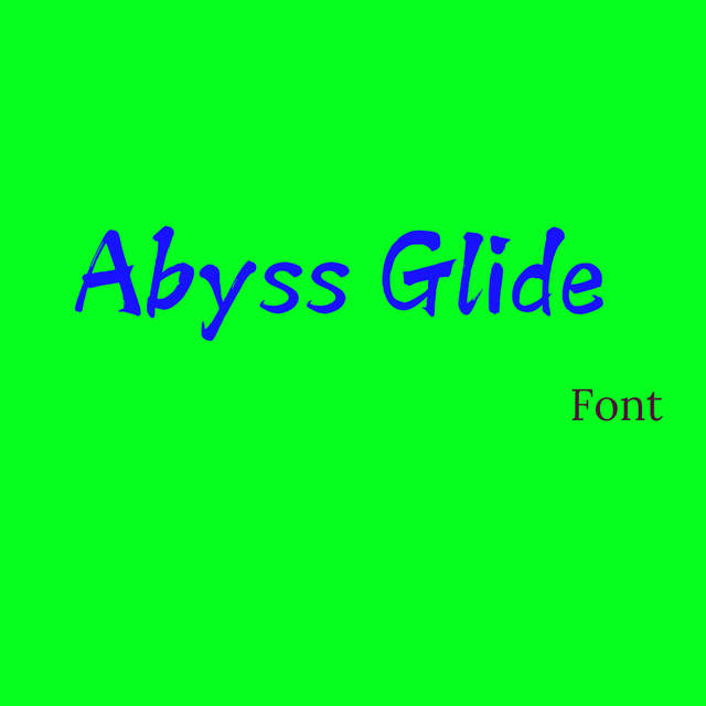
Abyss Glide: Abyss glide typeface It almost looks like hand-drawn letters. There are several other fonts that look almost the same. It looks like an art made out of paint. Basically it will look like it was written with crayons. If you look closely at the writing, you can see that each letter has a small residue at the beginning and end. This typeface adds extra art to the design. I wanted to discuss this typeface because it looks unique and creative. Basically such texts look like lines written by colors.
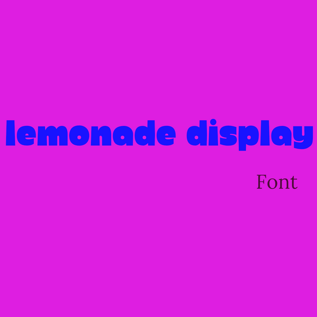
Lemonade Display: Lemonade Display is a typeface that looks extra bold. It will look much bolder and brighter in any design. Because each letter is relatively darker. This typeface has very little space between letters. Basically it is more bold so that it can attract attention easily. I find this typeface quite attractive for easily highlighting a line in a design.
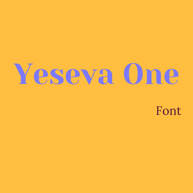
Yeseva One: Yeseva One is a typeface which is one of the smart typefaces. These texts are considered as smart typeface. Each letter of this typeface is shown in bold and some parts are bold. This typeface usually looks attractive when added to a content title. I use this typeface in resume headers most of the time. This typeface looks attractive and its design is quite smart. This typeface can be presented very brilliantly in the title of any design.
| Demonstrate your understanding of Typography just like I have done with my four examples using the following guidelines below. |
|---|
| 1st Design | 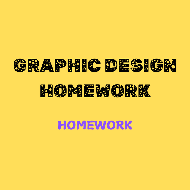 |
|---|
| SN | Items | Answer |
|---|---|---|
| 1. | Typeface/font used | Upper font : Rubik moonrocks font: Ample Display |
| 2. | Colour Hex used | Background: #ffde59 Upper font: #000000 Lower font: #8c52ff |
| 3. | Alignment used | upper side |
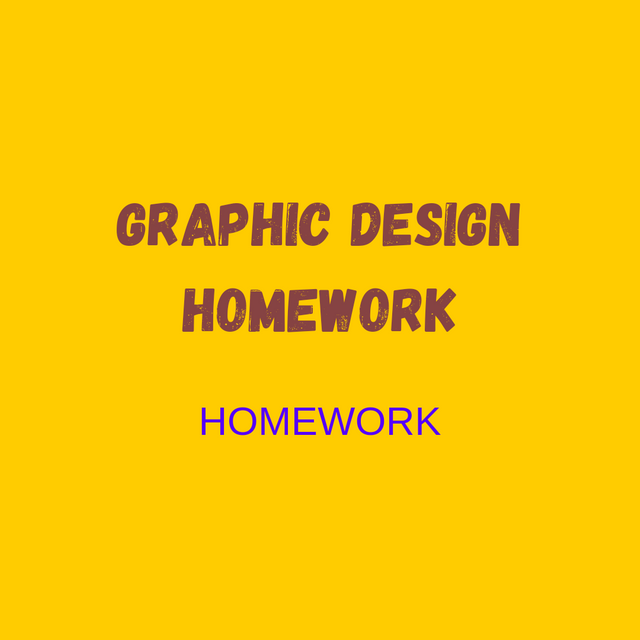 | 2nd Design |
|---|
| SN | Items | Answer |
|---|---|---|
| 1. | Typeface/font used | Upper font : GAGALIN Lower font: Arimo |
| 2. | Colour Hex used | Background:#ffcc00 Upper font:#864343 Lower font:#5500ff |
| 3. | Alignment used | corner |
| 3rd Design | 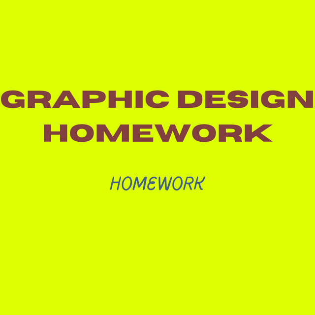 |
|---|
| SN | Items | Answer |
|---|---|---|
| 1. | Typeface/font used | Upper font: HORIZON Lower font: Pluma |
| 2. | Colour Hex used | Background:#dcff01 Upper font:#813f3f Lower font:#436187 |
| 3. | Alignment used | center |
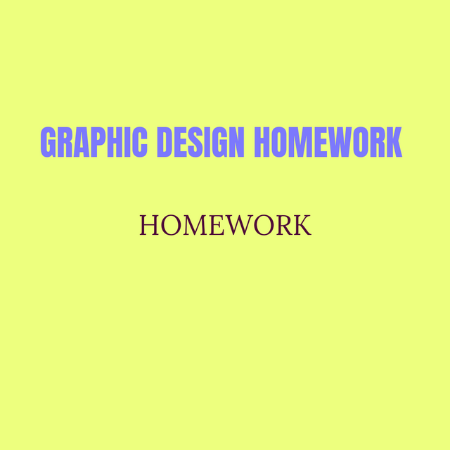 | 4th Design |
|---|
| SN | Items | Answer |
|---|---|---|
| 1. | Typeface/font used | Upper font: Anton Lower font: Lora |
| 2. | Colour Hex used | Upper font:#7c79fd Lower font:#ff7fd7 Background:#edff7e |
| 3. | Alignment used | Above |
I have designed the mentioned text in four types. I wrote the graphic design homework text here once in a different font. Me too. Redesigned the homework text with different fonts and hexa codes. You might notice the homework text here twice, I just did it to accommodate the different fonts. In this I was able to mention two fonts. I have put the full line in the above font. I guess it didn't look bad to you. Anyway I tried to present my designs clearly. Completed every design criteria.
This is a very interesting contest, I am happy to participate here. So I invite my dear friends to participate in this contest, @irawandedy @adeljose @radjasalman Hope you enjoy participating here.
Upvoted. Thank You for sending some of your rewards to @null. It will make Steem stronger.