"SEC20/WK3: Typography and Practical Application."
Hello Steemians, welcome to my post and stay safe as you read through this post.
 |
|---|
Discuss your understanding of Typography.
There is a way we can arrange type to make written language readable, visually appealing, and legible when it is being displayed which the way of doing such when it comes to graphic design is typography. Putting short and simple, it is the art and the technique of arranging type to make our written language readable, visually appealing, and legible when it is being displayed.
Typography involves the selecting of typefaces (fonts), line spacing (leading), adjusting the spacing between letters (kerning), and the arrangements of text on a page so it can be more appealing when it is been seen or display on a screen.
When it comes to design whether graphic design, art, etc typography plays an important role in making text look more appealing. Having said all of the above, below are the key elements of typography.
| Typeface/Font | This has to do with the design of the letters, symbols, and numbers. |
|---|---|
| Size. | This has to do with how large or small the text should appear |
| Line length | This has to do with the horizontal distance of the text block. |
| Line spacing (leading) | This has to do with the vertical space between lines of text. |
| Alignment | This has to do with has the text is aligned to the right, left, or center or is justified. |
| Kerning | This has to do with the space between each character |
The good thing about typography in graphic design is that it enhances readability, sets the tone or mood of a design, and also creates a visual hierarchy.
• Research 3 other typeface categories not captured in this lesson. Talk about them and also give a visual representation of the typefaces.
The face categories refer to the categorization of typefaces into distinct groups on their design, historical origin and characteristics which understanding them can help us to combine the perfect typefaces that can make our design readable and appealing. To this, I have discussed these three typeface categories.
- Monospeaced
- Display
- Blackletter (Gothic)
Monospaced Font:
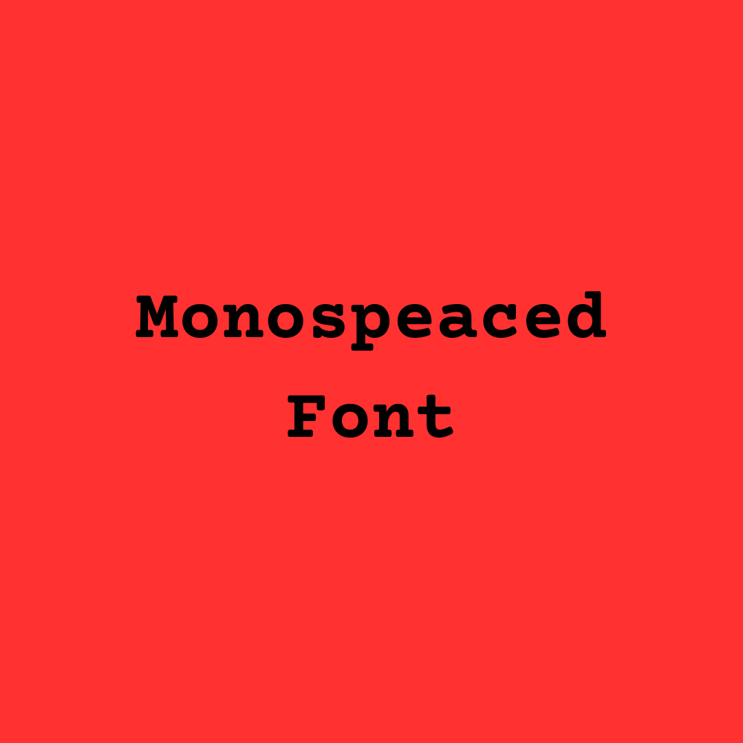 Monospaced font: courier Monospaced font: courier |
|---|
What I understand by monospaced in terms of its characteristics is that every character occupies (carry) the same amount of horizontal space. Monospaced is mostly used in typewriting, technical writing, and coding for uniformity of text. A perfect example is; Monaco, consoles and courier.
Display Font:
 Display Font: ample Display Font: ample |
|---|
What I understand by display interns of its characteristics is that it is attention grabbing titles as it is design for large sizes. Display can be experimental or highly decorative. Display is best use for posters, headlines, logos and so on. A perfect example are; Bauhaus, Cooper black, ample and impact display.
Blockletter (Gothic) Font:
 Adlery Blackletter Adlery Blackletter |
|---|
What I understand by block letter is that it is inspired by mediaeval scrips, and the fonts thin and thick strokes with details that are intricate. It is mostly used for certificate, historical themes and ceremonial documents. A perfect example are; Adlery Fraktur and old English.
• Demonstrate your understanding of Typography just like I have done with my four examples using the following guidelines below.
 | First Typographic Design |
|---|
| SN | Items | Answer |
|---|---|---|
| 1. | Typeface/font used | Upperbody: Display, Lower Body: Corporate font |
| 2. | Colour Hex used | Upper Body: #FFBD59, Lowerbody: #004AAD, Background #C42929 |
| 3. | Alignment used | Center alignment |
 | Second Typographic Design |
|---|
| SN | Items | Answer |
|---|---|---|
| 1. | Typeface/font used | Upperbody: Bodoni FLF, Lower Body: Arial Unicode |
| 2. | Colour Hex used | Upper Body: #00BF63, Lowerbody: #FFDE59, Background #C42929 |
| 3. | Alignment used | Left alignment |
| Third Typographic Design |  |
|---|
| SN | Items | Answer |
|---|---|---|
| 1. | Typeface/font used | Upperbody: Glacia Indifference, Lower Body: Alice |
| 2. | Colour Hex used | Upper Body: #153BC1, Lowerbody: #1FCE10, Background #D7D4B5 |
| 3. | Alignment used | right alignment |
| Fourth Typographic Design |  |
|---|
| SN | Items | Answer |
|---|---|---|
| 1. | Typeface/font used | Upperbody: Anton, Lower Body: March Script |
| 2. | Colour Hex used | Upper Body: #070F2C, Lowerbody: #281A83, Background #3CC513 |
| 3. | Alignment used | center |
From indications above you can see that I have proof myself worthy enough as someone who has learnt from his tutor. I used four images with their various background colours, text alignments in presenting my works. I applied the previous in completing this task and I am so grateful for the lessons I have learned so far.
I am inviting: @pelon53, @simonnwigwe, and @ruthjoe
Cc:
@lhorgic
Upvoted. Thank You for sending some of your rewards to @null. It will make Steem stronger.
¡Saludos amigo!🤗
Me gusta la elegancia y misterio que tiene la fuente gótica... Había visto e incluso utilizado en ocasiones anteriores la Galgari debido a su esencia gótica que tiene pero, después de ver esta que compartes, la voy a añadir a mis favoritas jajaja.
Te deseo mucho éxito en la dinámica... Un fuerte abrazo💚
TEAM 5
Hello! 🌟 It’s great to see your enthusiasm for typography and graphic design! You did an amazing job explaining the importance of typeface selection, spacing, and alignment. 📏✨ I love how you categorized different typefaces, especially the detailed descriptions of monospaced, display, and blackletter fonts. Your examples and visual representations are spot on! 🎨👏I’m excited to see how you continue to apply what you’ve learned in your future designs! Keep up the fantastic work! 💖🌈 Let's inspire each other! 🙌💡