My Design Contribution in State of the Sndbox Competition Entry
Hey you gfx lovers out there,
I've just taken part in the competition by creating this thumbnail for State of the Sndbox.

My process took some time in consideration as to what style I should have gone for.
From the start I knew I wanted to include an element of sand in there somehow.
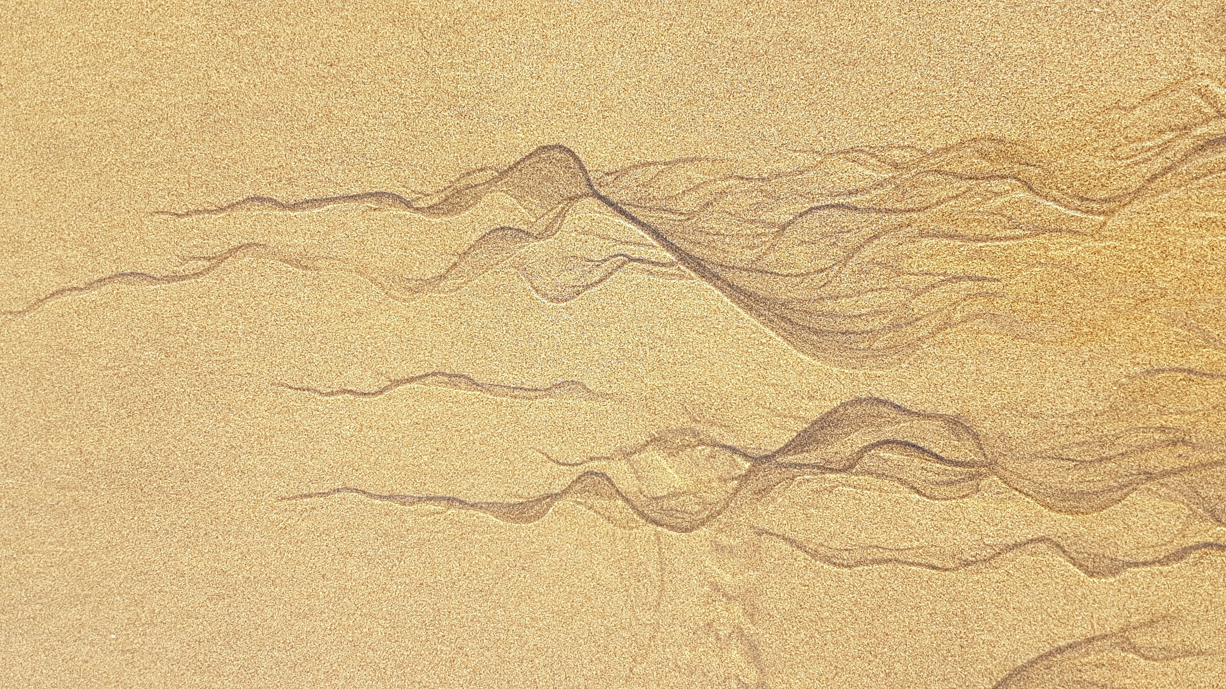
I had a few stock images to play with.
Unused Stock images:
i.

ii.
But finally I chose to add some kind of a human touch to it, and resorted to including a human hand in action.
iii.

What I like about the 3rd image is that it has motion to it. This enriches the experience of the image instead of having some kind of static look to it.
For the font I used HelveticaNeue Bold for the main text, and Harlow Solid Italic for the smaller text.
I'd love to hear what you design lovers think of the design, so feel free to comment below : )
wow bro! this is awesome !
Thanks so much buddy!
I love what you did with the color scheme. So unique! maybe you can remove the drop shadow. other than that, This is nice! Hey! maybe you're interested in the #redesigntheworld challenge? check it out in my blog. I would love to see your output on this.
Hey embity, thanks a bunch for your feedback!
Yeah totally agree, I was going for a more flat design but the shadow made the text look stand out a little more and I went with it at the end.
Thanks I'll definitely take a look at the challenge.