Designing an invitation for therapeutical fitness activity - Graphic design w/ tips and tricks [IT/EN]

Realizzare il design di un invito per attività di fitness terapeutica - Impaginazione grafica
Un mio cliente aveva bisogno di un piccolo formato per pubblicizzare l'avvio di un'attività di ginnastica terapeutica abbinata ad uno studio di psicologia. Sperando che l'attività possa crescere in futuro, al momento c'era bisogno di un prodotto realizzabile con un budget ristretto, da consegnare ai pazienti dello studio. Abbiamo optato per una cartolina 10x15 cm con una grammatura 350, prodotto a basso costo ma non facilmente sgualcibile come un flyer.
Le informazioni datemi dal cliente erano il nome del progetto, un testo esplicativo, la richiesta di utilizzare un'immagine che suggerisse benessere psicofisico e il simbolo del "Grounding", tecnica psicologica che non conoscevo, il cui logo consiste in una figura umana con radici arboree.
Realizzo tutte le mie impaginazioni in Adobe InDesign, programma standard di settore. Prima di iniziare a mettere elementi sul foglio, occorre sempre un'attività di progettazione a monte per ragionare sul tipo di pubblico a cui è rivolta la pubblicità, come possiamo creare interesse e portare la persona interessata a compiere un'azione (call to action) come ad esempio telefonare per avere informazioni.
Nel nostro caso ho deciso che il layout generale dovesse suggerire tranquillità e rilassatezza, utilizzando alcuni input grafici "rubati" dal mondo dello Yoga, anche se non sarebbe stata quella l'attività pubblicizzata. Ecco le mie 4 proposte consegnate al cliente.

Designing an invitation for therapeutical fitness activity - Graphic design
A client of mine needed a small format to advertise the launch of a therapeutic fitness activity taking place at psychology studio. Hoping that the business will grow in the future, at the time there was need for a product that could be printed with a tight budget, to be delivered to the patients of the studio. We opted for a 10x15 cm invitation with a weight of 350 gsm, which is low cost but not as cheap quality as a flyer.
The information given to me by the client was the name of the project, an explanatory text, the request to use an image that suggested psychophysical wellbeing and the symbol of "Grounding", a psychological technique that I did not know of, which logo consists of a human figure with tree roots.
I do all my layouts in Adobe InDesign, the standard software for the ad design industry. Before putting the elements on the sheet, it is necessary to brief about the type of public the advertising is aimed at, how it can create interest and how to turn that interest in perform an action (call to action) such as phoning for information.
In our case I decided that the general layout should suggest tranquility and relaxation, using some graphic inputs "stolen" from the world of Yoga, even if it was not the advertised activity. Here are my 4 submissions to the customer.

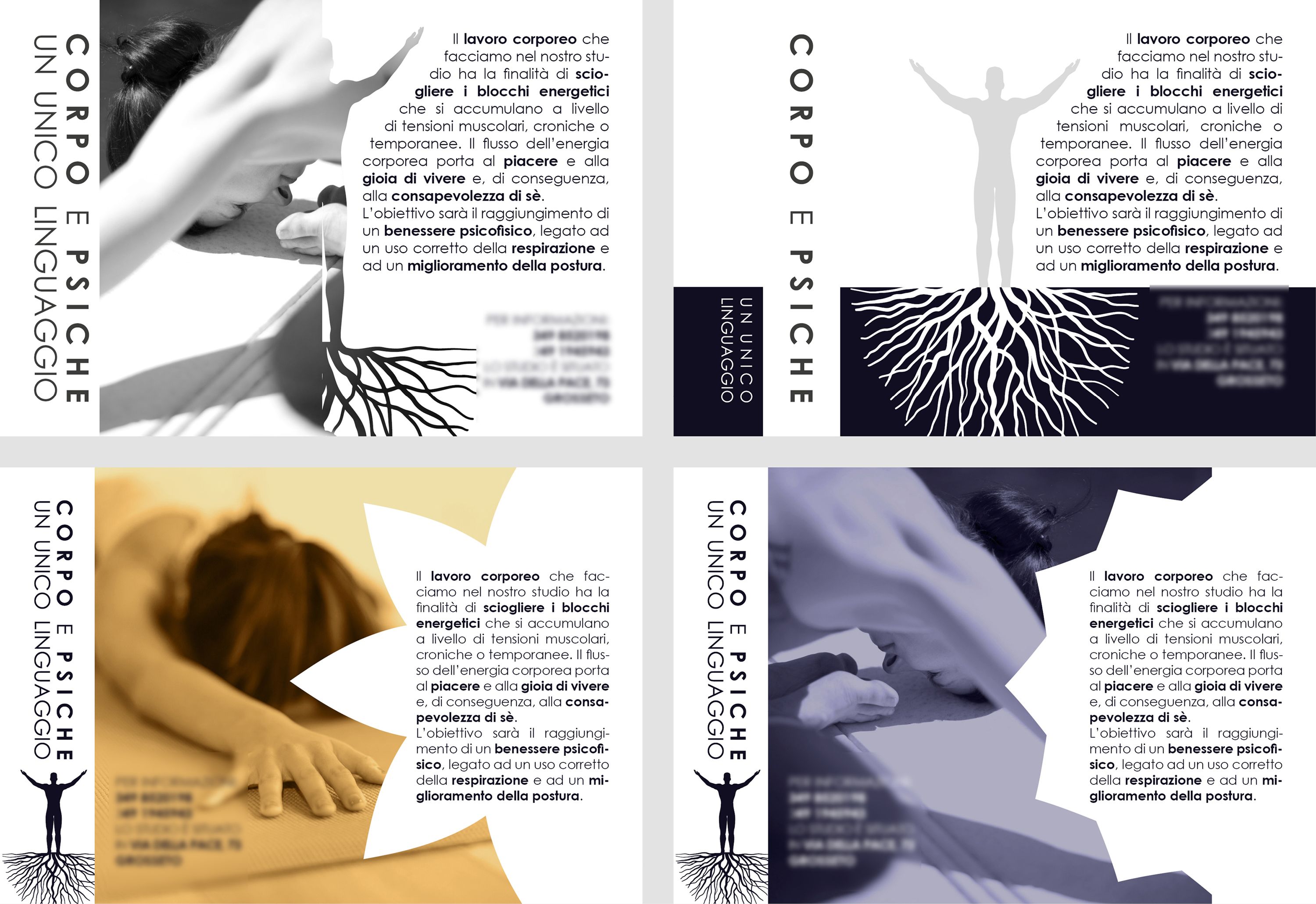


Ritengo che un design armonioso debba contenere delle forme semplici e dirette: in Adobe Illustrator ho ri-disegnato il simbolo del "Grounding" in modo da poterlo utilizzare come forma distinta.
I believe that for a design to be balanced it must contain simple and direct shapes: in Adobe Illustrator I re-drew the symbol for "Grounding" so to use it as a distinct shape.


La comodità di avere forme in vettoriale è di poterci inserire dentro delle foto per creare design interessanti. In questo caso le foto le ho prese ta Pexels, sito che mette a disposizione foro riutilizzabili commercialmente a risoluzione alta (ecco i link diretti alle foto: https://www.pexels.com/photo/fitness-girl-hands-lifestyle-374694 e https://www.pexels.com/photo/beautiful-exercise-female-girl-268101). Per rendere le foto più eleganti ne ho fatto una versione in bianco e in nero e una in mono tonalità utilizzando Adobe Photoshop.
The advantage of having vector shapes is to be able to place photos within to create interesting designs. In this case, i used photos from Pexels, site that provides commercially usable and high-resolution images (here are the direct links to the photos: https://www.pexels.com/photo/fitness-girl-hands-lifestyle-374694 e https://www.pexels.com/photo/beautiful-exercise-female-girl-268101). To make the photos more elegant I made a version in black and white and one in mono tone using Adobe Photoshop.
)

Un design ben progettato tiene conto degli spazi tra i vari elementi, da rispettare con precisione millimetrica. Ad esempio, se i margini esterni sono di 5 mm, anche gli spazi tra gli elementi interni saranno di 5 mm o magari l'esatta metà, etc. Le guide messe a disposizione da InDesign dono uno strumento molto utile per organizzare i posizionamenti.
A well thought out design takes into account the space between the elements, to be met with millimetric precision. For example, if the outer margins are 5 mm, the space between the inner elements will also be 5 mm or even the exact half, etc. The guides provided by InDesign are a very useful tool for organizing placements.
Nice posting
Thank you, man!
La prima proposta mi piace di più. Complimenti per il lavoro e del post.
Un saluto, nicola
Hehehe il cliente ha scelto la terza, generalmente più elementi ci sono più piacciono, mentre io sono per il minimalismo come te.
Great explanation 👍 I really like to use Indesign for those kind of things. I post emojitrivia and i used Illustrator in the beginning. Now I use InDesign and the whole process is just so much faster.
Omg your emoji are so well designed! Totally following you! However Illustrator is ok for making that kind of thing, myself i use it for infographics or logo design. The power of indesign comes into play when you need a layout with mixed elements (raster, text, vector).