Top 5 best color palettes on the NES
The NES is without a doubt one of the most important game consoles of all time. Through clever marketing, Nintendo was able to convince retailers who had just cleared out their stores of video games to take a chance on a new game console. The rest is history.
The console has an iconic look, both in its bold "VCR-inspired" exterior look and the 8-bit graphics that defined the generation. With a limited color palette of just 54 usable colors and a maximum of 25 on screen at once (13 background colors + 12 colors used for sprites), developers and artists had a very limited set to colors to work with.
Even with these limitations, some visually striking games were released on the console. Rather than just discussing the most visually advanced games on the NES, today we're specifically looking at the most well-designed color palettes considering the strict limitations of the hardware.
#5 Blaster Master
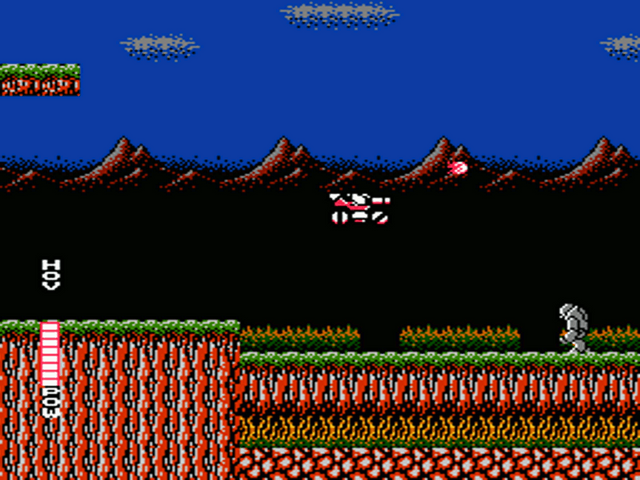
Image: RetroGameAge
Sunsoft's Blaster Master does a bold, yet colorful color scheme better than most. While many games that used a bold color palette look a bit too busy, this game kept it reigned in just enough that it never became distracting. The iconic red and black vehicle stands out in the blue, black and earth-colored stages very well.
#4 Kirby's Adventure
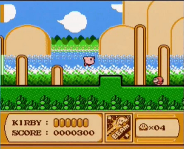
Image: GoSocial.co
Many NES games used a bright and pastel-inspired look, though many of those games ended up with graphics that lacked definition and felt too light. Kirby's Adventure did the pastel palette right, with light and bright colors, but just enough definition to keep everything clear and easily recognizable.
#3 Mega Man 2

Image: User MegaBubble! on YouTube
Honestly, any of the Mega Man games could have made this list but I had to single out my favorite. Every stage in this series has a distinct theme, which requires the color palette to define that theme clearly. My favorite example is the overwhelmingly blue Flashman stage, with the use of the neon-looking flashing stage graphics that make the level really feel alive.
#2 Batman
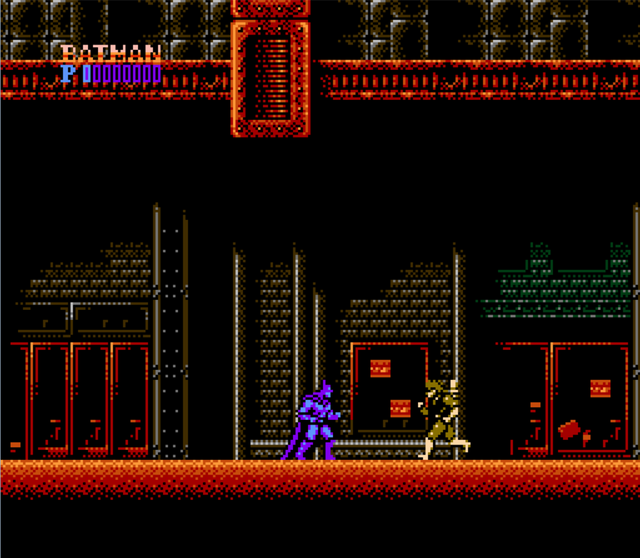
Image: The Scruffy Pixel
One of the greatest examples of a movie game being done right, Batman is another example of Sunsoft doing things right. The movie its based on is very dark, and the game mirrors that look very well. The choice to make Batman purple was a clever one, as making him black or gray would have made him hard to see on the game's dark backgrounds. The wonderful uses of industrial tones of black, purple, gray, green and red/orange give the game a striking visual style which helps it look great to this day.
#1 Castlevania II: Simon's Quest
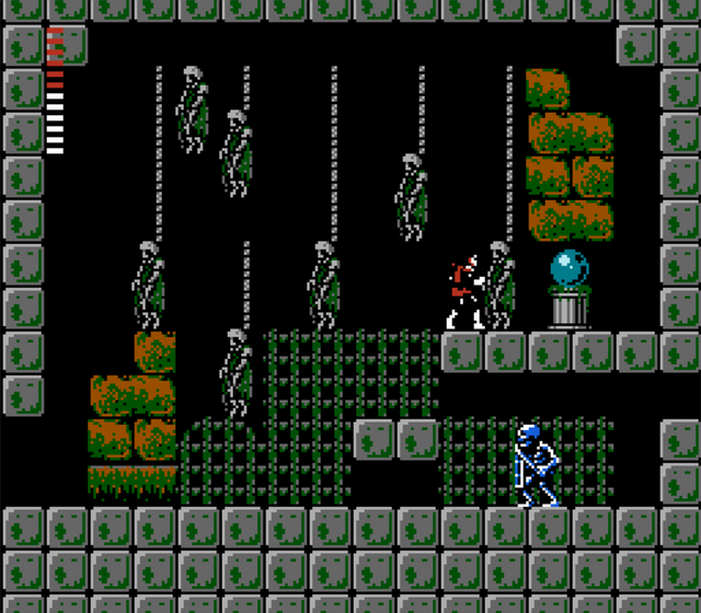
Image: The Bottom Rope
The red-headed stepchild of the NES Castlevania games, Simon's Quest tried to do on the NES what was finally perfected a decade later with Symphony of the Night. For a game released this early in the NES era, it has (in my opinion) the best color scheme on the console. Making Simon a bold black, red and white helps him stand out from the backgrounds nicely, and the use of blacks and purples in the cave areas, the blue, green and gray landscapes and the dingy green and yellow used in the dungeons results in a game with well defined colors that clearly represent the environments of the game. The game might be a mixed bag, but the color schemes look fantastic.
What do you think? Do any NES games have a bold or well-done palette that you love? Let's discuss!

Thanks for reading. As always, upvotes, resteems and comments are appreciated!
Cover Image Sources: Warosu.org and Polygon
Ugh gotta disagree on the n.1 pick there mate. And leaving out all the Disney games was a huge miss. What about Ducktales, Chip N Dale? They were gorgeous!
Good point! The Capcom Disney titles were all great-looking games with bright and colorful visuals.