Paper Mario: Color Splash Critique #1 - Streamlined, Yet Cumbersome
I recently finally got a chance to try Paper Mario: Color Splash. I've been a fan of the series from the very beginning, so I was interested to see the changes and how informed they are (or aren't) by proper game design. I want to make it clear that Color Splash is a fun game with a beautiful presentation, and this critique isn't intended to condemn all the work that went into it. In this first article, I'll examine my main problem with the game, the battle system, and how it tries and fails to streamline the series' formula.
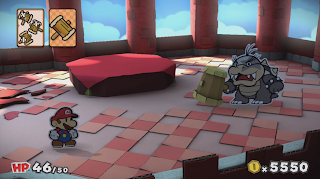
Paper Mario: Color Splash's battle system is, in a word, odd. Rather than allowing the character a set amount of moves to strategize with, the player instead relies on a finite set of cards acquired or bought in the overworld. In that sense this is very much an evolution of the battle system present in Paper Mario: Sticker Star.

source: https://www.youtube.com/channel/UCKc0OJoJ3cyJgTAMpSkG2FA
There really is no in game justification for why Mario requires cards to use the jump and hammer he is naturally armed with, but the lack of an in-world explanation doesn't necessarily condemn the battle system - only the degree to which it meets its intended goal does.
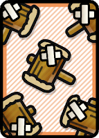
So what is its intended goal? It seems to me that Intelligent Systems attempted to streamline and simplify battles. Your average battle in Paper Mario: Color Splash takes one or two turns at most, for a few reasons: All attacks do a lot of damage (and that includes the enemies') and Mario can perform many actions in a one go. To name an extreme example: If you were two play 2 'worn-out hammer x 5' cards, you would be doing 10 hammer attacks in a single turn. You wouldn't be interrupted by any menus, everything would simply come down to your timing until your cards have run out of paint.

source: https://www.mariowiki.com/Battle_Card_(Paper_Mario:_Color_Splash)
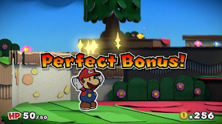
I understand and respect the basic idea of this system. You could potentially face down a tough group of enemies, and by choosing just the right cards in just the right order, defeat them before they land a hit on you. You can pack the strategy of what prior games would do in multiple turns, in just one. To further support this, the game always takes special note if you get through a battle without taking any damage and rewards you for it with a 'perfect bonus.'

source: https://www.youtube.com/channel/UCZU03wNQEGmDkGcNN-BT2Ng
That doesn't sound so bad, does it? But that's just the concept. Let's talk about the execution.
To choose your cards in Paper Mario: Color Splash, you are required to look down at the Wii U Gamepad. From there, you can choose your cards from a list. Unfortunately, however, the UI for selecting cards was obviously not designed with the sheer number of cards in mind. You might find yourself awkwardly dragging past a dozen of the same kind of card before finally finding what you want, even if you use the game's 'organize' button. Next, you have to drag said card - and later, cards - up to its spot to confirm you want to use it. Sounds pretty cumbersome, right? But it only gets worse.
Once you have selected your cards and confirmed your selection as a separate action, the game then requires you to paint in the cards. Even if all cards you selected were pre-filled, which they thankfully can be, the game still shows this screen and requires you to confirm that you are done painting the cards. If they weren't, you are expected to hold down on each card for a while to paint it. It's slow and feels extremely unnecessary. Why have a step deciding the strength of your cards when the cards themselves already do this? You have worn-out hammers, ordinary hammers and even big and giant hammers; and you can find and buy them at will. Other cards, like the jump, are much the same. Was the extra variable and the extra time it costs to fill in the cards really necessary or useful? Most of the time, you'll want to fill the entire card, since you're unlikely to ever run out of paint anyway. On top of that, Mario's attacks don't do a clear number of damage, so it's impossible to use an "informed" amount of paint.
So after making you find, select, drag, confirm, color and confirm your cards again, the game decides to waste your time just once more by forcing you to drag the cards up. After that, you're finally in business, and can perform Mario's attacks with their Action Commands as you would in any other Paper Mario.*
The underlying thought of the dragging is cute - you're sliding the cards from your Wii U screen up to your television - but the sheer amount of dragging and selecting actions the game asks you to take every turn makes me think they never tested it for extended periods of time.
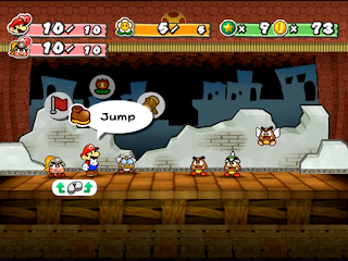
Compare this to Paper Mario: The Thousand-Year Door, where it'll never take more than three button presses to start an attack - and it lets you actually select the enemy you want to attack, whereas Color Splash simply attacks the enemies in order, with the first card attacking the first enemy, and so on. Regardless of how many cards are at your disposal, it ends up limiting the player's choices in the end. In the end, the vast majority of them are simple variations of the hammer and jump attack.

source: https://www.youtube.com/channel/UCSZYTqlzCV5a6HtVLCy0XCw
In conclusion, Paper Mario: Color Splash had a good idea to streamline battles into intricately planned out turns, but the poor implementation of the Wii U Screen, cards and paint make it so cumbersome that each battle ends up taking an unnecessary amount of effort. The system absolutely does not lend itself for the amount of battles and how repetitive they are. Paper Mario: Color Splash, like its predecessor, tries and fails to streamline the perfectly convenient battle system of Paper Mario 1 and 2.
In the next article, 'Overworld Joys and Overworld Woes,' I'll discuss the overworld you navigate in Color Splash outside of battles. Thank you very much for your time, and I look forward to your feedback.
Addendum: I received a reaction to this review about something I glossed over because I was too focused on the interface itself. In Paper Mario Color Splash, the Action Commands are almost exclusively timed button presses. In the first and second game, the Hammer Action Command worked by tilting the control stick, and there were a variation of Action Commands and stylish moves on top of that. This is another simplification that ends up making the battle system more tedious and monotonous than it could have been. Thanks for pointing this out, /u/rendumguy on Reddit!
Originally posted on my blog: https://arjenartdesign.blogspot.com/2017/06/paper-mario-color-splash-critique-1.html