Gamedev blog 5: Mockup
While getting to the next step on my checklist, adding enemies, I realize I don't want to simply have an enemy and a player in the room on the map, and the way to display it is slightly different in terms of code.
But before I figure out exactly how to write the code, I need a mockup.
Playing around in GIMP
I start by choosing a resolution that will work for most players, and that's 720p or 1280x720. For PC, this should cover the vast majority of people, and so can give me an accurate assessment of how it will look. I can even go so far as to lock the game to this resolution, and it'll be passable.
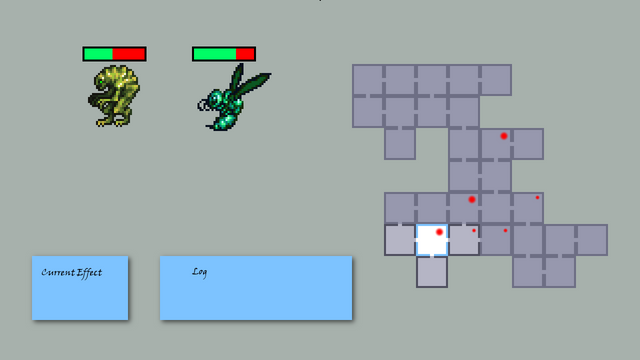
I start by making a map by hand, and placing the Map in the center, with the player character on the left and the enemies in the current room on the right. I quickly realize I don't even need a player character, and it would look much better with the map to the right.
Once the map is on the right, I mark down the threat level in each room with a red dot. I've already decided that enemies not in the current room will be designated by a threat level, which would be the combined threat of all enemies. The player won't be able to tell if there are 4 weak enemies, or one strong enemy in the room until they enter it.
I throw in a couple of sprites I found on opengameart.com by Redshrike
, and make some ugly health bars just to get a feel for it. My design currently calls for single digit hitpoints, so I'll likely choose a different display method for enemy hitpoints, but for now it'll do.
Lastly, I add two boxes, one for the current card effect and one for the log. I really like when games have a log I can scroll back up to see what happened if I got distracted for a second. The card effect will likely go through many variations until I find something that works, but for now a simple text box will do.
The last thing I haven't talked about is the highlighted room. I have the room the player is currently in highlighted (or rather, all other rooms in fog) and I also mark it in blue. I decided showing the character in the room is not needed, but I may change my mind in the future. Furthermore, I make the connected rooms lighter than the ones further away, to show where I can walk to. The final version will probably have the rooms I have yet to visit be completely dark, we'll see.
So now that I have the mockup, the next step to add enemies is slightly more clear, but also will take a little more effort. I
l'll need a new checklist.
Create a manager class to display the threat level in a room.
When the player is in a room with enemies, show them on the left side.
Highlight the room with the player, rather than display a character sprite.
Add a scrolling log. I currently print to console.
Card effect will be added later when I get to adding cards.
That's it for now.
If you've missed my previous posts, here they are:
Gamedev blog 1: Brewing an idea
Gamedev blog 2: Birthing pains
Gamedev blog 3: It’s checklist time
Gamedev blog 4: The world

I'm not sure what you meant by that?
Definitely agree that a log is great. And a good action log, like a good index in an RPG rulebook, is worth its price in gold in how it facilitates stuff without getting in the way of enjoyment.
Question, why go for a red dot instead of a number, for threat-level? More thematic? How about going with the Defcon colours and numbers? Would also help for colour-blind people.
And if you only have a dot, and it's not reflective of location within the room, why not place it in the center?
Finally, I think you should have a sprite for the player character. It just looks missing to not have it.
The map is essentially a minimap, and I don't see a need to display all characters there. In the current example, that highlighted room would need to have 2 enemy icons and a player icon. Too much.
Could definitely work. It was just easier in the mockup to just make a red dot of two intensities. And yes, could be in the center.
Maybe. I'm no artist, so making a player sprite is a lot of effort. Maybe just an arrow or something.
thank you friend for infoarmation
it's great to see another gamedev on steemit! keep up the work.
I am not sure i fully understand what you did but im excited about it hehehe 👍
Good enough for me!
I'm kidding, I'd love to know where I could be more clear.
Congratulations @poet! You have completed some achievement on Steemit and have been rewarded with new badge(s) :
Click on any badge to view your own Board of Honor on SteemitBoard.
For more information about SteemitBoard, click here
If you no longer want to receive notifications, reply to this comment with the word
STOPSTOP
Notifications have been disabled. Sorry if I bothered you.
To reactivate notifications, drop me a comment with the word
NOTIFY