VAPORWAVE DEADPOOL - [01] [Frontend inspirational piece / tutorial]
Standing on the backs of giants ( a short intro)
Have you ever looked at things other people made and think... "man that's a pretty cool thing you got there made"
Well so have I, and over time all those things just mush together in my head and sometimes in the middle of sleepless nights they align and makes me go: "Huh, it just might work...!"
So these tutorial series will focus on taking things other people have built and combining and using them in new and interesting ways. When so much quality tools have been made let's see how we can put them to use!
I will reference any tools/code I use and proved the links so the giants upon who' s backs we will be building receive their own share of recognition.
The tutorials are aimed at people who know how to use image editing software at at least advanced-beginner level and know a thing or two about basic web technologies such as HTML, JS and CSS. Alright, let's get into it !
What are we going to do and what are we going to use
If you just want to see the finished result or just play around with it click here!

First off we need the right music to accompany us in this journey.
We are going to use these things I found around the web:
- Parralax effect
(parallax.js) - Noise
(CSS based background noise) - Gradient
(CSS gradient generator) - Vaporwave text
(Vaporwave text generator)
And to create this cool looking vaporwave dead pool we are going to follow these steps:
- Make the necessary images in three basic colors in photoshop
- Make the basic HTML structure and style it with CSS
- Add the Parallax plugin
- Add the gradient background
- Add the noise
- Add the text
- Drink some good beer
- Be awesome
Part 1: Making the RGB pictures
So what do we need... We need 3 pictures that are split into 3 basic colors: red, green and blue.
For starters let's chose and image we want to chroma shift.
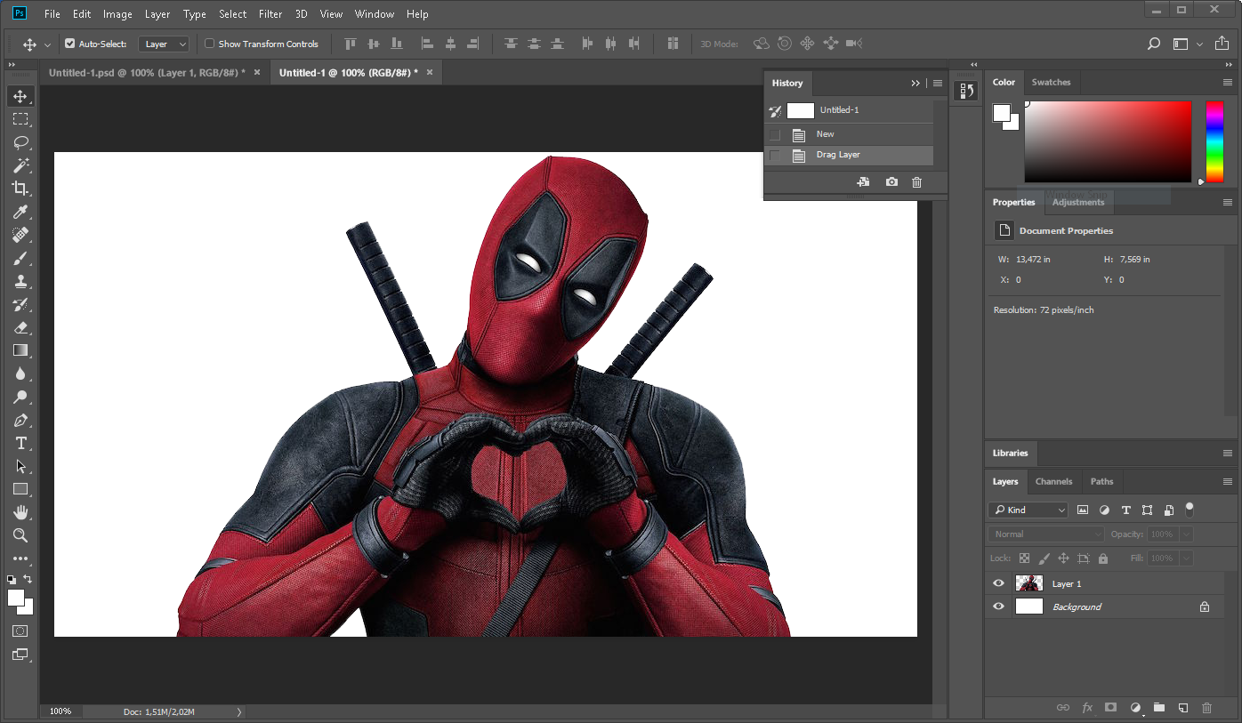
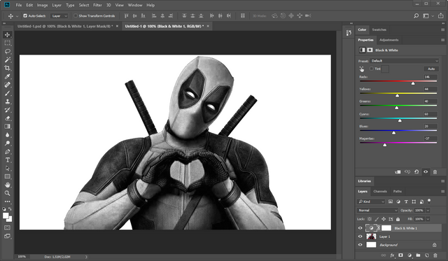
We mush convert it to grayscale so let' s use grayscale adjustment layer so we get a better control how make some details stand out. After you have done that merge those two layers in one.
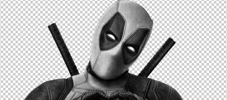
Remove the background using whichever tool you feel most comfortable with. This time magic wand worked just fine.
Select the layer and invert it (Ctrl+i)
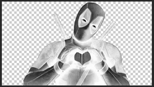
Then we need to right click on the layer in layer panel and select Blending Options to apply blending mode based on the brightness levels in the picture. Alt+ click and drag the left slider for "this layer" control and lets fade out the darker parts of this image. Use this to a measure so the main contours and gradients are still visible.
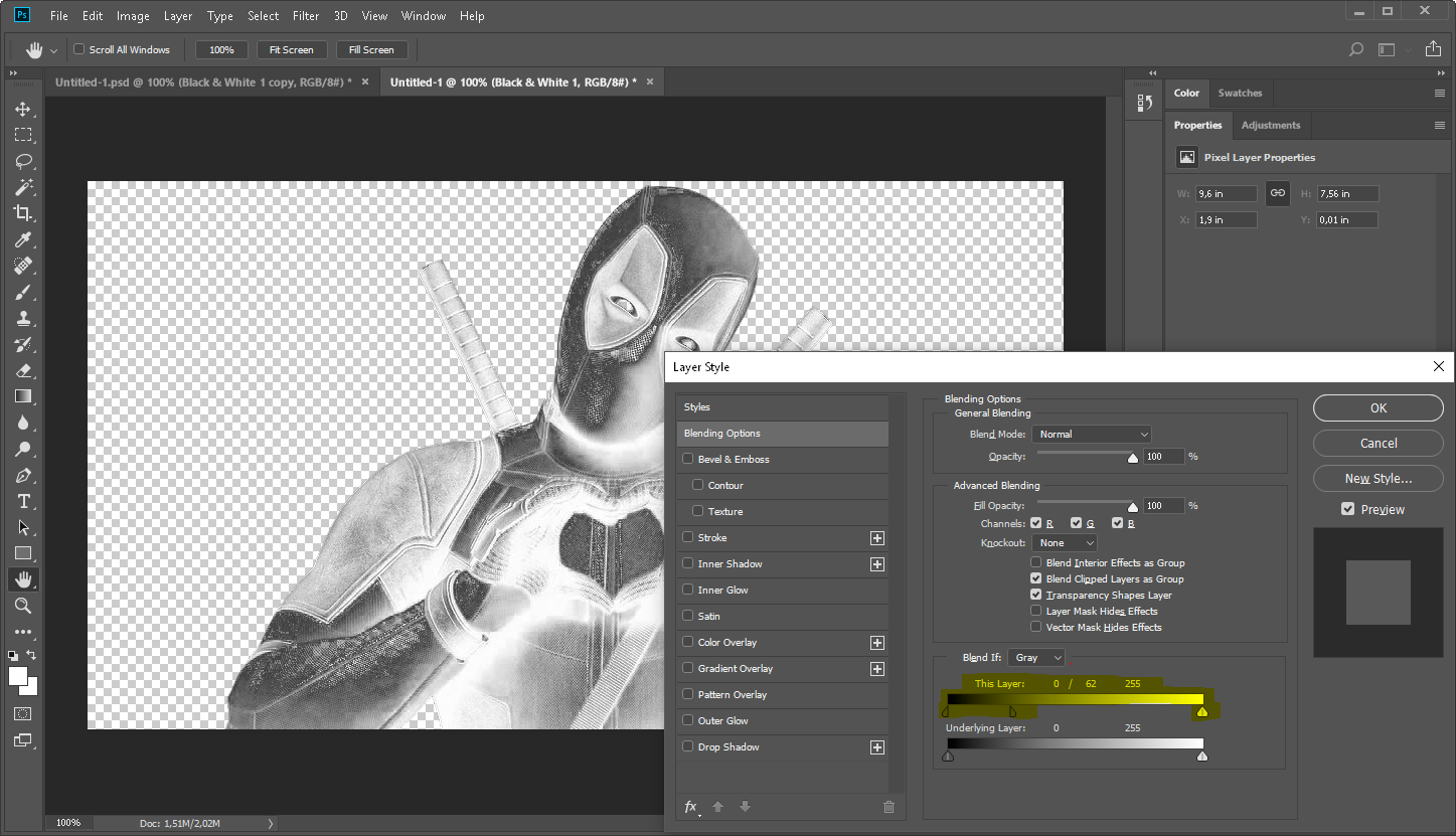
Now let's color it! Add a new layer that is filled with one of the three primary colors: red green or blue. Then change the color layer' s blending mode to linear dodge. Alt+click on the border between the color and grayscale layers to apply the top layer on top of the greyscale deadpool image.
Then it' s time to export it as a PNG with transparency.

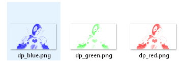
Do the same for the other 2 colors and as a result you should have 3 files like this.
Part 2: Setting up the structure
Now here I'm assuming you know how to create simple web page and know how to put it up somewhere so it works! Explaining it all would dilute this post too much. In any case you can use this as a base template.
Since we are going to put a few things over each other let's create relative division to contain it all.
HTML
<div class="wrap">

</div>
CSS
.wrap{
    position:relative;
}
Let's add another container (we are going to use it later for background effects) and another div to hold the three pictures in which we will also be used to initiate parallax plugin. (thats why we assign it the id="parallax-box")
HTML
<div class="wrap">
    <div class="content-wrap">
      <div  id="parallax-box">
        <div  class="screen blue"><img  src="https://i.imgur.com/na6l2f3.png" alt=""></div>
        <div  class="screen red "><img  src="https://i.imgur.com/2UEgDBk.png" alt=""></div>
        <div  class="screen green" ><img  src="https://i.imgur.com/lYGzg1z.png" alt=""></div>
      </div>
    </div>
</div>
To create the chromatic aberration effect we are going to add a css screen blending effect which will give us white-ish color where all 3 images overlay. Let's also center our deadpool.
CSS
.screen{
    mix-blend-mode: screen;
  }
.content-wrap{
   display:flex;
   justify-content:center;
}
#paralax-box{
  margin-top:50px;
}
body{
  background: #1d1f20;
}
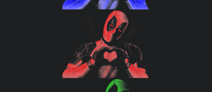
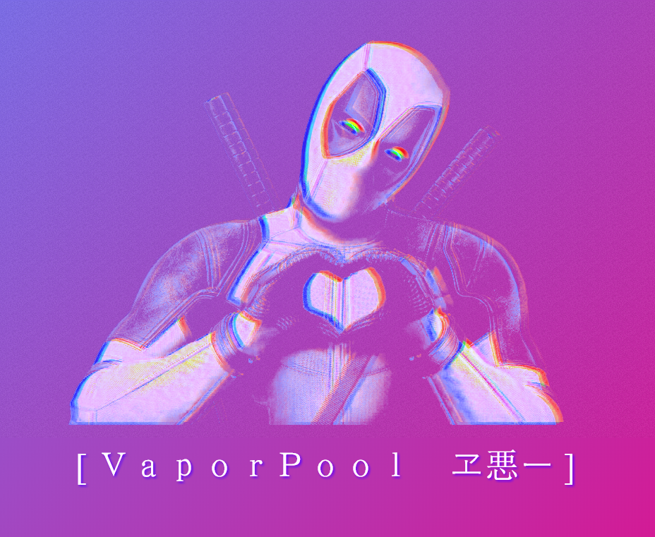
At this point it should look similar to something like this:
3. Adding the Parallax plugin
The cool thing about this particular parallax plugin is that it comes with some nice extra features - it responds to mouse movements and on mobile devices it responds to the tilt of the device. It also allows to customize the values for each element how much it moves in relation to the mouse.
First things first, we need to include the plugin in the document. In this particular case we can use CDN or just the path to the actual plugin if you downloaded it and put it in your project' s folder.
HTML
...
  <script src="https://cdnjs.cloudflare.com/ajax/libs/parallax/3.1.0/parallax.min.js"> </script>
</head>
<body>
  ...
</body>
Now that the plugin is added we need to initialize an instance.
JS
var scene = document.getElementById('paralax-box');
var parallaxInstance = new Parallax(this.scene, {
});
But we also need to configure the pictures and assign them depth values using the "data-depth" attribute so the plugin understands which picture to move faster and which to move slower.
HTML
<div data-depth="0.3" class="screen blue"><img  src="https://i.imgur.com/na6l2f3.png" alt=""></div>
<div data-depth="0.1" class="screen red "><img  src="https://i.imgur.com/2UEgDBk.png" alt=""></div>
<div data-depth="0.2" class="screen green" ><img  src="https://i.imgur.com/lYGzg1z.png" alt=""></div>
We can also set the sensitivity of it all by setting the friction values for both axis. In this particular case let's reduce the vertical movement more than the horizontal.
JS
parallaxInstance.friction(0.05, 0.01);
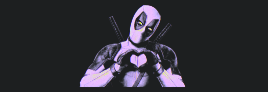
If everything went alright at this point it should resemble something like this:
4. Adding the gradient background
Let's make it more colorful and head over to gradient generator!
Feel free to play around and make a gradient you like. After you are done, select the generated code and copy it!

Since we are going to have noise and gradient background effects overlaying each other we need to separate out the gradient layer and position it under the content we already have.
We can do that by creating a gradient division in the wrap division and then adding our copied code from gradient generator to it's styling.
HTML
...
<div class="wrap">
  <div class="gradient"></div>
...
CSS
.gradient{
  position: absolute;
  top: 0;
  left: 0;
  right: 0;
  bottom: 0;
  mix-blend-mode: overlay;
  background: rgba(94,134,255,1);
  background: -moz-linear-gradient(-45deg, rgba(94,134,255,1) 0%, rgba(158,75,197,1) 44%, rgba(239,1,124,1) 100%);
...
}
And... Voila!

5. Bring the noise!
So to add a noise we are going to put a noisy grayscale image as a background of our content-wrap division. To save us the trouble of making one - let' s borrow an image from here.
But you see no pictures there? Well, it's because the picture is encoded in base64 which is a way to turn binary data into ascii symbols which look like gibberish to the naked eye, which then allows us to copy pictures directly into our code.
Copy the section and put it as the .content-wrap background image
.content-wrap{
  display:flex;
  justify-content:center;
  background-image: url(data:image/png;base64,iVBO.............(and so on)
}
But that's just a bit too boring isn't it?
Let's animate the nose!
Lucky us, we can animate backgrounds, so let's start by defining an animation:
CSS
@keyframes bganim {
    0% { background-position: 0 0; }
    0.1% { background-position: -7px -7px; }
    25% { background-position: -7px -7px; }
    25.1% { background-position: 17px -17px; }
    50% { background-position: 17px -17px; }
    50.1% { background-position: 5px 5px; }
    75% { background-position: 5px 5px; }
    75.1% { background-position: -3px 3px; }
    100% { background-position: -3px 3px; }
}
and then add this animation to the .content-wrap division. It should be pretty fast so the duration should be around 200ms and make it NEVER STOP!
CSS
.content-wrap{
  animation: bganim 0.2s linear infinite;
  display:flex;
  justify-content:center;
  background-image: url(data:image/png;base64,iVBO.............(and so on)
}
6. Time to add some aesthetic text!
What' s a vaporwave piece without it's hallmark aesthetic text style?

So head on over to the vaporwave text generator and enjoy.
You guessed it! - just copy it!
Now let's just add a text container division underneath the deadpool and paste in the text.
HTML
<div class="text">[ VaporPool ヱ悪ー ]</div>
and prettify it a bit by centering it and adding a colorful drop shadow
CSS
.text{
    color: white;
    font-size: 50px;
    text-align: center;
    text-shadow: 2px 2px 5px #3e00ff;
}
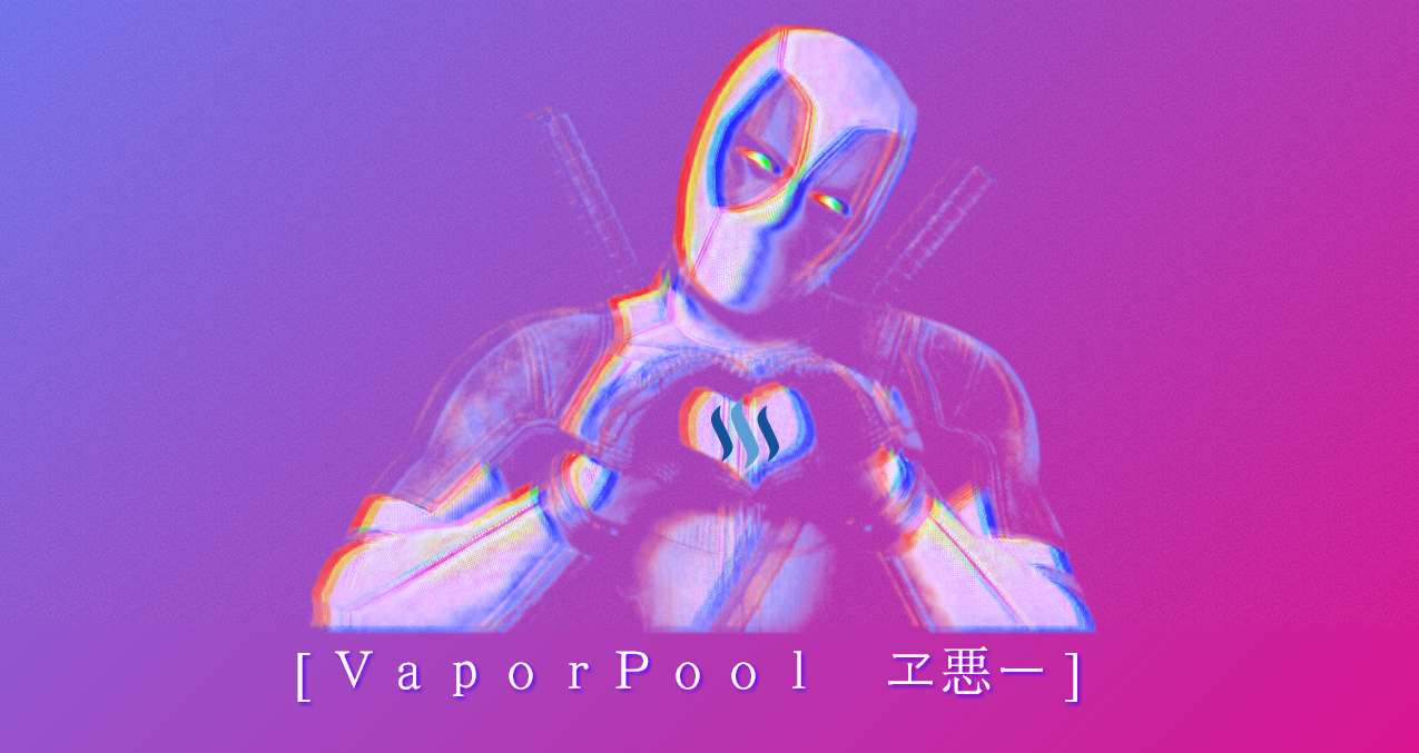
7. And this is the part were we sit back and enjoy our work
It's time top pop that beer open!

I hope the ones who wanted to - made it this far. To a seasoned developer this may look trivial but I know there are many people who are just getting into web development and want to try out and learn some new cool things. And I hope some of you did!
I myself am not that experienced so please forgive any errors or lapses in following the best practices. The main goal here was to share ideas and encourage people to experiment on their own.
8. Be awesome
Fhew... so this took a while...
I hope you all enjoyed this as much as I did! I mostly did it for myself to see if I can actually follow trough my ideas, but I'd be lying if I wouldn't appreciate some support from you guys as well.
So please don't be shy - ask questions, give suggestions and spread it to other corners of steemit!
Best regards,
@beercake out

[wrote this while listening to: My sleeping girlfriend's soft snoring ]
All tutorial images are created/owned by me
Dead Pool character and image owned by 20th Century Fox
Llama emotes owned by http://uteki.tumblr.com
This is really nicely done, well explained and easy to follow. Couldn't find the Sleeping Girlfriend's Soft Snoring song on Spotify though...
Ah well... hmmm... you need the "Girlfriend" DLC for your life, to be able to listen to it. Yeah, that's the only part of the tutorial that's not quite free :D
I knew it! I knew there was a catch! :D
Nothing's ever that easy, isn't it?
I can understand that you have worked very hard.
Darn' i thought i knew html, uhm can we get a full tutorial, it seems you have some magic touch😱
There are quite a lot of intro tutorials for web development on the internet. If I made one, it would add nothing new to the scene. I'd rather avoid that.
But stay tuned, subscribe, there will be more stuff like this down the line. Meanwhile don't be afraid and pick up a some HTML/CSS/JS tutorial ;)
Great tutorial! I’ve never tried graphic design digitally so I might give it a go and the end result looks sweet!
Thank you! Yeah, most digital art pieces are static (pictures) or video and have very little user interaction. I will try and explore this interactive stuff more in the following months.
As you might image it's not an easy content to make or come up with. But I still have some ideas up my sleeve that might be just good enough to share them.
This awesome.!!!!
Well detailed and very directive.
Appreciate the time spent on impacting on other steemians,. @beercake
If you got any tips on how to make it more fun or readable - please let me know ;)
Very interesting and amazing shots nature is amazing too :)
This is really nicely done
Thank you :)