Fresh Five Art Prompt

Ah, my friend @aussieninja asked me if I would like to toss an entry into the pool for the @thefreshfive art prompt / logo design competition.
I'm not much of a designer but I figured I would give it a shot.
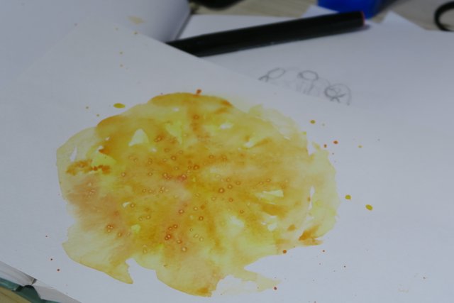
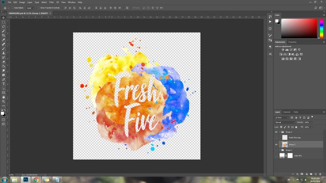
I had a couple interesting ideas but they all involved line drawings, which I am terrible at. So, I decided to go with what I know how to use (ish)- watercolour and Photoshop!


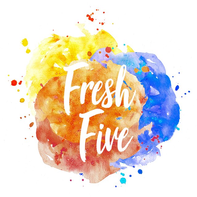
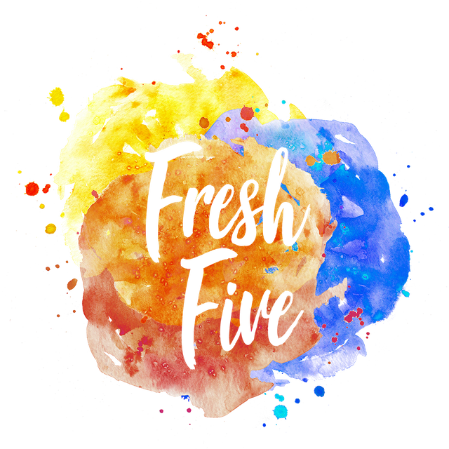
The idea behind the paint is that I wanted it to look fresh and juicy and fun. I used the three colours and had them overlap in the middle to convey diversity and coming together. Ad for the font, I picked it because it it very legible, and also made me think fresh and fun.
Everywhere that is white (including the font) is transparent so it will shot whatever colour is behind it. I would also provide an version with a white background.
I hope you like it! Cheers!

Don't forget to upvote, comment, and resteem!

This work is licensed under a Creative Commons Attribution 4.0 International License.
Peace & Love!

YES! Love it! It's so CaityCat AND so fresh!
Would you mind adding in the comments of this post just to make sure @mikepm74 sees it? (if GINAbot brought you here, opps, sorry, also Hi Mike).
Oh thanks! I'm glad you like it! :)
I tossed it into the comments on the original post, if that's what you mean (you forgot your URL link in your comment)
Duh! Doing too many of the things all at once. Thanks thanks thanks and also good luck but mostly you're ace.
😃Thanks, dude!! Cheers!
It is pretty and I love fonts. I am obsessed with fonts and will spend hours online looking at wonderful free to use fonts to play with!
Right?! Me too! They can really make or break a piece!