How to make your horror film look spooky in 5 minutes - Hollywood Looks 01
WooOoOoOoOo
Do you wanna make your horror flick have the same look as some films such as Insidious, The Conjuring, or It Follows?
If so check out this fast and easy guide!
(Full video tutorial at the bottom of post!!!)

STEP 1:
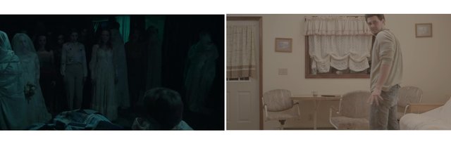
Grab a still image to compare your footage to. This way you have a reference to guide you!
On the left, I have a reference from Insidious 2. On the right, I have the footage from a short film I worked on called Vice
STEP 2:
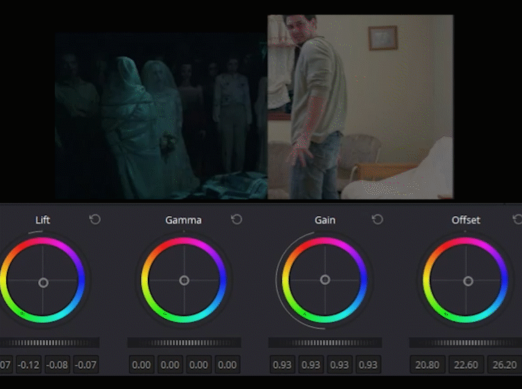
Next, let's match the exposure. I put my images side by side in DaVinci Resolve and then brought down the midtones and highlights using the color wheels. Don't worry about the color of it yet, just the exposure. You can also do this in Premiere, Avid, Sony Vegas, just about any editing program has color correction tools nowadays!
STEP 3:
Now this is the cool (and surprisingly easy) part to get the "look." Go to your curves (again, these are in just about any editing program, and every coloring program).
Select the blue channel first. Near the veeeerry bottom, boost up the blue until you start to notice the difference. Don't go too far; use your best judgement.
Then, do the same thing, but with the green channel. Get a nice creepy mix between the two colors so it looks just right.
Lastly, take your Y (the white line that controls luminance/exposure) and drop that near the bottom so that your image gets nice and dark. Don't go overboard, or you're image will get super crunchy.
If you don't have curves, or don't feel comfortable with them, you can use the color wheels. Just drag the shadows towards the blue/green area. It will have a very similar effect.

STEP 4:
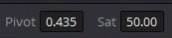
Lastly, just drop the Saturation a little bit. This gives your images a more ghostly look and helps sell the whole effect.
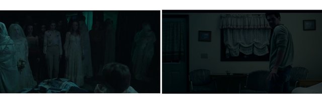
All done! Let's take a side by side look at the result!
Some other tips:
Light your set carefully. I would suggest you don't go crazy with blue lights on set. Use these powerful digital color correction tools to give you more control.
Light it neutrally. Make your whites white, and your shadows black. The one problem I had with coloring this film, was that the lighting was a little too flat in terms of contrast. As you can see in the Insidious 2 reference, the windows have some nice highlights to help add contrast to the scene. Try not to make your WHOLE movie just darkness.
I hope you all found this informative in one way or another.
If you have any requests for how to make another certain look just ask below. If you enjoyed this and want to see more, then don't forget to follow.
Cheers!!!!!!
Great post! Nice color tips. Full upvote.
Thanks so much Doug. Looking forward to seeing you release some stuff!
Thanks for the good article