Power BI Custom Visuals - Dial Gauge
Power BI is equipped with many different visualization that you can use to tell the story of your data. In addition to the standard visuals, Power BI also allows you to import custom visuals. If you have experience with R then you are only limited to your imagination. Most of us however are not experienced in R, and thankfully Power BI has a webpage where you can download visualization that have been created by Microsoft partners and sometimes even Microsoft.
Visit Power BI custom visuals site now
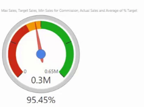
Today we are going to look at downloading and using the Dial Gauge which has been published by CloudFronts Technologies LLP. The visualization looks good, however some of the field names are not really self explanatory. You will see what I mean in the video below and I must admit, I got it wrong on my first try - just because of the field names.
Although the visualization looks good, there has been much written about the use of Dial Gauge in management dashboards. I would recommend you have a read of 'Is a gauge or dial effective for visualizing management information?' by Metapraxis and Down with Gauges written by Charley Kyd.
In this video you will learn how to download and then install a custom visual to Power BI. Just to note, when you add a custom visual to Power BI, you add it to that workbook only. If you wish to use the same visual in a different Power BI workbook then make sure you save it in a file that you can locate easy enough. That way, if you keep all your custom visuals in the one place, it is easy to add them to the workbooks as required.
In return for this tip 'Power BI Custom Visuals - DialGauge' I ask that you share this post and video with your friends and colleagues
Sign up Now
Sign up for my newsletter – Don’t worry, I wont spam. Just useful Excel and Power BI tips and tricks to your inbox
Learn and Earn Activity
This weeks learn and earn activity is easy for you to take part in. The comments section is open, feel free to take part as this is great activity making it easy for you to collect some tokens.
What Power BI Custom Visual do you like to use and why? Leave a comment in the comments section below and you are in with a chance of earning #steem rewards
The Excel Club blog is powered with STEEM. We are a tokenized website where you can earn while you learn. To earn STEEM tokens you must partake in the practice activity and post your answers, questions or feedback in the comments section below.
I would suggest either of these options for getting a STEEM account
- Purchase an instant account for $3.50 with this link
- Sign up with this link for a free account ( you could be waiting up to 2 weeks)
Posted from my blog with SteemPress : http://theexcelclub.com/power-bi-custom-visuals-dial-gauge/
hi @paulag and great tutorial again.
I like to use the tachometer chart, its similar to the gauge chart you have demonstrated.
https://appsource.microsoft.com/en-us/product/power-bi-visuals/WA104380937?src=office&tab=Overview
hello @dernan, great visualization, thanks for sharing
hi @theexcelclub, I have a question for you which is a little off topic, when will you be accepting steem as payment for your courses?
I like to use the pulse chart custom visual. Its a Line chart annotated with key events. Perfect for story telling with data.
https://appsource.microsoft.com/en-us/product/power-bi-visuals/WA104381006?src=office&tab=Overview
hi @m-t-p and thanks for your question. We can take STEEM or SBD as payment at any time. Although it is not integrated into our site, you just need to contact us and we will talk you through the process.
NIce work on sharing the visualisation too, that is an amazing chart indeed :-)
I can't change the direction of the wind, but I can adjust my sails to always reach my destination.