My Entry designs for the EOSbit logo contest
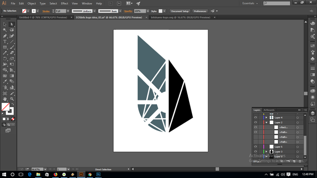
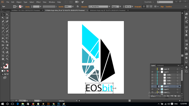
Hi, here are my 3 entry in the EOSbit logo contest organized by @officialfuzzy. I include some of my proof of work captures. The goal is to make a logo for a new token called EOSbit a kind of a mix between EOS and Bitshare tokens. As always I start to make some rough ideas in 3D as it takes me less time than 2D but after turning my ideas in my head it was sure the flat colors of a 2D vector design will fit better than 3D in the case of a token logo as it is always small on an internet page. So I switch from Blender to Illustrator. Also, the physical reaction of lights on the reflected EOS geometry makes it impossible to get right in the render and need to be retouched into Photoshop. Here are my POW and my 3 entries. In my opinion, it is looking stretched on the post but all the proportion of original logos have been respected, optical illusion due to the big size on the page of 1000x1000. The difference in shapes from 3D to 2D is just due to the lens of the camera as 2D is an orthographic view and 3D as perpective and lens field of view.
Version 1
Version 2
Version 3
Low-quality render of some ideas in 3D
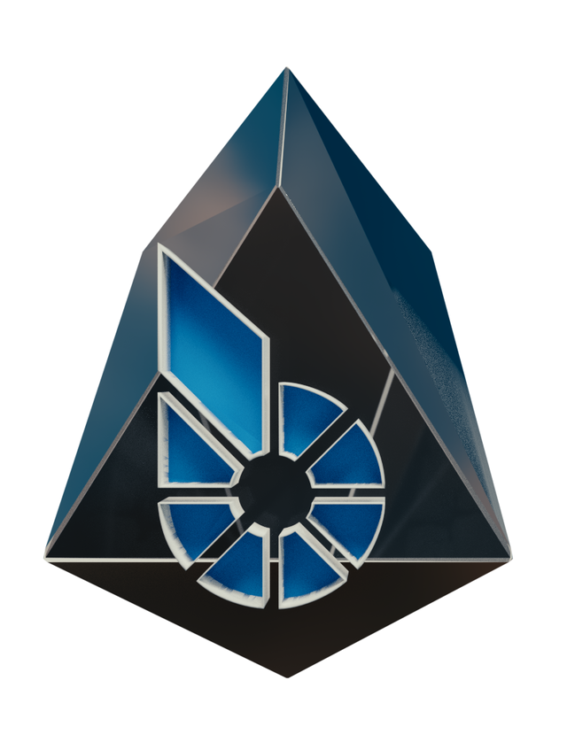
The beginning of an idea starts to take place in 3D
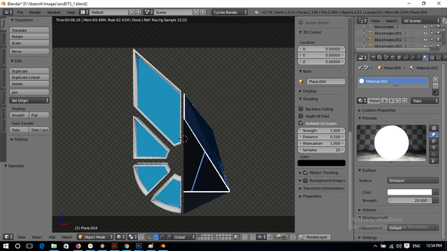
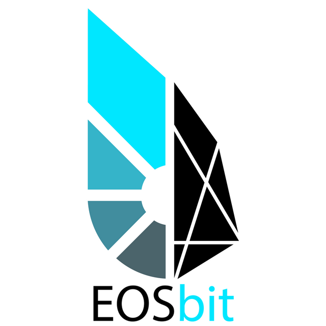
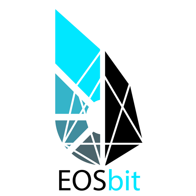
Version 1 is My favorite- very good work my friend !
It is my favorite as well.
Very good work. Version 2 is my favorite 😊