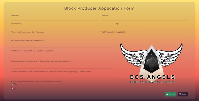
Entry #2 for EOS Angels Block Producer Application Form Design
So I was happy of my first entry for the EOS Angels Application Form Design Contest but I knew it was a bit too plain, so I wanted to make something a little bit more fancy.
Note: I am not a graphics designer but a software developer so my UI skills aren't that great. What I did do was look at a lot of neat websites and tried to get some inspiration for my second design.

I wanted to incorporate the colors of the sunset in my design as the word "angel" reminds me a lot about the sky and there supposed holiness and the colors of a sunset seemed to fit that.
This design took a lot more css than html coding as the background isn't a picture but rather a gradient made with pure css.
Here's the code for it:
background: linear-gradient(#ffe577,#fec051,#ff8967,#fd6051,#392033) no-repeat center center fixed;
It was a great learning experience doing this and I had a lot of fun.
Here's the deployed version: http://eos-angels.000webhostapp.com/
What do you think of the design? If you have any suggestions to make it better I'm more than open to suggestions!
Huge thanks to @officialfuzzy and @steempowerpics for hosting this contest! :D
I know you were a sunset fan. Nice design
Beautiful entry you've got. I think you have something about sunset 😀😀 Your last contest was about what sunset looks like in different locations around the world.
Wow amazing design, great work man