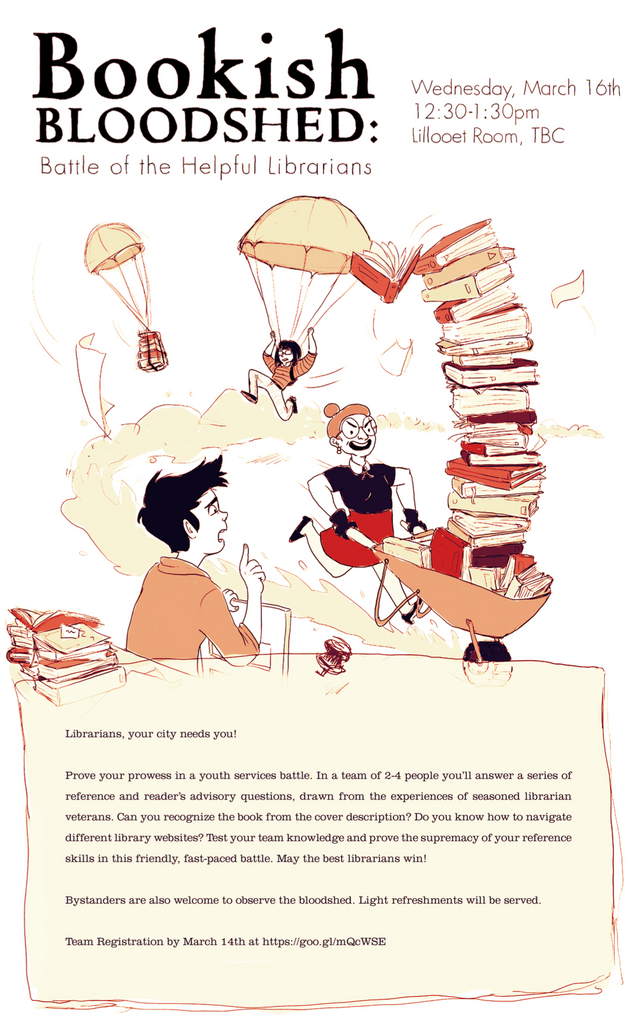
Simple is Best
I made a poster for my sister last year, and I may have put a little too much work into it. What I have below is what it ended up looking like, but I started with some much more complex ideas.
For a poster, you don't want complex. You want to convey you message in the simplest way possible so people want to actually look at the information provided.
So it took some revising to get this one straight.
And the more things I removed, the better the piece looked.
I loved how it turned out, and even though it was only for an event at a University, I think it was good practice in design.


Your descriptions of your process are great, we need more posts like this on steemit.
Thanks, I'll try to keep it up, but I'll probably run out of steam (hahah get it???) and content in a month. Gotta get going with doing stuff. (also, where'd all these votes come from??)
Loved this. I'm not a graphic artist, but the creative process for writing doesn't strike me as being all that different from this. I'll be following!
thanks, and the philosophy of it definitely applies! I don't write very often, but I try to use this same concept. thanks again!
I'd love to see more. I'll be following.
Thats great 🙂
Thankee! :)
Look at that strong arms. Your sister have been some exercising!
she is very buff! :D thanks!
What University was this poster for?
uh i think UBC in Vancouver? but I'm not sure.