The New DLive Logo
We mention this in almost every post but we will mention it again. The DLive Community is truly one of the best. We have so many talented designers and choosing a winning logo was not easy. There were so many great submissions but unfortunately we could only choose one.

We are proud to announce the logo for the New DLive.

Our in-house designer made slight adjustments to the overall design and change the font on dlive itself. This is the original for reference.
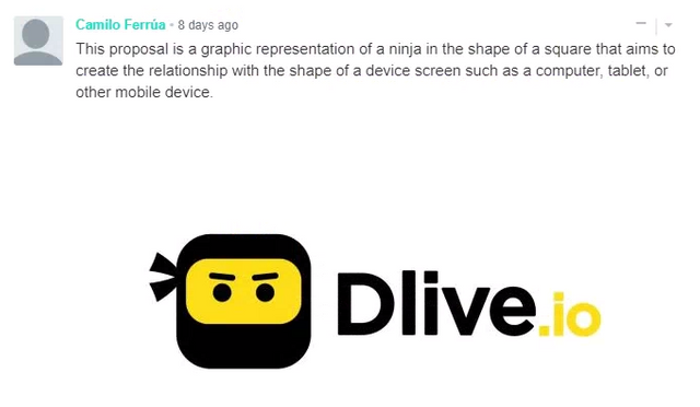
A big congratulations to @camiloferrua for making this amazing design. We have contacted you via email so please reply back at your earliest convenience.
As voting came to a close on September 5th, we have the top 5 designs with the most unique votes below. Congratulations to @lethaltoast, @vixmining, @tsukuyomi and @mrgodby.
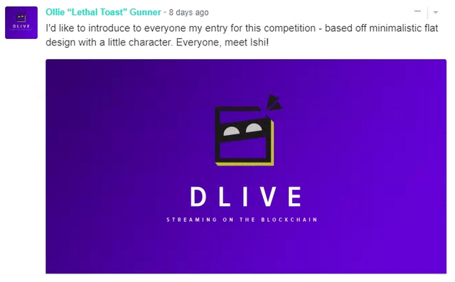
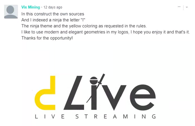
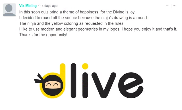
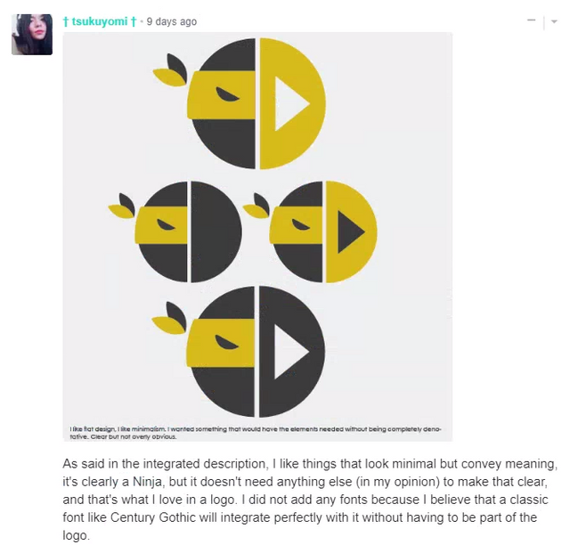
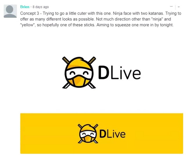
You will each receive an email shortly on how to claim your reward. A big thank you to everyone that participated in this contest, both as a designer and a voter.
We look forward to completing the re-branding of DLive and we can't wait to share it with everyone.


@jimmylin thanks for the opportunity.
I thank everyone who voted, so I managed to get two of my logos to be among the top five
Thank you @dlive team for the consideration as a top 3 design, and a big thank you to everyone else who voted. Congratulations @camiloferrua!
Awesome work on your design @mrgodby
Congratulations, @camiloferrua! Very proud of you.
Also thank you to @dlive, everyone that voted and all the team for the honorable mention! The logo competition was very fun - looking forward to what you have in store for the Dlive family next.
Thank you @lethaltoast it really was a very fun contest.
Whaaaaaaatttt????? Thank you very very much @dlive and @jimmylin!!
I'm too excited about this news. I can't believe it! Thank you very much for choosing my design. I'm really happy :D
You can count on me for any support you need, I'm always available to help you. Thanks again!
Check your email! I'm waiting for your response :)
Sent!
waow jim
Felicidades Camilo, qué emoción!!!!! 👏🏻👏🏻👏🏻
Gracias!! :D
nice logo men
Thanks!
Wooojooo felicitaciones ;)!!!!
Gracias!
Nice job @camiloferrua! Congratulations. It looks amazing.
Thank you!
The logo looks very good, but i definitely prefer the current logo and color. The current logo is really a spot on and i can't see why you are going to make so big change.
I agree, but some things are out of our hands and the best thing to do is roll with it.
Congrats everyone!!
Green is the best for any positive or creative way yellow make some doubtful occurrence
@calimeatwagon cool :D
All these are beautiful designs, created with the meaning of decentralized social media in mind
I'll miss puprle 😔 not really feeling this one, the OG is for life!