Week 2 Design A Character Contest - Colour Challenge - Aurora "The Show Lady" Borealis

"Every now and then, Mother Nature puts on a spectacle of lights in the evening sky, a show for mankind from the high mountain - known as Aurora Borealis"
Ello again, Steemians~! Tonight, I'm sharing my entry for @w0olf's Design a Character Contest. Unfortunately, I was unable to participate last week so to make up for it, I'm putting my effort in this week's challenge - colour! The picture above is what I created based on the colour scheme here:

To be honest, when I first saw the colour scheme, I was surprised with the rather neon colour choices with the exception of the lilac purple. I was a little intimidated but this wasn't the first time I was working a primarily neon colour palette (cough AFX2 cough). So I gathered my thoughts and try to think of some ideas. My first thought went to a cyber-punk neon covered character but then I tried to expand further from that and tried to see if I can find neon in nature instead.

Bless, Mr. Google
I went with creating a character based on the Aurora Borealis, which wasn't a new idea, but I wanted to try my own variation of that type of character. I picked this subject because I felt like the purple, cyan, pink and blue would really fit in a night time/galaxy type drawing. I also wanted to play around with the idea of gravity defying hair because why not, aye?
Sketch A Pose

I started with some really, really rough passes at some poses. At first, I thought that the character should look elegant and maybe a little shy from the eye of viewer but the more poses I did, the more I didn't like it. I felt like it didn't really fit the colour scheme nor the concept of Aurora Borealis I had in mind since those two concepts are very flashy. Why did my confused self thought that neon = shy/elegant? I don't know. Anyways, I really end up liking the little sketch, doody thing up in the top right corner. I quite liked the hourglass-like shape it had so I proceeded with that.
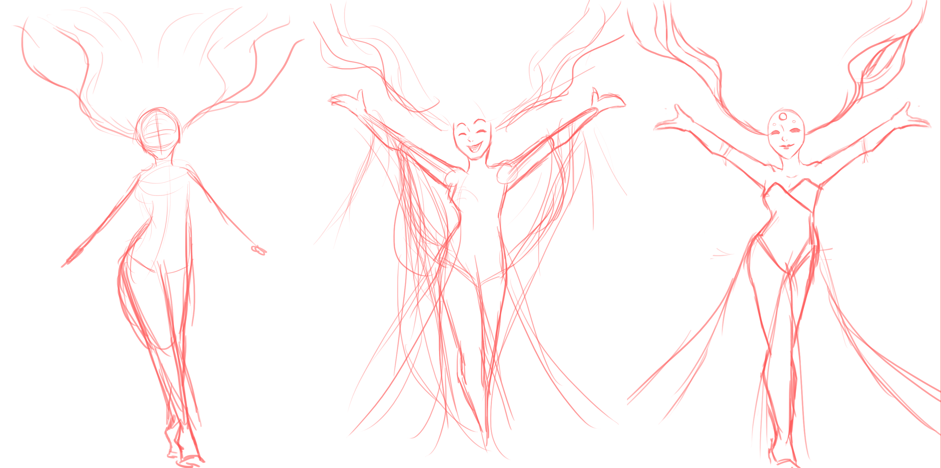
First pass - Now I already have some idea with the pose and how it should kind of look like. It looks ok-ish but the pose feels pretty meh and the way how her body is positioned makes her look like she's ice-skating.
Second pass - This time, I went back to GLORIOUS GREATEST SEARCH ENGINE MR. GOOGLE (if you know this reference, kita geng) and looked for some references. And based on the references, I took elements from them and put them into my illustration to further strengthen it.

Image sourced from Disney's Fantasia, Frozen, and Princess and the Frog
I liked how the Nature character looks happy and comfortable so I tried to adopt that. While Elsa's pose correct to what I originally wanted, I preferred Tiana's more since it has a more bouncy and welcoming feel to it.
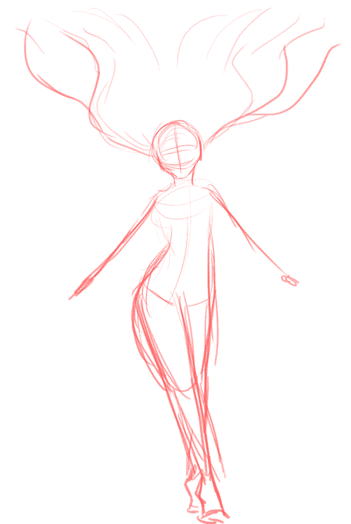
Third pass - AKA the tight sketch. At this point, I removed and added certain elements from the sketch. I kept it pretty simple in the because I really wanted to focus more on the colouring aspect.
Colouring

Dun. Dun. Duuunn! No lineart!
In the spirit of the challenge, I added another layer by doing this without a lineart on top. I thought it might be pretty interesting to do something a bit more flat and graphic looking so it'll force me to work a little more cleaner.
So while laying own the flat colours, I tried to use the same colours as the colour scheme provided but I used a much darker version first. This way I'd make sure everything looks unified because I won't be colour correcting the final image. I added gradients to the flats to add a bit more depth (who says flat needs to stay flat?) and to also focus the eye closer to the center top. Then I added more details to make all the elements clear. I tried to make sure to have some call backs to the Scandinavian mountains and woods in her dress. I also darkened the bottom half more but then this creates another problem: The leg becomes less visible.
Problemsolving

To solve the leg issue, I decided to make the leg resemble the light refracting off frozen waters. This was done by added some purple and pinks as well as some slashes of white in Overlay mode. The good part, it made the leg more visible, yay! The bad: now the hair doesn't stick out as much and the overall drawing looks flat. Boo! This was one of the cases where one solution creates a different problem...oh well...
To remedy that, I made the hair much more intense and vibrant compared to the leg (but not to the point of hurting my eyes) by using some Colour Dodge and added splotches of purple and pink. I also added the little bit of blue mist, just to sell the idea that the leg is meant to look like a waterfall.
Details

With all the attention going to her body, her face was pretty much neglected so it was time to get it painted. So I detailed her face and gave her freckles on her face and shoulders so they'd look like stars. I did the same thing to the hair as well.
Then I took a step back and I saw that there really wasn't enough of the blue from the given colour scheme so I decided to change the hands from the lilac to the blue since there was plenty of lilac in the face and hair.
Neglected Background

While I could've kept the dark purple as a background, it felt like it was eating away too much at the character and making her fade. I did a simple background of a simple flat sky with clouds. Thought that it would be cool to think that Aurora would manipulate the sky first before going full Borealis on it. I made the background much more desaturated so that the eyes can rest a little from the neon.
Process Gif
And so, that is the entire process. I hope you liked and enjoyed reading about the process and the finished drawing. This was really challenging but I really liked that it was. Hope to participate in more challenges soon.
See you next post~
wow!!..this is really great art and design hanbun..you are a great artist!!
Haha thank you very much @rambai
damn @hanbun, really pretty this one.. :D .. I dem love the galaxy-ish style of colouring ~~
Thanks, @muxidsq! 83
Deep research produces good results .. congratulations you do it wisely.
Thank you, @aurah. Hopefully I can inplement this all the time when I draw next time
Great post, like the compose and pose, best of luck!
Thank you, @erdavid!
@originalworks
The @OriginalWorks bot has determined this post by @hanbun to be original material and upvoted it!
To call @OriginalWorks, simply reply to any post with @originalworks or !originalworks in your message!
This character looks amazing. A goddess.
Thank you, @thunderbirdcomic ! I'm glad that the goddess feel came through
Its awesome sis!! Both the color scheme and the character design is marvellous..
Thanks, @fieza-hussin . It was real challenge but I'm glad you think it so ^^
I bet you can win, @hanbun. Ahhh i'm so jealous. You are so talented. Good luck sis! (^^;)
The pose reminds me of Kakegurui ending song hahaha. Anyway really nice work! Great effort xD
Have yet watch that anime ='D Hope to once I get more free time. Thanks a bunch, @elliebong! All the best in the contest. Cheers!
It's a pretty mind boogling anime but its great. All the best to u too :)cheero
Congrats, this is genius! I'll surely vote for it to win. However, although i do like the final background, i think it lost some charm when it went from negative (dark) to positive background.
Aww, thank you very much, @onicreative. I also appreciate your feedback. Thinking I might revisit this concept some time and take that into consideration =)
wow! so many details to just one graphic!
Haha I think I might have went a little overboard in my excitement, @calebleejl