Designing a new logo for The Writers' Block
I've been meaning to take a stab at this for a while, but with Christmas happening, it got put on the back burner.
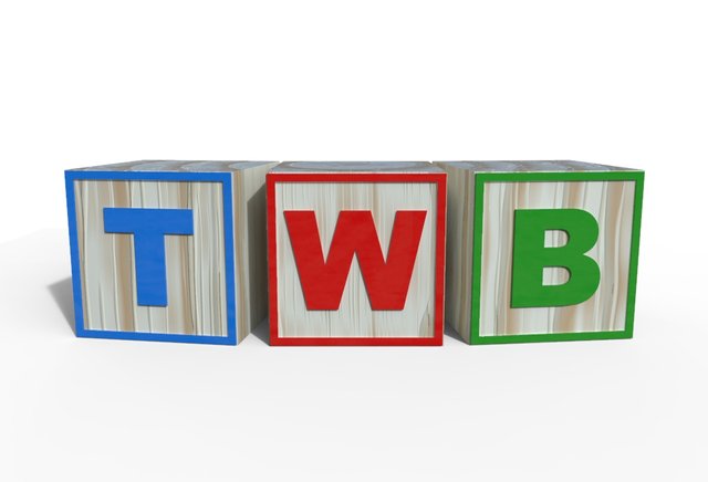
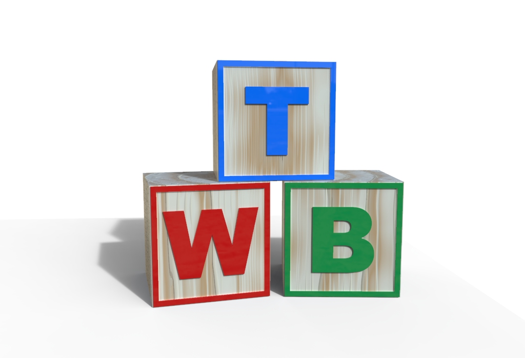
We tossed around several ideas at The Writers' Block and it was decided to use letter blocks in some way. The original idea was to have all three letters on one block but, try as I might, it didn't look good.
I fired up Modo and started playing around with text.
I then used the thicken tool to add some dimensionality to them.
My renderer of choice struggles with polygons over a certain number of sides, so I triangulated the meshes.
Next I created simple cubes, selected the front facing polygon, copied and pasted it and reduced its size.
I converted the polygon selection into an edges selection and extended the edges out to match the size of the cube. I then extruded these polygons to add thickness to the square border, before embedding it into the cube, along with the letter.
I then copied the cube and border twice, adding one to the other two letters, embedding these too. I then threw on separate colours to each part.
Next I slightly rotated the T block and B block before exporting the scene as an OBJ file.
I also rearranged all blocks for a different composition and exported this as a different scene before firing up Keyshot Pro.
Once all the materials were set I did a few test renders and ran them through The Writers' Block to see what people thought. When we came to an agreement I chose the lighting for the scenes, set shadows and raycasting to maximum and rendered each scene for half an hour.


@CrimsonClad will make these into footers for The Writers' Block. In the meanwhile, here's how it currently looks.


Wow. That is a crap-ton of work! And it looks great. Thanks for everything you do!
Thank you.
I love this and i'll even pretend there is a splash of pink hidden in there.
Yes, the letters around the back are all pink ;-)
This is absolutely lovely work, GMuxx. Thank you for doing this.
Thank you.
I love it! Mostly because those are my initials!
...and maybe for other reasons...
Good work and informative tutorial. Now please make a giant city block out of those letters :) PS. I want to see clotheslines and rooftop pigeon farms.
Lol, thanks.
Behind the scenes! Pretty cool step by step. I used to do 3D work in a former life, so it's kind of neat to see the workflow again.
Absolutely gorgeous. Probably better than the single block I had in my head initially. Great work, Muxx!
Really good job! :)
Thanks
Honestly making letter blocks limits you but you did great with what you had... nice job!
Great job love it
@gmuxx Hey have you tried a LOMBOK Font in Logo's ??
Try this font you will gonna fall in love :)
Happy
Peace :)
This? Not what we were going for.
Yes exactly this one